March 4, 2014
Genzken and the City
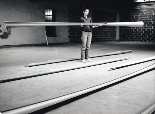
The artist in her studio, 1982. Image courtesy the artist and Galerie Buchholz, Cologne/Berlin.
“The entire art system urgently needs a vacation.” -Isa Genzken, 1992
Pay a visit to MoMA now, today, and there on the second floor is the perfect response to Diller and Scofidio’s plan for the American Folk Art Museum as if the answer were inside MoMA all along. But, you have to hurry. You’ll find this revelation in the Isa Genzken retrospective, and it closes on March 10th. Her work celebrates a New York that is weirder, messier and far more socially profound than the barren non-space of an “art bay.” Of course, it’s entirely unintentional. The show, years in the making, was never conceived as a critique of MoMA’s expansionist culture. Still, her work embraces urban spaces — particularly New York’s. She’s long dreamt of putting antennae on Philip Johnson’s AT&T building, and one series of hers, Fuck the Bauhaus, presents New York’s buildings as maquettes cleaved from plywood and construction fencing, oyster shells and pizza boxes in a response to the post-Wall boom in Berlin with its Bauhaus-lite corporatized modernism. You can only imagine now what she’d say about the “bay.” It would probably include a profanity.
A German artist in her 60s, Genzken has been little known in this country, at least until this show and all its accompanying press. On MoMA’s website a film called “Who Is Isa Genzken?” starts with stymied museum visitors struggling to pronounce her name. She’s often seen as an artists’ artist, as witness the paeans paid her by Dan Graham, Lawrence Weiner and Liam Gillick. Long identified through her exes — painter Gerhard Richter and art historian and Art Forum stalwart Benjamin Buchloh — her work has an abiding interest in the city, and here at MoMA is a chance to see that — not to mention an alternate vision of what New York City might be today — plastic hula dancers and all. Amidst the F the Bauhaus installation, one 6-inch high figurine in a grass skirt stands on the floor, precarious but also deeply funny.
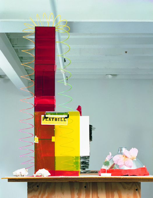
Isa Genzken. Fuck the Bauhaus #4, 2000. Plywood, Plexiglas, plastic slinky, clipboards, aluminum light shade, flower petals, tape, printed paper, shells, and model tree. Private Collection, Turin Courtesy AC Project Room, New York. © Isa Genzken
Over her career she’s made several major bodies of work, pieces that look hardly to share a thing in common at least formally, still there’s something deeper at their heart: design, architecture and urbanism. She starts in a vein close to Minimalism and ends up with what might be termed scatter art or anti-monumentalism, but forget the names. Throughout all of this is architecture and design. She seems to take Minimalism’s interest in the serial object to its logical conclusion, but where Minimalism found in the mass-produced something so empty of meaning it could serve as the teleological end of abstraction, she embraces the mass-produced, be it high or low, a Philippe-Starck chair or Bouroullec Brothers’ table (both of which appear in her installations). There are also snow globes, bald eagles, Scrooge McDuck — and the hula girl. These all are used as the thing itself (Scrooge McDuck stands on a banker’s desk) and as a material.
The show starts with some of her student work in the mid-70s at Dusseldorf Academy; Bernd and Hilla Becher, Richter and Joseph Beuys taught there. Here on the floor of MoMA, her perfectly-machined Ellipsoids and Hyperbolos have curves so subtle and precise they had to be achieved with a mainframe computer (as if some of the earliest computer-aided design). Handcrafted and made of wood, they also serve as a response to Minimalism. On the opposite wall, though, hangs a grid of photographs that can be read as a manifesto for her work. The photos are of stereos and hi-fis all promising perfection. In its copy the one ad in English claims a half dozen times to be “clean and simple” and “perfect.” For her these stereos were the ultimate objects, the thing which art itself should aim for.
Going through the exhibit with one of the curators, Stephanie Weber, I ask why Genzken didn’t use Snow White’s Coffin, assuming Dieter Ram’s austere all-white stereo would be an obvious inspiration. But Weber said Genzken wanted the objects to express their purpose and function, and Rams’ design hid its. (Interestingly, where purpose is concerned, she likened her massive Ellipsoids and Hyperbolos to arms — to spears and swords. When critics first saw the work, they assumed she was making something akin to giant knitting needles as if a woman would only make something “feminine”….)
Against another wall stands a wild collection of concrete radios (her World Receivers), hunks of cement with antennae poking out. Looking at them you see the genesis of her idea for the AT&T building as if it too were fashioned into a giant transistor radio. Genzken next turns the cement into maquettes — architecture, rubble, fragments…. They stand on steel plinths as if the pieces are building models and the debris of Post-War Germany. The concrete is literal and a representation suggesting she went out in the street and collected hunks of destroyed buildings and put them on pedestals. This profound doubling of the thing itself and what it represents continues in her work up to the present. Soon, she starts painting elements of skyscrapers, isolating these parts and turning them into surface. That series, More Light Research, was shown in 1992 at the Renaissance Society in Chicago. Here in the birthplace of the skyscraper she starts to reproduce its architectural elements as sculpture. An X-brace from the city’s most-visited building, the Hancock Center, is cast in resin. The cube glows gold. It’s heartening to know her retrospective will travel next to Chicago where viewers will see her work at the MCA, a block away from the building that inspired it.
In the middle of the gallery is something transcendent — three giant windows. Called Fenster (German for “window”) they stand folded out like a medieval triptych or altar. Displayed under a skylight the museum rarely opens, the three frames are empty and filled with light. Look up and it feels like the piece were designed for this very moment. Genzken’s windows mirror the ones above, while overhead a tower rises over it all. It’s an accident of hanging, but the piece reframes the space, underlining the architecture itself. Her work, made of architecture, isolates its elements and engages with actual architecture too. Somehow it feels like one of those only-in-New York moments. Or, maybe only at MoMA….
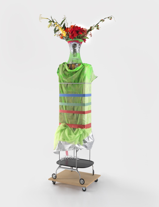
Isa Genzken. Hospital (Ground Zero), 2008. Collection Charles Asprey. Courtesy the artist and Galerie Buchholz, Cologne/Berlin. © Isa Genzken
New York has always had a pull on Genzken. She started visiting the city as a teenager, and when her marriage broke up, returned thinking she might move there. During that trip she made a series of scrapbooks called “I Heart New York Crazy City.” Using disposable cameras, she shot buildings and their details, collaging them together with detritus and ephemera — tickets, receipts and newspaper clippings. She called the results “a guidebook… for people who want to experience New York differently: a lot crazier, more multifaceted and beautiful.” Those words: “crazy, multifaceted, beautiful,” haunt me particularly as I think of what MoMA is doing now. The books are displayed between Fuck the Bauhaus and her New Buildings for Berlin; the two series seem like a suggestion of what could be — and what shouldn’t.
You can read in New Buildings For Berlin her disappointment in what that city became. Made of colored glass taped together, they stand on plinths so high looking at the work makes most viewers crane their necks. The sculptures comment on what happened to Berlin, serving as a history to what was lost from Mies’ original utopian view for Friedrichstrasse in his un-built skyscraper to what was destroyed in the War and what the city later got in places like Potsdamer Platz with its post-unification shopping and corporate buildings. Her version presents both the possibility and the promise that was watered down. Somehow in them the figure of Mies looms large, the architect of vision who then moved to the US, the man whose Seagrams building and International Style became the look of global capitalism and every corporate HQ for decades. Across the room is Fuck the Bauhaus, her buildings modeled on New York. Here a pizza box is both a pizza box and an architectural element; construction fencing tops a building like a pillbox hat. Oyster shells are pasted to the side. I can only imagine now what she’d do with the Folk Art Museum, a building so wildly weird and specific with its tiled copper façade that it’s like one of her collages. I keep thinking too of Johnson’s AT&T giant lintel with her antennae turning it into a giant alien with ears, almost come to life.
The show ends with her proposal for the Ground Zero site, a celebration of New York and possibility. There’s a hospital topped with a vase and wrapped in ribbons, a stacked parking garage made of the Bouroullec’s coffee tables for Kartell. She makes a 24-hour disco (called “Disco Soon” after a club flier on the front). There’s also a church made of a metal trolleys covered in transparent lighting gels. The trolleys here are the thing itself, like the pizza box is what it is, but also a material. Her Memorial Tower is made of stacked transparent Patrick Jouin boxes topped with two red tubes calling to mind the Twin Towers. Outside, film negatives unfurl down the building, a comment on what took place that day and the photographs with which we’re left. The tragedy hit her hard. She was in New York City during the attacks, and you can read her proposal for what to build in light of her work on what failed in Berlin. I talked about her work recently with Nicolaus Schafhausen, director of the Kunsthalle Wien, Austria. He curated her work for the Venice Biennale in 2007 and this spring will open in Vienna a show of her work from the last 15 years. He discussed how rebuilding cities in Post-War Germany and social housing had a deep impact on her.
“She is constantly looking for new models of living and working,” he says, “Even if her works appear to be extremely brittle and vary in style, she is trying with great persistency to develop new solutions for the misery that she sees. The street is her studio.” He also mentioned that Genzken’s mother still lives in some of Berlin’s earliest social housing, Onkel Toms Hütte (literal translation “Uncle Tom’s Cabin,” though not necessarily for the Harriet Beecher Stowe novel but perhaps a pub whose landlord had little cabins installed around it in the 19th Century). Designed by Bruno Taut in the 1920s, the estate was meant to be affordable and alleviate the city’s oppressive overcrowding. Genzken comes from that Post-War generation where architecture still had power to ameliorate. Schafhausen explains, “They had to build cheaply, something that is still visible in the streets of Berlin. The bare, pure concrete architecture was influenced by modernism, but built in a radical way” — not like what happened later on Potsdamer Platz, the first time Germany got architecture invested in global capitalism. Schafhausen’s show in Vienna will look in part at architecture in her work and her use of off-the-shelf objects. Genzken has also had a profound influence on him. They met when he was young in a club in Dusseldorf. We talk about her disco “Soon NY” and how she gets the idea of a nightclub as a socially leveling and transformative place. It can offer a powerful shared experience — much like cities.

Isa Genzken. Disco Soon (Ground Zero), 2008. Synthetic polymer paint on plastic, cardboard, mirror, spray paint, metal, fabric, hose lights, mirror foil, printed sticker, wood blocks, fiberboard, and casters. Carlos and Rosa de la Cruz Collection. Courtesy the artist and Galerie Buchholz, Cologne/Berlin. © Isa Genzken
Genzken is an artist where the world is always the stuff of her work, literally filled with stuff. Her ex, Benjamin Buchloh wrote in Art Forum in 2005 about the psychosis of consumerism in her work as if confounded by the direction in which her work went, as if overwhelmed by all the stuff — the off-the-shelf, the Kartell pieces, the Scrooge McDucks. He writes of “a terror that emerges from both the universal equivalence and exchangeability of all objects and materials and the simultaneous impossibility of imbuing any transgressive definition of sculpture with priorities or criteria of selection, of choice, let along judgment…”
But, her work is about something much bigger than too much stuff. She does indeed critique that culture of consumption (Take her Empire Vampire series on the War on Terror with its clever use of Nike sneakers, or her American Room, a site-specific installation for her London gallery, itself in an old bank. There the bank-turned-gallery had a vault called “the American Room” so the installation was about the US and money and power). What happens in her work, though, if you look at her Ground Zero proposal is something so deeply optimistic, something about urbanism and the civic realm and how architecture can unite us. The project is a church, hospital, disco and memorial towers. She builds them from the off-the-shelf, the mass-produced and then something amazing happens. Those objects retain their connection to our world, to the familiar, but they’re also transformed. That quality of being everyday and other makes them something much bigger. This ethos of transcendence is key in her work. The city represents that too for her. Instead of Benjamin Buchloh, a better way to read her might be Walter Benjamin with his celebration of the hallucinatory power of cities from shopping arcades to our ability to get lost on city streets.
He wrote, “Not to find ones way in a city… requires ignorance — nothing more. But to lose oneself in a city — as one loses oneself in a forest — that calls for quite a different schooling.” Those are the lessons Genzken provides. I keep returning to her guidebook: “crazier, more multifaceted and beautiful.” I think too of Berlin’s failings on Potsdamer Platz and its headquarters for Sony and Daimler and what MoMA is doing, with its subtext of real estate and power. There’s also that quote of Genzken’s, the one I started with about art — how “the entire art system needs a vacation.” The art industry does now even more than it did in 1992. That quote was used with her first show in the US, the one in Chicago. It was called “Everyone Needs At Least One Window.”
Her windows under MoMA’s skylight offer us something bigger, something moving. Architecture does too, at least the way Genzken envisioned it. I want you to try and see the city as she might: buildings constructed from pizza boxes, which seem spot on for New York, home of the slice, and oyster shells (once abundant in the Hudson River) covering facades. They literally remind me of the façade of the American Folk Art Museum. Genzken’s is a city of possibility, and it’s also the New York that’s getting lost very, very quickly on 53rd Street. I can only dream of what she might do with the copper-faced building. I’d like to think she’d turn it into a 24-hour disco.
Observed
View all
Observed
By Jennifer Kabat

 Jennifer Kabat writes frequently for Frieze and is a contributing editor at Metropolis and co-founder of The Weeklings. Recently she received a Creative Capital | Warhol Foundation Arts Writers Grant for her criticism.


