Architecture • Business • Graphic Design • History • Media • Product Design

December 31, 2009
George Nelson in Two Dimensions
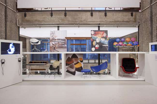
George Nelson: Architect, Writer, Designer, Teacher at the Yale Schools of Architecture Gallery (courtesy Yale Photo + Design)
There is one more month to see George Nelson: Architect, Writer, Designer, Teacher, an exhibition at the Yale School of Architecture Gallery that closes February 2. Even if you’ve seen enough knock-off Marshmallow Sofas to last a lifetime, I’d recommend it. The Nelson office’s greatest furniture hits are ranged around the central square of Paul Rudolph’s stepped gallery space, and, sitting up on modular platforms, their suggestive shapes and vibrant colors do hold the room. But the really interesting material (organized by the Vitra Design Museum and its chief curator Jochen Eisenbrand) is around the edges.
On the left side of the image above, for example, is a short film about the destruction of one such charismatic chair, a fiberglass shell from Nelson’s Swag-Leg series. The series, parts of which are now being reissued by Herman Miller, always struck me as an in-brand knock-off of the Eames shells, a little more showy and obvious. (I’d put the chairs the Eameses customized for Alexander Girard’s La Fonda del Sol in the same category. In that period, as now, friends did let friends soup up the icons.) In the film, a lovely young woman attacks the chair with hacksaw, sending up every furniture ad you’ve ever seen in which a lovely young woman takes her ease (or gets on with her typing) in a modernist chair. Nice to know that someone saw the irony in selling new chairs the old way.
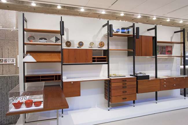
Comprehensive Storage System (CSS), 1957 (courtesy Yale Photo + Design)
At the far corner of the impressive Comprehensive Storage System on exhibit, lies a catalog for the same, a wonderful assembly of thick spiral binding and long, layered flaps. To play with the booklet was to play with your wall, imagining having a place for everything and everything in its place. We’ve seen a lot of these storage systems; Girard raised them to the level of art at the Miller House and his own homes. Nelson’s Storagewall, discussed in his 1945 book with Henry Wright, Tomorrow’s House, and wonderfully illustrated in LIFE may be the granddaddy of them all. But the catalog was more revelatory to me than the object, demonstrating, by its graphic design and interactive quality, how such a new form for the living room would have been sold. Stereo system by stereo system, board-foot of books by board-foot of books. To embrace the catalog would have been a pretty sure sign you would be happy with your CSS. The pairing of shelves and pages seemed a wonderful example of what George Nelson was really good at: having a full-service office, with graphic designers and furniture designers and exhibitions designers, all doing their jobs together. Those chairs were for show, but the CSS, the office systems, the exhibitions, and their full complement of coordinated and complementary graphic design felt like the heart of the office project.
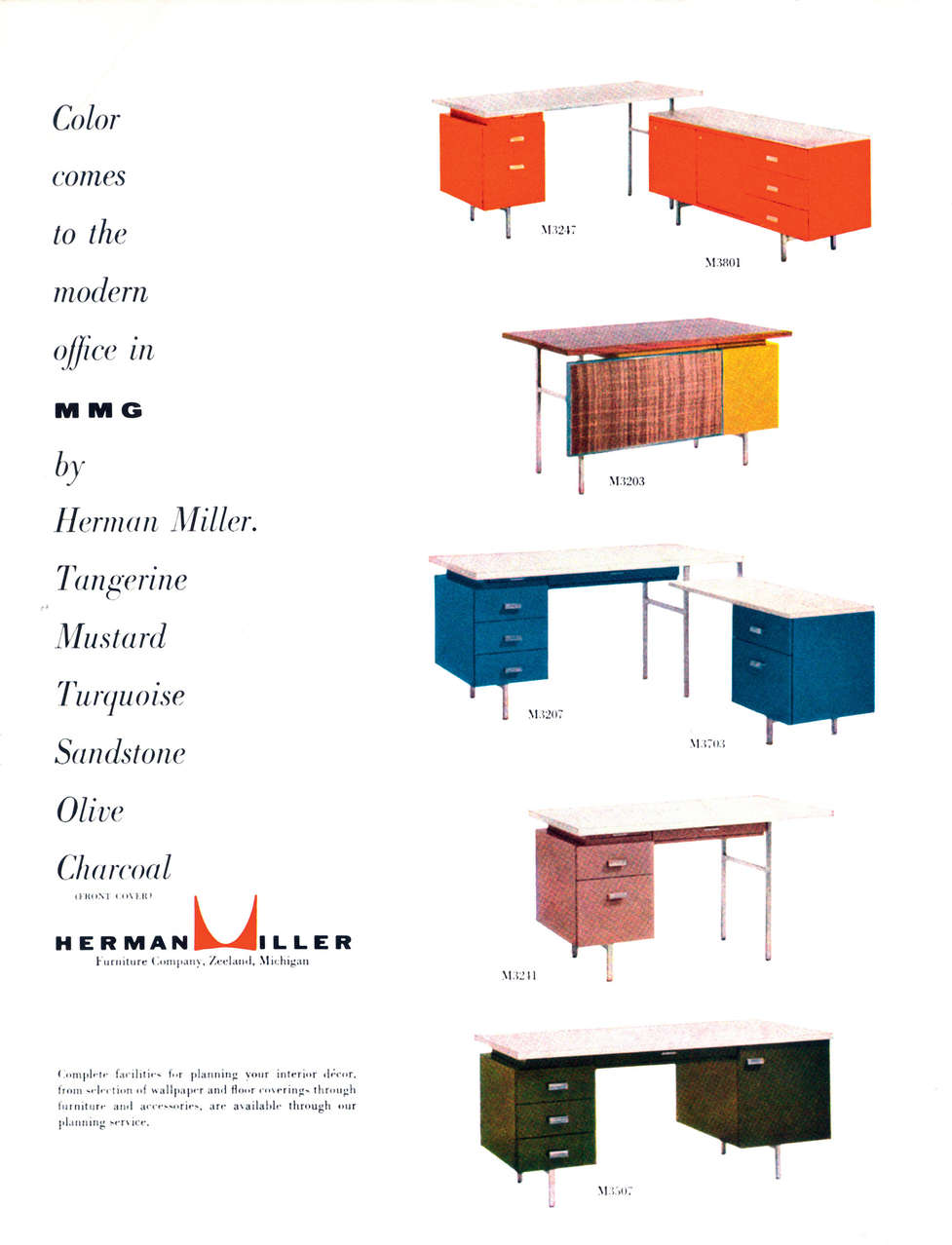
As I moved around the room, I found myself drawn again and again to the graphics. They have been much less seen, and in most cases they coordinate closely with better-known Nelson work in three dimensions. But if one admires the rattan and yellow laminate on the Modern Management Group (1955) one also has to admire how those colors are arranged on the brochure page and magazine advertisement. Both desk and graphics have a structure, a texture, and an easy-to-read quality that suggests a ready translation into easy-to-use. And the colors themselves — tangerine, mustard, turquoise, sandstone, olive, charcoal — form a little poem, and sound exactly like Miuccia Prada’s palette. I wish I could order my desk and chair in any of the options below.
Advertisement, Modern Management Group (1955) (via George Nelson Foundation)
The exhibit credits George Tscherny, initially working under the multi-talented Irving Harper, with much of the office’s graphic output in the 1950s. Tscherny has said that Nelson, trained as an architect, wasn’t that interested in the two-dimensional. But I would say, judging by the material in the show, that the graphic department did him proud, changing with the times, using plenty of bright color, but maintaining an architectural simplicity quite different from the work Herbert Matter was doing for Knoll. Maybe Nelson didn’t care, but there is a sense of continuity despite the neglect. Later, Tomoko Miho led the department, and the foudation lists all of the people who worked in the office here.

George Tschermy for George Nelson, advertisement for Herman Miller (1955) (via Container List)
A few other items of note. The most striking example of Nelson’s architecture is the Experimental House (1951-57) shown at the exhibition in large model form and with period clippings. It is a series of modular pavilions, deployed across a subtropical landscape. Most of Nelson’s built architecture is fairly ordinary, and this project shows him swimming in the flows of Rudolph’s Sarasota work, Eliot Noyes’s experiments with sprayed concrete in his Bubble House, and other sunny moments with tiny houses of the late 1940s and early 1950s.
Nelson’s films can all be seen here at the thoough George Nelson Foundation site. Nelson invited Charles Eames and Alexander Girard to help him produce “Art X” in 1953, an experiment in film and art education that was formative for Eames’s subsequent and more famous interest in moving pictures. I particularly enjoyed “Countdown” from the 1970s, which may be the first example of an idea now over-used in urban children’s counting books (and “Sesame Street”). And there’s a little surprise at zero.
“Countdown” (1970s) (via George Nelson Foundation)
Observed
View all
Observed
By Alexandra Lange
Related Posts

Innovation
Ashleigh Axios|Essays
Innovation needs a darker imagination

Business
Kim Devall|Essays
The most disruptive thing a brand can do is be human

AI Observer
Lee Moreau|Critique
The Wizards of AI are sad and lonely men

Business
Louisa Eunice|Essays
The afterlife of souvenirs: what survives between culture and commerce?
Recent Posts
Sam Furness got serious about investing in his curiosity. Now, he’s helping others do the same. Corporate crisis is design’s opportunity In a world that feels impossible to change, emerging designer Deborah Khodanovich is starting small Elixir Design founder Jennifer Jerde believes in the human touchRelated Posts

Innovation
Ashleigh Axios|Essays
Innovation needs a darker imagination

Business
Kim Devall|Essays
The most disruptive thing a brand can do is be human

AI Observer
Lee Moreau|Critique
The Wizards of AI are sad and lonely men

Business
Louisa Eunice|Essays

 Alexandra Lange is an architecture critic and author, and the 2025 Pulitzer Prize winner for Criticism, awarded for her work as a contributing writer for Bloomberg CityLab. She is currently the architecture critic for Curbed and has written extensively for Design Observer, Architect, New York Magazine, and The New York Times. Lange holds a PhD in 20th-century architecture history from New York University. Her writing often explores the intersection of architecture, urban planning, and design, with a focus on how the built environment shapes everyday life. She is also a recipient of the Steven Heller Prize for Cultural Commentary from AIGA, an honor she shares with Design Observer’s Editor-in-Chief,