December 31, 2009
Hope is The Thing with Feathers
There are two quotes I consider when asked about designing television network identities. First, “I’m mad as hell, and I’m not taking it anymore,” from the Paddy Chayefsky and Sidney Lumet film, Network (1976). Second, “If the identity system is right for fifteen minutes, you’ve done your job,” from AIGA Medalist Fred Seibert. These quotes refer to the transitory nature of network identities in a fluid media.


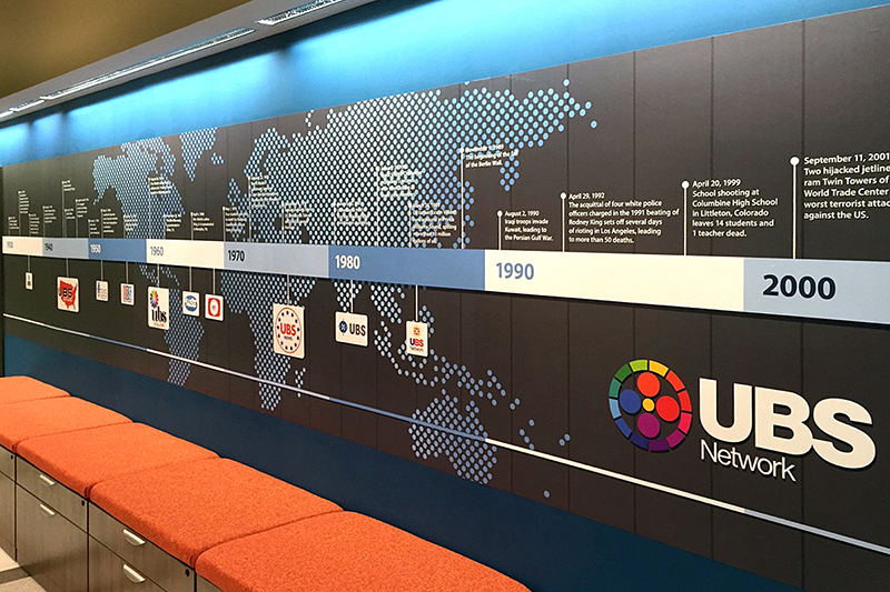
UBS identity, Sean Adams, 2015.
I’ve designed several network identity systems and used both quotes often. Two years ago, I designed an identity system for the UBS Network on the television series Blunt Talk, referencing the network’s name on the Lumet film. To provide a history of the faux network, I designed a timeline of logos for one of the sets. During the research process, I found myself returning to the history of the NBC logo often, reviewing the early radio based and early television logos. Then I fixated on the peacock.

LEFT: NBC logo, John Graham, 1956. RIGHT: NBC logo, Lippincott and Margulies, 1975.
Why was it a peacock? I know that the first iteration, designed by John Graham in 1956, refers to the networks color broadcasting. If you are old enough, you will quickly recall the mnemonic, “NBC, in living color.” And this is where I am lost. A peacock is blue and green. It is not rainbow colored. Yes, I understand the symbol of the peacock representing a colorful animal. The Graham logo is beautiful and exuberant. However, it is an illustration of a peacock.

NBC identity system, Steff Geissbühler at Chermayeff and Geismar, 1986.
In 1986, Steff Geissbühler, then a partner at Chermayeff and Geismar, updated the peacock logo. He discarded the previous mark, an iteration of the letter “N” or the shape of Nevada, depending on the viewer. Geissbühler explains, “It’s the N for Nothing: By trying to say too much, it says nothing at all.” “The N looked like X-Acto knife blades—a typical abstraction trying to be Swiss, without understanding the problem at hand or design principles, trying to make it look modern. The combined logo was not reproducible at small sizes, it was not good on camera, and was overall too complex in form and meaning.”
In Geissbühler’s hands, the peacock evolved from a literal representation to a symbol. Alluding to one of Paul Rand’s maxims, it identifies the network. It doesn’t describe what it does. The logo created a system for divisional identification. For example, yellow referred to the News division, red for entertainment, and orange for sports programming. The breakthrough came in 1986, with the refinement of a previous logo that had equity, rather than discarding it for “for the sake of new.” This was a time when corporations were abandoning long-standing identities for the trend of an abstract icon.
The NBC peacock’s transformation is a masterpiece of geometry. There are only two forms: a circle and straight line. The end of the peacock’s tail, the circle, is echoed with the base of the bird, the curve of its neck, and letterforms of the wordmark. The mathematically precise points repeat with the “N.” Every element relates to another with the simplest of visual forms. The teardrop shapes appear to exist as a uniform rotation of the same element. But, they don’t follow a simple structure. They are arranged to create the negative shape of the bird and simultaneously form a half-circle. Don’t try that at home.

NBC logo, 2013.
In the last decade, many networks modified their logos to be three-dimensional. Other marks faced the same fate, some like the UPS logo disappearing entirely in favor of a three-dimensional shield. Even Paul Rand’s venerable ABC logo now exists as a shiny and dimensional disk. Fortunately, although the peacock is now glossy, NBC continues to value the visual and emotional equity of the mark. In the world of fifteen-minute lifespans, this is a testament to smart business and beautiful design.
Images courtesy of Steff Geissbühler and Adobe Create Magazine.
Observed
View all
Observed
By Sean Adams
Recent Posts
Courtney L. McCluney, PhD|Essays
Rest as reparations: reimagining how we invest in Black women entrepreneurs Food branding without borders: chai, culture, and the politics of packaging Why scaling back on equity is more than risky — it’s economically irresponsible Beauty queenpin: ‘Deli Boys’ makeup head Nesrin Ismail on cosmetics as masks and mirrors


