
Arts + Culture • History • Media • Music
November 9, 2017
I Love the 80s

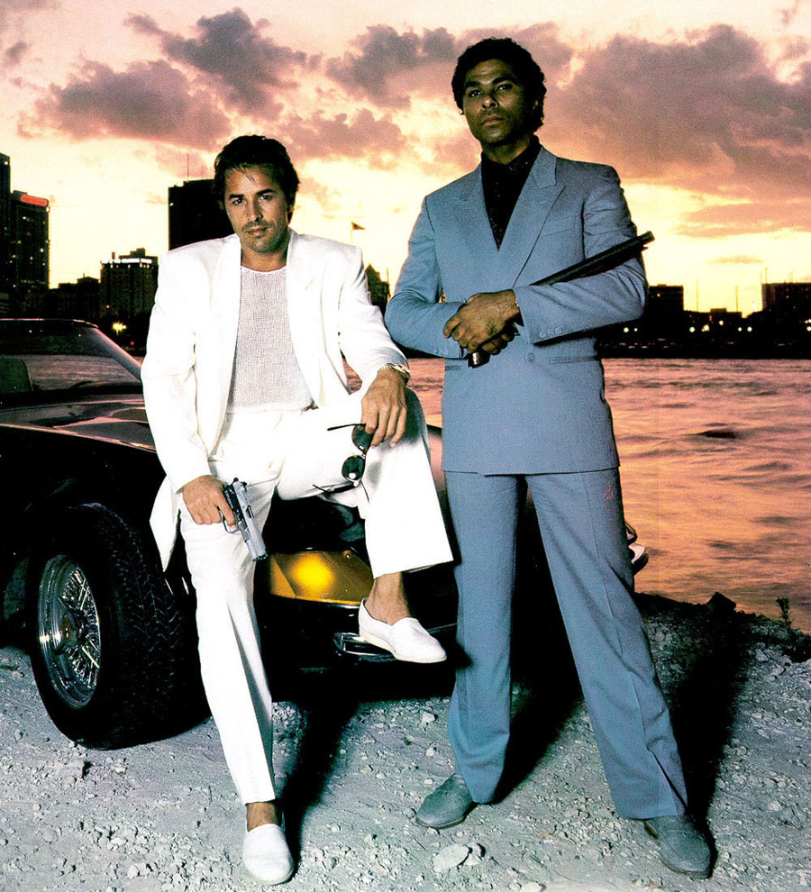
Miami Vice publicity still featuring Philip Michael Thomas as Ricardo “Rico” Tubbs and Don Johnson as Sonny Crockett, 1984.
This essay was originally published on May 22, 2012, and appears in the new essay collection, Now You See It and Other Essays on Design, available now from Princeton Architectural Press
I graduated from college in June 1980, and moved to New York City the following week. I had just spent five years at the University of Cincinnati’s College of Design, Architecture and Art learning that appearances mattered, that nothing was more important than the way things looked, that every detail counted. And knew something else as well: that this hard-won level of connoiseurship would subject me and my fellow designers to a lonely struggle that would probably last a lifetime. We understood that we were destined to care about these things, and hardly anyone else would. Such was the lonely life of a designer. Then, on Sunday, September 16, 1984, everything changed. I realized that the battle was won. Suddenly the whole world seemed to care about design. That evening marked the debut of Miami Vice.
Yes, Miami Vice. The quintessential 80s TV show, the epic entertainment that had been built, legend had it, on a two-word premise, scrawled on a notepad by NBC Entertainment head Brandon Tartikoff and passed to veteran writer Anthony Yerkovich: “MTV Cops.” There had been cop shows before, there had been stylish shows before, but none exhibited the obsession with surface gloss that came to characterise Miami Vice. It was common knowledge that the show’s executive producer Michael Mann had dictated a blanket edict — “No earth tones” — to the show’s production designers, and that every aesthetic decision on Miami Vice had to conform — or else. A cover story in Time in 1985 described the philosophy in depth. “There is a very definite attempt to give the show a particular look,” episode director Bobby Roth told the magazine. “There are certain colors you are not allowed to shoot, such as red and brown…I found this house that was really perfect but the color was sort of beige. The art department instantly painted the house gray for me.” The two stars, Sonny Crockett (Don Johnson) and Ricardo “Rico” Tubbs (Philip Michael Thomas) moved through a world of near-perfect hightened abstraction.
This mania for appearence, which no doubt struck some of Time’s readers as idiosyncratic at best and insane at worst, was completely understandable to me. Upon arriving at Vignelli Associates for my first job as a junior designer, I learned that Massimo Vignelli had arranged for all of the window air conditioning units to be sprayed with Krylon matte black paint, transforming the ugly (beige!) Fedders boxes into something resembling MoMA-ready Braun devices — sort of. Naturally I took a can back to my apartment so my own cheap unit could get the same treatment. Why stop there? The office was soon populated with matte black tape dispensers, adjustable lamps, and pencil holders. “The same attention,” reported Time, “is lavished on the show’s fashions. On a typical episode, Crockett and Tubbs wear from five to eight different outfits — always in shades of pink, blue, green, peach, fuchsia and the show’s other ‘approved’ colors.”
Exactly, approved colors! Finally the world was coming around to my way of thinking. Was this really any different from the realm of architecture, where postmodernists like Michael Graves were on the rise, and the cream and mauve paint was still drying on his 1982 Portland Building? Architecture even featured in the opening titles of Miami Vice itself, where millions every week saw the iconic palm tree in the upper-story atrium of Arquitectonica’s brightly-colored Atlantis condominium building. Meanwhile, the hot news in graphic design was coming from California. In San Francisco, the “Michaels” (Manwaring, Vanderbyl, Cronan and Mabry) were marrying European modernism with the West Coast version of Miami chromatism. In LA, April Greiman was turning up the intensity with Day-Glo colors that would soon find their full expression in the digital realm courtesy of the newly-introduced Macintosh. And the world had seen graphic postmodernism writ large in the program that Deborah Sussman and Paul Prezja had developed in for the 1984 LA Olympics, brimming with festive visual confetti designed to last for only a few weeks before a worldwide television audience.
More revolutionary than the visual appearence of Miami Vice was the underlying premise that somehow we had reached a moment in time where substance had ceased to matter. “The show is written for an MTV audience,” another director told Time, “which is more interested in images, emotions and energy than plot and character and words.” Indeed, the most powerful moment in that 1984 pilot wasn’t a gun battle or a courtroom confrontation, but a nearly wordless three-minute sequence where Crockett and Tubbs drive through the damp Florida night to the sound of “In the Air Tonight” by Phil Collins, neon reflecting off the hood of their black Ferrari Daytona Spyder 365 GTs/4. The legendary “Ba dum ba dom ba doom BOOM BAM BAM” of Collins’s drum break at 2:39 was no less powerful for all its studio artificiality, and went on to define the sound of the 80s for much of pop music.
Was I crazy to think it was all coming together exactly as I had dreamed in college, a world in thrall to the frisson of pinks and blues, of shiny black surfaces shimmering with squares and triangles? At Vignelli Associates, I became the unofficial “new wave” specialist. One of our established lighting company clients was an investor in a new experimental furniture line coming out of Milano. Without fully understanding what I was getting into, I was assigned to create the invitations for the New York launch of the Memphis movement. Each invitation involved applying a pre-printed sticker with the Memphis logo onto a pre-printed glossy black postcard that had itself been sprayed (by me) with Krylon Day-Glo paint and scribbed on (by me) with red, yellow and orange China markers. There were 1,000 invitations. The handwork this production required took a full weekend. At its conclusion I was fairly delirious. Whether this was from contemplating the promise of a new aesthetic era or three days straight of inhaling aerosol fumes it was hard to say.
For me, this era of design wasn’t about communicating messages, or serving society, or even problem solving. It was simply about manipulating colors and shapes, about engaging in the pleasures of the surface, as if these things had meaning in and of themselves. And although I loved the design work I saw all around me, it has not worn well. An exhibition on postmodern design was on view earlier this year at the Victoria & Albert Museum, and it was widely panned. Typical was the view of Stephen Bayley, who scathingly borrowed an epitaph for Po-Mo from Alexander Pope, saying it had “a brain of feathers and a heart of lead.”
Half true. Design in the eighties was shallow. But it wasn’t without soul. All those little discoveries I made, superimposing just the right orange on just the right teal, getting a curve exactly right, making something look perfect: those moments were thrilling for a young designer. The last piece in the V&A’s installation was the video for New Order’s Bizarre Love Triangle, directed by New York artist Robert Longo in the style of his “Men in the Cities” lithographs. The song took me back, as songs do, to my own innocent youth, particularly the line “Why can’t we be be ourselves like we were yesterday?” I left the museum a little misty-eyed and a little embarassed, remembering those days when the way something looked seemed to mean so much. I wonder if it will ever be that way again.
Observed
View all
Observed
Share on Social
By Michael Bierut
Related Posts
Graphic Design
Sarah Gephart|Essays
A new alphabet for a shared lived experience
Arts + Culture
Nila Rezaei|Essays
“Dear mother, I made us a seat”: a Mother’s Day tribute to the women of Iran

The Observatory
Ellen McGirt|Books
Parable of the Redesigner
Arts + Culture
Jessica Helfand|Essays
Véronique Vienne : A Remembrance
Recent Posts
Why scaling back on equity is more than risky — it’s economically irresponsible Beauty queenpin: ‘Deli Boys’ makeup head Nesrin Ismail on cosmetics as masks and mirrors Compassionate Design, Career Advice and Leaving 18F with Designer Ethan Marcotte Mine the $3.1T gap: Workplace gender equity is a growth imperative in an era of uncertaintyRelated Posts
Graphic Design
Sarah Gephart|Essays
A new alphabet for a shared lived experience
Arts + Culture
Nila Rezaei|Essays
“Dear mother, I made us a seat”: a Mother’s Day tribute to the women of Iran
The Observatory
Ellen McGirt|Books
Parable of the Redesigner
Arts + Culture
Jessica Helfand|Essays