February 17, 2011
I Was an Unhappy Hipster

Photos by Matthew Williams for Dwell
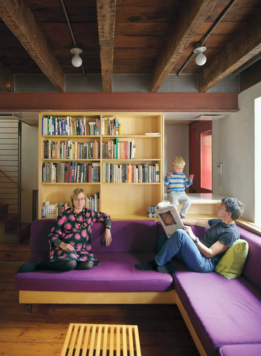
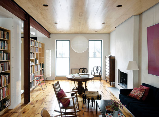
My husband and I had three fights about our bookshelves. They are an important element in our house — our first house, a brick townhouse in Brooklyn. We have lots of books, many oversize, and the shelves form the 2 -foot wall of our parlor. We are both design professionals: he’s an architect, I’m a critic. So I am not sure whether three fights were a lot or a little.
This month those bookshelves (and the rest of the house) can be seen in Dwell Magazine, where our house is representing Brooklyn in the New York Issue. Now I know why the couples in Dwell look so disconnected: the photographer tells you not to look at each other! But the Unhappy Hipsters Tumblr may reveal a larger truth amidst the snark. For the kind of people whose homes are featured in Dwell, design decisions are emotional. By the time of the shoot, our emotions had cooled, and the disaffection was just art direction. But that wasn’t always the case while we were under construction.
The first fight was in the car, when Mark said his shelf design would be inspired by a cabinet for Chinese scrolls he’d seen in an Asian architecture book. There would be vertical divisions every foot or so, dividing the wall into a hundred little cells.
Hearing this, all I could think of was the first and only other bookshelf Mark made for me, in the second year of our relationship. It was completed six months after the birthday for which it had been a gift, was tippy, ungainly, and weighed about 75 pounds. That couldn’t be happening again, could it? I snapped that I didn’t see much similarity between an architecture monograph and a scroll, and we gave each other the silent treatment for a half an hour. Second time he brought up the scrolls, same result.
About 45 minutes after each fight, I would start to feel bad. He was starting a discussion, and I was going to war. When I heard a design idea I didn’t like — hysterical verticals, a black staircase, cork in the bathroom — thunderclouds scudded into my brain. I imagined living in a house I didn’t want, one that just wasn’t me, and, like the Hulk, I had to smash the bad vision. Unfortunately, my husband was in the way.
The third time, he got smart. He showed me a drawing of the shelves, not their inspiration. He’d recessed the (obsessive) verticals, and made them out of thin metal. It wasn’t a chunky wall of white cubes, like a Richard Meier building made into a shelf. And he gave me a practical argument: all those coffee table books are heavy, and to take one out from an undivided four- or five-foot shelf requires arm strength. Once you’ve extracted a volume, the whole line of books slumps. “OK,” I said, adding the words he wanted to hear all along: “Looks great, honey!”
 Photos by Matthew Williams for Dwell
When the black stairs came up again I suggested barn red instead (less Tim Burton). Mark agreed, as long as it wasn’t Frank Lloyd Wright red. For him, it is the master builders that lurk in the back of every choice. For me, it is the clichés of contemporary architecture that must not be allowed across my doorstep. I’ve written about too many apartments to be intrigued by open kitchen shelving, Carrara marble countertops or rift-sawn oak.
Writing about other peoples’ apartments also gave me a collage of things I do like: the thick Corian counter from this project, the mirrored outlet covers from that one. When we began the renovation, I was so excited to finally get to pick out the paint, the backsplash, the countertops that were going to be me. I flagged tens of magazines. What I didn’t realize was all the things I was interested were only the icing on the cake. Even though I liked to I knew something about construction, my knowledge was only skin deep. It took months of demo, of rewiring, of ductwork to get to the part I wanted to argue about.
I found myself in the gendered position of the decorator. Where he saw all the mechanical and structural parts, I saw the finished product. My goal was a picture in one of those magazines I write for, because otherwise, what’s the point? Mark described a niche, and I mentally revolved our vase collection to find one that would fit. He wanted the architecture to do the talking, while my ego was all tied up in the furniture I bought from the estate, my upholstery choices, my EBay finds. I wrote the perky shelter magazine captions in my head as I picked the sofa fabric.
Here, for the first time, we were creating a portrait of ourselves as a couple. We both cared deeply but about very different things. The bookshelf was so controversial because it occupied the overlap between my image of our house and Mark’s drawing of the same space. The shelf was both wall — there was to be no sheetrock — and a major aesthetic statement. Even now that it is all over, it is only when I talk to my non-design friends that I can see how similar Mark and I really are. One of my best friends let her mother-in-law renovate her master bath before her family moved back from London, sight unseen. Can you imagine?
Three fights was more than enough for one element, though I feared a fourth. One night, months after I thought the shelf was squared away, Mark was reading W.G. Sebald’s Austerlitz and came across a photograph of the files of prisoners held at Terezín (discussed in Rick Poynor’s post, “W.G. Sebald: Writing with Pictures”). Squarish cells, perhaps eight-by-eight inches, climbed the walls. First and foremost, an image with an undercurrent of horror. But also, decontextualized, aesthetic. “See,” he said, “these look great.” I thought I was safe when he was reading fiction. But in a house of design, the books, their images, their home are all part of an endless conversation.
Observed
View all
Observed
By Alexandra Lange
Related Posts

Equity Observer
L’Oreal Thompson Payton|Essays
‘Misogynoir is a distraction’: Moya Bailey on why Kamala Harris (or any U.S. president) is not going to save us

Equity Observer
Ellen McGirt|Essays
I’m looking for a dad in finance

She the People
Aimee Allison|Audio
She the People with Aimee Allison, a new podcast from Design Observer
Equity Observer
Kevin Bethune|Essays
Oh My, AI
Related Posts

Equity Observer
L’Oreal Thompson Payton|Essays
‘Misogynoir is a distraction’: Moya Bailey on why Kamala Harris (or any U.S. president) is not going to save us

Equity Observer
Ellen McGirt|Essays
I’m looking for a dad in finance

She the People
Aimee Allison|Audio
She the People with Aimee Allison, a new podcast from Design Observer

Equity Observer
Kevin Bethune|Essays
