January 14, 2011
In Praise of the East European Film Poster

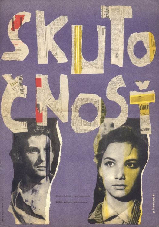
Richard Fremund, Reality, poster for Polish film, Czechoslovakia, 1961
Czech film posters of the 1960s are some of the most extraordinary graphic creations ever put on paper. So how can it be that outside of Eastern Europe, especially in English-speaking countries, these posters and the graphic artists who created them during a period of remarkable artistic freedom are barely known?
The history of the Polish poster in the Communist era is certainly familiar and widely appreciated. The story of the modern Polish film poster began in the 1940s and the medium remained strong for several decades. Czech film posters flourished for a relatively short time under Communism; the best in the modern style were created from the late 1950s to the early 1970s, after which there was a falling-off. In each country, editors at enlightened commissioning organizations — in Czechoslovakia the Central Film Distribution Agency — encouraged committed poster artists, who were often also fine artists, to do exceptional work.
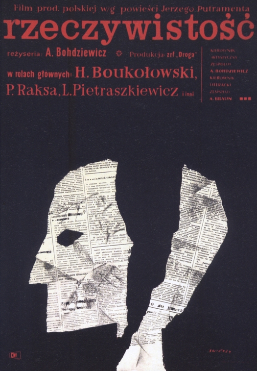
Waldemar Swierzy, Reality, poster for Polish film, Poland, 1961
Polish posters have been extensively documented in survey books and monographs about the major figures. But the graphic heritage of the golden age of Czech poster production has fared less well. Very little has been published in English on the subject. I knew nothing about these amazing Czech posters until I started to visit the Czech Republic regularly in 2000. Later, I was given a copy of Czech curator Marta Sylvestrová’s superb — and massive — Czech Film Posters of the 20th Century (2004), which remains one of my most treasured design books. (Amazon doesn’t have it, but you can find it here, here and here.) I included many of the most surreal posters in my exhibition Uncanny: Surrealism and Graphic Design.
For me, Czech film posters, considered as a school, have the edge over Polish film posters — I readily concede that it’s a close run thing. As is often remarked, Polish posters tend to be painterly and pictorial, though there are brilliant exceptions such as the work of Roman Cieslewicz, already a master of photo-collage in the late 1950s. The Czech poster artists were a little slower to discover photo-collage, but they soon made the technique their own in bravura feats of design that fuse collage, photo-collage, montage, hand-drawn and painted elements, and exuberantly playful lettering and type — often in the same image.
We now have a chance to make close comparisons between Czech and Polish film posters. Since 2005, a collector in Prague named Pavel RajÄan has amassed 10,000 Czech film posters, many for sale through his Terry Posters website; he also has 1,500 Polish posters. RajÄan isn’t the only dealer in Czech posters to be found online, but he is certainly the most active, image-conscious and visible. I visited him and his collection at the Kino Svetozor arthouse cinema in Prague last year while working on my exhibition and it’s a highly organized operation. To date, RajÄan — a man who clearly doesn’t sit on his hands — has put together around 70 exhibitions based on his collection. The latest show, Confrontation, at the Museum of Cinematography in Lodz in Poland (until the end of January), compares Czech and Polish versions of posters designed by different artists for the same films.
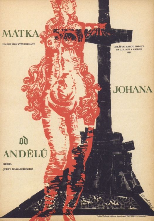
Karel Teissig, Mother Joan of the Angels, poster for Polish film, Czechoslovakia, 1961
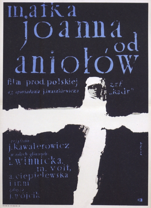
Waldemar Swierzy, Mother Joan of the Angels, poster for Polish film, Poland, 1961
There is also a catalogue with a larger selection of posters, showing 74 pairs. I have selected three pairs to reproduce here: Reality (1961), Mother Joan of the Angels (1961) and Interrupted Flight (1964). One consequence of the comparative method is that the posters in the show aren’t always all of the highest design quality since the classic posters produced by the two countries don’t necessarily correspond in this way. However, these six examples are all very fine, as well as being impressively oblique compared to any film poster we might see today, though I would say the Czech poster is the stronger in each case. All five of the designers — the Czechs Karel Teissig (1925-2000), Richard Fremund (1928-69), Milan Grygar (b. 1926), and the Poles Waldemar Åšwierzy (b. 1931) and Eryk LipiÅ„ski (1908-91) — are major poster artists.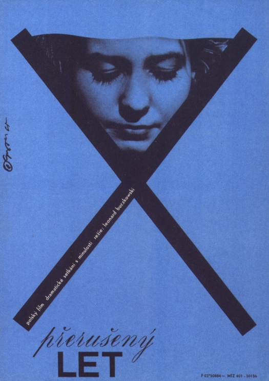
Milan Grygar, Interrupted Flight, poster for Polish film, Czechoslovakia, 1965
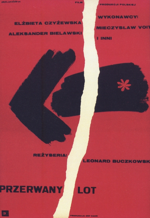
Eryk Lipinski, Interrupted Flight, poster for Polish film, Poland, 1964
One issue that immediately arises from this exercise is the question of influence. In each of the pairs here, the Polish poster presumably came first, but nothing is known for certain about whether the Czech designers had seen the Polish originals, though this might seem a reasonable assumption in the case of Reality, where both posters use torn-newsprint collage. While RajÄan, in the space of just five years, has already made a big contribution to keeping memories of the Czech film poster alive, his show and catalogue highlight the distinction, discussed in my recent essay, between a connoisseur’s enthusiasm for historical artifacts and probing historical scholarship. In his book, RajÄan expresses the modest hope that the material he has assembled will inspire scholars to undertake “a more precise examination of the differences, similarities, or intertwining of these two poster schools.”
Not for the first time, one is left thinking that graphic design history offers great swathes of nutrient-rich but barely charted terrain for any researcher looking to undertake original scholarly investigation.
Images: Terry Posters collection
Observed
View all
Observed
By Rick Poynor
Related Posts

Business
Courtney L. McCluney, PhD|Essays
Rest as reparations: reimagining how we invest in Black women entrepreneurs
Design Impact
Seher Anand|Essays
Food branding without borders: chai, culture, and the politics of packaging
Graphic Design
Sarah Gephart|Essays
A new alphabet for a shared lived experience

Arts + Culture
Nila Rezaei|Essays
“Dear mother, I made us a seat”: a Mother’s Day tribute to the women of Iran
Recent Posts
Courtney L. McCluney, PhD|Essays
Rest as reparations: reimagining how we invest in Black women entrepreneurs Food branding without borders: chai, culture, and the politics of packaging Why scaling back on equity is more than risky — it’s economically irresponsible Beauty queenpin: ‘Deli Boys’ makeup head Nesrin Ismail on cosmetics as masks and mirrorsRelated Posts

Business
Courtney L. McCluney, PhD|Essays
Rest as reparations: reimagining how we invest in Black women entrepreneurs

Design Impact
Seher Anand|Essays
Food branding without borders: chai, culture, and the politics of packaging

Graphic Design
Sarah Gephart|Essays
A new alphabet for a shared lived experience

Arts + Culture
Nila Rezaei|Essays

 Rick Poynor is a writer, critic, lecturer and curator, specialising in design, media, photography and visual culture. He founded Eye, co-founded Design Observer, and contributes columns to Eye and Print. His latest book is Uncanny: Surrealism and Graphic Design.