

January 8, 2014
Joseph Müller-Brockmann’s Typographic Re-boot
In the mid 60’s, when I was just learning about design and typography at Yale, Modernism was the style du jour. I was intellectually turned on by the minimalism (one font, usually Akzidenz in just a few sizes), the rules (flush left, ragged right, the logic of the grid) and the idea of a “universal” aesthetic where content of any variety could be accommodated in this rational system.
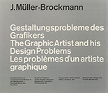
Switzerland was then the Mecca of European Modernism and Joseph Muller-Brockmann, one if its key practitioners, had just published what might have been the first pedagogical book on the subject: The Graphic Artist and His Design Problems.
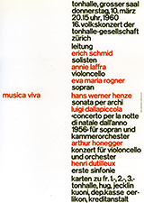
I opened it up and there on page 124 was this amazing poster from 1960:
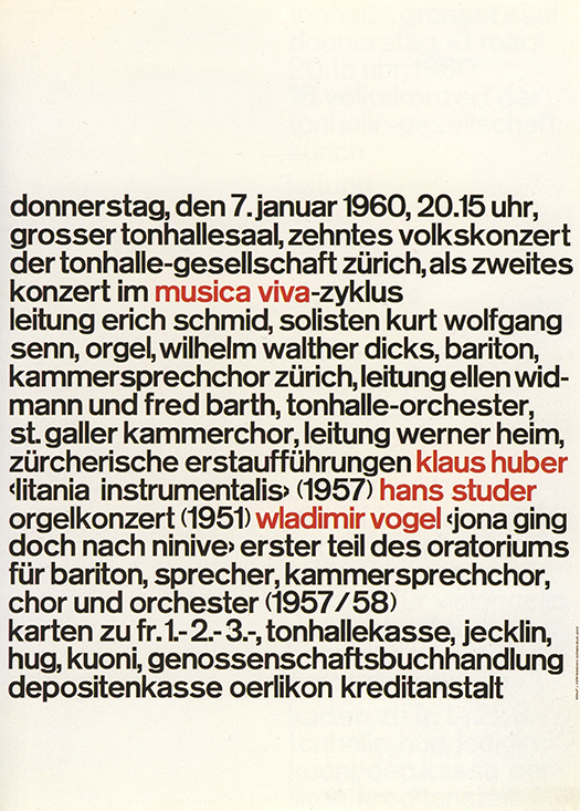
1960
I was jolted, because it seemed to me to represent the irreducible, can’t-get-more-basic-than-this exemplar of Swiss Modernism.
It was as if every Swiss poster of the previous decade was reverse-engineered, gradually eliminating all pictorial elements and all hierarchical and clarifying typographic signals until the only thing left was one un-inflected, flush left, ragged right, one size, one weight, run-on block of text. And then, into this distractingly dense message, the bare minimum of clarity was added: commas between phrases; a faint hint that it contained three paragraphs; and then those four red pairs denoting the content: the name of the concert series and the three performers.
Gone are Muller-Brockmann’s geometric illustrations and iconic photographic images of the 50’s.
 1958
1958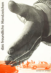 1955
1955
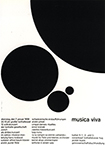
From this baseline, type-as-image-re-boot, sprang a series of beguiling and increasingly complex, but at the same time more legible, typographic compositions for Musica Viva.
 1960
1960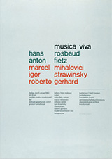 1962
1962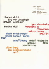 1968
1968
For me this deliberate process of moving from simple/un-inflected/opaque, to complex/articulated/clear, informed my own early typography as a teacher and encouraged me in my own work to see typography itself as an image.
A version of this article was previously published in I Heart Design, edited by Steven Heller, Rockport Publishers, 2011.
Observed
View all
Observed
Share on Social
By Chris Pullman
 Chris Pullman served as vice president of design for WGBH for 35 years. Viewers of PBS will recognize his work in the opening title sequences of “Masterpiece Theatre” and “Antiques Roadshow” and the WGBH animated on-air signature.
Related Posts

Business
Courtney L. McCluney, PhD|Essays
Rest as reparations: reimagining how we invest in Black women entrepreneurs
Design Impact
Seher Anand|Essays
Food branding without borders: chai, culture, and the politics of packaging

Graphic Design
Sarah Gephart|Essays
A new alphabet for a shared lived experience

Arts + Culture
Nila Rezaei|Essays
“Dear mother, I made us a seat”: a Mother’s Day tribute to the women of Iran
Recent Posts
Courtney L. McCluney, PhD|Essays
Rest as reparations: reimagining how we invest in Black women entrepreneurs Food branding without borders: chai, culture, and the politics of packaging Why scaling back on equity is more than risky — it’s economically irresponsible Beauty queenpin: ‘Deli Boys’ makeup head Nesrin Ismail on cosmetics as masks and mirrorsRelated Posts
Business
Courtney L. McCluney, PhD|Essays
Rest as reparations: reimagining how we invest in Black women entrepreneurs
Design Impact
Seher Anand|Essays
Food branding without borders: chai, culture, and the politics of packaging
Graphic Design
Sarah Gephart|Essays
A new alphabet for a shared lived experience
Arts + Culture
Nila Rezaei|Essays