
July 29, 2021
LogoArchive pLAy
LogoArchive
LogoArchive began by documenting the forms, form language and meaning-making that developed out of mid-century modernist identity programs. Today, it uses this archive to explore contemporary concerns and forgotten interests in design practice through a series of light booklets. Each becomes a short-form proposal that balance ideas–expressed through a gestalt of materials, texts and production–with the appealing forms of modernist symbols.

LogoArchive pLAy
Having just launched an issue on Renaissance printers’ marks, an approach made by Jim Sutherland, Studio Sutherl&–a designer well-regarded in the UK, not just for his work at The Partners and Hat-trick but for his joy for graphic design and experimentation–was an exciting opportunity.
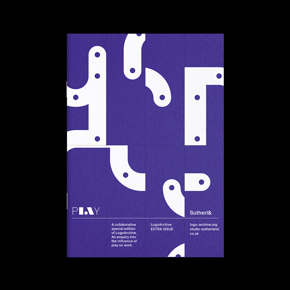
From this collaboration, LogoArchive launched its most pLAyfuL issue to date. Designed by Jim Sutherland, Studio Sutherl&, and featuring a story by poet and creative Director Tom Sharp, the latest LogoArchive Extra Issue presents an enquiry into work and play in graphic design practice and offers a new way to look at old things.
Printed by With Print the LogoArchive booklet takes on a new material dimension. A custom perforated grid system allows the booklet to be disassembled into a series of games. Rather than employing a formal essay, these games seek to evoke in the reader aspects or work (regulated and goal-orientated) and play (intuitive and self-directed). This enquiry was then further explored through games, objects and print at the LogoArchive exhibition “spieLrAum” which took place in London.

“How the silly Sea Squirt lost its brain: Journal of Play Studies Vol II, 38-45” written by Tom Sharp, offers the key to understanding the proposal of this issue. Part story, part parable, part marine biology text, the use of ambiguity and analogy intends to draw in readers rather than explicitly explain. The story draws an analogy between the life-cycle of the Sea squirt and that of a graphic designer. It is both playful and barbed, transitioning from the inventive use of language toward the more serious and humourless.

Games & Things
Game 1. “Work” – Find the pairs. Fold and tear along the perforations of the LogoArchive booklet to create cards. Find eight logos in amongst the cards. Then mix them up again and pair up the next eight. There are four sets of eight logos to find.
This exercise is designed to not only find a new way to engage with old work but to focus the mind on the details of form as many of the featured logos are not symmetrical. It hopefully raises the question, what is a playful form? Surely not just logos for toys factories! What might seem fun to begin with quickly turns into work, as matching pairs can be understood as regulated and goal-orientated.
Game 2. “Play” – Create chimeras! In the second game, there are no rules, readers are invited to engage their imagination and create unexpected chimera’s. The instructions invite readers to post their best #logochimera and tag @logoarchive to be featured on LogoArchive stories.

In contrast to Game 1, Game 2 is intuitive, inviting discovery and creativity. The game is endless and self-directed. In this way, it sits closer to play than work.
Together, these games create a liminal space between work and play. Work and play should thus be understood as not oppositional forces but an intersectional space to inhabit.
Within the booklet there are a further two games to play; a cover puzzle and typographic puzzle. Here, readers are able to spell out the keywords of this issue (Work), then make their own words and construct their own images (Play). To keep all the cards together, this issue comes with a Colorplan Marrs Green envelope, printed with the solutions to Game 1.
“Temporarily deprived of the ability to write, Finley turned to other similar activities. He began to construct small, wooden toys, boats, planes, ‘things of no account in themselves yet true to inspiration, which were away from syntax toward “the pure”’. ‘Toys are little limited things that have boundaries. Toys hold being like jugs hold milk.’”

Lindsay Fulcher, Octavo 87.3, (1987), Ian Hamilton Finlay: Terror and Virtue, p.02.
LogoArchive Extra Issue: pLAy
Design: Jim Sutherland, Studio Sutherl&
Sea Squirt Story: Thomas Sharp
Editor: Richard Baird
Publisher: BP&O
Print: With Print
Paper: G.F Smith
Observed
View all
Observed
By Richard Baird
Related Posts
Graphic Design
Sarah Gephart|Essays
A new alphabet for a shared lived experience
Arts + Culture
Nila Rezaei|Essays
“Dear mother, I made us a seat”: a Mother’s Day tribute to the women of Iran

The Observatory
Ellen McGirt|Books
Parable of the Redesigner
Arts + Culture
Jessica Helfand|Essays
Véronique Vienne : A Remembrance
Recent Posts
Compassionate Design, Career Advice and Leaving 18F with Designer Ethan Marcotte Mine the $3.1T gap: Workplace gender equity is a growth imperative in an era of uncertainty A new alphabet for a shared lived experience Love Letter to a Garden and 20 years of Design Matters with Debbie MillmanRelated Posts

Graphic Design
Sarah Gephart|Essays
A new alphabet for a shared lived experience

Arts + Culture
Nila Rezaei|Essays
“Dear mother, I made us a seat”: a Mother’s Day tribute to the women of Iran

The Observatory
Ellen McGirt|Books
Parable of the Redesigner

Arts + Culture
Jessica Helfand|Essays
