Alex Cameron|British Telecom, Essays
November 15, 2011
[MB][BT] A Very British [Design] Coup

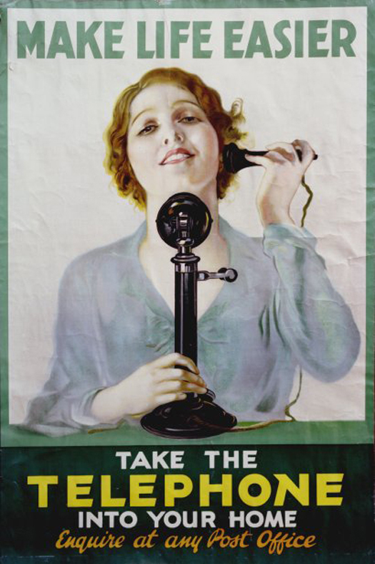
Pat Keely, 1931, Take a telephone into your home.. Image TCB 477/24-4-79 courtesy of BT Archives.
BT is the world’s oldest communications company, with a direct line of descent from the first commercial telecommunications undertaking anywhere. The below essay is one of seven, the result of a collaboration with Teal Triggs and Brigitte Lardinois from the University of the Arts London and their students in the Design Writing Criticism program.
The decade preceding the outbreak of World War II was a pivotal moment in the development of graphic design as a profession. The 1930s saw the commissioning of graphic designers, for the first time, at the General Post Office (GPO) and was central in the changing fortunes of a very British institution. The GPO would employ some of the brightest and best that would go on to be regarded as part of the graphic design canon.
Before the 1930s the GPO was not only bureaucratic in structure, but also in its relationship with the public — and it was still regarded as part of the civil service, rather than a business. This was identified as a barrier to the successful promotion of its services.
Under the stewardship of the GPO, Britain’s telecommunications network was undersubscribed and lagged behind the rest of Europe in telephone uptake by the public. A parliamentary review in 1932 would set the scene for the reconstitution of the GPO and its relationship with the public, through the creation of a public relations department.
The department was led by Steven Tallents, the visionary and trusted civil servant. A public relations pioneer (he was knighted in 1932), Tallents understood the importance of professional graphic designers in communicating with the public. Previously GPO publicity had been produced by employees with an artistic bent.
Tallents’ experience at the Empire Marketing Board (EMB) was to prove crucial for both the GPO and the graphic design profession. He recognised that design could play a transformative role in people’s attitudes towards the GPO. Culturally, this new attitude to communications was a marked departure for the GPO. It would attempt to reach a broader mass through publicising its services beyond the limitations of the GPO’s public advertising spaces.
Tallents gathered some of the most prolific and established graphic designers around the GPO. The campaign to encourage the take-up of the telephone for private usage provides a useful, if selective, illustration of this sea-change towards graphic communication.
In his reflective and instructive Green Paper on Publicity Tallents noted that, “The artist — and I use the word in a large sense, by no means restricting it to those who carry paint boxes under their arms — appears to have the quality of selecting the essential elements of any given material and of presenting them to other people in a way which touches their imagination and so secures their attention, their just appreciation and, if need be, their action. That is why I believe that, if you have a message to convey, you convey it most effectively … by securing artistic quality for it.”
Pat Keely was the first professional graphic designer to design a poster for the GPO in 1931. Keely’s painting style, of an angelic woman on a telephone, would not have looked out of place on the walls of a church (minus the telephone). What would have been a rather conservative painting style, seen in isolation, was nevertheless contrasted by bold sans serif typography. The message was unambiguous: “Make life easier — take the telephone into your home”, but the design was perhaps more subtle in its intentions. The contrast between the typeface and the painting spoke of both the practical (typeface) and the aspirational (painting) qualities of owning a telephone.
Other posters in the campaign were designed by Austin Cooper, a British-based Canadian, Clifford & Rosemary Ellis, a husband and wife design team, James Holland, a founder of the Artists International Association and John Barker (AKA Krabber), who had worked as an assistant to Cooper
They all contributed work to British companies and institutions including the EMB, London Underground, London & North Eastern Railway and Shell. Together with a plethora of other leading graphic designers, they would play an important part in redefining the aesthetic of Britain and Britishness between the first and second world wars.
The work of these designers would employ more abstract forms to communicate new commercial and aesthetic values. While photography was used, it tended to be as part of a collage of meaning. The move towards a more dynamic, asymmetrical and experimental typographic and visual language is apparent in the designs for these times.
As a signifier of the ‘modern times’, designers would use sans serif and slab type. The posters were big, bold expressions of the ‘machine age’. The telephone was projected as an object of desire and telecommunications were identified as a technology for the masses.
This was a fundamental moment for the development of graphic design as a profession. Graphic design came of age through the development of mass communication, radical printing techniques and the role of the designer as a form giver to new ideas. Graphic designers were employed to solve the problem of the wider distribution of goods and services in an increasingly competitive and connected world market. This thrust the graphic designer to the forefront of the communication process.
It was a dynamic and experimental time for graphic design. Art and design movements like Constructivism, the Bauhaus, the New Typography, Cubism and De Stijl were competing for, and influencing, the minds of a new generation throughout Europe.
The experimental nature of the posters of this period show a battle of ideas being fought out in the work of prominent designers for the attention of a mass public. Some ideas were competing, others harmonious, but all were pushing the boundaries of graphic design. They illustrate a period of technological and ideological change in society, and are reflected in the attitude and communications of the GPO.
The GPO in Britain provides a key insight into the position now occupied by the graphic designer. Tallents identified graphic designers as mediators through which the transformation of the organisation and its relationship to the public could be realised.
The role of the graphic designer both commercially and now in association with government departments and institutions was cemented. This was a pivotal moment for the relatively fledgling profession of graphic design and communication. In many ways, it was the moment graphic design came of age.
Observed
View all
Observed
By Alex Cameron
Related Posts

Business
Courtney L. McCluney, PhD|Essays
Rest as reparations: reimagining how we invest in Black women entrepreneurs

Design Impact
Seher Anand|Essays
Food branding without borders: chai, culture, and the politics of packaging

Graphic Design
Sarah Gephart|Essays
A new alphabet for a shared lived experience

Arts + Culture
Nila Rezaei|Essays
“Dear mother, I made us a seat”: a Mother’s Day tribute to the women of Iran
Recent Posts
Candace Parker & Michael C. Bush on Purpose, Leadership and Meeting the MomentCourtney L. McCluney, PhD|Essays
Rest as reparations: reimagining how we invest in Black women entrepreneurs Food branding without borders: chai, culture, and the politics of packaging Why scaling back on equity is more than risky — it’s economically irresponsibleRelated Posts

Business
Courtney L. McCluney, PhD|Essays
Rest as reparations: reimagining how we invest in Black women entrepreneurs

Design Impact
Seher Anand|Essays
Food branding without borders: chai, culture, and the politics of packaging

Graphic Design
Sarah Gephart|Essays
A new alphabet for a shared lived experience

Arts + Culture
Nila Rezaei|Essays
