
Michael Bierut|Essays, Vignelli
September 14, 2010
Mr. Vignelli’s Map
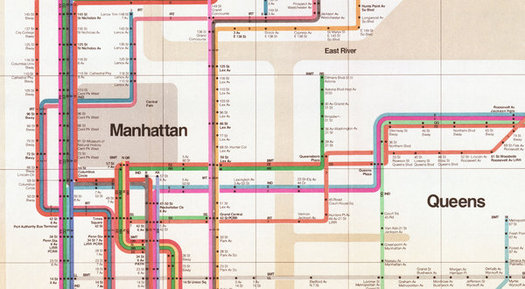
Detail, New York Subway Map, Massimo Vignelli, 1972
This essay was first published on October 10, 2004.
I still remember the first time I heard the rationale for this extraordinary graphic solution. Up on the sidewalks, New York was a confusing bedlam of sights and sounds. Below ground, however, it was an organized system. Each line had certain stops. Each stop had certain connections. Getting from here to there wasn’t the result of a meandering sojourn, but a series of logical steps, one following on the next like a syllogism. What was happening on the streets was meaningless. What happened below ground — that sequence of stops and connections — was supreme. It was as logically self-contained as Marxism. And, like Marxism, it soon ran afoul on the craggy ground of practical reality.
Like many complex urban transportation systems, the New York subways were aggregated over many years, as a variety of competing businesses (the Interborough Rapid Transit, the Independent Subway System, the Brooklyn Manhattan Transit) were consolidated into a single integrated network. The result was a tangled spaghetti of train lines, a mess of a “system” that was almost comical in its complexity.
In 1968, Unimark International was commissioned to design a sign system for the subways, and out of this chaos came order. Two Unimark designers, Bob Noorda and Massimo Vignelli, developed a signage plan based on a simple principle: deliver the necessary information at the point of decision, never before, never after. The typeface they recommended, the then-exotic, imported-from-Switzerland Helvetica Medium, was unavailable; they settled for something at hand in the New York City Metropolitan Transit Authority train shop called Standard Medium. The designs they proposed assumed that each sign would be held in place at the top with a black horizontal bracket; the sign shop misinterpreted the drawings and simply painted a black horizontal line at the top of each sign. And so the New York City subway signage system was born.
Four years later, Vignelli introduced a new subway map. It was based on principles that would be familiar to anyone who appreciated the legendary London Underground map designed in 1933 by Henry Beck. Out with the complicated tangle of geographically accurate train routes. No more messy angles. Instead, train lines would run at 45 and 90 angles only. Each line was represented by a color. Each stop represented by a dot. What could be simpler?
The result was a design solution of extraordinary beauty. Yet it quickly ran into problems. To make the map work graphically meant that a few geographic liberties had to be taken. What about, for instance, the fact that the Vignelli map represented Central Park as a square, when in fact it is three times as long as it is wide? If you’re underground, of course, it doesn’t matter: there simply aren’t as many stops along Central Park as there are in midtown, so it requires less map space. But what if, for whatever reason, you wanted to get out at 59th Street and take a walk on a crisp fall evening? Imagine your surprise when you found yourself hiking for hours on a route that looked like it would take minutes on Vignelli’s map.
The problem, of course, was that Vignelli’s system logical system came into conflict with another, equally logical system: the 1811 Commissioners’ Plan for Manhattan. In London, Henry Beck’s rigorous map brought conceptual clarity to a senseless tangle of streets and neighborhoods that had no underlying order. In New York, however, the orthoginal grid introduced by the Commissioners’ Plan set out its own ordered system of streets and avenues that has become second nature to New Yorkers. Londoners may be vague about the physical relationship of the Kennington station to the Vauxhall station: on the London underground map, Vauxhall is positioned to the northwest of Kennington when it’s actually to the southwest, and it doesn’t seem to bother anyone. On the other hand, because of the simplicity of the Manhattan street grid, every New Yorker knows that the 28th Street number 6 train stops exactly six blocks south and four blocks east of Penn Station. As a result, the geographical liberties that Vignelli took with the streets of New York were immediately noticable, and commuters without a taste for graphic poetry cried foul.
And thus it was that by 1979, the Vignelli map was replaced by a conventional, less elegant, more geographically accurate map that persists in revised form to this day. I remember a presentation at the Cooper-Hewitt Museum at which designer Wilburn Bonnell presented this revision as the graphic design equivalent of the demolition of the Pruitt-Igoe housing development: impractical, elitist Modernism succumbing to the practical, flawed imperfections of everyday life. The Vignelli map is remembered today as “colorful and handsome” but also “incomprehensible,” a regrettable lapse from good sense, if not good taste.
But it wasn’t to me. My favorite souvenir from first trip to New York in 1976 was my very own copy of the Vignelli map, straight from the token booth at Times Square: gorgeous, iconic and cerebral, it represented a New York that didn’t care if it was understandable to a kid from Ohio. It hung on my wall, in all its mysterious unknowablility, for the next three years. That was the city I wanted to live in. It still is.
Originally published October 28, 2004
Observed
View all
Observed
By Michael Bierut
Related Posts

Innovation
Ashleigh Axios|Essays
Innovation needs a darker imagination

Business
Kim Devall|Essays
The most disruptive thing a brand can do is be human
AI Observer
Lee Moreau|Critique
The Wizards of AI are sad and lonely men
Business
Louisa Eunice|Essays
The afterlife of souvenirs: what survives between culture and commerce?
Related Posts

Innovation
Ashleigh Axios|Essays
Innovation needs a darker imagination

Business
Kim Devall|Essays
The most disruptive thing a brand can do is be human

AI Observer
Lee Moreau|Critique
The Wizards of AI are sad and lonely men

Business
Louisa Eunice|Essays
