December 2, 2020
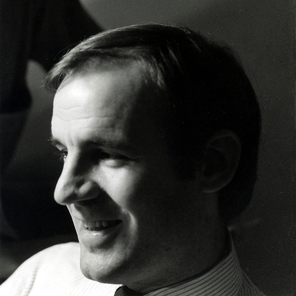
Peter Bradford, American Modern

I was shocked to receive an email from AGI last week announcing that graphic designer Peter Bradford (1935-2020) had died this past August. It was equally surprising to learn that he was 85. It seemed that I had been in touch with him only a few months earlier. This has been such a horrific year filled with loss. The AGI-mail included this quote from his friend and colleague Richard Saul Wurman:
In one of my books, I wrote that Peter Bradford was the greatest unknown graphic designer that I knew.
His bold use of type.
His bold very black strong illustrations.
His outstanding ability to write and edit would have been more than enough to put him in the pantheon of designers and multi-skilled communicators.
He worked for me and I with him on quite a number of projects. Upon completion of a project, I swore I would never work with him again because there was always a time of stubborn disagreement but then I came back for more because there was so much more I could learn from him and I loved him.
I owe so much to Peter and his silent permission of artistry, boldness, visual communication skill and words.
I am so sorry for the passing of such an important person in my life and I assume many others share these feelings.
His name may not be recognizable to today’s young designers. His work does not appear, as do other mid-century moderns, in the canonical history books, although it should. When considering who of the sixty-three moderns would be featured in our book The Moderns: Midcentury Graphic Design, Greg D’Onofrio and I included Bradford without a moment of hesitation. For me, it was a chance to reacquaint myself with his creative eloquence. Years ago we worked together on the editorial board of the short-lived monograph series, Documents of American Design, published by Abrams Books. It was further an opportunity to make certain his work was not overlooked, like so many graphic designers during the period when a designer’s reputation was known to a small group of other designers, and usually for a brief timespan at that.
By way of tribute to Bradford, and echo of Wurman’s poignant eulogy, the following was adapted from the text published in The Moderns.
In baseball jargon Peter Bradford would be called a utility player. Expert at his craft and artful in his execution, he is utilized across a wide range of genres and platforms, from editorial to architecture and so much in between. He was not a member of the first American modern wave, yet in his way reinterpreted the ideals of simplicity and dynamic flow that coursed through modernism. He has continuously practiced since opening his own firm, Peter Bradford and Associates (at the time he was the only principal and only associate), in August 1965 on 42nd street across from the New York Public Library (and a stone’s throw from Richard Avedon’s studio).
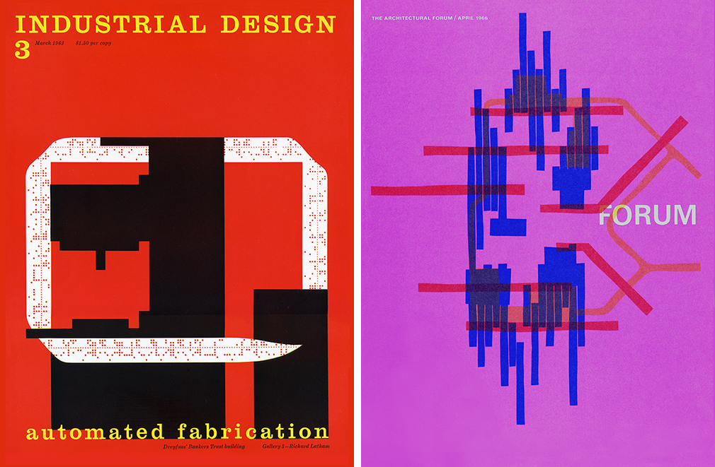
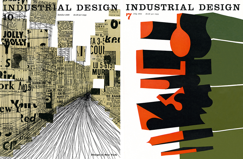
The Boston-raised Bradford studied at the Rhode Island School of Design. He worked as a designer for I.M. Pei, Time-Life, Whitney Publications and CBS, as part to build his corporate resume. He has also been involved with designing books for Aperture, Xerox and Encyclopedia Britannica. Yet arguably, the work that established his modernist credentials started with his covers for Industrial Design created in the early 1960s, which received accolades but disapproval from his superior, Charles Whitney.

In 1959 he left an unsatisfying job at Architectural Forum for an admittedly precarious one as art director of Industrial Design. “I was the fifth art director on a magazine that was only six years old. Does that tell you anything?” he wrote in an unpublished acerbic memoir. Publisher Charlie Whitney was so pleased with his readers’ growing interest in the industrial design articles in his Interiors magazine that on the suggestion of industrial design maestro George Nelson, in 1954 he launched a separate magazine that integrated industrial with other applied arts. The first issue of Industrial Design (or ID), edited by by Jane Mitarachi (Thompson) and Deborah Allen with Alvin Lustig as cover designer and art editor. “When I got there,” Bradford recalled, “the editor was Ralph Caplan [who died earlier this past Spring], whiz-bang writer and prime mind of the book.”
Caplan appreciated Bradford’s rebellious personality but there was still some tension. Bradford’s covers, for instance went counter to the more poetic Lustig tradition. “I felt safer hand-drawing most of the early cover images,” Bradford said about his own dramatic conceptual expressionist forms that appeared to be done with the mathematical precision of op art. He described his own covers as, respectively, “an ink-lined collage of energetic New York, a thick-nib rendering of a steel furnace, and odd shapings [sic] made by extruded foam;” For Whitney his method and outcome was “too arty.” While for Bradford, the covers, which richly yet abstractly captured an essence of industrial design, “were a mixed reward,” he wrote, “sometimes rich, often not.” (Massimo Vignelli took on the art direction from 1968-70, which seem to satisfy Whitney’s tastes.)
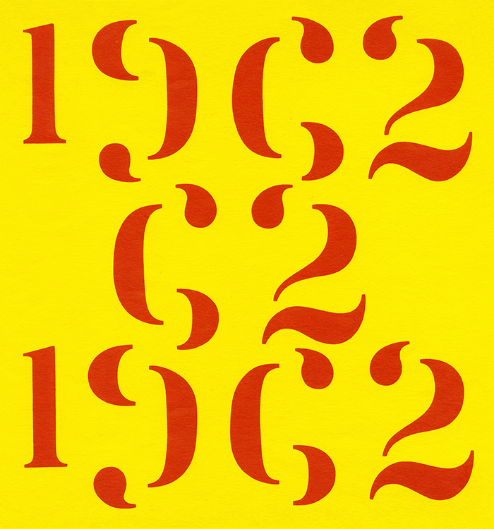
Bradford, however, found that the geometrical patterned illustrations he created for inside pages was more satisfying – what design critic William Owen author of Modern Magazine Design (William C. Brown, 1992) described as “a kind of humanistic rationalism.” These drawings were more improvisational compared to his covers. “Haste was my thrust, nearby objects my tools.” But Whitney was still not pleased with any of it. “He was sure I was plotting against him and his book by contaminating its looks,” Bradford ruefully explained. “He didn’t imply this he said this.”
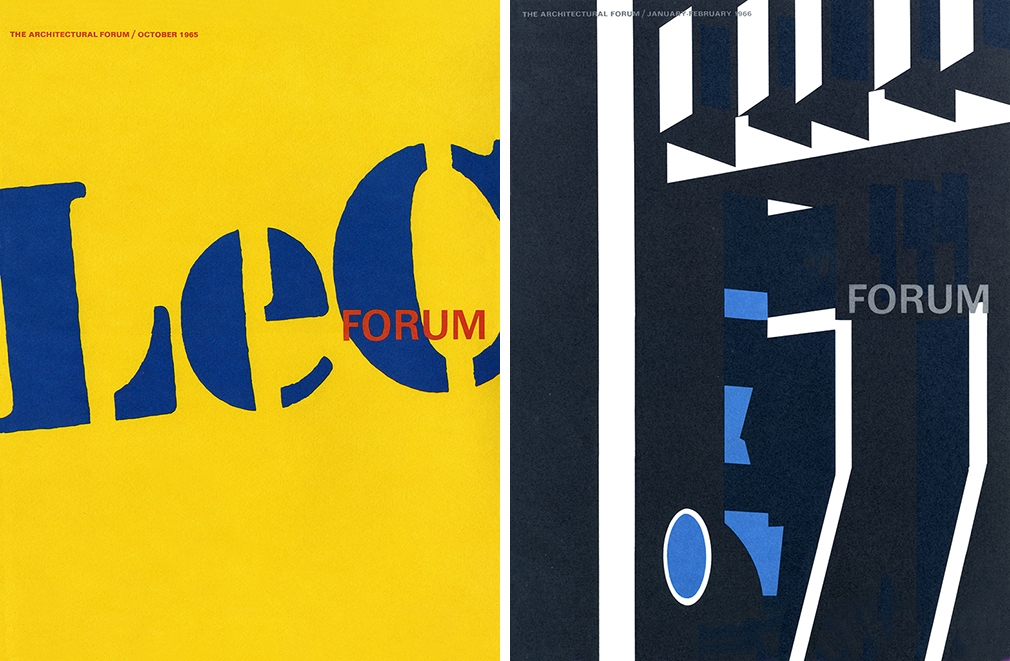
A few weeks after finally opening his own firm in October 1965, Bradford received a call from architect and critic Peter Blake, who had been named the editor-in-chief of Architectural Forum under the new auspices of Urban America Inc. Bradford was not anxious to return to the magazine, but Blake implored him to help design an issue about LeCorbusier. In turn, this began a new phase of Bradford’s cover modernity. For the Corbu issue’s cover he believed his job was to make the magazine, which was in a deathly rut, as atypical and lively as possible. “I made the largest sign I could manage using Corbu’s stencil letters,” he wrote. “Photostat after photostat” he made the letters of Corbu’s brand unreasonably monumental, nearly illegible and very rough in blue against a sunny yellow background. About his feat, he says “I felt gid-dy…and loved the “buck-naked bluntness of the thing.” Subsequent covers for Forum were not as audacious but no less unconventional for magazines in general and architectural journals in particular. His playfully optical tricks were abstract yet were still functionally representational.
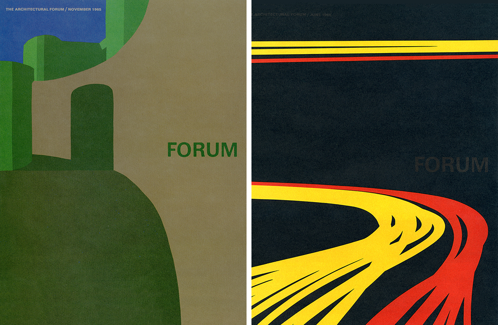
On the strength of the “LeC” issue, as it became known, Bradford took on eight more of the revived Architectural Forums. He also earned the design leadership of Urban America’s publications, which included other ventures related to declining urban centers and better city planning, including its logo: “I found pleasure in rationalizing the goals of Urban America and abstracting the in a mark,” he noted yet was ambivalent about abstract logos.
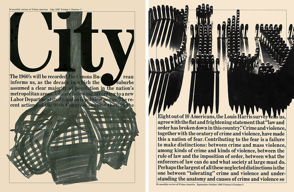
In 1966 he was also given a new magazine produced for Urban America, City magazine, a chronicle of urban happenings. Bradford said he was asked to make “an aggressive journal” with lots of freehand drawings. Then the second issue was covered with big bold text. And the next was a modern iteration with a large logo City dominating the text below and a marker drawing of tree roots strangling the words. Volume 2 Number 5 was the epitome conceptual design. The title, City, was formed dimensionally out of real high caliber bullets suggesting the racial strife in the cities in 1968. 3D illustrator Nicholas Fasciano was commissioned to take “the problem to magical lengths . . . he built whole physical narratives of our cities.” Bradford also had Fasciano make a City logo out real twisted pipes to illustrate the nightmare of getting federal funds.
Bradford’s ethos was to make the reader feel emotion. So, his work had to have message and attitude, “Lots of attitude,” he emphasized. He measured City (with this metaphor for his own work) as “weaponized” text and design.
He was an exponent of the conceptually astute wing of the Modern movement, not a slave to the predominant style but rather a thinker who combined precision and wit.
Observed
View all
Observed
By Steven Heller
Related Posts

Graphic Design
Sarah Gephart|Essays
A new alphabet for a shared lived experience

Arts + Culture
Nila Rezaei|Essays
“Dear mother, I made us a seat”: a Mother’s Day tribute to the women of Iran

The Observatory
Ellen McGirt|Books
Parable of the Redesigner

Arts + Culture
Jessica Helfand|Essays
Véronique Vienne : A Remembrance
Recent Posts
Beauty queenpin: ‘Deli Boys’ makeup head Nesrin Ismail on cosmetics as masks and mirrors Compassionate Design, Career Advice and Leaving 18F with Designer Ethan Marcotte Mine the $3.1T gap: Workplace gender equity is a growth imperative in an era of uncertainty A new alphabet for a shared lived experienceRelated Posts

Graphic Design
Sarah Gephart|Essays
A new alphabet for a shared lived experience

Arts + Culture
Nila Rezaei|Essays
“Dear mother, I made us a seat”: a Mother’s Day tribute to the women of Iran

The Observatory
Ellen McGirt|Books
Parable of the Redesigner

Arts + Culture
Jessica Helfand|Essays

 Steven Heller is the co-chair (with Lita Talarico) of the School of Visual Arts MFA Design / Designer as Author + Entrepreneur program and the SVA Masters Workshop in Rome. He writes the Visuals column for the New York Times Book Review,