
June 9, 2011
Philip Johnson’s Synagogue Problem

In the mid-1950s, Philip Johnson designed a synagogue for Kneses Tifereth Israel, a congregation in suburban Port Chester, New York. Johnson, in the 1930s and early 1940s, had been a proponent of Nazi Germany and a writer of anti-semitic tracts, so the job was presented as a kind of atonement, and completed without fee. It was also his largest institutional commission to date (at the time, he was primarily an architect of refined modernist homes), so a handy resume builder.
Johnson provided a little commentary on his design thinking for this project in a catalog for the 1963 exhibition Recent American Synagogue Architecture, curated by a young Richard Meier at New York’s Jewish Museum:
The problem in designing the contemporary synagogue is a nearly impossible one….The difficulty comes from the habits of the High Holy Days when the attendance, shall we say, swells. Now the space is either great small or great large, but it can hardly act like an accordion and be great small and large. How to design a room that will be great both ways? Our solution at Port Chester was a great room, with a small screen divider, because it seemed to us that most of the congregation comes on the on High Holy Days and we wanted the community to enjoy the temple.
The “High Holiday” problem, it should be noted, is not any different for a Jewish house of worship than it is for a Christian one. In any case, there are tools at the architect’s disposal to mitigate this problem: a fan layout, for instance, in which the wings can be closed off, is a good deal more amenable to shifting audience sizes. Balconies offer additional space that can be filled on busy holidays but otherwise don’t make a place feel empty. Which is all to say, Johnson’s suggestion that a space can either be “great small” or “great large” is false. KTI, anyway, isn’t great, period.
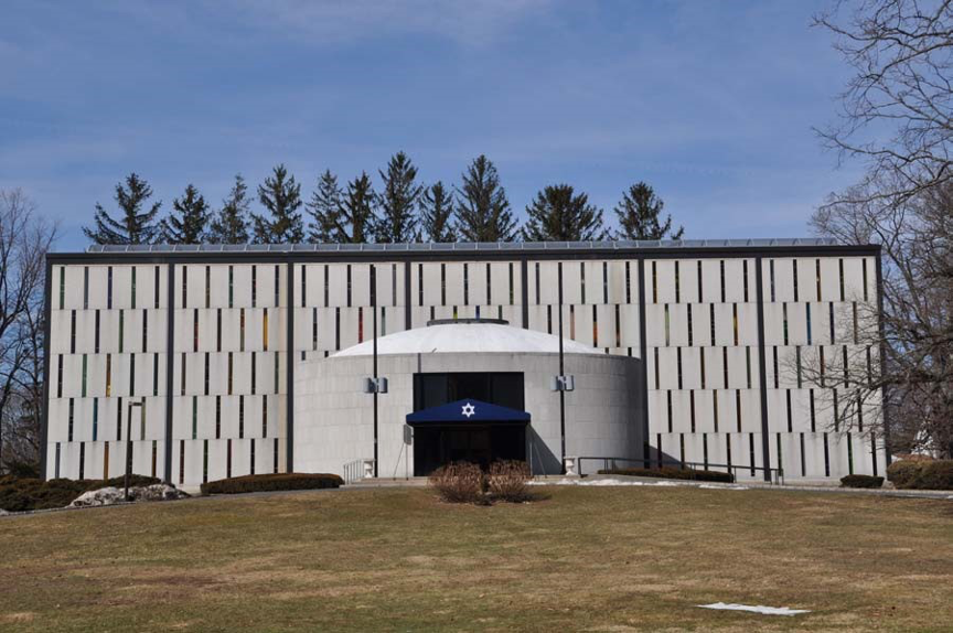
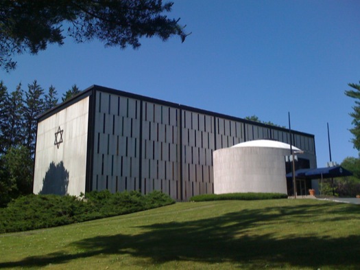
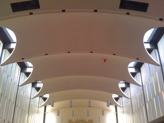
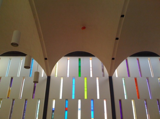
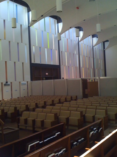
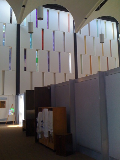
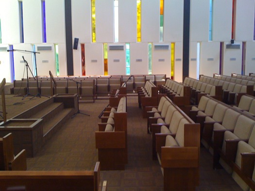
Johnson’s design, a rectangular box for the sanctuary with an attached eliptical entry pavilion, was essentially cribbed from an earlier project, for a church. (The relationship between pavilion and sanctuary is considerably more fluid in the original scheme.) The sanctuary is a simple, bright room, its signature element being its wavy ceiling, which is suspended from above and appears to float, like a giant rectangular ribbon pinned to the walls. There’s nothing particularly ethereal about it, though it is impressive, and is arguably an early manifestation of postmodern design. Johnson liked cathedrals. I suspect he had that kind of scale in mind when he designed this big shoebox.
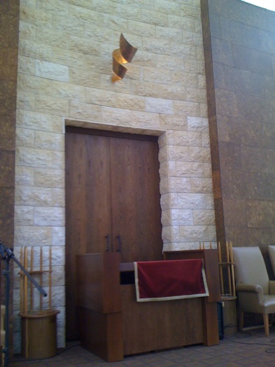
The congregation has wrestled with the building for decades, and a few years ago undertook an unfortunate renovation. The dramatic Ibram Lassaw sculpture that had been placed behind the altar has been replaced with a panel of Jerusalem stone. One can at least muster some justification for the removal of the wire sculpture, which some claimed reminded them of concentration camp fencing. There really is no defense for the egregious screen that divides the sanctuary in half, leaving the back free as an open space for synagogue functions.
One sympathizes with the congregation; dealing with this ungainly space is not easy. Johnson himself couldn’t figure out how to do it, and wound up designing for the exception rather than the rule. But there’s got to be a more elegant solution, and it need not break the bank. The building, whatever its weaknesses, is not without qualities. It may never be great, but it doesn’t have to be bad.
Some images follow.

Observed
View all
Observed
Share on Social
By Mark Lamster
Related Posts

Innovation
Ashleigh Axios|Essays
Innovation needs a darker imagination

Business
Kim Devall|Essays
The most disruptive thing a brand can do is be human

AI Observer
Lee Moreau|Critique
The Wizards of AI are sad and lonely men

Business
Louisa Eunice|Essays
The afterlife of souvenirs: what survives between culture and commerce?
Related Posts
Innovation
Ashleigh Axios|Essays
Innovation needs a darker imagination
Business
Kim Devall|Essays
The most disruptive thing a brand can do is be human
AI Observer
Lee Moreau|Critique
The Wizards of AI are sad and lonely men
Business
Louisa Eunice|Essays