April 5, 2018
Second Rate Prime Time: TV News and Talk Show Sets

In 1948, one of the first TV news anchormen, John Cameron Swayze (1906-1995), sat under hot lights at a nondescript desk. Behind him were a world map, wall clocks displaying the world’s time zones, and a teletype machine clanking out hot dispatches. On his desk rested a mic, pages of a script, a nameplate, and the sponsor’s logo display. This standard aptly fit the sobriety of the news. News was news, reporting was reporting, and commentary was commentary. Today, set design has gone far beyond those primitive, virtually makeshift broadcasts and into the final frontier—a world of the Starship Enterprise. With high-tech, luminescent glitz, especially on the daily talk and news shows, standard set design today has become carefully contrived.
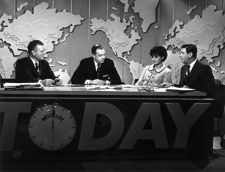
In 1951, the common televised newscast changed when the founding host of NBC’s Today show, Dave Garroway (1913-1982), mashed together daily news and celebrity interviews and introduced a new animal, the co-host, into the first morning televised variety current events show (a chimp named J. Fred Muggs, who became the show’s mascot from 1953 to 1957). Yet, despite the quirky new format, Today’s on-air design was modest and unassuming.
In 1954, when NBC’s Tonight Show premiered with its founding host, Steve Allen, the first late night talk show introduced scenic restraint. This one-and-a-half hour feature was not a “spectacular.” In fact, Allen promised it would be kind of “monotonous,” noting that the Hudson theater on 44th Street (where it was televised) “slept” over eight hundred people. At times, Allen sat at a grand piano, but usually his berth was behind a semi-circular desk. The seating arrangement included this desk with either a few chairs or a couch adjacent to the host’s central command position.
Color began at NBC in 1953, yet the stage set paradigm for news and talk was not altered by color conversion for another few years so as to keep it simple. Once it did, wild color backgrounds were introduced to news and talk shows. Color was itself news. Added to the former were green screens to show the latest headline images; to the latter, iconic cityscapes were common (and remain so with LEDs).
The older, colorless sets had been built on the theory that whether viewers were fed news or entertainment, they should feel comfortable with a show’s informal formality that resembled their own domesticity (or psychiatrist’s office) with desk, carpet, and house plants… Each show’s host had a persona, but the sets were mostly the same.
Color, however, ultimately redefined earlier cliché notions of TV talk and news by ushering in more futuristic, even pyrotechnic sets. News and talk show sets started to resemble cheap sci-fi films and carnival arcades. Psychedelics sneaked in too. No longer were they comfy environments that approximated a living or working space. Instead, show sets became replications of space stations—more technically distinct, more disco than a living room. Even the radical shows today—Bill Maher, John Oliver, Stephen Colbert—are variations on the same old intractable format.
Only a few broke the mold. For David Suskind’s Open End, a uniquely intellectual show that addressed serious issues back in 1961, guests and hosts sat around a small coffee table in chairs. Similarly, Charlie Rose used a round table that allowed him to face interviewees.
Reporting on the importance of set design, Nikki Wheeler for Business.com wrote in 2017: “The studio and set design needs to find the perfect balance between looking good and being practical, and needs to represent the overall tone and personality of the show. A studio set design needs to perform the following functions: 1. A TV studio set needs to be highly functional, facilitating the movement and functions of the actors or television personalities. 2. A television studio design needs to be aesthetically pleasing and attention-grabbing. 3. A television studio set design needs to work as the background to the focus of the cameras, finding the perfect balance between being flashy and not detracting from the television personalities.”
She added, “A newsroom set design requires some newsroom-specific elements, such as a large news desk, graphics panels for a colorful background and technology, such as teleprompters, for newscasters to read from.” News shows introduced lima bean-shaped desks with built-in prompter screens; talk shows ramped up the lighting and motion graphics on and around the desks. For a while, anchor desks were surrounded by newsroom staff working diligently at their computers, to provide some verisimilitude. But not today.
Current news and talk shows are filled with the effects that approximate emergency mode electronic systems in 787 airplanes—shining lights, illuminated risers, digital screens…the works. Is this another case where design and technology have conspired to produce kitsch? Maybe? Is there an answer? Maybe there’s no turning back the international clocks. The circus started with Silvio Berlusconi’s RAI TV in Italy. I think, even though the U.S. is too classy for this crap, we’ve fallen for it hook, line, and strobe light.
Observed
View all
Observed
By Steven Heller
Related Posts

Equity Observer
L’Oreal Thompson Payton|Essays
‘Misogynoir is a distraction’: Moya Bailey on why Kamala Harris (or any U.S. president) is not going to save us
Equity Observer
Ellen McGirt|Essays
I’m looking for a dad in finance

She the People
Aimee Allison|Audio
She the People with Aimee Allison, a new podcast from Design Observer
Equity Observer
Kevin Bethune|Essays
Oh My, AI
Related Posts

Equity Observer
L’Oreal Thompson Payton|Essays
‘Misogynoir is a distraction’: Moya Bailey on why Kamala Harris (or any U.S. president) is not going to save us

Equity Observer
Ellen McGirt|Essays
I’m looking for a dad in finance

She the People
Aimee Allison|Audio
She the People with Aimee Allison, a new podcast from Design Observer

Equity Observer
Kevin Bethune|Essays

 Steven Heller is the co-chair (with Lita Talarico) of the School of Visual Arts MFA Design / Designer as Author + Entrepreneur program and the SVA Masters Workshop in Rome. He writes the Visuals column for the New York Times Book Review,