October 14, 2009
Small Wonder: 41 Cooper Square

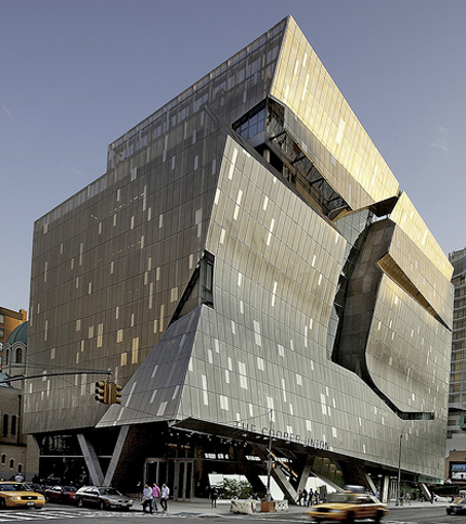
But in reality, 41 Cooper Square is contextual, similar in bulk and heft to what we might now call Cooper Classic, the art, architecture and engineering school’s 1859 Renaissance Revival brownstone building across the street. It kindly nods to the St. George Ukrainian Catholic Church around the back, with a gangly hexagonal cut-out in the perforated exterior stainless steel screen that frames the reflection of the church dome when you stand on the sidewalk across the street. That screen closely follows the rectilinear glass curtain wall that the is building’s real outer envelope on the back and sides, but swoops and bends away from the glass in front, creating horizontal creases that turn into an awning that points uptown. This is not an attack on the dullness of the New York contemporary architecture scene, or the building that restores the city’s place at the architectural center, but a minor work. Just as some architects can’t play at an institutional scale, Mayne seems a little dull in miniature.
The creased facade and the cut taken out of its upper half, I truly don’t understand. They look cool, but that’s about it. Call me old-fashioned, but I like my facades to interact with the interior, to develop from the inside out as well as the outside in. I can’t figure out how the interruptions are supposed to interact with the city, with Cooper’s pedagogical purpose, with the design. They seem merely willful.


If the perforated metal was hard to see through, I could understand the need for some unmediated views, but it is not. The sad little concrete bench built in next to the window behind that cut-out is nowhere I would want to hang out. And to make the cut-out work, Mayne has had to engineer a huge curve of concrete running perpendicular to the edge of the slashing “gesture.” This takes away much of its energy, and anarchy. The difference between a real cut and one embalmed in architecture is similar to the difference between revolutionary Frank Gehry and the one we see today. When he tossed chain-link fence up in the air around his house in 1978 it was loose and direct; contrast that with the frozen music of the IAC Building’s scudding waves. The former seems like a better lesson for students than the mid-career signature style of the latter.
Mayne’s 2007 Federal Building in San Francisco, which I saw last spring, is a powerful piece of architecture, also more horizontal than vertical, and also employing a metallic wrap. That building owns its corner, and suggests that the future of organizations (corporate or governmental) is not in the vertical skyscraper. But it, like 41 Cooper Square, is also aggressively anti-urban. The Federal Building’s ground floor, which includes a “plaza” and a saw-tooth-roofed snack bar, seems to repel people. That may have been what the situation required — the building’s location on Mission is grungy, and there are a lot of obvious efforts downtown to homeless-proof the new architecture — but judging by these two examples, hermeticism is also part of the Morphosis DNA.
At the sidewalk 41 Cooper Square might as well be set in the middle of a parking lot in Mayne’s native L.A. I was thinking of the criss-crossing concrete legs as Breuer-esque (there are lots of big boxes lofted on diagonal columns in his campus buildings in University Heights) when another building, closer to Mayne’s home turf, popped into my head: Eliot Noyes’s 1964 IBM Aerospace Building in Los Angeles, now the Otis College of Art and Design. Almost a cube, clad in precast concrete panels punctuated with windows that suggest a punchcard, Noyes’s building lifted its symbolic screens off the ground on shifted diagonal legs and does sit in the middle of a sea of cars. Noyes’s building offered shaded space at the base, before the glass entrance, but in Mayne’s building, the space between concrete and glass is narrow and empty. A strip big enough for some sociability opens up on the south side, where a bookstore is scheduled to open. Maybe they will put out a few tables? In their loneliness the interstices of the legs are filling with bits of trash.
There is a small publicly-accessible lobby inside the entrance at the corner of Third and East 7th Street, and the guard ringed by the front desk will point you downstairs to a gallery. But the reason anyone would want to come inside, the lattice-wrapped, four-story, daylit “vertical piazza”, is only half visible, buried at the center of the volume.

What you are looking at is Mayne’s architecture: the lattice (tubular steel encased in glass-fiber-reinforced gypsum) that starts in the lobby and twists up and around the stairs, the sideways sway of the staircase itself and, as you ascend, the more crystalline geometry of the acrylic-lined stairs, suspended in the atrium, that take you from floors 5 to 9. The light that filters down is distinctly northern in cast, reinforcing the building’s cool, stripped-down palette. Many of the interior materials are renewable, recycled, and low-emission, part of 41 Cooper Square’s bid to be LEED-certified platinum, a first for an NYC academic laboratory building. The walls are white, the floors mirror-polished concrete, the signage (by Cooper graduate Abbott Miller and his team at Pentagram) stainless steel.
Gruzen Samton Architects did much of the interior programming, layouts, and material specifications.

The few spots of color are hidden away, largely invisible both from the outside and from the staircase. I saw an orange-red fire stair in the northwest corner, and a yellow box to the south (it houses some offices). I would have liked something bright to warm up all those matrixes, but the pop sensibility was denied. Mayne’s building seems like it should have some warmth, since he’s working with curves and texture and fabric shapes, but every one of his matrixes turns out to be hard and cold to the touch. In the lower level Frederick P. Rose Auditorium, ordinary screen mesh has been molded to ripple like the surface of an ocean on walls and ceiling — there’s acoustical material behind, and it looks lovely — but it is as rigid as a metal plate.
When I originally embarked on this review, I wanted to talk about the building as an educational space. Most other reviews I had read were filed before students and faculty moved in, even, in the case of the New York Times, before the building was finished. But on my tour I was whisked past the classrooms, and told not to hang around with a notebook for fear of disturbing the students. The classrooms and labs looked like perfectly nice plain rectilinear rooms with natural light ringing the outside edges of the building. A few looked like corporate conference rooms. The double-height student lounge at the top of the big stairs was dominated by the vending machines, as they always are. Someone forgot to work bulletin boards into the design, so the walls between the elevators are already covered in 8 ½ by 11 posters.
What all these day-to-day bits of student life had in common was they had nothing to do with the staircase, and nothing to do with the exterior screen. Students can almost entirely avoid engaging with either simply by taking the elevator, crossing Third Avenue. Those gestural parts are only applied to the Cooper experience, as if to say, If you’re lucky, this is what you get to do. Both elements already feel a little like museum pieces from 2009, show-offy but not integral. Paul Rudolph’s Art and Architecture Building at Yale, where I took my architecture classes, and wrestled with his unforgiving staircase, is not everyone’s cup of tea. But the design did impact every part of your student life, the tiered studios, the two sets of stairs, the skip-stop bathrooms, the snack bar with a view. Mayne’s work for Cooper Union feints at that kind of mind-altering, shape-shifting experience. But it didn’t make me feel pummeled or exalted, just curiously bored.
Observed
View all
Observed
By Alexandra Lange
Related Posts

Graphic Design
Sarah Gephart|Essays
A new alphabet for a shared lived experience

Arts + Culture
Nila Rezaei|Essays
“Dear mother, I made us a seat”: a Mother’s Day tribute to the women of Iran

The Observatory
Ellen McGirt|Books
Parable of the Redesigner

Arts + Culture
Jessica Helfand|Essays
Véronique Vienne : A Remembrance
Recent Posts
Why scaling back on equity is more than risky — it’s economically irresponsible Beauty queenpin: ‘Deli Boys’ makeup head Nesrin Ismail on cosmetics as masks and mirrors Compassionate Design, Career Advice and Leaving 18F with Designer Ethan Marcotte Mine the $3.1T gap: Workplace gender equity is a growth imperative in an era of uncertaintyRelated Posts

Graphic Design
Sarah Gephart|Essays
A new alphabet for a shared lived experience

Arts + Culture
Nila Rezaei|Essays
“Dear mother, I made us a seat”: a Mother’s Day tribute to the women of Iran

The Observatory
Ellen McGirt|Books
Parable of the Redesigner

Arts + Culture
Jessica Helfand|Essays

 Alexandra Lange is an architecture critic and author, and the 2025 Pulitzer Prize winner for Criticism, awarded for her work as a contributing writer for Bloomberg CityLab. She is currently the architecture critic for Curbed and has written extensively for Design Observer, Architect, New York Magazine, and The New York Times. Lange holds a PhD in 20th-century architecture history from New York University. Her writing often explores the intersection of architecture, urban planning, and design, with a focus on how the built environment shapes everyday life. She is also a recipient of the Steven Heller Prize for Cultural Commentary from AIGA, an honor she shares with Design Observer’s Editor-in-Chief,