March 15, 2010
Superbeauty

“The man-made world, our environment, is potentially a work of art, all of it, every bit of it.” —David Pye, The Nature and Aesthetics of Design
In 2002, Tord Boontje, a Dutch designer known for co-authoring a collection of vases cut from recycled wine and beer bottles, produced a chandelier for the inaugural Swarovski Crystal Palace exhibition at the International Furniture Fair in Milan. Suspended from the ceiling of an enormous kohl-black space in the city’s artsy warehouse district, Boontje’s Blossom mixed clusters of clear and rose-colored crystals with 240 LEDs winking on a metal branch.
Until then, Boontje’s work had been largely devoted to ideas of humility and practicality. His Rough and Ready furniture collection, for instance, which was displayed at London’s Tate Modern Museum in 1999, was made from simple wood, old blankets and strapping tape. Blossom, along with other floral-themed products Boontje had turned out in 2002, signified a shift for the Dutch-born designer. At the same time, the chandelier represented a departure — or rather, return — for Swarovski. One hundred years earlier, the Austrian company had perfected a technology for cutting crystal, and it had long divided its energies between science and fashion. Swarovski produced both advanced telescope lenses and costume jewelry, but since 1974 it had become popularly associated with twee animal figurines sold in mall boutiques. Under the direction of Nadja Swarovski, a direct descendant of the company’s founder, the Crystal Palace was an occasion to recapture some of the company’s earlier glamor. Eminent designers were invited to exploit all of the material’s glittering possibilities and to impress aesthetes who, by this point in a long, lavish economic boom, had thought they had seen the limits of indulgence. Swarovski, with Nadja’s blessing, went on to produce crystals studding almost every conceivable form of merchandise, from cell phones to thong underwear. It forged a democracy of luxe that allowed consumers an applied dose of sparkle for as little as $9.99 for a palm-tree-shaped hair clip to as much as $130,124 for a crystal-embedded 24-carat-gold-plated bicycle.
Indeed, Blossom was emblematic of a new attitude toward beauty. After being exiled to the periphery of design, ornament, at the turn of the 21st century, was making a comeback. The 1990s had seen the rise of an industrial — even laboratory — aesthetic for the home, with stark white walls, stainless steel appliances and unforgiving concrete surfaces that seized the hearts of homeowners despite the material’s tendency to stain and crack. Classic mid-20th-century furniture pieces that had been developed with an eye to functionalist precision were de rigueur for urban lofts. Indeed, if a single item defined this modernist revival, it was Emeco’s 1006 “Navy” chair, a 1940s design originally produced for warships because, thanks to its anodized aluminum construction, it resisted rust, withstood the blasts of torpedo shells and remained buoyant after being swept overboard. By the end of the ’90s, however, the Emeco 1006 had become a style icon. Philippe Starck was commissioned to update its simple lines and polished surfaces without compromising its minimal aesthetic, and the chair could be seen in Ian Schrager hotel rooms and in episodes of “Sex and the City.”
And yet, such frivolity overlay a conceptual layer, requiring the viewer to pause for a moment to contemplate the relationship between, say, a flowering bathroom fixture and fertilizer. For the Dutch design collective Droog (translation: “dry”), which came to prominence in the ’90s. whimsy often dissolved into serious analyses of authorship and materiality. Such was the case with Tejo Remy’s strapped-together chest of random found drawers called You Can’t Lay Down Your Memory (1991). “It has the visual impact and provocative intent of a Dada sculpture, minus a Dadaist sense of humor,” remarked the Museum of Modern Art curators who acquired the piece for their collection. And while in the ’90s the German lighting designer Ingo Mauer displayed a wonderfully waggish tendency in such works as chandeliers made of scribbled memo-pad notes or clusters of Campari soda bottles, his obvious pleasure in experimenting with technology added a wonky layer to our enjoyment of his products. That decade’s fanciful designs for the most part bore less of what the cognitive psychologist and design critic Don Norman classifies as visceral appeal — a jolt of pure pleasure — than reflective appeal, a more subtle and contemplative genre of appreciation.
Boontje’s Blossom chandelier made a play for the visceral. It wasn’t the first design produced by a European master in the 21st century that was widely admired for its prettiness, but it was among the first to be unapologetic about its earnestness. In its winking, sparkling ways, Blossom flirted with kitsch, yet Boontje evidenced none of Starck’s knowing pleasure in that danger. In interview after interview, Boontje explained that it was the birth of his daughter Evelyn in 2000 that inspired him to turn his back on strict functionalism and embrace organic, nature-based motifs. He experimented with crystal-studded wallpaper, designed a popular light fixture of laser-cut metal leaves and flowers twisted around a bare bulb, clothed chairs in Alexander McQueen gowns, and produced sumptuous interior installations draped with lacy fabrics and furnished with benches and swings that felt like three-dimensional versions of a Fragonard painting. He quickly turned famous and much imitated and made his home in the woods of rural France.
Reclaiming beauty from irony, reclaiming beauty from kitsch — this has been a project of early-21st-century design. As many observers have noted, we are recapitulating aspects of the last century’s turn, when the floral motifs of Art Nouveau were both aided by and represented a reaction against technology’s incursions. Then as now, the designer as auteur stood as a bulwark against the prospect of increasing specialization: a William Morris or Koloman Moser put his aesthetic signature on every surface to create a meticulously fashioned world within the world, but it was the tools of specialization, the machine, that allowed such pervasive mastery. Then as now, materials generated or manipulated by new technology held a special allure, whether it was cellophane, praised, along with the National Gallery and Garbo’s salary, in Cole Porter’s 1934 song “You’re the Top,” or Tyvek, a sturdy, weatherproof DuPont product commonly used in architectural construction sites and express-mail packaging.
But superfluity can have philosophical import, too. In 1964, the architect, industrial designer, and woodcraftsman David Pye wrote,
“Whenever humans design and make a useful thing they invariably expend a good deal of unnecessary and easily avoidable work on it which contributes nothing to its usefulness. Look, for instance, at the ceiling. It is flat. It would have been easier not to have made it flat. Its being flat does not make you any warmer or the room about you any quieter, nor yet does it make the house any cheaper; far from it. Since there is a snobbism in these things flattening a ceiling is called workmanship, or mere craftsmanship; while painting gods on it or putting knobs on it is called art or design. But all these activities: ‘workmanship,’ ‘design for appearance,’ ‘decoration,’ ‘ornament,’ ‘applied art,’ ‘embellishment,’ or what you will are part of the same pattern of behavior which all men at all times and places have followed: doing useless work on useful things. If we did not behave after this pattern our life would indeed by poor, nasty and brutish.”
Pye’s defense of flat ceilings underscores the fact that beauty, though never divorced from ideals of simplicity or essentialism, has more often been associated with the gratuitous. It’s for this reason that the art critic Dave Hickey thought he was spouting nonsense when he spontaneously declared in an early 1990s lecture room, “The issue of the nineties will be beauty!” And it accounts for the gingerly tone of the essays collected by Bill Beckley and David Shapiro in Uncontrollable Beauty: Toward a New Aesthetics (1999). In this book, critics appraising beauty in contemporary culture are mindful of the scorn long attached to the term and approach it with care. Peter Schjeldahl, for instance, posits the reason for beauty’s pariah status:
“Much resistance to admitting the reality of beauty may be motivated by disappointment with beauty’s failure to redeem the world. Experiences of beauty are sometimes attended by soaring hopes, such as that beauty may some day, or even immediately, heal humanity’s wound and rancors. It does no such thing, of course…”
Schjeldahl goes on to respond to the “is-it-trivial-or-not?” question with a deft bit of semantic judo:
“When politics is made the focus of art, beauty does not wait to be ousted from the process. Beauty deferentially withdraws, knowing its place. Beauty is not superfluous, not a luxury, but it is a necessity that waits upon the satisfaction of other necessities. It is a crowning satisfaction.”
The sudden restoration of beauty’s legitimacy in the 21st century appears to have to do with its ability to walk both sides of the street. Just as beauty is neither a luxury nor necessity but a “crowning satisfaction,” it is neither the rich person’s trophy nor the poor person’s elusive prize but a democratic gift to all. Thanks to modern manufacturing and marketing, which has built a hungry audience for it, beauty is now available at any scale or price, by way of Tiffany, Target, or Apple. But somehow, unlike the easily manufactured ornamentation at the turn of the last century that provoked the rage of aesthetes such as Adolf Loos, it has not been cheapened by its populism. (Consider, among many other examples, that the Dutch designer Hella Jongerius produced the $39.99 Jonsberg vases for IKEA practically alongside her $755 Non Temporary vase for Royal Tichelaar Makkum.)
Answering the capitalist economy’s call to create and fulfill desire in every corner of life, designers have even entered an age of superbeauty. This is the title of a section in an exhibition I recently co-curated, “The State of Things: Design and the 21st Century,” currently on view at the new Design Museum Holon in Israel, designed by Ron Arad. The category is based on the premise that nothing in today’s domestic environment is too modest or obscure to be prettified: sink strainers, dish soap packages, extension cords, humidifiers, radiators, computer components, fire extinguishers. It is as if contemporary designers have vowed to make an utter sweep of domestic inventory and leave nothing unpleasing to the eye. Among the superbeautiful objects in “Only Now,” only one, Peter Arnell’s fire extinguisher for Home Depot, has a strategic (apart from sales) motive for its appeal: Arnell was concerned that people who were put off by the look of the apparatus would hide it in a drawer, obviating its purpose.
Despite the prideful nature of Arnell’s fire extinguisher, it seems the goal of superbeauty is not to impress one’s friends and neighbors, unless they are expected to poke around one’s gadget drawers or under one’s desk. It is design for personal delectation. As the ability to create a modern gesamtkunstwerk has grown easier with an abundance of designers, clients, factories and consumers supporting the aesthetic enhancement of humble, resolutely functional objects, ambitions have grown, too. Like cosmetic surgery, which is driven by the promise of fulfilling one’s ideal image and is therefore a project that can never be completed, superbeauty reevaluates the world through the deceptive lens of perfectibility, lighting on formerly invisible targets (sink strainers!) and rubbing its hands as it prepares for another makeover. Its refusal to kowtow to mere public appearances in dressing the most remote corners of one’s home suggests a romantic belief that beauty nourishes us at a deep and perhaps even moral level.
Can there be an excess of beauty? Is it possible for an object to be prettier than it has to be? “Form follows function,” the principle that usability should be a guide to aesthetics has been shot down almost as frequently as it has been invoked and misattributed. Pye, for one, challenged prevailing ideas of both form — because there are far more possibilities for workable shapes in design than one might imagine — and function — because an object’s effect extends well beyond how it operates. Regarding form, he noted, “Even some paleolithic tools are considered to have been made with better workmanship than was needed to make them get results.” As for function, he wrote, “There is a difference between useless and ineffectual, no matter what the dictionary says. All the things which can give ordinary life a turn for the better are useless: affection, laughter, flowers, song, seas, mountains, play, poetry, art, and all. But they are not valueless and not ineffectual either.”
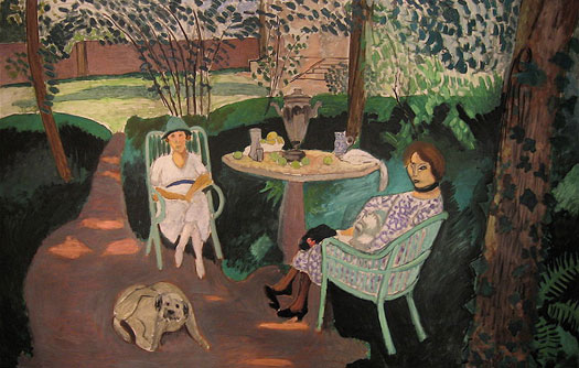
One explanation lies in the philosopher Arthur Danto’s musings over beauty’s distasteful associations. Writing in 1994 in defense of Matisse after the artist had been judged by the art critic Richard Dorment to be “infinitely” inferior to Picasso, Danto noted that Matisse “has sought to create a world that excludes suffering and hence the pleasure that might be taken in it.”
“His characteristic corpus has the aesthetic quality of a medieval garden — a garden of love — from whose precincts everything inconsistent with the atmosphere of beauty has been excluded. And to be in the presence of a Matisse is to look into that garden and to be in the presence of — an embodiment of — the spirit of the garden: a fragment of the earthly paradise.”
In Dorment’s view, Danto writes, “beauty is a consolation, and consolation means mitigating the bitter truth, which it is morally more admirable to admit and to face than to deny.” In other words, beauty was seen as a naïve or cowardly escape from outrage.
“And to the degree that this represents the current attitude, it is not difficult to see what has happened to beauty in contemporary art. It is not art’s business to console. If beauty is perceived as consolatory, then it is morally inconsistent with the indignation appropriate to an accusatory age.”
Adapted from “Garden of Unearthly Delights: Design and Superbeauty,” in The State of Things: Design and the 21st Century, exhibition catalog published by the Design Museum Holon, 2010. Reproduced by courtesy of the Design Museum Holon, Israel.
Observed
View all
Observed
By Julie Lasky
Related Posts
Design Impact
Seher Anand|Essays
Food branding without borders: chai, culture, and the politics of packaging

Graphic Design
Sarah Gephart|Essays
A new alphabet for a shared lived experience
Arts + Culture
Nila Rezaei|Essays
“Dear mother, I made us a seat”: a Mother’s Day tribute to the women of Iran

The Observatory
Ellen McGirt|Books
Parable of the Redesigner
Recent Posts
Food branding without borders: chai, culture, and the politics of packaging Why scaling back on equity is more than risky — it’s economically irresponsible Beauty queenpin: ‘Deli Boys’ makeup head Nesrin Ismail on cosmetics as masks and mirrors Compassionate Design, Career Advice and Leaving 18F with Designer Ethan MarcotteRelated Posts

Design Impact
Seher Anand|Essays
Food branding without borders: chai, culture, and the politics of packaging

Graphic Design
Sarah Gephart|Essays
A new alphabet for a shared lived experience

Arts + Culture
Nila Rezaei|Essays
“Dear mother, I made us a seat”: a Mother’s Day tribute to the women of Iran

The Observatory
Ellen McGirt|Books

 Julie Lasky is editor of Change Observer. She was previously editor-in-chief of