Kaleena Sales|Terms of Service
December 31, 2009
Teaching Black Designers

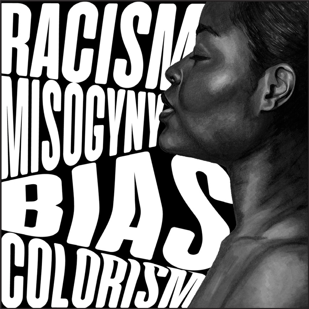
TEACHING TOOL Inspired by AfriCOBRA, I created this work to show my students how to celebrate urban elements in their work. Design and illustration by Kaleena Sales.
Editor’s Note: The following is an excerpt from Extra Bold: A Feminist, Inclusive, Anti-Racist, Non-Binary Field Guide for Graphic Designers (Princeton Architectural Press, 2021), published here with permission of the author. Those interested in more from the book can read Ellen Lupton’s excellent—Confidence Equality—here.
As a Black professor of graphic design at Tennessee State University, an HBCU (Historically Black Colleges and Universities) in Nashville, Tennessee, I intimately understand the many challenges my students face as they prepare to enter a largely White design field, governed by Eurocentric design standards. In this essay, I offer insight into the cultural aesthetic differences and racial biases that impact many young Black designers.
Many of my students come from low-income, predominantly Black neighborhoods in cities like Memphis, Atlanta, and Chicago. Redlining, the practice of denying loans, insurance, and other services to marginalized neighborhoods, has shut off Black people from their White neighbors, sometimes living just blocks away. These Black urban areas often have visual textures and colors that aren’t found in higher-income communities. For the people who live in these areas, views of urban roads, public transportation, graffiti, and more mix with the fresh paint and new construction of revitalization efforts. The vibrant complexities of the urban landscape create visual impressions in the mind, eventually serving as a mental library of stored images to use or reference when necessary.

Two approaches to bank logos. LEFT: Typeface: Trade Gothic Display, by Lynne Yun. RIGHT: Typeface: Halyard Display, by Joshua Darden
Aesthetics
In addition to environmental influences, it can’t be underestimated how influential hip hop culture is to the design sensibilities of its fans. Hip Hop represents more than just the music. The rhythms and energy are seen in the visual stylings as well. In the 1990s, design firm Pen & Pixel pushed the elements of urban street culture to the extremes by creating in-your-face, blinged-out, heavily Photoshopped, layered designs for rap labels Cash Money Records and No Limit Records. Their influence can still be seen today in many urban brands. The routine intake of certain images, colors, or textures from our cultural environments significantly affects our perception of what’s normal, even what’s beautiful. In my students, I often see these influences translate to expressive, bold designs that combine textures and layers with vibrant color choices. This sometimes means there’s a lack of interest in the flat colors and grid-based compositions of-fered by the International Typographic Style and other Eurocentric movements.
Furthermore, consider how experiences with wealth and poverty seep into our de-sign aesthetic. If someone grows up poor, in a family that struggles to make ends meet, that person might view wealth in a fantasti-cal, idealistic way. If asked to design a logo for a financial institution, they might opt for a representation of money that matches those idealistic feelings, such as . . . gold, extravagant, glitzy, big!
Conversely, if a person grows up well-off, where having lots of money is normal, then their design might be quieter and more corporate. The latter is more universally accepted as “good” design in most class-rooms and design spaces. When thinking of how often a student is asked to design something and make it look “expensive,” or “cool” or “trendy,” it becomes clear how the cultural interpretation of those words will affect the fonts, colors, and symbols used to express those concepts.
Biases
Of the many young Black designers I’ve taught, the ones who have been granted the most opportunities in this industry come to understand that all too often, their portfolios must communicate an appreciation for European design and must only showcase Black and urban design in specific brand choices. What’s most troubling is that Black people have been assimilating to White culture for so long that we sometimes fail to recognize it as a problem. In fact, the process of getting closer to Whiteness in our design can be met with feelings of accomplishment, as graphic designers are typically taught against having a culture-specific aesthetic and learn instead to service a mainstream audience governed by Eurocentric principles.
Years ago, as I was searching for jobs after grad school, I interviewed for an art director job at a large minority ad agency in New York. This agency handled the African American consumer market for several Fortune 500 clients. When I discussed the potential offer with an industry mentor (a White, male creative director at a suc-cessful, mainstream agency), he advised that I not take the position at the minority agency, as it would stigmatize me as only being able to do “that” sort of work. I took his advice. To work in this industry and be taken seriously meant that while my intersectionality of being a Black, female designer was appealing for diversity ini-tiatives, when it came down to it, my work needed to blend into White-dominant culture to be deemed legitimate.
In an attempt to critically examine Eurocentric design, many educators have begun to diversify their teaching materials, often encouraging their students to find ways to represent their identity in their design work. While it’s important to create opportunities for students to share their cultures, we must be careful to make sure minority students don’t feel tokenized or put on display for their differences.
As educators work to move the needle forward, it’s important for industry “gatekeepers” (creative directors, recruit-ers, etc.) to recognize how differences in culture and identity might show up in the portfolios of Black designers and to confront potential biases in their reviewing standards.

TEACHING AND LEARNING Over the course of my teaching, I’ve noticed the ways in which my students draw inspiration from urban Black culture. I work with my students to build the spirit and expressiveness of the work while refining their skills and craft. Poster by Kayla Workman; text from Beyoncé, “Run the World (Girls)”; course taught by Kaleena Sales, Tennessee State University.
Double Consciousness
When you’re Black and working in a predominantly White industry, fears of affirming any racial stereotype can create a pervasive, nagging voice inside your head, reminding you to always represent your people well. This hyperawareness of one’s identity as a racial minority in a professional set-ting makes some Black people question their tone of voice, their hairstyles, their clothing, and more, all in an effort to blend into the majority. This internal battle leaves some people feeling like imposters and others exhausted from the performance. It’s a mistake to think that these things have no impact on design. The truth is, the feeling of being an outsider can creep into a person’s thought patterns, making some designers second-guess their instincts, potentially muzzling them and suppress-ing important contributions and insights.
In his 1903 book, The Souls of Black Folk, W.E.B. Du Bois explores the concept of Black double consciousness: “It is a peculiar sensation, this double-consciousness, this sense of always looking at one’s self through the eyes of others….One feels his two-ness—an American, a Negro; two souls, two thoughts, two unreconciled strivings.” Our identity is abstract and ever-changing. The ways in which we’re shaped by our world can evolve as the world around us changes and we encoun-ter new experiences. What’s important is that as we meet young designers along their journey, we don’t impose antiquated ideas about what it means to make good design, or quiet their instincts to fit our expectations. With diverse representation comes a wealth of experiences and perspectives that elevate the design industry and the work we put out into the world.
Observed
View all
Observed
By Kaleena Sales


