

June 10, 2013
That Personal Touch
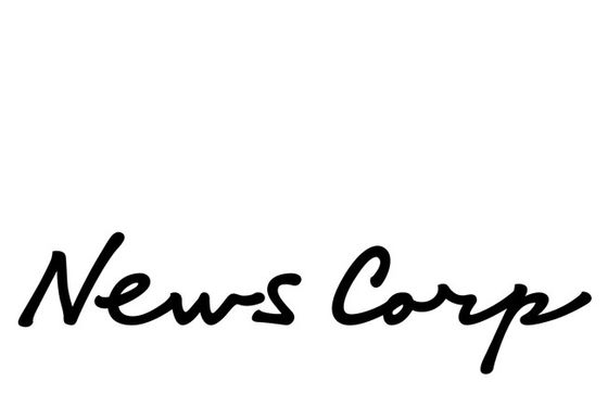
News Corp. logo (2013). Press release via Romenesko
In late May, News Corp. released a new logo, seen above, to herald the split of the company into two parts: News Corp. (newspapers and publishing) and 21st Century Fox (entertainment). The logo release was something more than that too: described as being derived from the handwriting of News Corp. founder Rupert Murdoch and his father Keith, the logo seemed to indicate a return to family control, and that Rupert was to be literally hands-on as the corporation shook off its scandal. In the Guardian, Creative Review‘s Mark Sinclair noted, “In the era of digital text, handwritten lettering can appear honest, candid even.” Note the can because this artless logo immediately seemed like something else. First, the handwriting of two people cannot be candid. It’s been manipulated, apparently to create a better press release narrative. If you don’t like Rupert, remember his father. It’s also undistinguished. That initial N could never stand as a part for the whole logo, as anyone could write it. And the blobby ends of the N and P suggest Sharpie origins, the bleeding when you let the pen linger too long on your packing box. The black and white looks cheap, which may also have been the point, after a 20th century of geometric symbols and shiny gradients. Scripts are supposed to signal nostalgia, personal connection, with-love-from-me-to-you. But when anyone can make their handwriting into a font, has script lost its meaning?
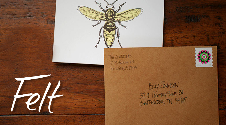 The Felt app: “Personal, handwritten cards. Sealed, stamped and mailed. All from your iPad.”
Another example: the Felt app, which I add to my list of perverse digital proxies. With this app you can pick a card from a stylish, letterpress- and wood-type-influenced selection, write a message and the address in your own handwriting, and a stamped, “personalized” physical card will be sent to your loved one. (I tried to send myself a sample but was stymied by my lack of stylus. Writing with my index finger made my handwriting look as bad as the Murdochs’.) As in their logo, Felt is making a fetish of the awkwardness of real handwriting, enshrining it as a symbol of care while reducing the effort needed to select, write, stamp and address a card to the bare minimum. I’ll admit that a thank-you or a happy-birthday is better than no recognition, but if you know the score, is this better than an email? Or just an elaborate way to give your mother what she wants without leaving the sofa? Again, if we can digitize the honest, candid hand, what’s the significance of handwriting?
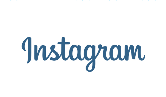
Instagram new logo (blue) and old logo (black). GIF via The Verge
Last but not least there is Instagram, which recently updated its own script logo. As a billion-dollar company, they clearly figured an off-the-rack script like Billabong would no longer do. Designer Mackey Saturday gave them an update, one which customizes without undue disruption. When the new logo made the rounds of the tech blogs in May the consensus seemed to be that it was OK: smoother and more professional, while still recognizably Instagram. Logo #1 was a scribble, Logo #2 was a product. But why a script? Instagram also traffics in nostalgia, candor, and (visual) messages of love. The “gram” is from telegram, so they could have gone with Western Union’s distinctive capitals and stops. The service, like Felt, wants to suggest that a digital image can be just as personal as a handwritten note. I would agree that it can, but only when freed of the uncandid-candor of the digital script. Just look at Saturday’s grid of capital Is. The one he finally chose is like no I I can imagine writing, so divorced is it from handwriting. If News Corp. had created a polished new script for itself, it would have seemed ridiculous, like a wolf in sheep’s clothing. At least the homely handwriting is homely. But I’d argue it is no less ridiculous a choice, in this day and age, for Instagram. Our true digital signatures are the links and images that trail us (my yellow Marimekko avatar, perhaps). To promote the “signature” and the “script,” relying on their old connotations, is absurd.
Observed
View all
Observed
Share on Social
By Alexandra Lange
 Alexandra Lange is an architecture critic and author, and the 2025 Pulitzer Prize winner for Criticism, awarded for her work as a contributing writer for Bloomberg CityLab. She is currently the architecture critic for Curbed and has written extensively for Design Observer, Architect, New York Magazine, and The New York Times. Lange holds a PhD in 20th-century architecture history from New York University. Her writing often explores the intersection of architecture, urban planning, and design, with a focus on how the built environment shapes everyday life. She is also a recipient of the Steven Heller Prize for Cultural Commentary from AIGA, an honor she shares with Design Observer’s Editor-in-Chief, Ellen McGirt.
Related Posts

Business
Courtney L. McCluney, PhD|Essays
Rest as reparations: reimagining how we invest in Black women entrepreneurs
Design Impact
Seher Anand|Essays
Food branding without borders: chai, culture, and the politics of packaging
Graphic Design
Sarah Gephart|Essays
A new alphabet for a shared lived experience
Arts + Culture
Nila Rezaei|Essays
“Dear mother, I made us a seat”: a Mother’s Day tribute to the women of Iran
Recent Posts
Minefields and maternity leave: why I fight a system that shuts out women and caregivers Candace Parker & Michael C. Bush on Purpose, Leadership and Meeting the MomentCourtney L. McCluney, PhD|Essays
Rest as reparations: reimagining how we invest in Black women entrepreneurs Food branding without borders: chai, culture, and the politics of packagingRelated Posts
Business
Courtney L. McCluney, PhD|Essays
Rest as reparations: reimagining how we invest in Black women entrepreneurs
Design Impact
Seher Anand|Essays
Food branding without borders: chai, culture, and the politics of packaging
Graphic Design
Sarah Gephart|Essays
A new alphabet for a shared lived experience
Arts + Culture
Nila Rezaei|Essays