December 16, 2015
The D Word: In the Shadows
In a precis for “Technical Preservation Services” section of the online manual of the National Park Service, U.S. Department of the Interior term “Signs” refers to “a great number of verbal, symbolic, or figural markers. Posters, billboards, graffiti, and traffic signals, corporate logos, flags, decals and bumper stickers, insignia on baseball caps and tee shirts: all of these are ‘signs.’ Buildings themselves can be signs, as structures shaped like hot dogs, coffee pots or Chippendale highboys attest. The signs encountered each day are seemingly countless, for language itself is largely symbolic … .”

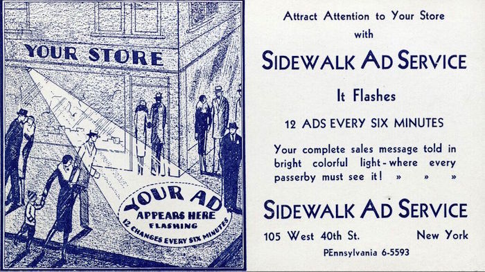
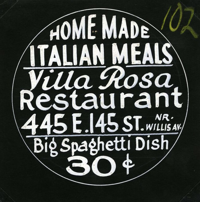
Here’s how it works for Villa Rosa Restaurant: The Sidewalk Ad Service of New York provides up to twelve hand brush-lettered circular cards from which negatives are made. These films are then loaded in a revolving cartridge that is timed to advance every six minutes, projecting “your ad” on the sidewalk.

In many instances a so-called Gobo projector is used today using utilizing energy saving LED technology that produces cool light. Called gobo, it is a stencil or template slotted inside, or placed in front of, a lighting source, used to control the shape of emitted light. But the premise is the same as this c.1930 version. Showing multiple messages on the sidewalk increases store visibility. Today’s ads, however, are doubtless more polished than the Sidewalk Ad Service specimens. This is a typical example of rudimentary show card writing. The artist has a modicum of lettering skill yet perhaps because this is not meant to be printed the end result is flawed in terms of letterspacing and scale. The top half works better than the bottom. “Home Made” efficiently contours with the circle. Villa Rosa is effective calligraphy, with both V and R working well. The rest is crammed into the space.
Observed
View all
Observed
By Steven Heller
Related Posts

Innovation
Ashleigh Axios|Essays
Innovation needs a darker imagination

Business
Kim Devall|Essays
The most disruptive thing a brand can do is be human

AI Observer
Lee Moreau|Critique
The Wizards of AI are sad and lonely men

Business
Louisa Eunice|Essays
The afterlife of souvenirs: what survives between culture and commerce?
Related Posts

Innovation
Ashleigh Axios|Essays
Innovation needs a darker imagination

Business
Kim Devall|Essays
The most disruptive thing a brand can do is be human

AI Observer
Lee Moreau|Critique
The Wizards of AI are sad and lonely men

Business
Louisa Eunice|Essays

 Steven Heller is the co-chair (with Lita Talarico) of the School of Visual Arts MFA Design / Designer as Author + Entrepreneur program and the SVA Masters Workshop in Rome. He writes the Visuals column for the New York Times Book Review,