March 24, 2008
The Magic of the Peace Symbol
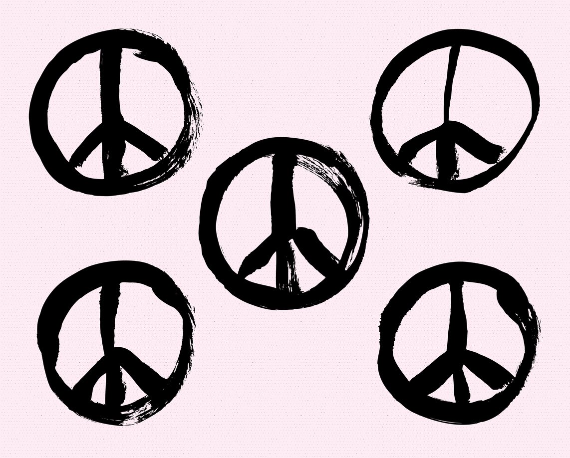
The symbol for the Campaign for Nuclear Disarmament is 50 years old this year, and despite all the wars fought since its birth, none of them have been a nuclear war. Perhaps it was the dramatic specter of the mushroom cloud and all it symbolizes that has helped deter the unthinkable.
But just maybe there is some magic in the peace symbol. There was probably no more galvanizing nor polarizing emblem during the 1960s than the upside-down, three-pronged, fork-like mark in a circle that came to symbolize the anxiety and anger of the Vietnam era. And perhaps few symbols have had origins surrounded in as much mystery and controversy.
Although the basic form had roots in antiquity, the peace symbol was popularized during the period in the mid-1950s when H-bomb testing prevailed. It was designed in 1958 by a British textile designer named Gerald Holtom for use by England’s Campaign for Nuclear Disarmament (CND). Also known as the “Peace Action Symbol,” it was used at the first annual Aldermaston Easter Peace Walk to promote world disarmament. It debuted in the United States in 1961 on protest signs in the cautionary science-fiction film about the tragic ill-effects of nuclear testing, The Day The Earth Caught Fire. Soon it was universally adopted for use as an anti-war insignia.
The symbol is a composite semaphore signal for the letters N and D which, of course, stand for “nuclear disarmament,” but its basic form also derives from an ancient runic symbol which casts some doubt on whether the ND/semaphore rationale might have been an afterthought. According to an article in a 1969 issue of WIN (Workshop in Non-Violence) magazine sponsored by the War Resisters League (one of the 1960s foremost anti-Vietnam war activist groups), the peace sign derived from an initial iteration of a white circle on a black square. This was followed by various versions of Christian crosses drawn within the white sphere, which in turn evolved into the ND form. Referring to the Aldermaston march, WIN asserted that for subsequent demonstrations an ND badge was “devised and made by Eric Austen,” whose researches into the origins of symbolism underscored that the basic fork-like symbol — what he called the “gesture of despair” motif — was associated throughout ancient history with the “death of man,” and the circle with the “unborn child.” The reason for calling the upside down fork a “gesture of despair,” derives in turn from the story of St. Peter who was crucified upside down in 67 AD Rome on a cross designed by Emperor Nero, known thereafter as the “Nero Cross” or the “sign of the broken Jew.”
Before Gerald Holtom and Eric Austen, however, there was a still earlier precedent for the symbol. During the 1930s, decades prior to the nuclear disarmament and anti-Vietnam war movements, but on the precipice of fascist dominance in Europe, a strikingly similar emblem was devised by the English philosopher and socialist Bertrand Russell as an attempt “to depict the universal convergence of peoples in an upward movement of cooperation.” During the late 1950s Russell was the chairman for the CND and present at numerous disarmament demonstrations and protests against English involvement in NATO, at the very time when the symbol was adopted as the CND emblem. It is therefore probable that Russell introduced the basic sign to the organization from which Holton created his final design.
Russell was a former member of the Fabian Society (a fellowship of English socialists), which prompted a right-wing journal, American Opinion, to link the peace symbol, like the anti-war movement in general, to a broad Communist conspiracy of world domination, “It is not at all surprising that the Communists would turn to Russell to design their ‘peace sign,” states a 1970 article in this journal, which continues: “A Marxist from his earliest youth, he greeted the Russian Revolution with the declaration: ‘The world is damnable. Lenin and Trotsky are the only bright spots…’” The journal further describes Russell as an active anti-Christian who was well aware that he had chosen an “anti-Christian design long associated with Satanism.” In fact, the basic form, which appears both right-side up and upside down as a character in pre-Christian alphabets, was afforded mystical properties and is in evidence in some pagan rituals. Rightside up I represents “man,” while upside down it is the fallen-man. Referred to in Rudolf Koch’s Book of Signs as “the Crow’s foot” or “witch’s foot” it was apparently adopted by Satanists during the Middle Ages.
The Nazis routinely adopted runic forms for their official iconography, such as the SS runes, the insignia of Hitler’s personal bodyguard. Indeed the Nazi iconography calls the “crow’s foot” the todesrune or death rune. Paradoxically, in a rightside-up position it was frequently used on death notices, gravestones of SS officers, and badges given to their widows. Not unlike the Swastika itself, the direction of this runic symbol has positive and negative implications. The downward version might be interpreted as death and infertility, while the upward version symbolized growth and fertility.
The meaning of signs and symbols are easily transformed into good and evil depending on how they are sanctioned and applied over time — and who accepts said usage. Whatever Satanic associations the “crow’s foot” may have had when Bertrand Russell “designed” this symbol, he imbued it with more positive virtues of life and cooperation. Once adopted by the CND, and later by scores of other anti-war, ecology, civil rights, and peace and freedom groups, its meaning was forever changed to that of a sign of protest in the service of humanity. Magic had nothing to do with it.
Observed
View all
Observed
By Steven Heller
Related Posts

Innovation
Ashleigh Axios|Essays
Innovation needs a darker imagination

Business
Kim Devall|Essays
The most disruptive thing a brand can do is be human

AI Observer
Lee Moreau|Critique
The Wizards of AI are sad and lonely men

Business
Louisa Eunice|Essays
The afterlife of souvenirs: what survives between culture and commerce?
Related Posts

Innovation
Ashleigh Axios|Essays
Innovation needs a darker imagination

Business
Kim Devall|Essays
The most disruptive thing a brand can do is be human

AI Observer
Lee Moreau|Critique
The Wizards of AI are sad and lonely men

Business
Louisa Eunice|Essays

 Steven Heller is the co-chair (with Lita Talarico) of the School of Visual Arts MFA Design / Designer as Author + Entrepreneur program and the SVA Masters Workshop in Rome. He writes the Visuals column for the New York Times Book Review,