
May 7, 2009
Trump, The Logo
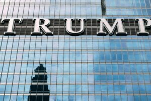
The Trump Tower, New York, NY
The first plans for Trump Tower were drawn in secret. Late in the 1970’s, Der Scutt, the building’s architect, devised a saw-toothed, gleaming dark bronze glass tower that was to be constructed on the site of the old Bonwit Teller department store on Fifth Avenue in New York City. The secrecy, uncharacteristic of Donald Trump, was for good reason. When work began on what was then dubbed “Project T,” Trump had neither the rights to the Bonwit Teller property, nor the funding for construction, nor the approval for a crucial urban redevelopment tax abatement from New York City, nor the air rights from neighboring Tiffany’s, which Trump needed in order to build the Tower to his desired height. In the beginning, Trump Tower was little more than a mad scheme, and its fate would ultimately hinge on its namesake’s ability to force it into existence.
Trump’s ambitions for the Tower were enormous. With only one major project to his name, the Grand Hyatt on 42nd Street (on which Der Scutt was also the lead design architect), Trump was, at best, a semi-somebody — the big-talking, club-hopping son of Fred Trump, a well-connected outer-boroughs developer who owned thousands of working-class housing units in Brooklyn and Queens. For the younger Trump, who was already flipping properties in Ohio and Arizona before he finished undergrad at U Penn, controlling his father’s sizable real estate holdings would never be enough. There was little glamour in middle class housing. And besides, whatever money could be made running the family business would never match the billion-dollar deals being brokered across the East River, in Manhattan. From the start, Trump Tower was intended to be Donald Trump’s literal and figurative stamp on New York City, a bold, once-in-a-lifetime swipe at the big leagues.
Trump Tower was the first of Donald Trump’s buildings on which his name appeared — a significant personal achievement for someone so concerned with recognition, but also an important step forward for Trump’s businesses. Affixing his name to the building made Trump Tower an instantly recognizable landmark and transformed the Tower into Trump’s most literal and significant vehicle for branding both himself and his future projects. The building’s logo — thick block letters that spell out TRUMP TOWER in all caps — was particularly significant to the emerging Trump brand identity, marking Trump’s territory on Fifth Avenue and defining his aesthetic.
The logo above the building’s main entrance, huge and gleaming in 34-inch brass block letters, bluntly announces Trump’s presence on the street. It’s crude, perhaps, but undeniably effective. In a neighborhood filled with names like Bergdorf, Cartier, and Tiffany, none is more prominent than Trump’s. Inside, the same lettering is repeated on nearly every conceivable surface — on windows, directory signs, elevator labels, you name it. At a certain point, the word “overcompensation” springs to mind. The logo ensures that Trump is never upstaged by his high-profile neighbors, or even by the prominent tenants in his building. From the moment you walk under those big brass letters and enter the Trump lobby, with its 80-foot waterfall and rose-colored Italian marble walls, you are in Trump’s world, and no one else’s.
Trump Tower was built under an airtight construction schedule. If the building was not completed by the end of 1983, Trump would not qualify for a massive tax abatement from the city, so much of the building’s design, including the logo, was done on the fly. Final pre-construction renderings of Trump Tower did not include a visual identity, and early photos of the construction site show that Trump was using a temporary logo when ground was broken. However, a later photo, taken roughly a year before the building opened, shows that Scutt and Trump had by then chosen the final identity. In the picture a five-piece brass band stands atop an awning in front of Trump Tower. Behind the band we see the building’s steel skeleton still exposed, a Christmas tree, and off to the right, almost out of view, the logo.
Der Scutt, the architect of Trump Tower, told me he designed the Trump Tower logo. Scutt says he had relative autonomy in terms of the logo’s design, at least initially. Scutt chose the lettering for the logo — Stymie Extra Bold — because he thought it fit the look of Trump Tower. His design, he says, was “a purely aesthetic decision.” Stymie is in some ways an ironic choice for Trump Tower. Designed in the 1930’s by Morris Fuller Benton for the American Type Foundry, Stymie is a typeface more often associated with industry than luxury. IBM used a variant of Stymie for its logo, and the New York Times Magazine has used Stymie for years. In other respects, though, Stymie is perfect Trump Tower. Stymie belongs to a family of typefaces called slab serifs, which are often used for visual identities that call for impact; a lot of college uniforms, for instance, use slab serifs. Scutt, however, says Stymie’s provenance was of little concern. “I couldn’t give a rat’s ass as to the history of it,” he says. “I chose it because I liked it.”
Der Scutt’s only lasting regret about the logo is something he had no control over. Scutt’s initial design for the lettering over the building’s main entrance called for the letters to be 17 inches tall. He was aiming, he says, for elegance; he kept telling Trump to “be Tiffany’s” — that is, he wanted the building’s entrance communicate with its elegant neighbor. Trump had other ideas. According to Scutt, Trump went behind his back and had the letters doubled in size. “I told him people flying into New York would see the sign before their planes landed,” he says.
The rest, though, is history. The Trump Tower logo became the basis for the identities of Trump’s side businesses and glamour projects — Trump’s early books, The Art of the Deal and Surviving at the Top, and Trump’s board game, Trump: The Game, all used a version of Scutt’s design. The logo has also proven remarkably durable — it’s remained unchanged for more than twenty-five years, and still exerts a powerful presence both inside and outside Trump Tower. Trump would likely say he predicted that all along.
The overall use of Trump’s logos, however, has changed over the years. In the late 1980’s, after a decade of rabid expansion fueled by continued leveraging of himself and his properties, Trump nearly went bankrupt. He has referred to this period as a “blip.” Whatever you call it Trump lost much of his empire — management control of the Plaza Hotel; the titles to Trump Shuttle, his airline; his 238-foot yacht, the Trump Princess; and his private Boeing 727 (which he subsequently repurchased). He was forced to agree to a personal spending limit of four hundred and fifty thousand dollars a month. But, worst of all, Trump lost his credit; banks were suddenly reluctant to finance Trump’s massive ventures. Trump found, though, that he did not have to look far for a new revenue stream. There was still money to be made by licensing the Trump name.
Trump’s first post-blip licensing deal was the Trump International at Columbus Circle. Though the building bore Trump’s name — again in gleaming bronze letters — Trump was paid an up-front fee as a consultant, and his ownership stake was limited to a penthouse apartment in the building and a share of the restaurant and parking. Many properties have since been structured around similar deals. Remarkably, most people still believe Trump owns these buildings. In his 1997 New Yorker profile of Trump (written around the time the Trump International was opening and Trump’s star was once again on the rise), Mark Singer perfectly summed up Trump’s skill for “image ownership”: “By appearing to exert control over assets that aren’t necessarily his — at least not in ways that his pronouncements suggest — [Trump] exercises his real talent: using his name as a form of leverage.”
Trump’s licensing empire now extends far beyond real estate. A brief sampling of Trump products currently available include Trump Steaks, Trump: The Fragrance, Donald Trump Menswear, Trump Ice (bottled water), and Trump Vodka (with a label designed by Milton Glaser). While he still actively oversees the design of the new buildings that bear his name, Trump does not always work side-by-side with the designers who shape the look of his licensed products. On Trump Vodka, for instance, Milton Glaser’s office was hired by Drinks America, the vodka’s distributor, and Glaser did not have direct contact with Trump until the Trump Vodka launch party. (Drinks America, coincidentally, specializes in celeb-brand alcohol — the company also markets Dr. Dre cognac and Willie Nelson whiskey.)
Today, each of Trump’s licensed products uses a different visual identity. There is no longer a single Trump style — the man is the brand. Maybe this is what Trump ultimately envisioned thirty years back, when Der Scutt sketched out the first iterations of Trump Tower. Maybe Trump knew the building would propel him into the strange air of fame, where he would forever buzz around our collective consciousness in some gold-plated helicopter. Maybe he understood he was destined to exist more as an idea than a person, to be an adjective and a noun, and maybe this is what he truly desired.
Observed
View all
Observed
By John Cantwell
Related Posts

Innovation
Ashleigh Axios|Essays
Innovation needs a darker imagination

Business
Kim Devall|Essays
The most disruptive thing a brand can do is be human

AI Observer
Lee Moreau|Critique
The Wizards of AI are sad and lonely men
Business
Louisa Eunice|Essays
The afterlife of souvenirs: what survives between culture and commerce?
Related Posts

Innovation
Ashleigh Axios|Essays
Innovation needs a darker imagination

Business
Kim Devall|Essays
The most disruptive thing a brand can do is be human

AI Observer
Lee Moreau|Critique
The Wizards of AI are sad and lonely men

Business
Louisa Eunice|Essays

 John Cantwell is a graduate of the College of the Holy Cross. He has worked as a research analyst, a freelance writer, and a standup comedian. He is currently enrolled in the inaugural class of the School of Visual Arts’ Design Criticism MFA program.