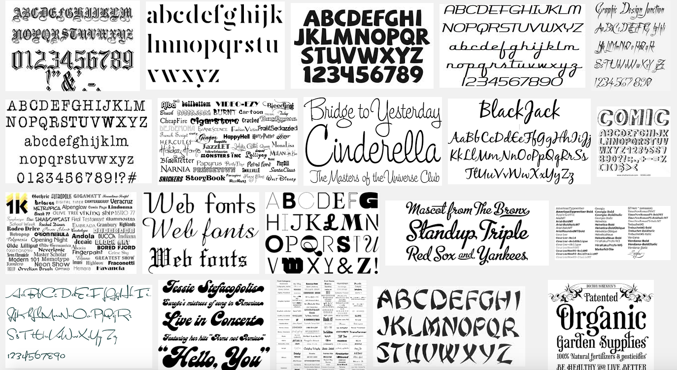
How many typefaces is too many typefaces? A million? 100 million? Or is it the case, as Massimo Vignelli memorably observed, that a graphic designer can function effectively with only a small stable of thoroughbred sans and sans serif typefaces?
Today’s graphic designers can choose from countless sophisticated, highly serviceable, and precision-engineered typefaces. Not only that, but thanks to the miracle of the download, they can be on our desktops within seconds—beautiful families of immaculately conceived letterforms, all fully operational and legal (if, of course, we’ve taken the trouble to include our credit card in the transaction).
But what happens to our ability to discriminate and exercise good judgment when we have a near-infinite number of possibilities? How do you choose anything when you have everything to choose from? The concept of “too much choice” is an acutely contemporary problem—a digital world problem caused by the superabundance and super-availability of everything. We find it in music, literature, food, tv channels, consumer products, in information itself, and now in typography. Enough, it seems, is never enough.
Have we reached peak typeface? Apparently not. More fonts appear daily in a seemingly endless quest for newness. And if we factor in the search for a viable, fully-responsive typographic ecosystem for the web, the results offer a near infinity of variables. Why? Our inner Marxist would remind us that the reason for this ever-expanding galaxy of typographic alphabets is simple: markets need perpetually escalating commodity production or they wither. And while the world of typeface production cannot be compared to the worlds of automobiles or apparel, it does offer us a microcosm of these larger spheres.
Beyond the capitalist need for serialized production, this explosion of activity in typeface generation seems to have two driving forces: the first is the corporate lust to posses bespoke typefaces and the attendant eagerness of designers to cater for this demand. The second is the huge upsurge of interest in typeface design amongst young designers.
The corporate hunger for ownable typefaces is easily explained. Why wouldn’t they want to possess a vital piece of their brand real estate? It’s what corporations do—they land grab. Odd, therefore, that so many of them end up with corporate fonts that look alarmingly similar to other corporate fonts.
A far more interesting question is why do so many designers want to design their own typefaces? Why all that painstaking work when there is, most likely, a typeface already in existence that will serve your purpose? Of course, the work of type creation is far less laborious than it once. Software has reduced much of the drudgery, but type design is still a task that requires quiet dedication and hours of patient refinement.
The designer
Mark Kingsley takes a jaundiced view of the current fad for type design: “The reason so many design students feel compelled to design a typeface,” he says, “is that typefaces don’t speak back like clients do. It’s a safe place to work where one is dealing strictly with form, and the complexities of human interaction are minimized. There’s no thought, other than formal thought. And when you’re done, you have the semblance of relevance.”
I share Kinglsley’s view: type design is widely seen as the last arena where the graphic designer is still in charge of his or her own work. Typeface designers will bang the table and say that commissioners of typefaces are every bit as picky as commissioners of other types of graphic production. But to idealistic young designers appalled at the interfering tendencies of clients, stymied by the rise of templated graphic environments where everything is already designed, and demoralized by the slavish adherence to business strategies that limit creative thinking, typeface design feels like one of the last arenas of free expression. It also feels like the exercise of a craft. It feels like proper old-fashioned ‘making’, at a time when huge areas of graphic design practice have become increasingly robotic.
