September 22, 2016
User-Friendly Paul Rand

Paul Rand did not coin the term “user friendly.” He would have hated such trendy jargon. Yet he did, arguably, introduce the “friendly” concept, creating the first friendly computer-user packages that paved the way for human-centric digital age products. Rand probably would say my assertion was “for the birds”, but consider the following.
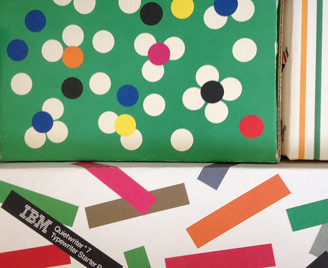
Decades before Apple introduced its Newtonian-inspired rainbow-colored logo, Rand helped develop IBM’s populist aura through commercial packages for Selectric typewriter starter packs, ink ribbons and type balls that were vibrantly festooned with multi-colored stripes, pastel confetti and abstract flower blooms. Not your run-of-the-mill identity for a serious business machine manufacturer, these cheerfully designed boxes were gifts intended for IBM’s consumers from a company whose historic edict — “Good Design is Good Business” — continues to resonate.
“Ideally, beauty and utility are mutually generative,” Rand wrote in his first monograph, Thoughts on Design (1947), which is being republished this week by Chronicle Books. It was an ideal made real at IBM, which enabled him to inject his Klee-Matisse-Picasso-inspired graphic good vibrations into IBM’s product line. Rand’s zealous belief in the power of wit and play was an outgrowth of a childhood passion for comics, which in turn fed his impish side. “I always steered towards toward humorous things,” Rand once told me. “People who don’t have a sense of humor really have serious problems.”
Despite Rand’s often misinterpreted dogmatic adherence to a Modernist credo — the so-called “rightness of form” — and his total commitment to “Design is a way of life,” he had an incredible sense of humor. Moreover, he believed that design had transformative powers that in part, through wit, could positively appeal to the masses while also serving the client. “To design is to transform prose into poetry,” he wrote in Design Form and Chaos. Designing with joy was his means, resulting in a better relationship with the consumer.
Yet it was IBM that benefited most from Rand’s compulsion for play, or as he called it “experimentation.” But the computer giant was not the first. In the 1940s, his covers for Direction magazine were inspiring. As chief art director at Weintraub advertising agency in New York, Rand challenged the antiquated Victorian conventions of cigar packaging through comic El Producto gift boxes and tins. His handmade cartoon drawings, collages, photograms and other playful visual treats were dada-esque approaches that also emerged in his book covers and jackets, and later in posters and children’s books.
Much of this playful abandon was intuitive. “Imagination begins with intuition, not the intellect,” he wrote in the self-effacingly titled From Lascaux to Brooklyn. But Rand often vacillated between crediting the subconscious and the conscious for his design smarts. The creative spark lasts only a second, he insisted, refinement of any given visual idea could then take months. “I don’t think that play is done unwittingly,” he asserted in Graphic Wit (1991). “At any rate, one doesn’t dwell over whether it’s play or something more serious — one just does it.”
Whatever the reason or method, the IBM boxes are the roots — and represent the innocence — of user-friendliness. Considering their inviting simplicity, I wonder how Rand would package new digital products into something that makes the consumer feel they are getting something truly user-friendly.
This essay was originally published in August, 2014.
Observed
View all
Observed
By Steven Heller
Related Posts

Innovation
Vicki Tan|Books
How can I design at a time like this?

Civic Life
Bert de Muynck|Essays
Walkie talkie: An architect-turned-tour guide on designing presence in Lisbon

Business
Courtney L. McCluney, PhD|Essays
Rest as reparations: reimagining how we invest in Black women entrepreneurs

Design Impact
Seher Anand|Essays
Food branding without borders: chai, culture, and the politics of packaging
Related Posts

Innovation
Vicki Tan|Books
How can I design at a time like this?

Civic Life
Bert de Muynck|Essays
Walkie talkie: An architect-turned-tour guide on designing presence in Lisbon

Business
Courtney L. McCluney, PhD|Essays
Rest as reparations: reimagining how we invest in Black women entrepreneurs

Design Impact
Seher Anand|Essays

 Steven Heller is the co-chair (with Lita Talarico) of the School of Visual Arts MFA Design / Designer as Author + Entrepreneur program and the SVA Masters Workshop in Rome. He writes the Visuals column for the New York Times Book Review,