December 31, 2009
What Makes Architecture Useful?

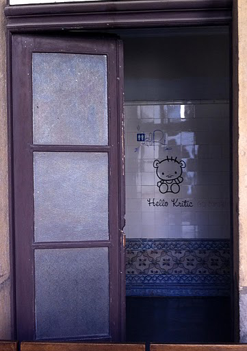
Two of my favorite things, Hello Kitty and criticism, on the wall at EXD’11
I spent the end of last week in Lisbon, where I had been invited to speak on a panel at Experimenta Design 2011, the city’s design biennial. My theme, and the theme of the biennial as a whole, was “Useless Architecture.” Or was it “Use less”? No design conference is complete without punctuation trickery. I found Useless to be an excellent jumping off point for my talk, in which I tried to identify what recent criticism, and what recent architecture, could actually prove Useful. It seemed to go over well.
The entrance to the Lounging Space, with bureaucratic chandelier
But meanwhile, the best argument for the ongoing usefulness of good design was made by the buildings of Lisbon, most notably the Antigo Tribunal da Boa-Hora, a 1633 convent with traditional center courtyard that was used as Lisbon’s main courthouse as recently as 2009. Rebranded the “Lounging Space,” the morning panel discussions were held in one of its magnificent tiled courtrooms, lunch was served on repurposed office furniture under the arches, and drinks were served after dark in the open court.
Some well-designed wires, leading to the cafe
The building, unused for two years, was brought back to life with minimal interventions: wall graphics layered over the patterned tiles, neon tubes in the oh-so-bureaucratic fluorescent light fixtures, an installation of court detritus in the entrance, including an Ingo Maurer-esque chandelier of paperwork. It was casual, it was cheap, and it underlined the need for Lisbon to figure out what to do with its existing magnificence. The cranes that dotted the city skyline were all in the process of preservation, but for what use was not always clear. It was sad to think that the tribunal, so rapidly and artfully brought back to life for Experimenta, was destined to be shut up again.
Pattern on pattern, directing you to the small exhibitions
Two exhibitions on view as part of Experimenta made similar points about beauty, age and uselessness in the city itself. The first, “Typography in architecture: useless artifacts or useless to care about?” is installed in two downstairs rooms of the tribunal. A brief walk around the center of Lisbon had already alerted me to the presence of wonderful early modern signs around town (from Art Nouveau to Deco to type best suited to a bat-wing bumper). The exhibit highlighted a number of the best examples and implicitly suggested that the best design show was a stroll, before the signs and their modest, local stores disappeared. I loved that a graffitied Hello Kitty welcomed the critics, but the street leading to the Lounging Space was lined with the bright and familiar signs of H&M, Muji, Sanrio and Zara.
One of many period signs in the city center
The second relevant exhibition is “Utilitas Interrupta: An Infrastructural Index of Unfulfilled Ambitions,” curated by Joseph Grima, currently editor of Domus. It’s a small collection of big infrastructural dreams, united by scale, ambition and disuse. He writes that these are
…projects once celebrated and now forgotten, reminders of a long-gone (or not so long-gone) optimism that lie concealed in plain sight, magically erased from collective consciousness despite their often gargantuan proportions.
The exhibit includes Australia’s No. 1 Rabbit Proof Fence, France’s Bertin Aerotrain, the American Biosphere 2 and Salton Sea and (because such a project would not be complete without something from North Korea) the Ryugyong Hotel, a crumbling concrete mountain once intended to house 3000 hotel rooms, seven revolving restaurants, and to be the 7th tallest building in the world. As Grima said at the opening, when you think big, you have to be prepared for failure. What brought the point home was Lisbon’s interrupted infrastructure across the park: an 18th century cistern and aqueduct, now a museum. It’s big, it’s beautiful, but is a museum really its highest and best use?

Exhibition entrance, via EXD’11 Blog
The tribunal, the signs, the cistern were all once of utmost importance. Experimenta made them briefly important again. It would be nice to think that the outcome of a Useless series of talks, exhibits and tours would be to make these physical artifacts Useful once more.
[And, in case that was too nice for you, click on over to Architectural Record, where I critique the new (mutant?) digital design magazines.]
Observed
View all
Observed
By Alexandra Lange
Related Posts

Business
Courtney L. McCluney, PhD|Essays
Rest as reparations: reimagining how we invest in Black women entrepreneurs

Design Impact
Seher Anand|Essays
Food branding without borders: chai, culture, and the politics of packaging

Graphic Design
Sarah Gephart|Essays
A new alphabet for a shared lived experience

Arts + Culture
Nila Rezaei|Essays
“Dear mother, I made us a seat”: a Mother’s Day tribute to the women of Iran
Recent Posts
Courtney L. McCluney, PhD|Essays
Rest as reparations: reimagining how we invest in Black women entrepreneurs Food branding without borders: chai, culture, and the politics of packaging Why scaling back on equity is more than risky — it’s economically irresponsible Beauty queenpin: ‘Deli Boys’ makeup head Nesrin Ismail on cosmetics as masks and mirrorsRelated Posts

Business
Courtney L. McCluney, PhD|Essays
Rest as reparations: reimagining how we invest in Black women entrepreneurs

Design Impact
Seher Anand|Essays
Food branding without borders: chai, culture, and the politics of packaging

Graphic Design
Sarah Gephart|Essays
A new alphabet for a shared lived experience

Arts + Culture
Nila Rezaei|Essays

 Alexandra Lange is an architecture critic and author, and the 2025 Pulitzer Prize winner for Criticism, awarded for her work as a contributing writer for Bloomberg CityLab. She is currently the architecture critic for Curbed and has written extensively for Design Observer, Architect, New York Magazine, and The New York Times. Lange holds a PhD in 20th-century architecture history from New York University. Her writing often explores the intersection of architecture, urban planning, and design, with a focus on how the built environment shapes everyday life. She is also a recipient of the Steven Heller Prize for Cultural Commentary from AIGA, an honor she shares with Design Observer’s Editor-in-Chief,