
October 7, 2010
Uncommon Ground

Michael Maltzan Architecture, Plan for Inner-City Arts, Los Angeles, CA, 1993–2008. Photo: Iwan Baan
What is small? This sounds like a trick question, or an excerpt from the text of one of my favorite children’s books, Big Little. But an explanation would seem central to the Museum of Modern Art’s new exhibition “Small Scale, Big Change: New Architectures of Social Engagement,” featuring 11 built or under-construction projects on five continents in underserved communities.
This is the museum’s second foray into the world of social and sustainable design, after last winter’s successful “Rising Currents.” While it contains a number of worthy (if occasionally over-exposed) projects, the inability of “Small Scale” curator Andres Lepik to define his terms means the exhibition fails to move the conversation forward, offering no sense of where these 11 projects find common ground, and hence which small architectural interventions are likely to be effective elsewhere. It isn’t scalable, which means Lepik defaults to MoMA’s historical agenda, aesthetics. Not one of these projects, but for Rural Studio’s gable-roofed $20K House VIII, would be out of place in an exhibition on new schools, new urban infrastructures, new low-cost housing.
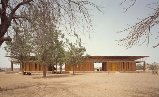
In listing those three categories, I think I’ve identified the exhibition’s main conceptual problem: the diversity of type creates a lack of cohesion and, ultimately, conclusion. The first project I saw as I walked into the gallery seemed like the model for such a show: architect Diebedo Francis Kere’s Primary School in his hometown of Gando, Burkina Faso. Made of unbaked mud bricks, a traditional building material that had fallen out of use, the school achieves architectural distinction and improves on its neighbors by lifting its overhanging roof high on a system of metal struts. Kere’s school, in use since 2001, plays with the classic modernist parti for the hot climate — regionally inflected box under big roof — by making it all hand- and community-made rather than a product imported from abroad. The persistence of this parti is visible on the opposite wall, in Anna Heringer and Eike Roswag’s Handmade School in Rudrapur, Bangladesh (2004–06), or even, larger and sturdier, in Noero Wolff’s Red Location Museum of Struggle, in Port Elizabeth, South Africa (1998–2005).
Anna Heringer and Eike Roswag, METI — Handmade School, Rudrapur, Bangladesh, 2004–06. Photo: Kurt Hörbst
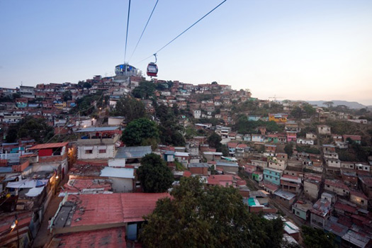
But is a “museum of struggle” really a front-line actor in architecture’s social engagement? Noero Wolff’s building feels like it was included as a placeholder for the firm’s master plan for Red Location, one of the oldest black townships in South Africa, rather than for the museum’s particular urban power. But then, a master plan, including housing, a library, city archive, and other communal spaces, is hardly small. Several of the 11 are really plans masquerading as interventions and, in my ideal exhibit, would not have made the cut. These include Urban Think-Tank’s 2007–10 Metro Cable car system for Caracas, Venezuela, partly built, intended to link two informal and unrecognized barrios (the type of communities that are home to 60 percent of the city’s population) to the city metro system. Plans for roads would have required wholesale demolition, while the cable cars float above, and the architects envision plug-in urban amenities attached to the stations. It is a great idea, stylishly achieved, but again, not small. Also unmentioned is whether legitimizing barrios via transport, without addressing their illegal and possibly unhealthy architecture, counts as real improvement.
Urban-Think Tank, Metro Cable, Caracas, Venezuela, 2007–10. Photo: Iwan Baan
The “big” part of the title isn’t addressed either. In his remarks at the opening, curator Andres Lepik specifically thanked two MoMA funds for allowing him to travel to see which sites were successful. But neither his benchmarking nor his on-site observations are part of the show. What counts as a success, particularly given the diversity of program and scale contained in the gallery? What counts as failure? I would have been really interested to find out more about projects that almost made the cut, until Lepik saw the situation on the ground. Maybe that’s the critic’s role rather than the curator’s?
A stronger point of view could have been achieved through bolder exhibition design. Mimi Zeiger, who paused to chat while reviewing the exhibit for Architect‘s November issue, made the excellent point that she expected some simple graphic showing the cost/benefit ratio for each project. Instead, one had to mine the shallow wall texts for tidbits of information, and scan the terse captions. I found only one of the latter that rained on the socially engaged parade. Metro Cable was intended to have color-coding and graphics systems by Ruedi Baur, but these have been “adapted and diluted by the city.” Boo-hoo.
Valuable real estate was taken up by horizontal display cases featuring the architects’ sketchbooks. I understand this approach for design competitions and young architect showcases, but here it seemed jejune and possibly patronizing. This is no Architecture Without Architects. Every project was designed by an architect or architecture student, many with long-established careers. Showing their sketches seemed like an attempt to make the whole thing seem more amateur, more bottom-up than top-down. But the sophistication of the design, emphasized by spectacular models, belied this suggestion. I would much rather have seen the cases filled with clear program diagrams, construction images, documentation of the un-MoMA-worthy context. Wonky, to be sure, but to fly the flag of social engagement you do indeed need to move beyond looks. The curators didn’t give us enough information to do that.
Elemental, Quinta Monroy Housing Project, Iquique, Chile, 2003–05. Photo: Cristobal Palma
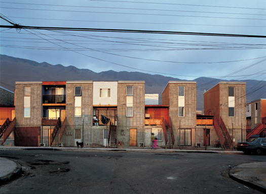
My favorite of the 11 was perhaps the most over-exposed, save for Rural Studio: Elemental’s Quinta Monroy Housing (2003–05) in Iquique, Chile. In nine months, 93 reinforced concrete units were built for a unit cost of $7,500, each one-half house, one-half open lot, to allow for future expansion. All units were equipped with plumbing, a stair, and door openings. The rest was up to the residents to provide, add, complete and customize as income and leisure allowed. The units bear a distant familial relation to Le Corbusier’s Dom-ino, but more important, are blank slates for the expression of owners rather than architects. Elemental seems (though you wouldn’t know it from the show) to have solved the age-old problems of modernist low-cost housing, offering residents light, air, decorative freedom and room to grow. The units are tiny, but Elemental now has 1,100 built and another 1,000 in development. I think they’ve outgrown the show, or rather, I would have been more engaged by an exhibition that made direct comparison between Quinta Monroy, the $20K house, and the other two housing projects on view.
I hope it is clear that I have no issue with most of the work on view in “Small Scale, Big Change.” (Though I do have an issue with the glossy, tone-deaf film starring a white rabbit that accompanies Michael Maltzan Architecture’s Inner-City Arts complex, as well as the Iwan Baan photo used to show it. Is it really community-minded to present your building as a sort of secular white temple in the middle of a gray city?) I also have no issue with the idea of MoMA embracing social change. The problem is this exhibition fails to engage with real-world questions of scalability, accountability and popularity in a forward-thinking way. The museum is playing catch-up on a decade of design that fell under their radar, and it shows.
Observed
View all
Observed
By Alexandra Lange
Recent Posts
Courtney L. McCluney, PhD|Essays
Rest as reparations: reimagining how we invest in Black women entrepreneurs Food branding without borders: chai, culture, and the politics of packaging Why scaling back on equity is more than risky — it’s economically irresponsible Beauty queenpin: ‘Deli Boys’ makeup head Nesrin Ismail on cosmetics as masks and mirrors
 Alexandra Lange is an architecture critic and author, and the 2025 Pulitzer Prize winner for Criticism, awarded for her work as a contributing writer for Bloomberg CityLab. She is currently the architecture critic for Curbed and has written extensively for Design Observer, Architect, New York Magazine, and The New York Times. Lange holds a PhD in 20th-century architecture history from New York University. Her writing often explores the intersection of architecture, urban planning, and design, with a focus on how the built environment shapes everyday life. She is also a recipient of the Steven Heller Prize for Cultural Commentary from AIGA, an honor she shares with Design Observer’s Editor-in-Chief,

