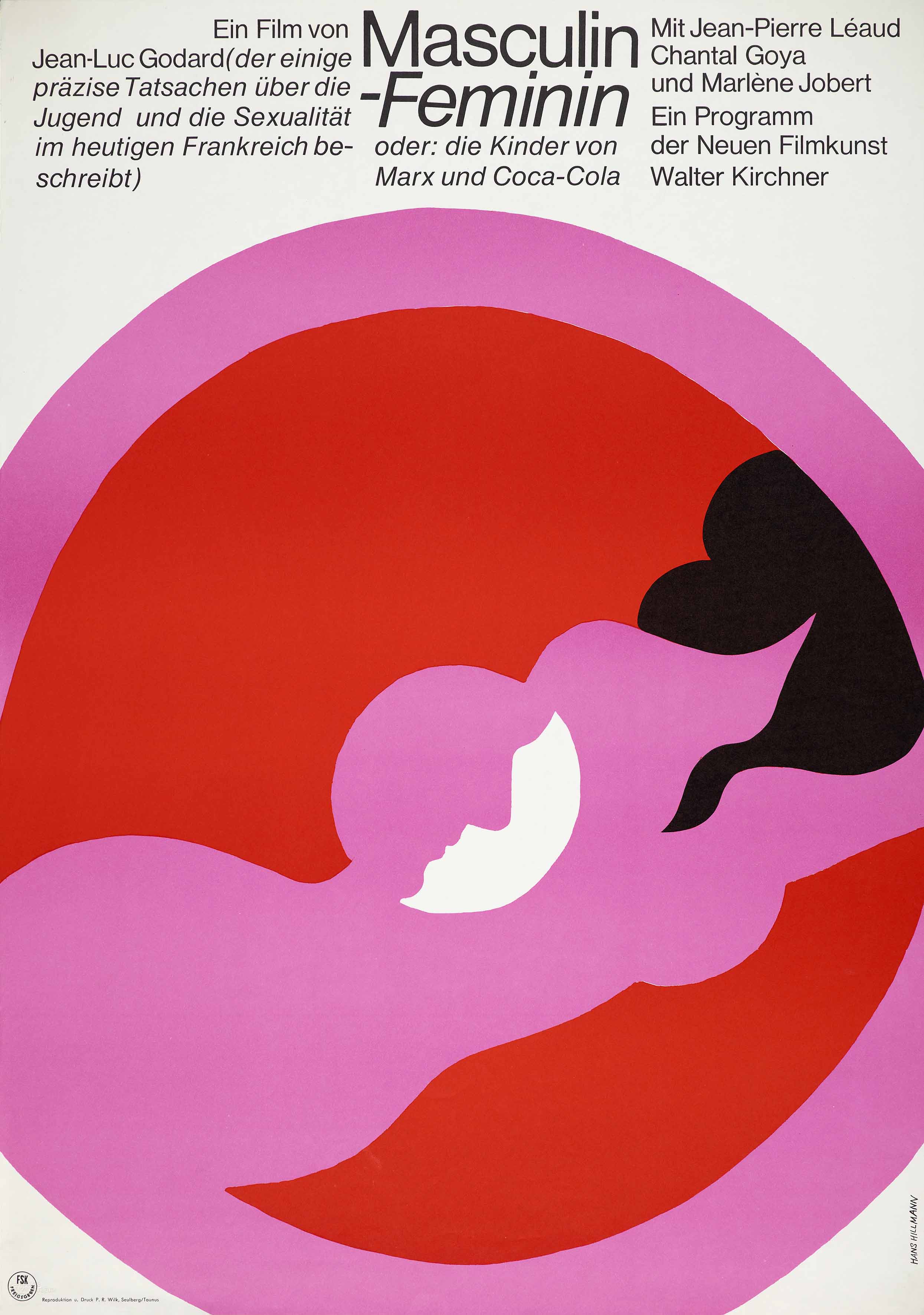
Masculin Féminin, 1967 (released 1966). On show at Kemistry Gallery
Here, I want to single out the eight posters Hillmann created for films by Jean-Luc Godard, three of which are on display at Kemistry. Even before Hillmann became his regular graphic interpreter for a while, Godard seems to have been an admirer. In Two or Three Things I Know about Her (1966) Hillmann’s poster for Alain Resnais’ film Muriel appears on a wall in the apartment of Juliette (Marina Vlady), the lead character. Later, as she sits in bed, we see a section of Hillmann’s poster for The Criminal Life of Archibaldo de la Cruz, directed by Luis Buñuel, behind her. Godard has applied a green background and a red outline to the off-white original to boost the graphic impact within the film image of the hand clutching a woman’s throat.

Two or Three Things I Know about Her, directed by Jean-Luc Godard, 1966. Poster for Muriel by Hans Hillmann
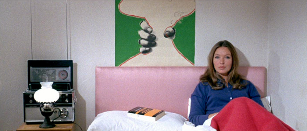
Two or Three Things I Know about Her, directed by Jean-Luc Godard, 1966. Poster for The Criminal Life of Archibaldo de la Cruz by Hans Hillmann
The order of Hillmann’s posters reflects the films’ appearances in Germany, rather than the original date of release. His first, in 1967, for Masculin Féminin (top), Godard’s study of French youth—dubbed “the children of Marx and Coca-Cola”—retains the shocking pink of Georges Kerfyser’s poster for the French release, but drops its constructivist montage and sociological manner for some stylized Pop sexiness that’s completely of its moment. As in the original Masculin Féminin poster, the aesthetic of the best French interpretations of Godard tends to stay close to the montage style and visual texture of the films, which are famously crammed with graphic imagery and typographic effects. When French designers borrow images from a Godard film, they like to convert them into a collage, as in René Ferracci’s near definitive fragmentary emblem for Two or Three Things I Know about Her, where the pictures’ ragged edges capture the energy and mood of the film’s freewheeling construction.
Confronted with the same film, Hillmann’s heavily typographic solution (below) is much more hard-edged and “Germanic,” and this is true of all his Godard posters, though his work for other filmmakers could be more relaxed and illustrative. With Two or Three Things, Hillmann opts for a rigorously engineered typographic image, though the centered title, combined with a left-ranging type panel, could never be called a doctrinaire modernist choice. The three negatives of Marina Vlady, descending from a close-up of her arm to a medium shot, have a harsh, early conceptual art feeling to them, making it evident, with no distractions, that the character is the film’s object of study. By 1968, psychedelic color effects were widely seen in album covers and posters. The poster’s extreme hues help to position the film, with every justification, for an adventurous younger audience of filmgoers.
It remains unusual for a designer with a strong personal style to be given the chance to devise so many posters for a filmmaker, and there is enough here to make one wish Hillmann had been able to do more: Une femme mariée, Pierrot le fou, Made in U.S.A. … He certainly ended on a high. His final poster for Godard, Le gai savoir (bottom), is one of his best interpretations—and surely one of the most Godardian of the set—the work of a designer confidently into his stride.
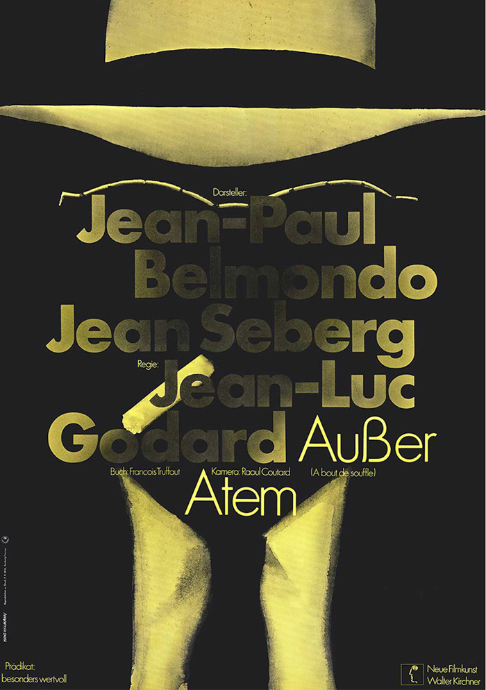
À bout de souffle (Breathless), 1968 (released 1959)
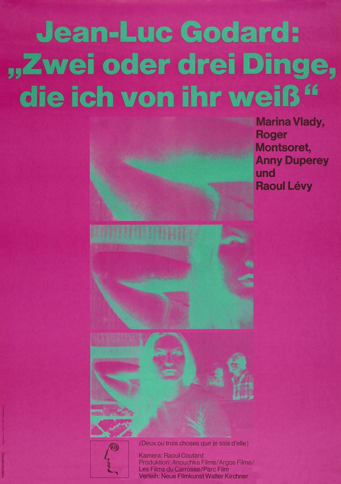
Deux ou trois choses que je sais d'elle (Two or Three Things I Know about Her), 1968
(released 1966)
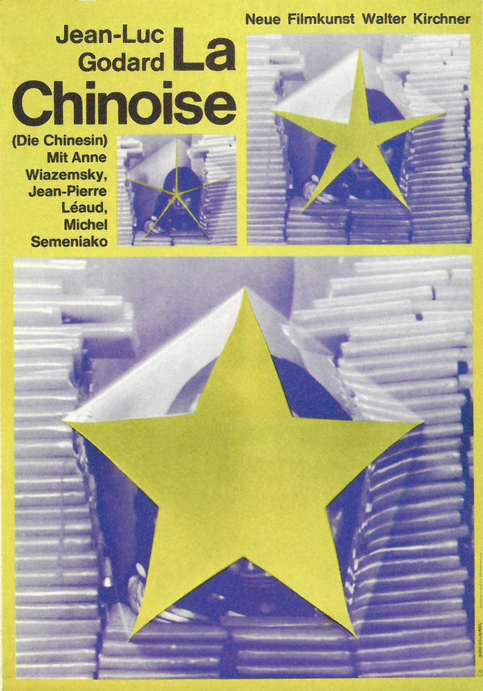
La Chinoise, 1968 (released 1967)
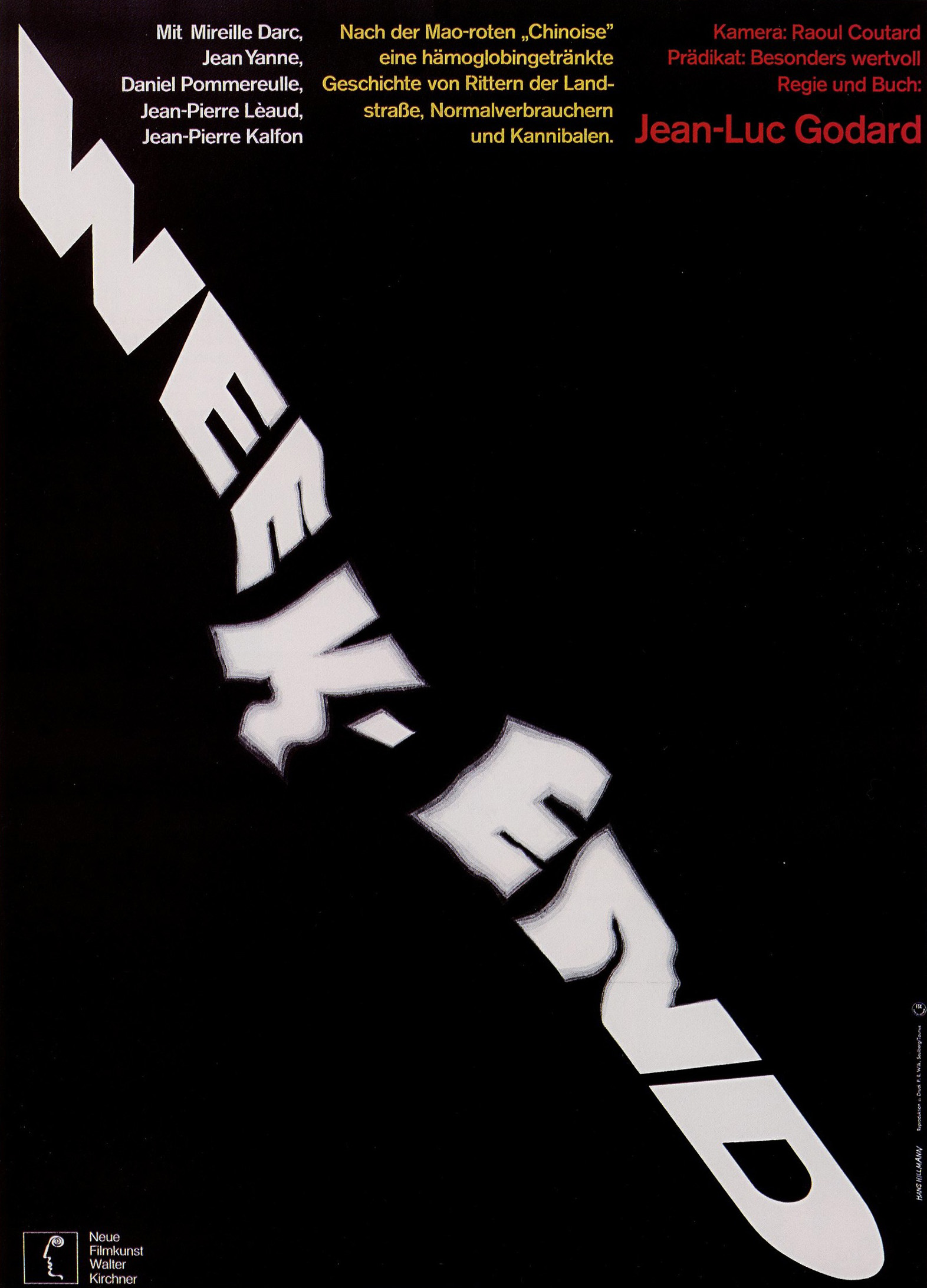
Weekend, 1969 (released 1967)
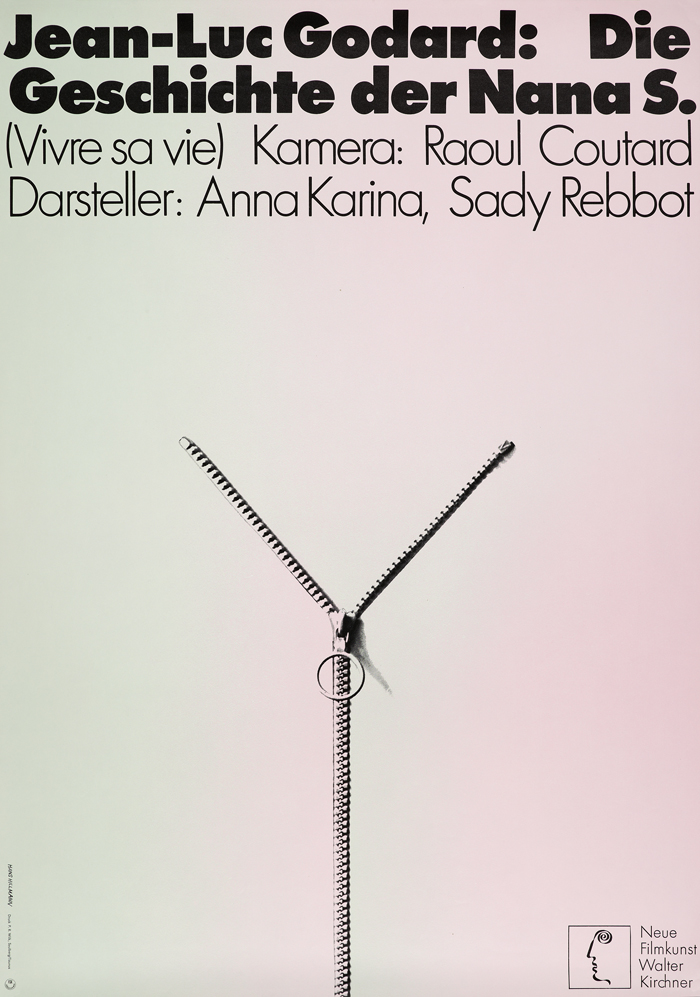
Vivre sa vie (My Life to Live), 1969 (released 1962). On show at Kemistry Gallery
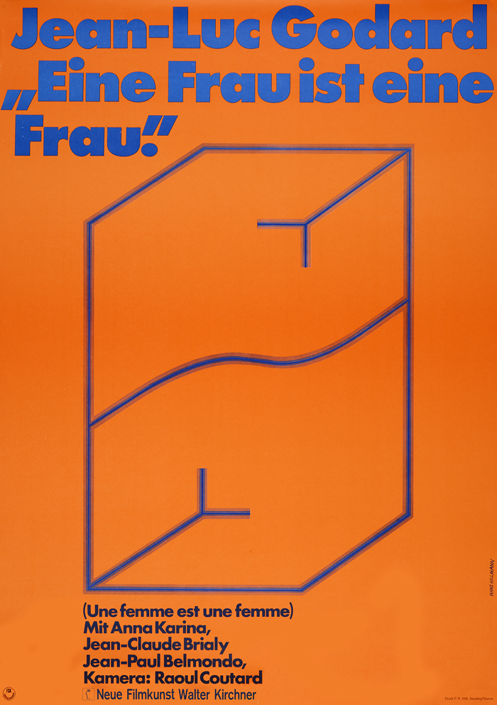
Une femme est une femme (A Woman is a Woman), 1970 (released 1961)
On show at Kemistry Gallery
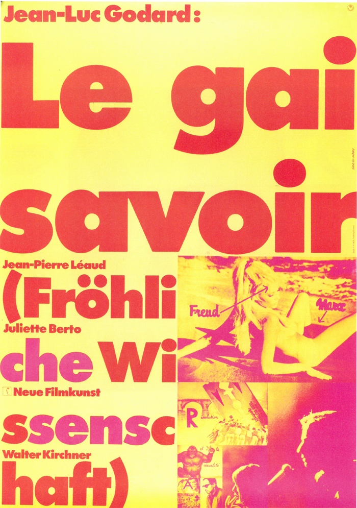
Le gai savoir, 1970 (released 1968)
Except for Weekend, posters courtesy of Museum Folkwang, Essen


Comments [1]
09.16.14
06:01