Matter, Denver, Colorado, 2011
When did the fashion for taking and publishing descriptive photos of graphic designers’ studios begin? In the 1980s and 1990s, you would often see that kind of picture in Japanese magazines such as the aptly named Designers’ Workshop. Japanese researchers would come to London (or wherever), interview trendy designers, collect images and samples of their work, and take matter-of-fact — not Phil Sayer-like — pictures of the designers’ environments: tables, computers, book shelves and storage. Back then, the geeky fanboy literalness of these images still looked distinctive as a journalistic device. It was not exactly news, after all, to find that a design studio used computers. In those days, we never took this kind of picture for Eye.
But something changed. Ubiquitous digital cameras made every kind of picture more commonplace and the ordinary and everyday are now a universal preoccupation. “Process” became a mantra for designers and it’s a short step from valorizing process to valorizing the place where the process occurs. Nor is it the case that all studios look the same. While certain fixtures are a given, there is an endless variety of ways they can be assembled and these are always revealing. At the end of Studio Culture by Tony Brook and Adrian Shaughnessy, a nice collection of shots provides an opportunity to ponder the exquisite shelf placements of Carin Goldberg, the folksy back-office profusion of Ed Fella, and the tyrannical tidiness of Mark Farrow. Last week I visited a studio in London I hadn’t been to before. It has a fantastic view of Smithfield Market next door, but space is limited and the four designers sat at their computers on the sides of a small square table, facing each other like poker players. They could almost have linked hands. I hope they all get on well. Their set-up looked challengingly intimate.
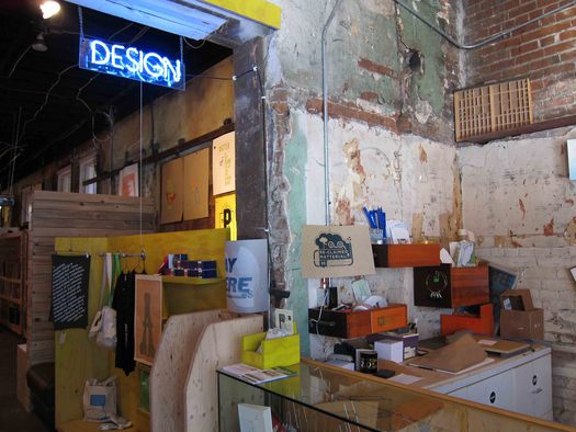 The Matter shop counter
I saw the studio shown here in Denver last year. Studio is something of an understatement. It’s more like a studio/print shop/dance club with a store selling funky self-printed material out front. I have visited many enviable design studios over the years, but this is the one I like most and if I were a designer in Denver, I’d be banging at the door for a job.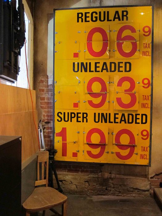
Gas station price sign
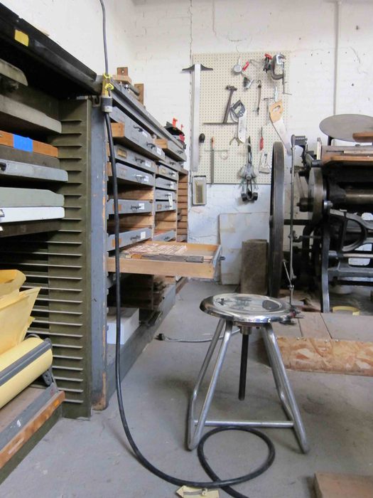
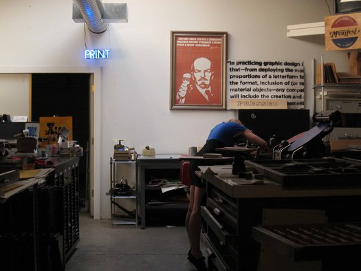
This paradisiacal playground belongs to a company called Matter and it was pure chance that I was there. Word reached me during a visit to the city that a designer called Rick Griffith would like me to drop by. Griffith turned out to be a fascinating character and we ended up spending time together. He comes from Britain — his family moved to Washington, D.C. in the mid-1980s when he was a teenager. He ran away and became involved in the hardcore punk scene. He still loves music and one of the first things you see inside the studio, after passing through Matter’s shop, is his vinyl record collection and a couple of DJ turntables. He is just as knowledgeable and passionate about type and the studio is full of letterpress, offset and screen-printing equipment. The closest typographical equivalent to Griffith in Britain would be a designer-printer-teacher like Alan Kitching and his letterpress Typography Workshop. But this post isn’t intended to be a profile, and if you’d like to find out more, there’s a thoroughly researched piece in Denver’s Westword magazine.
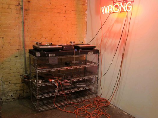
Rick Griffith’s turntables
At the end of my visit, I asked whether I could take some pictures. The space is huge, occupying three big open areas, plus smaller rooms, spread over two floors. All this for just a handful of people. In London, only a rich agency, with many staff to accommodate, could afford such a layout, though they would probably clean it up and make it look too polite.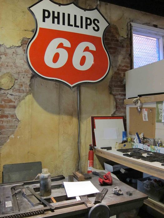
Gas station sign
I’ll let the pictures do the talking. Suffice to say that what I cherish about Matter’s studio is the thickness of texture that comes from leaving the shell battered, rough and unfinished, like a lovingly arrested ruin-in-progress, and then building it back up and overlaying it with tools, cans, shelves, drawers, posters, prints, proclamations, street signs, books, records, neon, and accumulated random clutter. It’s a three-dimensional projection of the creative imagination — of the process — turned loose. Order out of chaos. A space of freedom inviting you to roll up your sleeves, pull down an inspirational design history book from the library, and start thinking with your hands. It would be impossible not to get energized there and do great work.
 Matter’s print shop
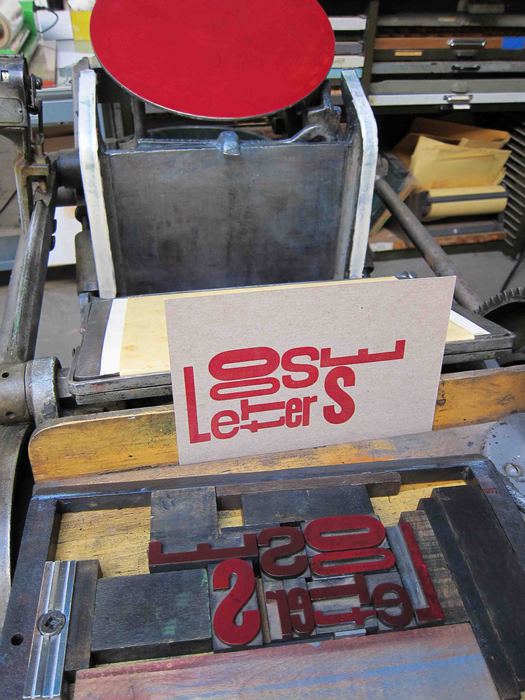
Letterpress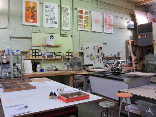 Second print shop
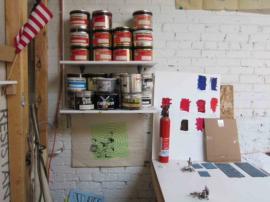 Color tests
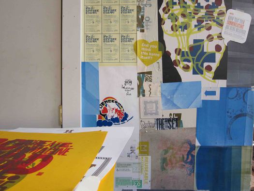
Printed material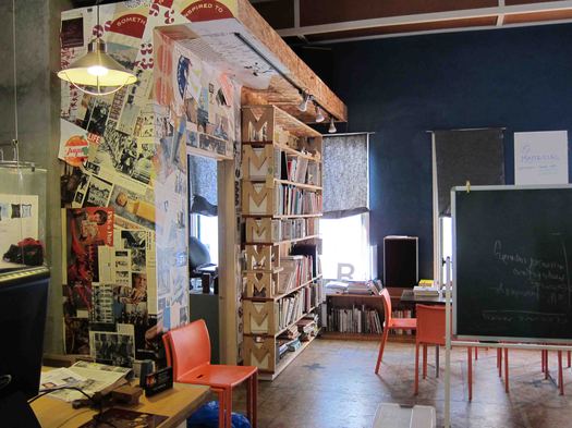
Office and meeting area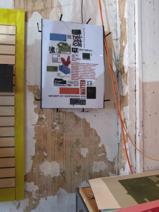
Matter poster: “In practicing graphic design it is implied that . . . any competent attempt
will include the creation and application of some sympathetic agreements”
Photographs: Rick Poynor
See also:
On Display: The Kirkland Museum


