June 29, 2020
An Interview with Milton Glaser + Walter Bernard

The following is an excerpt from Mag Men (Columbia University Press, 2019) by design writer Anne Quito, profiling the work of Milton Glaser, who died last week on his ninety-first birthday. In coming days, and in honor of Glaser’s remarkable design legacy, we will be publishing a number of Quito’s essays. This is the first.
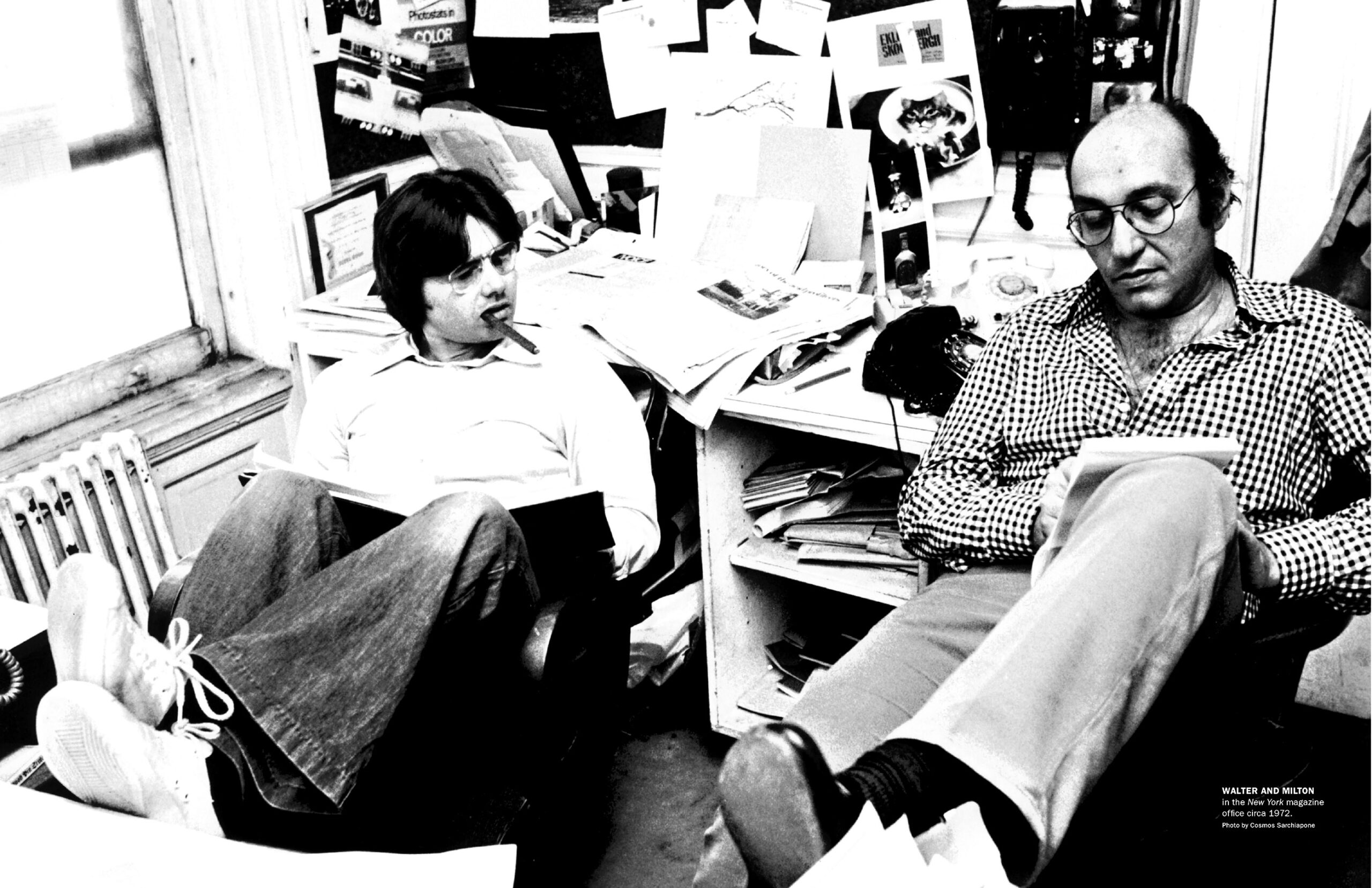
A magazine is designed to arrive in our hands as a perfect package. Whether a school publication or a major newsstand periodical, a magazine offers a lively assortment of items that seem to come together seamlessly. Of course, this is an illusion, as Walter Bernard and Milton Glaser will quickly tell you. The award-winning graphic designers, who have worked on over 100 publications, know that each issue involves an enormous amount of teamwork, logistics, and luck. What follows is my interview with Bernard and Glaser about their five decades in the business.
Anne Quito: When did you first become interested in designing magazines?
Walter Bernard: After a long day’s work as a carpenter, my father relaxed by reading the Saturday Evening Post and Life magazine after dinner. I remember snatching them up as soon as he was done. We had no TV until I was a teenager, so those magazines showed me the world beyond New Jersey. What thrilled me the most were the famous illustrators of the period: Norman Rockwell, Stevan Dohanos, Albert Dorne, Edwin Georgi, Constantin Alajalov, and many others.
Milton Glaser: My introduction to magazines came via comic books. A lot of kids got interested in design and illustration because of comic books. You might say they were once a big educational force. I learned to draw by copying comics like Smokey Stover and Superman. Growing up, I also read Liberty, the Saturday Evening Post, Reader’s Digest, and all the things that fueled America through those years.
I didn’t specifically pursue magazine design, but the first professional job I held was at Condé Nast. Figuring out the dynamic between words and images has always been fascinating, but I knew early on that my interests went beyond designing publications.
AQ: How did the two of you meet?
WB: As a student, I knew of Milton from his many illustrations on paperback book covers. We first met when I took a night class at the School of Visual Arts that he and Henry Wolf taught. They were both very good teachers, but Milton was more articulate, with the capacity to explain things more fully.
AQ: Why begin this book with a quote from Henry Wolf?
WB: I think it explains how someone falls in love with magazines. Henry Wolf was the greatest magazine art director of that time. His work was clever, whimsical, and extremely elegant. As a regular Esquire reader, I dreamt of working for him. I never got that chance, but Henry did help me get a job at Esquire with Sam Antupit, who succeeded him.
MG: Henry and I were very good friends, but it’s almost funny that we ended up teaching a design class together because our aesthetic was very different. We often argued about how things should be done, though to some degree he mentored me, too. He loved the magazine business and did beautiful layouts. I learned a lot from him.
AQ: How did you get to work together at New York magazine?
MG: I was running Push Pin Studios with Seymour Chwast at the time and New York was one among many projects. As a weekly, it needed ongoing attention every day, and there was a problem of producing the ideas that we had. I knew Walter and knew that he could produce magazines of a professional quality that few people could achieve. I believed that we could work successfully together. I hired him to assist me in executing the magazine in the beginning, but eventually we shared that responsibility.
WB: I was in my fourth year at Esquire magazine in 1968 when the call came. I was hoping I would hear from Henry Wolf. To my surprise it was Milton, asking if I’d be interested in working with him at New York—an offer I couldn’t refuse. I came on board and began our nine-year adventure. Those fruitful years working together gave us the idea of forming a publication design studio in 1982. We called it WBMG (our initials), which in retrospect sounded like a radio station.
AQ: Before desktop publishing, how did it all get done on time?
WB: Magazines were certainly produced by hand. We specified type, pasted up layouts, and corrected mistakes by inserting missing characters with glue and tweezers. I remember one closing night, Gloria Steinem was with us editing her George McGovern story to fit. With no time to reset the manuscript, we made the corrections by hand, letter by letter. In those pre-computer days, producing an issue involved complex logistics.
For example, at New York magazine, our close was early enough on Thursday so someone could make a train to our printer in Philadelphia. At Time magazine, our couriers took a flight to Chicago twice a week to hand-carry the mechanicals to our printers. In fact, we prepared a duplicate packet of the entire issue in case anything went wrong in transit.
AQ: You have helped shape magazines about politics, advertising, literature, business, sports, fashion, even pregnancy. How did you find a way into such a diverse range of topics?
WB: In all cases, you learn about any subject from a strong editor. True, some art directors have a flair for particular topics because of their personal interest. Designing a sports magazine might have bored Milton, but it was exciting for me. But a knowledgeable editor with a strong point of view can guide you to developing an appropriate design. New York magazine, being the eclectic publication that it was, also served as a great training ground. In addition to covering politics and culture, there were articles about food, shopping, real estate, and crime that made it into the main well. We worked in an open space like a newsroom. Editors, writers, and designers mingled and learned from each other.
AQ: As consultants to magazines, how did you navigate the internal politics of established publications?
MG: Our personal friendships with clients helped. Sir James Goldsmith, a dear friend of mine, owned L’Express and Lire. He introduced us to the staff, which made things smoother. The same goes for Katherine Graham, whom I met through Clay Felker. Knowing that we had her support gave us confidence when working on the redesign of The Washington Post.
WB: We always emphasized that we were there to help. Occasionally we were asked to evaluate the design staff, but we always tried to convey that we were there to support them. We were in and out of projects fairly quickly, so we did not get involved in office politics. The Washington Post was an exception. Our involvement lasted for over a year. Ben Bradlee, the executive editor, and Donald Graham, the publisher, asked me to spend several months listening to every editor in each department. Shelby Coffey III, the deputy managing editor, arranged for me to meet with the typesetters, sales people, pressmen, and delivery truck drivers. Bradlee and Graham wanted me to know everyone and for everyone to know me. It really did help to smooth the way.
AQ: Collaboration is a major theme of this book. Why?
WB: Because it is an essential part of magazine work. The art department is like a kitchen, where all the ingredients and the cooks come together. This is often where decisions are made, negotiations take place, arguments are resolved, and ideas are exchanged. If you wanted to see how an issue was progressing, you would go into the art department. At New York magazine, for example, our large flat filing cabinets—like a big kitchen table—served as an informal gathering place where discussions flourished.
MG: At New York especially, it was a sense of collaboration that bound us and made the experience so satisfying. In some ways, we retain a relationship to all of those who ever worked there. We shared that moment in time; the sense of purpose and affection made us a community.
AQ: WBMG’s managing editor, Killian Jordan, says your greatest strength was that you took “a full-bore approach to every project.” Was that always appreciated by editors?
WB: We were a small studio and we only took a few magazine projects at a time. We usually had one major project and several minor ones. This means we could really pay attention to each, and work closely with the editors. For every magazine project we took on, we can honestly say that we designed it and didn’t simply pass all responsibility to our staff. Our clients expected that when they hired WBMG they were really working with W.B. and M.G.
AQ: What other projects did you work on at WBMG?
WB: Aside from magazines, we have designed five major newspapers: The Washington Post, Barron’s, La Vanguardia (Barcelona), ABC (Madrid), and O Globo (Rio de Janeiro). We also designed several books. The most ambitious one was Our Times: An Illustrated History of the 20th Century, edited by Lorraine Glennon and Daniel Okrent.
Our former New York magazine colleague Nora Ephron got us to venture into designing film titles. We enjoyed working on the title sequence for five of her films, including Sleepless in Seattle and You’ve Got Mail. There is a common thread through all these projects. They all deal with the news and storytelling.
AQ: How do you handle criticism?
MG: I’m interested in solving a problem and communicating information clearly. If you can orient the conversation to be about ideas, then you can avoid reducing everything to an ego issue. Sometimes you meet people who are forceful, intelligent, and respectful. They can lead you to do better work.
WB: I think criticism is informative. I still have a thick folder of reader mail—handwritten notes, faxes, telegrams—reacting to the 1977 redesign of Time magazine. It’s amusing to read them now, but I remember management made sure that I saw every piece of feedback that arrived because they were nervous about all the changes we had made.
One time, a reader actually got through the switchboard. I picked up the phone and heard an irate subscriber complain that he couldn’t find a thing in the “confusing” new format. I suggested we go through the issue together. In the course of doing so, he decided the magazine was slowly improving and wished me luck. You are never happy to hear anything bad about your work, but there’s always another issue to prepare and you have to move on.
AQ: How do you design for the short attention span of readers?
MG: When we were working at New York magazine in the 1970s, we learned that the attention span for uninterrupted reading of most people then hovered around seven minutes. This coincided with the length of two commercial breaks in most TV programs. We designed features to be read by somebody with the temperament of the so-called “TV generation.” The design of New York had constant interruptions—headlines, subheads, drawings, jokes—all to prevent reader fatigue and loss of attentiveness. There’s a psychic load in the mere act of turning a page. I’m familiar with the anxiety that piles of beautiful, unread magazines bring to people. Magazines tend to accumulate in my own house. I always resolve to thumb through them. The truth is, I rarely do. It’s a matter of discretionary time.
AQ: Do you think it’s essential for graphic designers to be good readers?
MG: Absolutely. Reading inspires a respect for language. That balance between narrative and visualization is critical. It’s true you can be a gifted artist without ever reading. There’s no exact correlation. But for magazine designers, you have to at least get the gist of the article to know what you’re dealing with. In art school, they very rarely ask you to read books, but these are a few I recommend to my students: Art and Illusion: A Study in the Psychology of Pictorial Representation by E. H. Gombrich, Ways of Seeing by John Berger, and The Gift: Creativity and the Artist in the Modern World by Lewis Hyde. I believe you have to read the stuff that ultimately nourishes you.
AQ: Are print magazines still important today?
WB: Yes, but in a different way. Magazine and newspaper reporting still drives the culture and provides source material for the online media and television. But huge audiences are no longer reading the same issue at the same time like they did in the 1950s or ’60s. These days, magazines need their own online presence to gain readership and attract advertisers.
MG: Advertising in magazines has diminished because print doesn’t offer the interactive dimension that electronic channels do. But the reason print remains interesting is you respond to it differently. First of all, its permanence gives you a sense that it’s more important and that it is retainable. This is the element that keeps print alive. Sometimes, the material you read is so satisfying that you want to hold on to it. Of course, this is not always the case because there’s a lot of trivia in magazines today. The role of magazines shifted from providing understanding to entertainment. That’s a big change. Almost everything in our culture today is about entertainment—the presidency is about entertainment. We shouldn’t misunderstand what that means.
AQ: So do you hold on to old magazines?
MG: I’ve been increasingly throwing away more stuff. It’s a process that feels both sad and exhilarating at the same time. It’s great to get rid of all the stuff that no longer means anything to you. In doing so, you get to examine your understanding of “meaning.” That reinforces some idea you have about your own historical past that you want to retain. Outside of that, there’s almost no reason for keeping anything. It’s an attitude I now have about books. They’re going into the landfills and they will bury us all. What you have to do is to find books that sustain your interest, the way a painting does. A great painting is always interesting, no matter how many times you pass it. This is what I’d like to try to do with books; to make a book that always has available something new to say each time you open it. That makes the book mutable—a live object.
AQ: What do you hope the reader takes away from this book?
WB + MG: This book chronicles our experience working with the many talented people who make magazines happen. We celebrate over 90 artists, writers, photographers, and editors who worked with us over the years. The work in this volume includes selections from our nine years at New York magazine, our time working separately, and the many years working together as “magazine doctors” at WBMG. Occasionally, we have each written a separate text, with individual initial bylines, but most of the book is in our collective voice.
We have tried to include successes and failures—some hits but also swings and misses. Along with an emphasis on graphics, we recount stories and observations from our many colleagues who contributed to the material in this book. Magazines are not created in a vacuum. External forces affect editors, writers, and readers. “In the News” items found throughout this book recall contemporary events, large and small, to help place the magazine story in a historical context.
On its most fundamental level, a magazine is a collection of energy and information. We hope the reader will take away an appreciation for the complexity, invention, and joy it takes to produce a good one.
Observed
View all
Observed
By Anne Quito
Related Posts
Arts + Culture
Ellen McGirt|Interviews
The face, reconsidered
Design Impact
Alexis Haut|Education
‘Thoughts & Prayers’ & bulletproof desks: Jessica Dimmock and Zackary Canepari on filming the active shooter preparedness industry

Design Juice
Ellen McGirt|Interviews
Making ‘change’ the product: Phil Gilbert on transforming IBM from the inside out
Arts + Culture
Alexis Haut|Interviews
How production designer Grace Yun turned domestic spaces into horror in ‘Hereditary’ and heartache in ‘Past Lives’
Related Posts

Arts + Culture
Ellen McGirt|Interviews
The face, reconsidered

Design Impact
Alexis Haut|Education
‘Thoughts & Prayers’ & bulletproof desks: Jessica Dimmock and Zackary Canepari on filming the active shooter preparedness industry

Design Juice
Ellen McGirt|Interviews
Making ‘change’ the product: Phil Gilbert on transforming IBM from the inside out

Arts + Culture
Alexis Haut|Interviews
