March 25, 2011
An Unknown Master of Poster Design

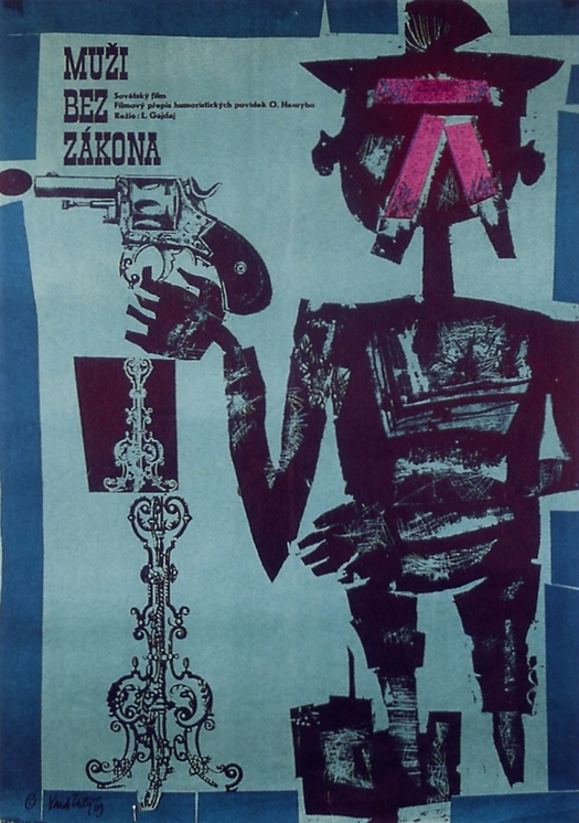
Karel Teissig, Business People, film poster, Czechoslovakia, 1963
Karel Teissig might just be the best poster designer you have never, or barely ever, heard of. I showed one of his early designs in a recent post about the East European film poster. An exhibition of his work opened in Prague on March 24, organized by the indefatigable Terry Posters, and I’m using that event (wish I could see it) as an excuse to show a few more Teissig posters, not that I need any prompting. One mission of this blog is to help promote wider awareness of the extraordinary era in graphic design history to which Teissig belongs.
It goes without saying that anyone from the Czech Republic, or Slovakia, or other countries in central and Eastern Europe, with a basic historical knowledge of design, will probably be familiar with at least some of Teissig’s work. But in the English-speaking design world he is all but unknown. You won’t find any mention of Teissig in graphic design histories by Philip Meggs, Richard Hollis, Stephen Eskilson, Johanna Drucker and Emily McVarish, or Patrick Cramsie. He’s not in French design historian Roxanne Jubert’s historical survey either. And he slipped past Steven Heller’s recently updated and reissued Graphic Style. I could go on.
Yet Teissig (1925-2000) is not just good — he is fantastically good, as I hope the seven posters shown here will instantly make clear. Teissig was a world-class poster designer of great inventiveness, originality and power, his achievement only a little blurred, even within Czechoslovakia (as it was then), by the fact that there were a lot of excellent poster designers working in the country in the 1960s when Teissig and his colleagues produced their finest film posters. I hope to return to some of the other remarkable designers in future posts.

Karel Teissig, The Demon, film poster, Czechoslovakia, 1965

Karel Teissig, The Beast is Loose, film poster, Czechoslovakia, 1966
Very little information about Teissig has been translated and I have seen nothing written in English. The best source I know is the excellent Czech Film Posters of the 20th Century edited by Marta Sylvestrová and I’m indebted to that book for the details that follow. Teissig studied at the Academy of Fine Arts in Prague (1945-50) and at the Académie Royale des Beaux-Arts in Brussels (1948). He worked as a painter, graphic artist and illustrator, and later did some writing; his book Drawing Techniques, which can still be found, was published in 1986. In 1961, Teissig won second prize for a poster titled The Possessors in the Toulouse-Lautrec Prize international film poster competition in Paris. It was a modest work compared to many of his later posters, but it earned him an invitation to sit on the jury the following year with Jan Lenica, René Ferracci and Saul Bass.
“A successful film poster should be beautiful, somewhat mysterious, highly intelligent, brief and inventive,” said Teissig. “Shouting suits posters for food and other consumer goods. A film poster operates in a sphere of the spirit and emotions, and so meditation and philosophical concerns are in place here, tying threads to a contemporary feeling for life.”
Karel Teissig, Difficult Years, film poster, Czechoslovakia, 1967

Karel Teissig, Ten Little Indians, film poster, Czechoslovakia, 1968
I showed some of Teissig’s posters in my exhibition Uncanny: Surrealism and Graphic Design because his work displays a clear debt to Surrealism. Here, this can be seen most obviously in the dolls — derived from the German artist Hans Bellmer — that inhabit posters for The Demon, Ten Little Indians and The Last Butterfly. In a more diffuse way, the Surrealist influence also guides Teissig’s use of collage: the candlestick holder, the pistols, the rose, the cut-out eyes and other body parts, and Jane Fonda’s magisterially floating, disembodied head. Shockingly “present” and commanding, Teissig’s graphic apparitions emerge from whatever comes to hand. In The Beast is Loose, he forms the mouth parts, ferocious teeth and monstrous countenance from nothing more solid or intrinsically disturbing than torn edges and cut papers. The effect owes almost as much to Expressionism as Surrealism. The gun-toting figure in Business People has the abrasive outline of a woodcut and the left-hand figure’s face in Ten Little Indians is a leering Expressionist mask.

Karel Teissig, A Doll’s House, film poster, Czechoslovakia, 1974
Accustomed as we are now to public images devised to be stylish, cool and aspirational, while saying nothing and offending nobody, Teissig’s confabulations could seem almost grotesquely insistent. He can make even an innocuous porcelain doll appear to be lost in the depths of unshakable melancholy. No beavering team of strategy-minded “creatives” could ever have thought up these magical and mysterious icons. Teissig’s posters express emotions and perceptions that might take their cue from some aspect of the film, but that go far beyond mere advertising, using the full resources of art and design, in new alchemical fusions, to pique viewers’ interest and usher them into a realm of imaginative freedom. And all this under Communism, too.

Karel Teissig, The Last Butterfly, film poster, Czechoslovakia, 1990
Observed
View all
Observed
By Rick Poynor
Related Posts

Business
Courtney L. McCluney, PhD|Essays
Rest as reparations: reimagining how we invest in Black women entrepreneurs

Design Impact
Seher Anand|Essays
Food branding without borders: chai, culture, and the politics of packaging
Graphic Design
Sarah Gephart|Essays
A new alphabet for a shared lived experience
Arts + Culture
Nila Rezaei|Essays
“Dear mother, I made us a seat”: a Mother’s Day tribute to the women of Iran
Recent Posts
Courtney L. McCluney, PhD|Essays
Rest as reparations: reimagining how we invest in Black women entrepreneurs Food branding without borders: chai, culture, and the politics of packaging Why scaling back on equity is more than risky — it’s economically irresponsible Beauty queenpin: ‘Deli Boys’ makeup head Nesrin Ismail on cosmetics as masks and mirrorsRelated Posts

Business
Courtney L. McCluney, PhD|Essays
Rest as reparations: reimagining how we invest in Black women entrepreneurs

Design Impact
Seher Anand|Essays
Food branding without borders: chai, culture, and the politics of packaging

Graphic Design
Sarah Gephart|Essays
A new alphabet for a shared lived experience

Arts + Culture
Nila Rezaei|Essays

 Rick Poynor is a writer, critic, lecturer and curator, specialising in design, media, photography and visual culture. He founded Eye, co-founded Design Observer, and contributes columns to Eye and Print. His latest book is Uncanny: Surrealism and Graphic Design.