Posters have always existed in that tension-filled space between culture and commerce, situated somewhat precariously between the fine and applied arts. If nineteenth-century posters offered pomp and proaganda, early twentieth-century posters created a canvas in which expressive typography mixed with theatrical juxtaposition to produce new formal languages. In the interest of blog-brevity, this is a rather generalized view of the last 150 years of poster history, but throughout this time, it might be argued that a poster has always been seen as a kind of visual tonic, an antidote to chaos — and something which, by sheer virtue of its scale, can knock you right over. "Some one sole unique advertisement," as James Joyce once wrote, "to cause passers to stop in wonder, a poster novelty, with all extraneous accretions excluded, reduced to its simplest and most efficient terms not exceeding the span of casual vision and congruous with the velocity of modern life."
Posters seem a somewhat antiquated form of expression, at least the paper kind. European airports are everwhere poised to entertain the time-pressed traveller, offering serially-static psoters — that is, mechanical installations that change their poster display every 15 seconds. Billboards, too, offer interlaced installations in which the image shifts, like an oversized venticular, as you move past it. (Some years ago, an environmental group in the UK was nominated for a BBC design award for a billboard made from litmus paper: the message was revealed after it rained.) Just as the non-fiction television screen is compartmentalzed to mimic the single-screen multitasking of the typical computer interface, so, too, have posters responded to modern conditions in a way that, well, might just not be soo good for the poster.
Or is it? Over the past decade, my father has been slowly curating a collection of AIDS posters from all over the world, for the National Library of Medicine in Bethesda. The collection includes posters in many languages, from many cultures, some deeply cryptic and others, deliriously overstated. Some are comic. Others are tragic. Some are both, and others, neither: they're just scary and real. The more primitive posters — ones using presstype or line drawings — are, in a way, more powerful because they represent a more urgent demographic. In this view, the more removed sophistication of professional graphic design is, arguably, less moving (and certainly less powerful) even if, as a consequence of its authorship and sleek means of production, it is likely to be more widely disseminated.
So: What makes A (Good) Poster? These questions come up often with my students, many of whom are somewhat conflicted about the poster's form and function. And they are not alone. In a world besieged by multiple media feeds, has the paper poster become an imperiled species?
Certainly, by sheer force of personality, the poster can be an arresting form: bold, aggressive, in your face. On the other hand, it has no musical accompaniment, and disappears when you walk away from it. (So does a painting.) However, it can multiply and, like television, it can be serialized. Like architecture, it can both envelop and distort space. As a public medium it is, in a general sense, rather democratic. Malleable and transportable, it can be folded and rolled, mailed and sent anywhere. Yet unlike the internet, it does so in a form of real time which many of have come to see as not very real at all, because it implies waiting. In a world of immediate kinetic gratification, the poster may be said to have a rather diminished impact.
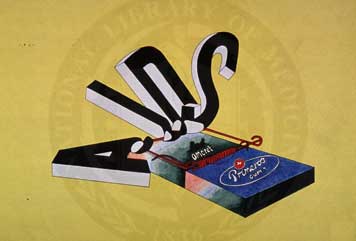
Or does it? In perusing the posters at the NLM (there are more than 5,000 of them in the collection there, of which a sampling of more than 200 are online here — you have to enter AIDS posters in the keyword search) I stumbled on this poster which I found quite compelling. Simple and stark, not immediately recognizable, and not altogether successful in its message: a box (of condoms?) trapped in a mousetrap and wrestling with the skewed letterforms that represent a lethal disease. It could be an advertisement for chewing gum in Spain from the 1930s. But it is a poster, dating from the early 1990s, and its implied message is that AIDS is a killer.
While I am ordinarily one of those very literal people who like justified type, I like this poster. My father, on the other hand, hates it. He writes, "This is an interesting example of what I feel is a bad poster. I think the mouse trap contains a condom, and therefore will catch the offender, AIDS, and thus be an effective disease preventative. But while the condom will prevent AIDS, I do not think the poster is an effective one at all. Posters have to make an immediate impact to get the viewer to grasp the message in less than five seconds or so. There is too much competition from other messages to provide time for restful contemplation."
As restful contemplation is always a good thing at Design Observer, I turn this over to our readers and contributors. Obviously, what a poster "is" is not an absolute. On the other hand, I scratch my head when I see students showing huge posters with unrecognizeable 6-point type, leading me to suppose that Joyce may have been not only right, but oddly prescient in his observation. The Ulysses quote is infact Bloom's comment as a response to the question, "What were habitually his final meditations?"
Contemplation, meditation: but wither the poor poster?


Comments [7]
To answer your question, I don't see a contradiction between immediate impact and restful contemplation, at least as far as posters are concerned. In my view, the first read of a poster should stop you on your tracks. It should also open up the intellectual space for the thoughtful consideration of the subject. The best posters allow for multiple readings, even as they convey their message in a clear, forceful way.
01.13.04
01:45
There are some questions we're never going to get a single, universal answer to because sometimes, especially when it comes to creativity, formulas are best left unused--unless a formula happens to work, of course, but that's beside the point.
Maybe its just my way of looking at things, but I tend to be totally intuitive and solutions-oriented rather than process-oriented and analytical. Do whatever it takes, do it from the gut, and leave it at that...this informs how I, personally, react to things and judge them. I can't sit around analyzing the living shit out of every detail, it either works or it doesn't, I either remember it or I don't.
And when it comes to critiquing unfinished work, my guideline is to simplify. I dunno. Get rid of what's not working, find a vein to inject more energy.
A good poster is something you remember. It's explosive. That can happen in a million different ways, trying to figure out how & why that happens is no different than designing a diagram that instructs others on how to fall in love with someone. There's not much rhyme or reason to it, for better or for worse.
01.14.04
06:09
http://www.misleader.org/daily_mislead/read.asp?fn=df12042003.html
in connection to "Truth & Message" moments (Peter Hall and Natalia Ilyin) --
http://designinquiry.meca.edu/designinquiry.html#words
-- wondering when the false, the prop, the lie really does carry the most truth... and where too this lives in the designer's purview of persuasion.
01.15.04
10:02
"Some one sole unique advertisement," as James Joyce once wrote, "to cause passers to stop in wonder, a poster novelty, with all extraneous accretions excluded, reduced to its simplest and most efficient terms not exceeding the span of casual vision and congruous with the velocity of modern life."
That graphic design is cited in Ulysses, is a wonderful surprise, expecially as an answer to Leopold Bloom's question, "What were habitually his final meditations?"
In a recent review (Times Literary Supplement, December 12, 2003) of Graphic Design, Print Culture, and the Eighteenth-Century Novel by Janine Barchas, I was struck by the phrase "a literary dimension of graphic design." This book acknowledges the influence of graphic design on the work of Alexander Pope, Daniel Defoe, and Samuel Richardson.
Without suggesting that Design Observer become a literary-obsessed site, I am intrigued that recent posts have been about James Joyce and Vladimir Nabokov. It strikes me that the "literary dimension of graphic design" is territory well worth exploring.
01.19.04
11:32
02.01.04
12:36
there are several thousand poster "artists" in evidence on this one site and that is still a fraction of the total number of folks out there making these things. it takes a lot of time to really get an overview of what's there and what is the best, but it's worth the effort.
frankly, i have a hunch that the next generation of great american illustration will emerge from this group. as for design, well, i have a hunch there as well.
please check out gigposters.com.
02.25.04
10:21
you have drawn the AIDS letters in a very unique and nice picture in the article titled: "The Span of Casual Vision"
I am wondering if you will be nice enough to guide me on the type of software that can be used for this purpose.
Best regards
RL
[email protected]
04.23.04
02:46