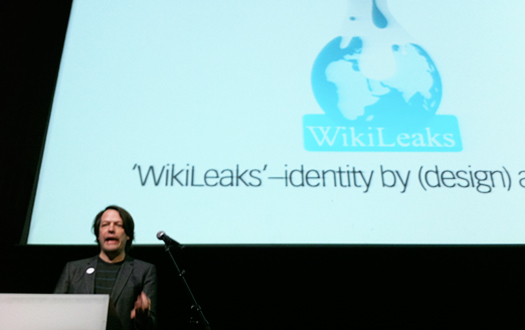
 Daniel van der Velden at "I Don't Know Where I'm Going But I Want To Be There" conference, Amsterdam, December 18, 2010
The Dutch design research studio, Metahaven, took a bold, newsworthy step last weekend in Amsterdam by proposing new graphic identity options for WikiLeaks. Presenting at the conference, "I Don't Know Where I'm Going But I Want To Be There," sponsored by the Graphic Design Museum of Breda, The Netherlands, Metahaven partner Daniel van der Velden suggested new approaches for WikiLeaks' visual identity. (His partner and collaborator is Vinca Kruk.)
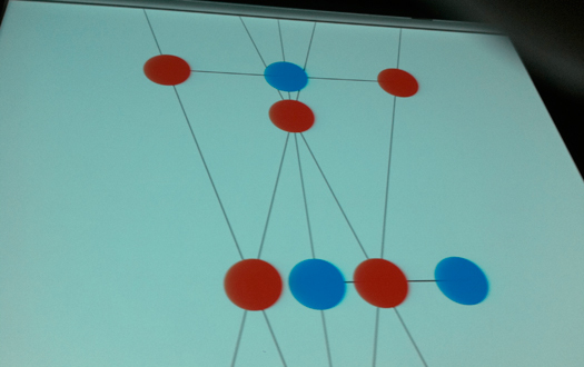
Metahaven reached out to Julian Assange, the infamous founder of WikiLeaks, in June 2010 (way before the controversy started) with an email proposal that they revisit the WikiLeaks graphic identity, and they received a succinct reply: "Absolutely, J.A." Consistent with a proactive stance towards design research, this message was enough for Metahaven to assume they had a project and a client. They have since proceeded to map the network supporting WikiLeaks, an image economy where network architecture, hosting, funders, and media all play key roles. Described as "transparent camouflage," the world of WikiLeaks mutates under the pressures of secrecy versus transparency: ironically it's network is secret in order to publish freely. In fact, Metahaven has suggested that its map of WikiLeaks cannot be published or shared — it's too accurate for a WikiLeaks under investigation and potential indictment in numerous countries. Further, we should consider the "zones of journalism" that simultaneously support and critique the impact of WikiLeaks.
One hopes that Metahaven will fully publish its work for WikiLeaks on their site. Metahaven's information map of WikiLeaks is the most important part of their work, and reminds me of the work of Mark Lombardi, conspiracy theories and all. In the meantime, they are releasing ("leaking") posters in support of WikiLeaks for every country in the world.
The images below do not do justice to the work of Metahaven, and are only directional in suggesting the range of proposals they have suggested for a new WikiLeaks identity. This said, I was disappointed that there was not a more concrete WikiLeaks proposal. Metahaven seems to always want to explore and publish many options as a part of their research, much like design students. Yes, I can find a bit of Dutch formalism, a bit of petri-dish scientific formalism, or a bit of IKEA formalism. But I don't see a new identity for Wikileaks that supports them in crisis, or critically suggests that they are in fact doing damage. I keep wishing that Metahaven would take a firmer stand.
This critique aside, Metahaven was the only firm at "I Don't Know Where I'm Going But I Want To Be There" to present fundamentally new work — and work that grapples with a truly contemporary political issue. Kudos.
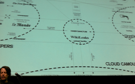 Daniel van der Velden at "I Don't Know Where I'm Going But I Want To Be There" conference, Amsterdam, December 18, 2010. Detail of WikiLeaks map by Metahaven
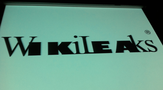
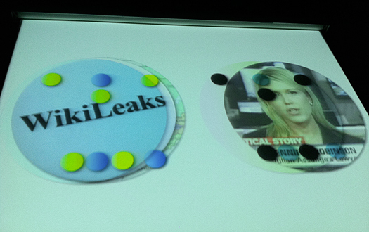
Metahaven, WikiLeaks logo proposal
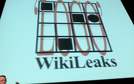 Metahaven, WikiLeaks logo proposal
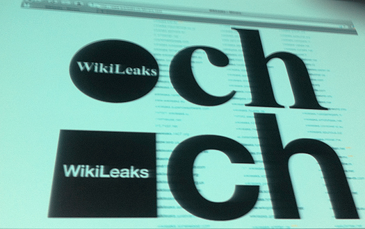
Metahaven, WikiLeaks logo proposal
Metahaven, WikiLeaks logo proposal
Metahaven, WikiLeaks logo proposal
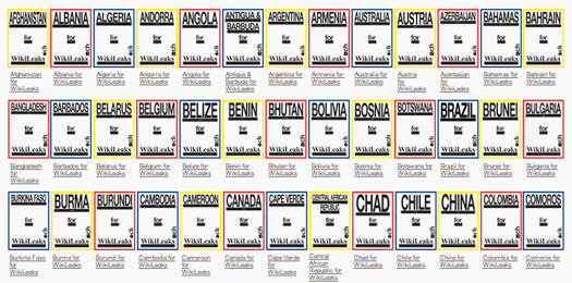
Metahaven, "Leaked" WikiLeaks posters, 2010


Comments [14]
hat is off to Metahaven for asking the question and plotting the answer. Congratulations to both of you. Wiki deserves our support and our creative energies.
12.22.10
03:42
12.22.10
04:19
12.26.10
08:58
12.26.10
09:23
12.27.10
12:55
12.27.10
05:16
12.27.10
11:23
12.27.10
12:32
Many Stuff Interview mentioned by Emily Craig:
http://www.manystuff.org/?p=9986
I have also just published a 6500 word interview with Daniel van der Velden on Design Observer/ Observatory channel:
http://observatory.designobserver.com/entry.html?entry=23688
12.27.10
12:56
What is the point of saying the logo is "ugly?" Such discussion leads nowhere. Graphic design is not supposed to be about what one likes but about communicating meaning. About what works. And what works should be beautiful. I am not revealing anything new here -- this is what they are supposed to tell one in graphic design 101.
This is the second time in my life that i am posting commentary anywhere and might be my last time (first time it was also on a graphic design related blog). It is very easy to talk in this 2.0 world and as many mass phenomena in my life, this had a counter-effect on me. It makes me skeptical so I just do the opposite. I shut up. What can I do, I am subversive by nature or circumstance and come from the Balkans (but live in the US, if this explains anything). Why I am hesitant to talk in the 2.0 world? Look at the mass of blabbering that goes on every day, 24 hrs/day on all this social media and blogs. Even, look at the Wikileaks -- at the rate they are going, 250,000 cables will be released only in the next decade. And what is with a 500 gigs hard drive of the bank executive?Overall, in the 2.0 world what might appear as a lot of information might just be trivial, meaningless or a repetition of one and the same information. It seems that contrary to the seemingly obvious interpretation of the term 'information age' as man's mastery over the information, information appears to be the biggest problem of the information age. Another paradox of the 'information age' is that while the amount of available information is growing, attention span of an average human is shortening (as illustrated by the commentary to this article). What is information today? Does information as we know it even exist any more? Is information loosing meaning? And what do we (graphic designers) do? What is the raw material of our trade? Is it all this information and we are supposed to communicate it? And in that sense, it just might be that graphic design should become more important than ever. It almost seems as if the whole burden of the 'information age' just might fall on the shoulders of a graphic designer whose job is to make sense out of all this information and communicate it in a comprehensive, digestible, consumable portions to the world.
It is a great responsibility. Even Wikileaks is not exactly sure how this what they are doing is all supposed to work and what exactly they are about (journalism, activism, politics, technology...?). It doesn't matter, graphic designer must know regardless in order to create an identity. I think Spinoza said that intuition is a highest form of knowledge. Maybe this is the only way out of this. Who knows, it might lead to a better 3.0, 'age of intuition' world -- less rational, less materialist. And while I am quoting, another one comes to mind -- 'we must confront vague ideas with clear images' (jean luc godard). So please, if we are to conquer the beast of our (information) age we must not follow the general trend. We can't surrender our attention spans. We must still be patient enough to think, understand and feel. We must really stop blabbering nonsense for the sake of sole orgasmic pleasure of hitting various submit buttons.
01.15.11
01:37
The London Review of Books has a nicely skeptical essay about WikiLeaks in its latest issue by the ever provocative Slavoj Žižek.
"The only surprising thing about the WikiLeaks revelations is that they contain no surprises. Didn't we learn exactly what we expected to learn? The real disturbance was at the level of appearances: we can no longer pretend we don't know what everyone knows we know."
01.17.11
09:04
Metahaven's presentation was transparent, laying down its most recent design explorations on the table for everyone to see. The presentation was a glimpse into a work in progress. So refreshing.
And incredibly refreshing to see designers addressing WikiLeaks. There was an interesting panel discussion called 'WikiLeaks, the Internet and Democracy' from The Real News, where lawyers, professors and journalists discussed various aspects of the phenomenon. The conversations were smart, aggressive and funny, and often touched on public image, reputation and responsibilities; but alas, no designer at the table.
-----
tg: "It is interesting that there is so little and so ignorant commentary here despite the very engaging and popular subject... This is the second time in my life that i am posting commentary anywhere and might be my last time (first time it was also on a graphic design related blog)."
In other words, there is so little commentary, because the most interesting and opinionated people do not comment.
-----
tg: "What is the point of saying the logo is "ugly?" Such discussion leads nowhere."
Agreed.
However, its a discussion designers encounter on a daily basis—either from clients or other designers—with no clear way of dodging it. It's one thing to point fingers at amateurs who talk about their designs being slick and fancy; or at people who splash comments about the clumsy or ugly. But even "esteemed" designers and design critics from The West peddle weak notions of design as beauty, poetry—you name it—without explaining what they mean in smart or creative ways.
Rick Poynor was right. Until the design press stops behaving like a design appreciation club—or "glorified PR service" as he put it—design will continue to be treated as a pretty gadget at a tacky beauty contest. And for that, we have many professional experts to thank.
02.07.11
06:11
02.07.11
07:43
Sure, most DO designers—mostly Western designers—are busy pleasing clients and making things beautiful, inspiring, or whatever. But how can a forum like DO ignore this topic? It's completely transforming every sector of society. And how can the comments be genrally so silly and ridiculous?
Drenttel's article, as well as comments from tg, Rick Poynor, M.C. and Ced Lapa should have a permanent feature on the home page. Thanks Mr. Drenttel for trying to squeeze this one through the Design Observer crowd.
08.04.11
08:07