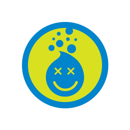
"Crunked" Foursquare badge, by Mari Sheibley
Continuing, perhaps, recent lines of thought on de-degitization, and stealth iconography:
I got interested a while back in the look (and ultimately the function, or more specifically the function of the look) of Foursquare badges. I ended up interviewing Mari Sheibley, Foursquare’s chief designer a couple months ago, and Slate has lately published the result of that conversation (and some additional research, and conjecture, by me).
A bit:
In the beginning, Foursquare co-founder Dennis Crowley had a set of 16 badge concepts and "an idea of what he wanted these to look like," Sheibley recalls. (She created that initial batch on spec.) Many of the early ideas were fairly conceptual: Not a place or a thing, but an idea tied to the use of Foursquare itself ("10 check-ins") or the kind of real-world social behavior the service was attempting to leverage (checking into the same place three times in one week, or checking in with two people of the opposite sex). The round shape and circular border directly referenced Boy Scouts merit badges. Beyond that, Sheibley says the relevant design context wasn't logos, it was the familiar instructional iconography meant to signal ideas without words: "How do you communicate to people in an airport, who don't speak the same language, where the bathroom is?"
…
Over the lasts two years, Foursquare has added scores of badges dealing with an ever-expanding range of concepts, but has pretty much stuck to its original aesthetic. "Overshare" is represented by speech balloons; "Gym Rat," a barbell-hoisting rodent. Back in 2009, the imagery had to work within more limited technical parameters (pixel counts, for instance) that narrowed some of the graphic choices. The original badges have been re-sized to bear the scrutiny of newer, high-resolution screens, but Sheibley has stuck with a less-is-more approach, for example limiting the number of colors in any badge to three.
…
"One logo represents a brand, but here it's almost as if the whole batch of badges, together, represent the brand," Sheibley says.
Also mentioned: Isotype, Ryan McGinness, Susan Kare, and Nerd Merit Badges.
Read the rest here.
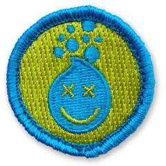
"Crunked" Fousquare badge, de-digitized, by Nerd Merit Badges
Previously and somewhat related:
On digital things made physical
On the Google Maps Pin as stealth icon