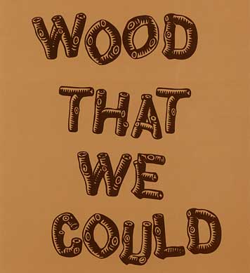
Invitation to exhibition at Moss, detail, designer unknown, 2007
Remember back in the late 1980s, when Minneapolis was a hotbed of graphic creative energy? Back when brochures were tied together with straw braid and twigs? As a counterpoint to the scrappy xerox fragmentations coming out of New York, or the pretty joyousness of work from San Francisco, Minnesota was making a play for the next big thing: the North Woods look.
Hark! What do I receive in my mail last week but this invitation to the newest, hippest thing: an exhibition at Moss of Jasper Morrison's Crate Series, and Richard Woods and Sebastian Wrong's Wrongwoods. Wood That We Could.
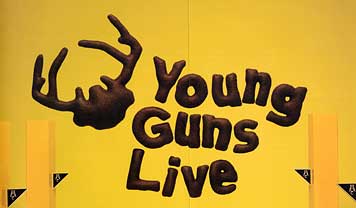
Young Guns poster, detail, design by Jennifer Lew & WSDIA, 2007
Then, continuing to sort the mail, there's the newest poster from the Art Director's Club by Jennifer Lew & WSDIA | WeShouldDoItAll for the their Young Guns event.
It's in furry moose type!
Could the North Woods look be back so soon?


Comments [17]
Did this back woods aesthetic ever extend outside the US?
I imagine it would make no sense in Europe or Asia.
10.03.07
08:03
10.03.07
08:28
10.03.07
08:51
10.03.07
09:31
this my first reply to DesignObserver, although i am a long time visitor. truly great place!
I am one of the principals at WSDIA and just wanted to give a little insight into the typeface used on the poster.
Jennifer constructed the type out of brown fabric and cotton. And is actually playful rendition of Mr. Hoefler's Gotham. The stuffed antlers was a rendition of Alan Dye's logo for the Young Guns 5 branding.
More images of the poster and postcards in production here.
10.03.07
11:36
10.04.07
12:42
but back to the point of this post,
Architecturally, the 'North Wood' aesthetic is definitely back, at least in NYC. Seems as though every store, hotel and restaurant is catching 'Cabin Fever'.
With architecture, comes graphics.
10.04.07
09:04
No, not really.
Perhaps if you lived and worked in the US, I remember Manchester most from that period.
10.04.07
01:38
You see that log type quite a lot in UK books and magazines of the Forties and Fifties, usually humour titles.
Variations go back at least as far as the Punch magazine of the 1860s which had its title rendered as tree branches:
http://www.spartacus.schoolnet.co.uk/punch1.jpg
10.04.07
02:08
which reminds me...
If you are too poor to afford membership or a ticket to such affluent affairs in the above post, how bout you dress up and meet outside such swanky places.
I'm thinking Ms. Hoosier might even show up outside the doors asking for directions to get inside the doors. Must be some secret tunnel for hippie chicks to become affluent designers?
Forever in blue jeans of course, or maybe yoga pants.
10.04.07
02:11
The successors to Figgins, Stevens, Shanks & Son Ltd appear to have still been casting them in the 1950s. Anthony Froshaug had certainly used them in his Cornish venture at this time; he designed the specimen for them during this period. Somewhere within the vaults of St Bride library the matrices may still exist
10.07.07
07:29
10.07.07
04:48
10.08.07
10:27
White Wall-1
White Wall-2
10.08.07
05:24
10.11.07
11:24
http://www.jwda.com
Long live Minnesota creative....
10.15.07
07:56
10.16.07
02:12