
July 31, 2018
Chain Letters Recap
As a UX Designer / Product Designer, what criteria do you use to assess which product ideas should be designed and developed further versus being left on the cutting room floor?
Everything must be backed with research. Of course, sometimes I have a gut idea and will go with it, but I always force myself to research if that idea will actually work. It’s absolutely crucial because as designers, we’re too close to the idea. It’s easy to get stuck in the details of things and lose focus of the big picture. It’s not because we’re bad designers. But, research is what helps us maintain the balance between what we think will work and what people actually respond to. The research has surprised me many, many times.
One important point I’d like to make: research is not just looking at analytics. Numbers only tell you the what, but people tell you the why. If you truly want to understand why a design solution is working, why people are doing the things they’re doing, then you have to go beyond the numbers and focus on the narrative—and that comes from talking to users.
Next week Sarah Doody asks lead UX designer at 3M Design Health Care Business Group, Briana Como: How does a team like the 3M Health Care Group balance being a part of a huge company with the need to comply with so many details and regulations that must come with designing for health product and services?
First of all, 3M is a big company—70 countries, 5 business groups, and 24 divisions. The Health Care Business Group (HCBG) has 6 divisions, and each product within can vary greatly in its goals, requirements, users, and regulations. So I asked the rest of the HCBG team to weigh in. Thanks to Stephen Hooper, Kristen Sewell, Matt Zabel, Amie Winkel, and Poeuth Pann for their thoughts.
Our human-centered design process keeps the focus on understanding and designing for the patient. We collaborate very early with internal stakeholders and business partners to lay out challenges, and we work jointly with Human Factors, Quality, and Regulatory colleagues throughout the design process, using formative usability testing to inform the design and summative usability testing to validate solutions.
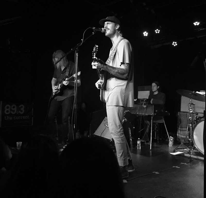
I find a lot of inspiration in music, and it’s a critical part of my design process. Here’s a recent show: Rayland Baxter at the Turf Club…
…and Glass Animals at the Palace Theatre.
Next week Briana Como asks Dian Holton, deputy art director at AARP: You mention on your website that you can concept 100+ solutions to solve a problem or visually tell a story, but have trouble editing down solutions. How have you learned to overcome this, and what strategies have worked (or not)?
Over the years I’ve tried many approaches to narrow down my final option. It pertains mainly to my publication design work, but you could apply it to other genres. For one, I figure out the visual pacing for the section at hand and where the design piece I’m evaluating falls in the issue. Then, if it involves a personality, I look to see what other people are near and how they’re being showcased. Are they close up, or pulled back, photographed in an environment, or on a seamless? Are they male, female, a person of color? I take all of it into consideration.
For instance, when I art directed the Upfront opener featuring Ann Curry for AARP magazine, I asked that we be given photos of her propped out in a variety of scenarios, because frankly, you can never have enough. Then I mocked up a few that could be swapped in as the Upfront section came together. From there I whittled down the composition before sharing it with upper management for final approval.
In other scenarios, I may poll someone outside the art department or office. This doesn’t speak to page pacing, but to visual appeal. Knowing the AARP Media brand aesthetic is important and while I’ve have had some success stories, I’ve had some that resulted in going back to the drawing board. But what can you say—you can’t knock it out of the park every time.

Next week Dian Holton asks creative director Ced Funches: Share a moment when you were realized the impact of your work on a community or specific demographic (this could be a negative or a positive) and how it changed you.
When I worked in the NBA I saw firsthand how impactful it was to my community to see an African American working in the front office. I have had so many individuals reach out and tell me that I have been an inspiration to them over the years, and that seeing me on TV, at large events, and featured in articles made a difference in their lives.
That experience changed my perspective on how important representation is and gave me a lot of purpose within my work. That moment made it clear to me that my purpose needed to be backed up with outreach and mentoring.

Branding for Omar Miller’s O-Zone sports podcast on UNINTERRUPTED

Sports branding for community college in San Diego, CA
Next week Ced Funches asks Jason Murphy, former design director at Nike: If you could change one troubling aspect you’ve experienced in the design community into a positive outcome, what would it be?
I’ve never seen African Americans given the opportunity to fall up. What I mean by this is, given the opportunity to make mistakes on the job or in their career and be given the latitude to learn from and be forgiven for them while on the post. We usually work with a never-fail-at-anything mentality because of the fear of being fired or perceived as frauds and charity cases.
On the other hand, while at Nike, I’ve seen how non-African Americans, usually white men and women, are continually afforded this opportunity in the corporate system. They are elevated to another job title while we get mined for our insights, creativity, and intellectual currency until we’re no longer needed. Eliminate the belief and practice that African Americans have to do three times as much and work three times as hard to just compete on the same uneven playing field of our non-African American counterparts.

Images from Nike “Hall of Phenomenal” in NYC
Next week: Jason Murphy asks Julian Alexander, Grammy-winner and principal of Slang, Inc.: What made you want to become a graphic designer, and how was it working with 
50 Cent during the start of his career?
A drawing teacher recognized my tendency to position things in unexpected places on the page. She mentioned that I’d be good at graphic design. After she explained what it was, I saw a path to making a living as an artist, started working on a portfolio, and went for it.
50 and I started working together in ’99. Three things that have been present from the time we met are his talent, hustle, and curiosity. He would sit in my office for hours while I was working and we got to know each other by talking about music and art. No other artists I’ve worked with showed that level of interest. Our relationship allowed me to better understand how to visually tell the story of “Get Rich or Die Tryin’” years later, which became the cornerstone of his brand.
Next week: Julian asks Lindsay Peoples, fashion market editor at The Cut: How do you handle situations where your personal style and the sensibilities called for in your professional work are at odds?
It’s always tough to figure out how you want to present yourself at work, especially if the culture and people aren’t what you’re used to. In the past, I conformed a lot to what other people were into, and now those pieces in my closet feel extremely foreign to me. I’m shocked I ever even wore them. My motto now is that, while obviously appropriate, I have the right to dress how I feel—whether it be bossy, casual, or sexy.
Next week: Lindsay asks Rhea Combs, Supervisory museum curator, photography and film, and director, Earl W. and Amanda Stafford Center for African American Media Arts at the Smithsonian National Museum of African American History & Culture: How do you go about making sure that African-American history in photography is preserved and upheld to the standard it deserves?
African American history is extensive, as some would imagine (and others rarely consider). Some historians have even said photography is the window in which to better understand history. Put another way, for some people, their initial point of entry into examining African American history starts with an image they have never seen before about a topic ‘they thought they knew.’ Often times, seeing an unfamiliar image from a seemingly familiar topic sparks questions that allows people to seek more information.
This perspective motivates me when collecting images. As it relates to preserving those images, it is fortunate to be at a museum like the Smithsonian, a place that prides itself in adhering to best practices. It is critical to seek as much information as possible about the subject or context of an image. This becomes an important way of preserving the image and African American history. When we are able to identify the subject in the photograph, and obtain substantiated information about the circumstances surrounding the photograph, we are able to preserve lesser-known facts about American history told through the African American lens.
Another way to explore this question of preservation is from a conservation standpoint. In this sense, curators work closely with conservators to make sure we are exercising the best standards possible in order to ensure a photograph is able to be around for decades and doesn’t fade or fall into disrepair. Curators work closely with conservators to determine the best course of action. In some instances, a digital reproduction is decided to be the best thing that will preserve an image. The photograph could be too fragile to be on display for more than three months at a time. Knowing how long we generally have exhibitions on display, we often have to use a graphic image in lieu of putting the actual object in jeopardy.
In other instances, we will rotate images off display in order to preserve them. Curators also work closely with conservators to determine the best light levels for putting something on display as well to ensure it doesn’t fade. As you can imagine, there are a lot of factors when considering the ways in which to preserve and share the long-standing legacy of African American images. But the work is critical and we are committed to telling stories of people known and lesser-known. One way to do this is through images that must be preserved to show a fuller picture of American history and culture.
The most recent exhibition Rhea mounted.
Next week: Rhea asks Deva Pardue, Design Director at The Wing: How does your worldview influence the work you choose? And how does that perspective affect your design aesthetic?
In every way! My worldview is pretty undefined, but values that are important to me as a person are kindness, curiosity, and purposefulness. Being a designer isn’t what defines me and it isn’t the only thing that makes me happy so I try to choose work that I can learn from; work I find inspiring, interesting, and meaningful. I’m also a realist and I know that we all have to do things we don’t want to every now and again, but my philosophy in those instances is first, do no harm.
How does that affect my aesthetic? Well, I’m not sure I have one really, or at least it’s flip-flopped over time. And I like that—I’m of the belief that design aesthetic should be informed by the project at hand and shouldn’t be self-serving. Purposefulness is key!
Next up: Deva asks director at Imaginary Forces, Karin Fong: How, if at all, have recent political and societal events changed the way you think about and approach your work?.
Recent events have really made me think about the value of journalism in its many forms—the value of messages thoughtfully researched, true to the data and facts, and presented with craftsmanship. I had the honor of hearing Dan Rather speak at SXSW and found his activism very inspiring. We don’t have the evening news in the same way anymore; we get our information differently now.
There is so much data being mined. How do we make it useful as a story?
I’m involved with all kinds of storytelling, and it often involves data—notably, documentary films and series. Imaginary Forces recently produced its first full length doc, Sonic Sea, with the NRDC, and we’re constantly involved in creating the sequences and graphic language for other projects. In that context, I think about how we can use our skills to influence policy and really make people understand complex issues in a way that is memorable and entertaining. There is so much data being mined. How do we make it useful as a story: to emotionally engage, make meaning, and ultimately spur action? It’s exciting that short form content will likely become more and more important, and that we designers have the tools to elevate the form.
Next week: Karin asks: With which fictional character do you most identify? Why?
I love this question, but find it quite hard to answer honestly. I identify most with complex and fatally flawed female characters such as Clarissa Dalloway, Emma Bovary, and Anna Karenina, but I think the psychiatrist’s chair might be a better setting than this public forum for that discussion! So, I will choose Alice in Wonderland—reflective, mostly polite (but sceptical of authority and bureaucracy), outwardly sociable but ultimately a bit lonely in her wanderings, persistent in her goals, but above all, a curious character, open to adventure. In my own explorations in the world of design, I often find myself often murmuring her little, yet generative, phrase “curiouser and curiouser.” It’s a great position from which to begin one’s investigations of why and how the world works.
I still very much identify and practice as a designer (of both communications and spaces). I blend different roles together on a project. For instance, I just finished writing, editing, and designing a publication for a new exhibition I curated, which I also designed. Not by myself of course, but with different teams of people. I also use the process I learned as a designer to tackle almost every kind of substantive problem: identifying issues, gathering and analyzing information, formulating creative solutions, guiding implementation, and evaluating feedback.
Next week: Andrew asks Molly Heintz, Program Chair of the SVA MA Design Research program: It’s interesting that Superscript was formed out of alumni from a design criticism program. How do you think about content differently than other editorial consultants that arrive to content and strategy from marketing or press relations backgrounds?
With our work at Superscript, we wanted to start farther upstream than writers traditionally have started when collaborating on a design project. We wanted to be involved in early, formative conversations that are about ideas rather than tactics. We play the role of provocateurs, or perhaps in-house psychologists, pressing the team with questions such as “What change does this project create in the world?” or “How does this project relate to the firm’s point of view or mission?” Then we put those ideas into words that become a critical touchstone for the project through its development. The project might be a book, a competition, or the genesis of a new studio.
Next week: Molly asks Jamer Hunt, Associate Professor of Transdisciplinary Design at Parsons, the New School for Design: Your work defines design broadly, including considering design as a system. How can we expand the general public’s perception of design, from the purely visible—the shiny object—to complex networks or processes that may less visible?
First of all, complexity can be dazzling to behold (think of the paintings of Julie Mehretu). But the question calls forth a larger one: How can we appreciate the formless? To begin to answer that, I will return back to the question of aesthetics. Systems and processes have aesthetic qualities: A collaboration between multiple stakeholders can be awkward or smooth; antic or subdued; accelerated or attenuated; out of proportion or exquisitely balanced. Processes and systems take form, they just do so in less visible, material ways…just like music. We will have to develop a higher level of attunement to the immaterial, first of all. It makes up more and more of our everyday experiences. But we also need to exuberantly embrace the fact that our ability to thrive will depend upon our capacity to feel at home within the whorls of chaotic systems.
Next week Jamer asks Lawrence Azerrad: One of the amazing things about music is our capacity to listen to it over and over again—in some cases hundreds of times. And our pleasure only seems to increase with repetition and familiarity. What do you think it is about music that allows for that expansiveness when so many designed experiences and objects seemingly degrade with each use?
A key power of music is tied to the fact that we experience it through our own emotional lens. Whether through birth and death, loss and triumph, or a private moment using earbuds on the subway, our public and private anthems have been welded to our life cycles for eons. Other designed experiences have a great capacity to stir, move, inspire, and evoke emotion—however music has its deepest roots in the DNA of the human experience.
Today’s physical design objects give us proof that people want quality; people want creativity. It vastly enriches the only life we have.
The same song can have different meaning and power depending on where you sit on the spectrum of life. On a micro level, our emotions are almost always in flux: depending on when you listen, you may hear a lyric you never heard before, or interpret a different emotional tone that’s reflective of the mood you’re in when listening to it. Art for music works in a similar way. That poster you had in your teenage bedroom may have been a badge of protest at the time, but twenty years later you can look at it and see a level of craft and meaning you never saw as a teen. It’s the emotional viewpoint we see art and design from that changes things.
Next week: Lawrence asks photographer, artist, and director Frank Ockenfels: Design for music can be a slow and challenging process. Lengthy dances around artist approval can go into describing music through design. Yet so many photographs capture the entire essence of an artist or an album in a single instant—Clarence Clemons and Bruce Springsteen on the cover of Born To Run for one example. How do you prepare to capture an essence in an instant? How do you conjure that spirit of a song in a single day, shoot, image?
Sometimes during a shoot, a moment happens when you see the musician drop his or her guard. It could be as simple as a look or a piece of light that feel like what you heard when you listen to their music. I feel that each shoot is a journey; a collaboration to create an image together that reflects what they have worked so hard on. That image should be true.

Roger Waters shot for Musician magazine.
Next week, Frank asks Emily Batson, costume designer and stylist for St. Vincent: Have you ever designed something and it just went too far? That you saw and that the St. Vincent team couldn’t see?
I’ve definitely had the experience of being edited and creatively shut down in work experiences. In retrospect, that sometimes proved to be ok. Other times it was a major disappointment. A key part of my job is collaboration. I like feedback. I enjoy the negotiation of finding a concept that truly works. When I’ve collaborated with St. Vincent I always felt that I was trusted implicitly. It’s a lovely and sometimes scary way to work, because there’s so much freedom. I spent a lot of time refining my ideas and following my intuition. Luckily—almost always—the things I’ve been most inspired by have worked out. This is the sign of a good creative partnership.
A key part of my job is collaboration. I enjoy the negotiation of finding a concept that truly works.
Next week: Emily asks Paul Moore, creative director at Capitol Records: As a creative person, do your personal philosophies and values influence the projects you work on? What do you think is the role of creative influencers in our world’s current political state?
As creatives, we’re fortunate to work with a lot of like-minded people. My position is to portray the values of my clients through the visuals I create for them. I’d like to think those shared philosophies naturally show through the work because of the relationship I form with an artist. Our role in this political climate is to be an instrument for those who need one and a voice for our core beliefs. It’s important for us to stay active, and to support and vote for the people who can lead to a better future.
Next week: Paul asks Anna Gerber, co-founder of Visual Editions, Do you feel there is a perceived notion that art created for digital use is valued and respected less than in the print medium, and should therefore take less time to create?
I think this circles back to the idea of the emotional value we place on digital. Digital experiences need just as much, if not more time to create than print, simply because there is less familiar ground to cover. This takes time to discover.
But maybe to really progress we can think less about digital and print as such separate worlds and think of ways to bring them together. For our next book, we’re dipping our toes into the world of print on demand, which has such terrific potential in terms of creating new audience experiences, making completely personalised printed objects though digital potential and collapsing boundaries between print and ebooks. Let’s see if it actually works.

Next week, Anna asks Jennifer 8. Lee, co-founder and CEO of Plympton: Your work plays with the idea of narrative environments, at one point do you think a book stops being a book? Or do you think this doesn’t matter?
For right or wrong, I think of a “book” as a unit of permanent reading that is designed to be consumed, sold, and distributed as a holistic unit with a cover. There are many works of wonderful writing that are not designed for that mode of distribution and consumption. I’m in love with serialized fiction, which I think is an organic, wonderful way of storytelling that the digital format is well suited for. Wattpad has demonstrated some of serial fiction’s potential, but I would love for it to become a powerful form for writers who have been traditionally published. There will be stumbling blocks in working out the platforms, distribution, and economics before it can achieve its full digital glory. But we’ve been patiently waiting for it. In my line of work, sometimes you have to wait for the future to catch up.
Next week Jennifer asks Joan Wong: What, in your eyes, goes into a spectacular and memorable book cover?
The covers that catch my eye are often abstract and emotive. Sometimes they are minimal and designed with a controlled hand; sometimes they are loud, busy, and purposefully overdone. Either way, they are designs that offer a tone or a feeling.
Next week, Joan continues the conversation by asking: In a world where technology has advanced to a point where the possibilities are limitless, what would your ideal container for reading look like?
All books would be hardcover, with good paper inside. No bar codes on the back, no testimonial quotes or sell lines. My needs are few.
Next week, Gail continues the conversation by asking: A well-respected author has written a book that sounds interesting. You finally track down a copy and the cover is hideous. How much does a bad cover influence your book buying decisions?
Observed
View all
Observed
By Lilly Smith
Related Posts
Design Juice
Rachel Paese|Interviews
A quieter place: Sound designer Eddie Gandelman on composing a future that allows us to hear ourselves think

Design of Business | Business of Design
Ellen McGirt|Audio
Making Space: Jon M. Chu on Designing Your Own Path
Design Juice
Delaney Rebernik|Interviews
Runway modeler: Airport architect Sameedha Mahajan on sending ever-more people skyward
Sustainability
Delaney Rebernik|Books
Head in the boughs: ‘Designed Forests’ author Dan Handel on the interspecies influences that shape our thickety relationship with nature
Recent Posts
“Dear mother, I made us a seat”: a Mother’s Day tribute to the women of Iran A quieter place: Sound designer Eddie Gandelman on composing a future that allows us to hear ourselves think It’s Not Easy Bein’ Green: ‘Wicked’ spells for struggle and solidarity Making Space: Jon M. Chu on Designing Your Own PathRelated Posts

Design Juice
Rachel Paese|Interviews
A quieter place: Sound designer Eddie Gandelman on composing a future that allows us to hear ourselves think

Design of Business | Business of Design
Ellen McGirt|Audio
Making Space: Jon M. Chu on Designing Your Own Path

Design Juice
Delaney Rebernik|Interviews
Runway modeler: Airport architect Sameedha Mahajan on sending ever-more people skyward

Sustainability
Delaney Rebernik|Books
