January 5, 2011
Charging Double

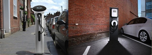
Will WattStation (left) and Blink (right) change how we feel about electric cars?
The year 2010 may be remembered as a watershed for the electric car: that’s when the Nissan Leaf and Chevrolet Volt, the first mainstream electrics, were introduced in the U.S. But another 2010 innovation may turn out to be more important in the long run: two electric car chargers have arrived representing radically different design approaches to a whole new category of product.
When it comes to recharging batteries, efforts so far have been focused on providing home units for electric-car owners; there are fewer than 500 public electric charging stations in the U.S. The company SPX supplies home chargers for Chevrolet’s Volt at a price of around $2000 including installation. Aerovironment performs a similar function for Nissan’s Leaf.
But increasingly the electric car story will shift to chargers in public spaces. That was the message this summer when Blink, designed by Frog Design for ECOtality, and WattStation, designed by Yves Béhar and Fuseproject for General Electric, made their first appearances.
These chargers have much in common. Both work not just for Volt and Leaf but also for developing EV models such as the Mitsubishi i-Miev that I tested last summer for Change Observer. Both have corporate support, which means they are likely to show up in good numbers in 2011. And both have made a technological leap forward.
The most basic chargers are essentially extension cords from 120-volt house current. Classified as Level 1 by the Society of Automotive Engineers (SAE), they juice up most electric cars in eight hours. Blink and Watt Station are Level 2, which means they use 240-volt current to charge vehicles in half that time. (Think of higher voltage as something like higher water pressure.) On the horizon are Level 3, or 480-volt, chargers, which would bring a Nissan Leaf to 80 percent charge in half an hour.
Installed on main streets or at malls, Level 2 and eventually Level 3 chargers could ease “range anxiety” dramatically. The ability to recharge during a lunch date is likely to change the way people think about electrics and add a whole new measure of practicality to the cars. The catch: the use of higher voltage may wear batteries out faster and the equipment is more expensive.
Despite their identical purposes and problems, the contrast between Blink and Watt Station couldn’t be more striking.

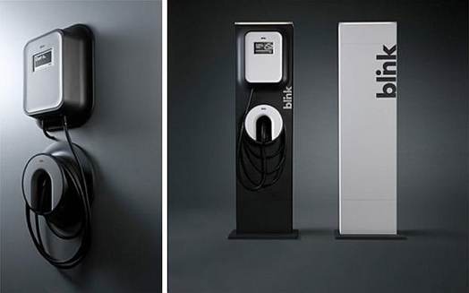
Blink’s home model (left) and commercial model (right).
Blink is a simple, practical, and adaptable design that emphasizes the charger’s networked nature. Described by Frog as a “new icon for a smart EV ecosystem,” the unit comes in a wall version to fit garages as well as a freestanding model for public spaces. For the wall version, Frog devised a connector set flush to its mount to prevent breaking or scratching in a crowded garage. In the public version, the top is tilted to shed rain and discourage users from parking a coffee cup on the unit, risking a spill into the electronics.
Frog chose black-and-white for Blink, a reassuring, sober approach that literally transcends local color. The point was to create a highly recognizable, lasting image. “Blink was designed to be timeless, not trendy,” the company’s product prospectus says. “Understanding that the charger will live in both residential and public locations for years to come, we created a design language that will last.”
It is as no-nonsense as an airport way-finding icon. If the formal approach is “functional architecture,” the graphics and interface are derived from a basic monochromatic aesthetic and the design language from consumer electronics. The interface includes a light to signal drivers that a unit is available, and a full-color touch screen.
Blink has been adopted by the ambitious EV Project, a $230 million public-private initiative funded by Department of Energy and stimulus money, in which more than 15,000 chargers are being installed in 16 U.S. cities. The goal is to provide chargers for free as a public amenity and to expand the places they can be used to include movie theaters, shopping malls and coffee shops.


WattStation comes in an array of candy colors for both commercial (top) and residential (bottom) use.
Whereas Frog aimed at universality with Blink, Fuseproject has varied and personalized its Watt Station charger for General Electric. Instead of reassuring consumers with sober, buttoned-down looks, this charger, which is also available in a home or garage version, emphasizes its friendliness with candy colors. These not only make the units seem more welcoming but also could easily inspire mayors or CEOs to order chargers in their civic or corporate hues. Never underestimate the appeal of a good ribbon-cutting ceremony.
Variability doesn’t end there. In an interview with Fast Company’s website, Yves Béhar referred to “the ability for different cities to customize the finish of the materials depending on their identity, on the street, and on their look.” Just as there are many different designs for streetlights and benches, he suggests, “in the future, electric vehicle chargers will be so commonly available that people will be able to fashion them after the environment they want to live in.”
Judging from Watt Station’s shape, Béhar and his colleagues locate chargers somewhere between street furniture and parking meters. The design is a sturdy-looking column with an angled head. (It may remind some of a thinner version of the British pillar mailbox, a dependable symbol of public amenity.)
The screen is heated for winter weather. A ring of LEDs signals the unit’s status: white means available, yellow out of order. The ring glows red while charging and turns green when charging is complete.
Payment systems are still taking shape: Frog’s prospectus highlights Blink’s color-screen interface, the ability to operate a charger remotely, by mobile phone or web and the potential of “the monetization of the charging space.” (Indeed, analysts estimate that the EV charging market will be worth $1.5 billion by 2015.)
The design approaches of both chargers have their appeal. We are still struggling for metaphors to understand what an auto charger means. How well designers shape that understanding is likely to regulate the pace at which we move toward electric cars. As with any new technology, design needs to overcome fears and highlight conveniences. Is a charger a simple, dull utility like a wall plug or a fireplug? Should it be thought of as a theatrical selling spot, like a gasoline station with bright graphics and bold forms? (Think of Landor’s BP, Loewy’s Exxon, Teague’s Texaco.)
Or are chargers descendents of an older device, familiar to us from Hollywood Westerns: the hitching post?
Observed
View all
Observed
By Phil Patton
Recent Posts
“Dear mother, I made us a seat”: a Mother’s Day tribute to the women of Iran A quieter place: Sound designer Eddie Gandelman on composing a future that allows us to hear ourselves think It’s Not Easy Bein’ Green: ‘Wicked’ spells for struggle and solidarity Making Space: Jon M. Chu on Designing Your Own Path
 Phil Patton is an author and curator who writes on autos for


