
November 22, 2011
Decorating Brutalism: The Interiors of Kevin Roche
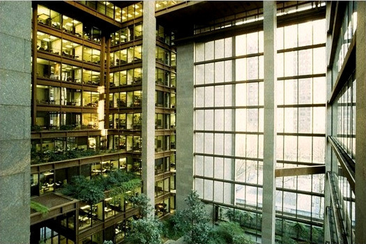 Ford Foundation Headquarters, New York (1968) Kevin Roche John Dinkeloo and Associates (courtesy KRJDA)
Brown.
Not a glamorous color. One that has been sidelined in the design world in favor of black, gray, cobalt and orange. But in the 1950s, brown meant something different. Graphic designer Paul Rand used it for the UPS brand, suggesting no-nonsense reliability, the democratic pleasure of the brown cardboard box.
Industrial designer Henry Dreyfuss streamlined his wardrobe to include only brown suits, which allowed him to travel easily (and without wardrobe malfunctions) between industrial clients in the Midwest and banking clients in New York.
Conceptual sketch, Deere & Co. (courtesy Cranbrook Digital Collections)
So when Kevin Roche, then chief designer for Eero Saarinen & Associates, came to work for tractor maker John Deere, one of Dreyfuss’s oldest clients, it wasn’t surprising that his building ended up brown. Early sketches by Saarinen show heroic concrete ziggaurats, honeycomb structures, and long, lean glass boxes. But eventually Saarinen threw all those ideas out. He would use them in other places, but for Deere he wanted something earthy, literally and figuratively. He set his building in a valley, making it a bridge rather than a mountaintop folly. He made it glass, but chose brand-new bronze reflective glass, which mirrored the surrounding trees rather than other office buildings. And he designed an exosketleton of Cor-Ten steel, a product then associated with highway bridges, that naturally rusted to a matte, cinnamon-color finish.
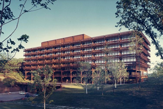
Deere & Company Administrative Center, Moline, IL (1963) Eero Saarinen & Associates (courtesy Yale University Manuscripts & Archives)
John Dinkeloo, who became Roche’s partner after Saarinen’s death, suggested Cor-Ten, after the architect rejected aluminum and stainless steel. Dinkeloo was the firm’s materials expert, and as such had a major impact on the appearance and symbolisn of the design work of Saarinen and Roche. By 1960, the glass-box modernist office building was already identified with Mies van der Rohe and Skidmore, Owings & Merrill. Saarinen, a fierce competitor, was looking for the next thing in projects like the TWA Flight Center (poured-concrete shells) and the CBS Headquarters (New York’s first concrete skyscraper). For Deere, neither an expressive form nor a skyscraper made sense: offices need rectangular modules, and a rural site doesn’t require height. Saarinen liked the Cor-Ten because it weathered like wood, and would blend in rather than stand out from the forest eventually planted on the hilly site.
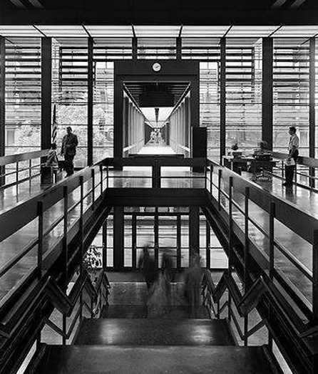
Link from display center to administrative building (Ezra Stoller/ESTO)
The interiors at Deere weren’t designed until after Saarinen’s death in 1961. On several contemporary projects, including CBS, Saarinen & Associates had to relinquish control of the interior design to experts like Florence Knoll. Roche and Dinkeloo were determined not to let that happen at Deere, and had architect Warren Platner take the lead. Platner took his inspiration from the natural landscape of trees, sticks and branches, and from their artificial versions in the Cor-Ten building frame. He said no to the primary colors that characterized Knoll’s signature look, and embraced brown.
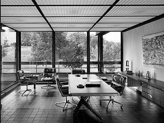
Deere executive office (Ezra Stoller/ESTO)
Roche and Platner devised a custom set of office partitions in black-painted steel and glass, which allowed the engineers on staff at Deere to see through the executives’ exterior offices. The partitions were movable, clicking into the luminous ceiling grid, but ran floor-to-ceiling, giving them a look of permanence and solidity. Storage cabinets, set against the solid brick walls of the stair and elevator core, were also floor-to-ceiling and black. This combination of brown-on-brown materials would be repeated at the Ford Foundation, with slightly more luxurious variations.
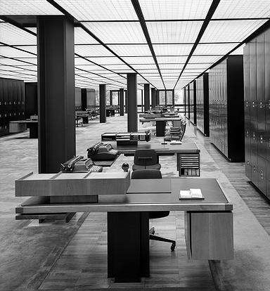
Deere secretarial pool (Ezra Stoller/ESTO)
For the executive floor, Platner stepped up the material palette. He chose black Heath tile for the floor, creating another grid, and designed teak-framed pedestal desks for the secretaries. Inspired by Saarinen’s Tulip chairs, he tried to clean up the office’s “slum of legs”, filing cabinets and power cords by using single steel uprights for the desks as well as teak occasional tables, with wiring concealed inside. (Unfortunately, this only meant that technology made the furniture quickly obsolete.) The sofas in the waiting area were brown wool. The executives had leather desktops. The pedestals were bronze-toned. The palette was brown on bronze on black. Instead of art, there was the view, available on every side, of woods and water and lawns, carefully mowed by John Deere tractors.
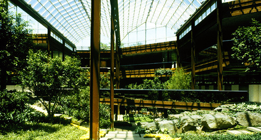
Deere & Co. West Office Building, Moline, IL (1975) KRJDA (courtesy KRJDA)
In 1975, Roche and Dinkeloo were asked back to complete Saarinen’s original plans, which called for three buildings, joined by sky bridges, facing the lake. The new building mimicked the exterior mirror glass and Cor-Ten of the original, but radically transformed the interior. In the original building, Platner minimized solid walls and choose a woodsy color palette, but there was little actual nature inside. For the West Office Building, Roche and Dinkeloo placed the offices and workspaces around a planted garden, bringing the skybridge through the interior atrium. The center of the building was open to the sky via a glass roof, and in the cafeteria adjacent to the garden, the back wall was mirrored so no one would be without a view. In the offices the ceilings were reflective rather than luminous, bouncing light from the garden into the cubicles.
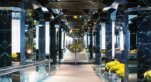
Lobby, UN Plaza Hotel (1975) KRJDA (courtesy KRJDA)
Platner wasn’t associated with this later Deere project, but the mirrors are definitely one of his signature moves, often re-used by Roche Dinkeloo in the 1970s. The mirrors intensify the blurring of interior and exterior, just as the atrium, suggesting that one might be working in the great outdoors. It’s an appropriate illusion for a tractor manufacturer, just as the steel, brick and wood interior was appropriately rugged. Deere allowed Roche, Dinkeloo and Platner them to create what became a signature masculine template. As the years went by the mirrors began to dominate the brown until, at the UN Plaza Hotel (1975), you have the mirrors inside and out, simply mirroring themselves.
If brown was a move away from the lightness and brightness of primary colors and stainless steel, the mirrors are a move away from the brutalism of the firm’s early 1970s work.
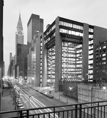
Ford Foundation, exterior looking west across 42nd Street (courtesy KRJDA)
Deere’s most obvious fraternal twin is the Ford Foundation Building, completed in 1968 between the first and second phases at Deere. Ford was designed by Roche Dinkeloo, with Platner as the interior designer. Soon after its completion, Platner started his own firm, concentrating on interior design for corporations and restaurants, as well as his famous furniture. At Ford, the outside landscape that existed at Saarinen’s Deere building was first brought inside, and combined with a distinctly New York form: the privately-owned public space. Rather than creating another version of the Seagram Building: offices behind an open plaza, Roche arranged the offices in an L, put the garden in the nook, and wrapped the whole thing in granite, Cor-Ten and glass. Roche Dinkeloo had already begun to play with nature as a design element with the green roofs at the Oakland Museum. With the Ford Foundation building, they officially added landscape to their list of materials.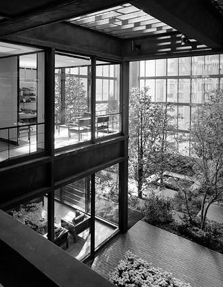
Ford Foundation, offices and garden (Ezra Stoller/ESTO)
At Deere, the executive floor had had a richer material palette than the engineers’ floors, but the Ford Foundation leadership hewed to a democratic ideal. Anything the men at the top had (and the foundation’s boardroom and executive offices were still on the top floor), the rank-and-file employees had too. The client talked the architects down in terms of luxury, though the overall level of magnificence is still higher than at Deere. That meant a new suite of custom furniture designed by Platner, from huge brass pendant lamps, to mahogany desktops, to parquet floors with inset carpet. The colors ranged from coffee to bark to rust to straw, with natural linen walls.
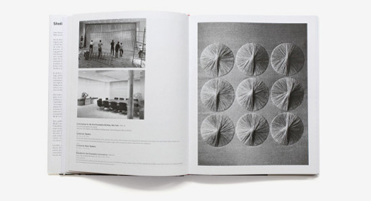
Bas-relief embroidery for the Ford Foundation conference room and Auditorium (1966-67) Sheila Hicks (courtesy Metropolis)
The Deere headquarters also originally had little to no art, but for Alexander Girard hangings in the stairwell (which were eventually destroyed by cigarette smoke and food spills). Part of the no-nonsense ethic was an all-work, clean-desk policy, and the forest view was supposed to be enough. The Ford Foundation also tried to maintain design order, but in a few spaces Platner commissioned artworks that continued the material monotone. In a basement conference room and auditorium, where there was no view, textile artist Sheila Hicks covered a wall with silken, golden embroidery, also non-hierarchical, also crafty, where a different architect might have specified a large Abstract Expressionist work.
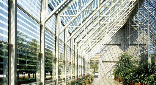
Irwin Union Bank and Trust Co., Columbus, IN (1973) KRJDA (courtesy KRJDA)
As they worked through the 1970s, Roche and Dinkeloo continued to play with brown, mirrors and nature. A link between Saarinen’s 1955 Irwin Union Bank and a new building became a striped, silvery orangerie (1973), angled like a skyscraper despite its small scale, with trees planted in a grid. The firm’s iconic, three-pyramid headquarters for College Life Insurance (1971) had carpeting that looked like the ground, and offices under slanted glass roofs that look like balconies. Notice the mirrored cubicle partition.
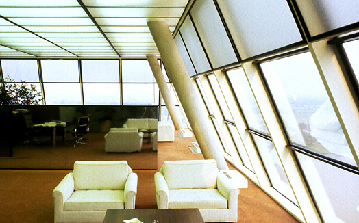
College Life Insurance Company of America Headquarters, Indianapolis, IN (1971) KRJDA (courtesy KRJDA)
Most of the Roche revivalism, now underway, focuses on the big scale and tough materials of his buildings—the brown—but it is clear that from the start Roche and his partners were equally interested in the little things, and light touches, that could give those shapes texture and character. Brown, mirrors and leaves were part of his efforts to make architecture from outside in, and inside out.
This essay was adapted from a talk given at the Museum of the City of New York on November 15, 2011. For more on Roche, see Belmont Freeman’s Places essay, “Kevin Roche: Architecture as Environment” and the exhibition of the same name at the museum, up through February 5, 2012.
Observed
View all
Observed
By Alexandra Lange
Related Posts

Innovation
Ashleigh Axios|Essays
Innovation needs a darker imagination

Business
Kim Devall|Essays
The most disruptive thing a brand can do is be human

AI Observer
Lee Moreau|Critique
The Wizards of AI are sad and lonely men

Business
Louisa Eunice|Essays
The afterlife of souvenirs: what survives between culture and commerce?
Related Posts

Innovation
Ashleigh Axios|Essays
Innovation needs a darker imagination

Business
Kim Devall|Essays
The most disruptive thing a brand can do is be human

AI Observer
Lee Moreau|Critique
The Wizards of AI are sad and lonely men

Business
Louisa Eunice|Essays

 Alexandra Lange is an architecture critic and author, and the 2025 Pulitzer Prize winner for Criticism, awarded for her work as a contributing writer for Bloomberg CityLab. She is currently the architecture critic for Curbed and has written extensively for Design Observer, Architect, New York Magazine, and The New York Times. Lange holds a PhD in 20th-century architecture history from New York University. Her writing often explores the intersection of architecture, urban planning, and design, with a focus on how the built environment shapes everyday life. She is also a recipient of the Steven Heller Prize for Cultural Commentary from AIGA, an honor she shares with Design Observer’s Editor-in-Chief,