Eero Saarinen, Deere and Company Administrative Center, Moline, Illinois, c. 1963. Photograph: Harold Corsini. Courtesy Eero Sarinen Collection, Manuscripts and Archives, Yale University
So far, so tasteful. But what happened between 1968 and 1974 is the difference between the CBS Building and the World Trade Center, black granite and 110-story Gothic, rectitude and (failed) exuberance. People got tired of grids and glass, gray flannel and luminous ceilings. They wanted to have some fun with their architecture, warm it up, play with mirrors, Ultrasuede, lights and color. The boredom that led to Postmodernism also led to Platner’s version of modernism, architecture used in the service of entertainment, as illusion, in a way that made his former colleagues profoundly uncomfortable.
Earlier this year I argued that it is ironic that the Standard New York looks so good, since it derives from the worst work of a great modern architect (Marcel Breuer) and the best work of a great modern showman (Morris Lapidus). In rediscovering Platner, Balazs found the ideal combination of the two, giving his designers a jumping-off point that was already extreme (he had a book of
Platner designs, likely
Ten by Warren Platner; Robin Standefer of Roman & Williams also spent many a birthday at Windows on the World). Like Lapidus, Platner was an apostate who spent time thinking about theater, texture, interiors and restaurants rather than the serious work of building. His work became increasingly wild: Michael Bierut claims to have never recovered from his encounters with Platner’s 1986 Pan Am Building lobby redesign, with its dangling golden handkerchiefs and floating gilded suns, not to mention vicious triangular planters of garish blooms. According to the usually generous Paul Goldberger, it was “so dreadful that it inspires only a disquieting nostalgia for the Pan Am Building as it used to be.” In
New York, Carter Wiseman wrote, “Liberace would have blushed at the vulgarity.” But in the late 1960s, into the early 1970s, Platner skated along the edge of taste, his glitz tempered by clever architectural manipulations of space, his gilt tempered with black and cream.
      CBS building. Most restaurants you go in and they are a whole world of theirÂ
      own that has nothing to do with whatever else is around.
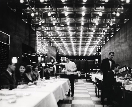
Warren Platner, CBS Building, Ground Floor Restaurant, 1965. Courtesy Warren Platner Papers Manuscripts & Archives, Yale University
One architectural photographer quipped, “The understatement is overdone.” Progressive Architecture was dubious: “For Formal Dining, Black Granite?” The restaurant was black. The exterior granite-clad piers were continued inside, turning them into diamonds rather than triangles. Tables were tucked between each pier, with views out to CBS’s sunken plaza. Towards the center of the C-shaped space were eight-foot-tall tufted red leather banquettes, acting simultaneously as seating and as architecture (think of the Bouroullec brothers’ Alcove sofa).Â
The sparkle that — perhaps — saved the space from sepulchral gloom (“like eating in a coal cellar,” said one critic) was all overhead. The ceiling of all three sections of the restaurant was paved with mahogany cages, fitted with glass sides and brass reflective tops. In the center of each cage a filament bulb was hung — an industrial, exposed fixture in a very luxurious setting — and its light reflected and refracted off the glass and metal. It is hard to tell, in photographs of the space, whether the fixture is infinite or just infinitely reflected. The whole Ground Floor seems in retrospect like a willful provocation, much like the tower itself. It turns its back on the outside world in order to better embody the building in which it resides. It turns its back on restaurant conventions of appetizing décor. But it is not vulgar; the ceiling-as-chandelier is rather wonderful, and Platner is still working off the corporate grids upstairs.
The more direct influence for 18 is Platner’s 1974
American Restaurant, which still exists… in Kansas City. Part of a vast modernization and renewal effort for that downtown, led by the Hall family of Hallmark Cards, the restaurant occupies the top floor of a building designed by Edward Larrabee Barnes as part of Crown Center Plaza. (The Halls were quite
au courant in their choices; the corporate apartment at the top of another Hall building was designed by Alexander Girard, like Platner, a defector from pure architecture who innovated in textile, exhibition and restaurant design.)
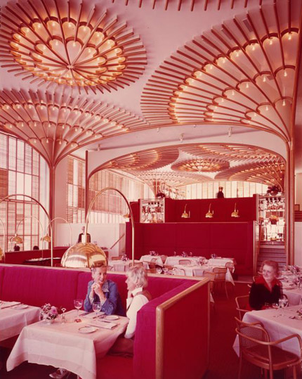
Warren Platner, The American Restaurant, 1970. Courtesy Warren Platner Papers Manuscripts & Archives, Yale University
In this glass box, Platner installed what I can only describe as the meeting of a Thonet café chair and a Gothic cathedral. He described it somewhat differently:
Â
      …it occurred to me that since our client was in the greeting card businessÂ
      we should treat the space in a very decorative way — like a huge lace Valentine
      — and everything we did was to enhance that impression.
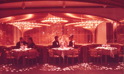
Saarinen’s “style for the job” approach was applied again to an interior. The banquettes here are also red, but everything else is light and bright, feminine and curvy where the Ground Floor was dark and boxy. Big brass lamps riff on the iconic Achille Castiglioni floor lamp, and act as reflectors for the space’s glory and innovation: ceiling rosettes of bent oak, descending in the corners as slender columns to divide the 80-foot-square penthouse into four sections, each one at a different level. Above, the wood is worked into scallops that simultaneously refer to dime-store doilies and the fan vaults at
Gloucester Cathedral. The material is that of the bentwood chairs Platner used here and at Windows on the World. Oak also appears in floor-to-ceiling shutters, the only use of such traditional window coverings I have seen in a modern tower. It is fantastic but not, I think, over the top. One’s first impression must have been of happening on a fairy glade.
Only one of the columns made its way east from KC to the Standard, and in thickened form, but the lineage is obvious in form and deluxe desire. Standefer says she and partner Steven Alesch thought of their version as a baobab tree, and considered the woods in Brazilian modernist furniture, and decided to make it in high-gloss alder the color of honey. “The current obsession with stainless steel and nickel, the obsession with matte wood started to become banal,” she says. “You can never escape the Vegas reference, but by trying to put blinders on you can design with brass and high gloss.” Period images show the American Restaurant’s fan vaults visible from the street, as 18 is from the High Line. 18’s colors are also light, but the furniture and layout are more rooted and curvaceous than any of Platner’s (he always planned on a grid): cream leather banquettes, facing the sunset, are sculpted like mesas; a nook is upholstered, seats, wall and all, in beige Ultrasuede. The stools sit on chunky supports of massed sticks. The effect is glamorous, but more tiki.
Â
Where Platner followed the 14th-century craftsmen, and attached one rosette to the next across the ceiling, the Standard’s designers decided instead to surface theirs in tiny brass discs, which reflect the lights from above and below and outside. The discs may derive from Platner’s most celebrated work, Windows on the World, completed two years after the American Restaurant and a harbinger of Platner’s excesses to come. In the semi-sedate environs of the WOW restaurants, there were thick columns studded with discs, along with Platner’s now familiar vocabulary of architectural tufted banquettes, reflective ceiling, Thonet caned armchairs. And everywhere brass: dish-shaped downlights, railings atop each banquette.
I can’t say anything about the crystalline and
crystal-lined elevator hall at WOW because I still can’t really believe that it really existed. The entrance to 18 is mirrored, but in angled, champagne-tinted strips that reflect your view of the city — ideally, sun setting to the southwest — as you exit the elevator.Â
I suppose Platner’s mirrored entrance hall was a version of the Ground Floor ceiling expanded to fill a room. But what if he had made it into a building? It could be
100 Eleventh Avenue. The contemporary architect I think Platner has most in common with is Jean Nouvel, for their shared interest in making each project a complete and powerful thing, themed to its client, rich in materiality, unique in his oeuvre. This, of course, is a quality both share with Saarinen, considered too much of a shape-shifter to be a serious architect in his day. This position now seems rather stuffy. And indeed the glamour element in Saarinen’s work was often executed by others: Kevin Roche designed the most beautiful staircase in the world for the
General Motors Technical Center, Alexander Girard the modern baroque interiors at the
Miller House. With Platner, like Nouvel, we are just one reflection away from disco, one black room away from S&M. Each project comes with the question, can he hold himself back? Can he convince us that brass is back?
The jump from the Ground Floor to the American Restaurant to Windows on the World does not seem so huge, and it is through Platner’s progression that we can get from the 1960s to the 1970s, from the monochrome grid to mirrored halls. For him brass was a progression from black paint and Cor-Ten, another project for another client warranted another material. If Mies used bronze, why not brass? It warmed up the darkness at CBS (Florence Knoll’s interiors were criticized for being “anti-people” and “still[ing] creative thought”), it paired better with wood in Kansas City. He completely understood the rigors of modernism, but he thought it needed a little kick. One wonders what, given the chance at a skyscraper, would have been the result. Could he, as Der Scutt did at Trump Tower, have used brass like wallpaper? Could he have made us love it?








 Alexandra Lange is an architecture critic and author, and the 2025 Pulitzer Prize winner for Criticism, awarded for her work as a contributing writer for Bloomberg CityLab. She is currently the architecture critic for Curbed and has written extensively for Design Observer, Architect, New York Magazine, and The New York Times. Lange holds a PhD in 20th-century architecture history from New York University. Her writing often explores the intersection of architecture, urban planning, and design, with a focus on how the built environment shapes everyday life. She is also a recipient of the Steven Heller Prize for Cultural Commentary from AIGA, an honor she shares with Design Observer’s Editor-in-Chief,