

January 5, 2007
Diversity as Form: The Yale Architecture Posters

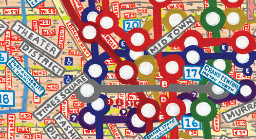
Cover detail, Forty Posters for the Yale School of Architecture, 2006.
Since 1998, Design Observer’s Michael Bierut has worked in close collaboration with Robert A.M. Stern, dean of the Yale School of Architecture, designing more than 40 posters for open houses, conferences and public programs. Mohawk Fine Papers has published a book celebrating this collaboration: Forty Posters for the Yale School of Architecture.
As acknowledged in his introduction, Bierut was inspired by Willi Kunz‘s long design relationship with Columbia University’s School of Architecture, where Univers was the single typeface used over many years. Bierut went in the opposite direction, insisting that every Yale poster use a different typeface: diversity, in this case, “could represent its own form of consistency.”
Such sustained graphic intervention between designer and patron is indeed notable. Beyond the work of Willi Kunz, one is reminded of other designers who maintained long relationships with institutions: Willem Sandberg and the Stedelijk Museum in Amsterdam; Armin Hofmann and the Basel State Theater; Josef Müller-Brockmann and the Zurich Tonhalle; and, more recently, Paula Scher and the Public Theatre in New York City. Such collaborations are interesting precisely because the work evolves over time, as do the institutions they represent. It is the relationships that remain constant.
Observed
View all
Observed
Share on Social
By William Drenttel


Recent Posts
DB|BD Season 12 Premiere: Designing for the Unknown – The Future of Cities is Climate Adaptive with Michael Eliason About face: ‘A Different Man’ makeup artist Mike Marino on transforming pretty boys and surfacing dualities Designing for the Future: A Conversation with Don Norman (Design As Finale) Innies see red, Innies wear blue: Severance’s use of color to seed self-discovery