
November 23, 2018
Enchanted Lion
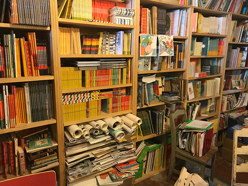
Why aren’t graphic designers more broadly gaga for children’s literature? Why is kid-lit and children’s illustration considered a niche interest? After all, visual literacy begins for just about everyone with reading picture books; it’s the universal training ground.
But scads of other reasons suggest that graphic designers of all stripes should take a more serious interest in the recent revitalization of kid-lit. Today’s children’s books take formal experiments more as a given, not an exception. The productive tension between word and image — always palpable to designers as they work — has always registered keenly in children’s picture books, as central to reading pleasure. All sensory inputs matter in print culture for children: the feel and weight of paper stock, choices and shifts in typography, how pictures jostle their way into the page’s white space, an illustrated line pulsing like a seismograph. Unlike adult books whose texts get poured virtually from Kindle to smartphone, children’s picture books are resolutely physical. They’re also inherently social, rooted in a shared ritual of parents reading to kids, who eventually find their own private connection to books, pictures, reading and thinking.
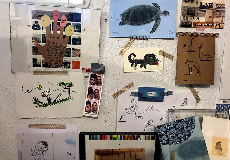
As a design journalist and author of two illustrated books for adults, I fancied I had a decent handle on visual literacy and storytelling before becoming a parent myself. Now with five years under my belt of buying kids’ books for my son Lev, I stand corrected. From reading loads more kid-lit, then writing about that phenomenon, I now realize picture books offer nothing less than a concentrated — you might even say unbeatable — education in design basics.
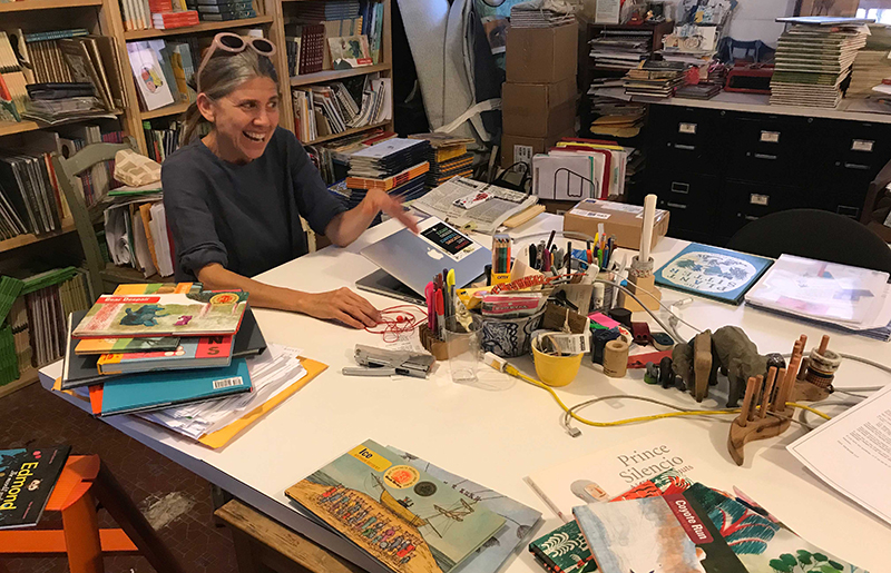
What makes a great picture book tick? To reverse-engineer the genre, I visited Claudia Bedrick, publisher and editor-in-chief of Enchanted Lion Books, in her offices in Greenpoint, Brooklyn. (Later her colleague Marc Drumwright joined our conversation.) If you admired the 50th anniversary re-issue of If Apples Had Teeth by Milton Glaser with his wife Shirley, you’ve bumped into Enchanted Lion’s handiwork. Other ELB lost classics include The Paper-Flower Tree by Jacqueline Ayer, a black American illustrator who settled in mid-century Thailand and won a 1961 Society of Illustrators award, but is largely unknown today. In additional to re-issued classics and original titles, Enchanted Lion offers delightfully wry translations like The Heartless Troll (retelling a Norwegian fairytale) and What What What (a Japanese kid-lit classic). The illustration styles are relentlessly diverse and bursting with exuberance. I could happily bankrupt myself buying their books.
Bedrick came to children’s literature by accident. Raised in a publishing family — her father Peter Bedrick was publisher of Schocken Books before founding Peter Bedrick Books with his wife Muriel in 1983 — Claudia initially worked at non-profits supporting libraries in the former Soviet Union. When her father and younger sister Abigail founded Enchanted Lion in 2003, she joined the team for pragmatic reasons: as a new mom, she hoped it’d be “a part-time job situation…I didn’t come into children’s publishing with any love for it, honestly.” (The name Enchanted Lion hearkens back to family memories of an old Berkshires hotel, the Red Lion Inn, with its “big verandah and many, mysterious back staircases”.)
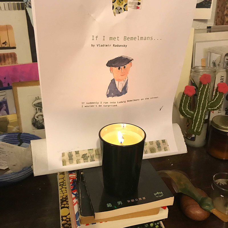
When, ten months into the new venture, her father abruptly passed away, Claudia’s investment suddenly had to increase. “I had spent a lot of time in foreign libraries and collections and bookstores,” she recalled. “I realized I could try publishing books in translation…and that I could care about that. It was a process of falling in love, really.” In 2006 they translated their first title, Prince Silencio by Belgian author-illustrator Anne Herbauts and translated from the French — again, pragmatically to reduce costs — by Bedrick. The story revolves around the prince who enforces in the kingdom what his oppressive father calls the Law of Silence. The Law is eventually overturned in favor of some badly-needed boisterousness, but soon the people come to realize that silence, too, is golden.
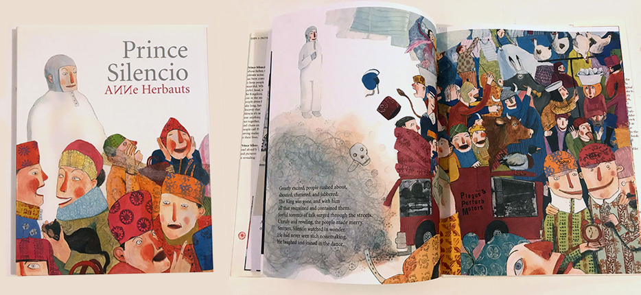
Bedrick explained why this book spoke to her: “A lot of American children’s books at that time…seemed to me very busy and fragmented,” she said. “The notions of silence and emptiness were intriguing to me. If everyone’s talking at the same time, it all becomes noise. It’s like you need the downbeat in music for it to be music. You silence for there to be sound. You need white space for there to be a picture.”
Flipping through the book, I noticed it contained the word “smitten” — not a standard kid-book word. Bedrick replied, “A kid doesn’t know that’s not a kid word. Everything is a mystery to kids until they learn about it. It’s the same thing with ‘kid food’. You can feed them goulash and poppy seeds and they’ll eat it happily. It’s the parent’s fear [that limits what kids consume]: Oh, that’s too sophisticated for you.”
This captures an unofficial credo of Enchanted Lion: kids crave more visual and literary spiciness than they’ve been served. Bedrick had spent the previous day at the Brooklyn Book Fair and noticed many gaps in the books kids gravitated towards, and the safer options parents were foisting on them. “There were so many weird forms of parenting on display there,” she laughed. One little boy wouldn’t leave the booth until his mother bought him Thunderstorm by Arthur Geisert. This original, accordion-style edition tells a wordless story of how a Midwestern storm gathers strength, breaks, and then ebbs away. The book opens longer and longer, spooling out a landscape as flat as Geisert’s chosen home, rural Iowa. “This man is a craftsman,” Bedrick murmured. “It’s all copper-plate etching and hand-colored with watercolors.” The cover alone is electric: a brooding slate-gray expanse cut by electric-yellow lettering. It bodes somber thrills inside, just like an impending storm.
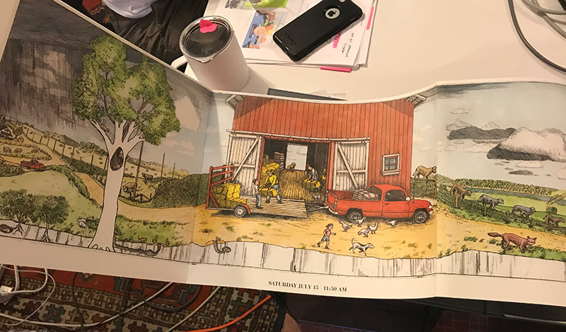
Clearly the delicacy of the accordion-fold spoke to the boy’s mother, too — but in the wrong way, of inevitable destruction. Here Bedrick reveals another implicit rule of Enchanted Lion: kids should be invited to touch beautiful books, even at the risk of trashing them. How else will they learn to treasure anything?
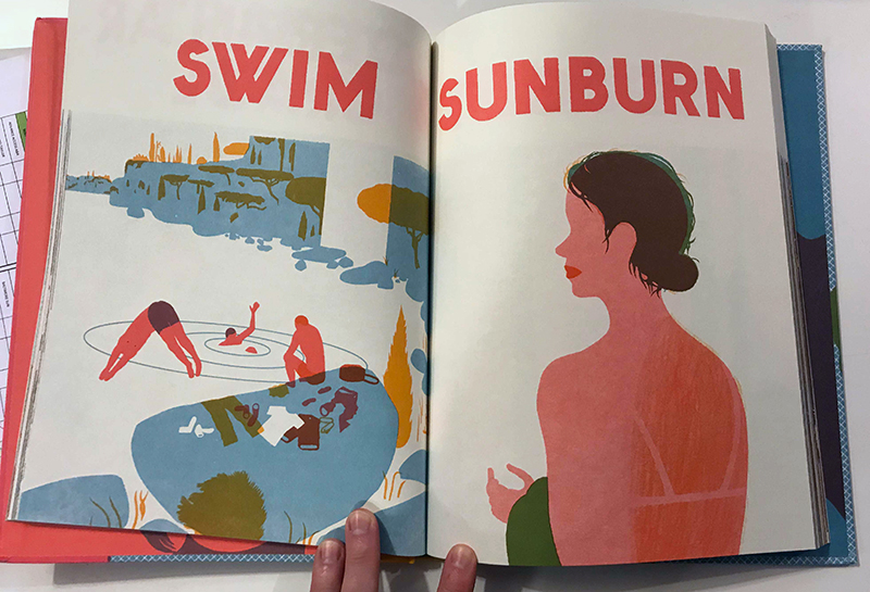
I’m not proud of it, but as a parent I’m biased against wordless picture books. What am I doing wrong that I don’t enjoy this kind of storytelling as much? Nothing — except I could be lazier if my kid “read” me the story occasionally, instead of the other way around. Bedrick slipped another book in front of me: Seasons by French author-illustrator Blexbolex. “I’ve gotten emails from people about this book,” said Bedrick, “about how their little girl puts this book under her pillow to sleep with it at night. Now a lot of parents look at it and say: ‘Oh, French graphic design — that’s an adult book.’ And Seasons has had a lively time in the adult world: one Christmas it was carried in Paul Smith and Anthropologie.”
This nearly-wordless book cycles a child through the seasons repeatedly with a flow of evocative objects: ice cream, sunburn, apple orchards, frosted windowpanes, then dizzyingly onward. Wordless books can help children with reading issues via indirect means. By parsing the pictures first, they gain purchase necessary to tackle the words. Wordless books “prompt questions on the direction of narrative and what’s happening on the page,” said Drumwright. “It’s a kind of engagement [with reading] you don’t often see.”
Bedrick handed me next The Forest by Italian author Riccardo Bozzi and co-illustrated by two Spaniards, Violeta Lopiz and Valerio Vidali. This book reveals perhaps the biggest enthusiasm common to picture books and graphic designers: both are suckers for print culture. With illustrations plus die-cuts, embossing, cut-outs and gate folds, The Forest uses innovative printing techniques to draw readers into a leafy, green, silent world with all their senses alert. Bedrick opens to a spread in which the protagonists enter a forest clearing, a temporary pause in both the book’s action and its dense backdrop of trees. Bedrick recalled a conversation she had with the illustrators about “the separation of the body from this clearing. Could we push the thinking of the clearing into more of a bodily experience? The result is really gorgeous.” You can almost feel your feet throbbing and your breathing slow, in extra-oxygenated air.
Designers face the problem of repetition constantly in their work: they field the same requests for websites, logos, annual reports, yet must deliver a fresh jolt each time. The resulting designs often repeats for end-users too — while hopefully retaining some zing at each new encounter. Repetition is big within picture books, too, whose density must unfold over multiple — what can feel like zillions — of repeat readings. Children may abandon a book for a time, then re-open it years later and find more inside: same book, same but different kid. How does repetition figure into Bedrick’s work as an editor? “If a story is listless or monotonous, if we can’t look at it a hundred times, then we’re certainly not going to publish the book,” Bedricks said. “You hope there are enough layers of intrigue, a sense of mystery and density so that as a child moves through time themselves, they’ll find different possibilities within it.” That pleasing density doesn’t automatically mean illustrations cluttered with detail, either; a strong, weird, evocative idea can stay interesting with simple visuals.
Bedrick looks for “vitality of line” in illustrators, encouraging the notion that a great picture book assumes a kind of numinous, independent life over time. Like the Velveteen Rabbit, the goal of any picture book is to become battered and realer with repeated readings: evidence of being loved.
Observed
View all
Observed
By Jude Stewart
Related Posts

Graphic Design
Sarah Gephart|Essays
A new alphabet for a shared lived experience

Arts + Culture
Nila Rezaei|Essays
“Dear mother, I made us a seat”: a Mother’s Day tribute to the women of Iran

The Observatory
Ellen McGirt|Books
Parable of the Redesigner

Arts + Culture
Jessica Helfand|Essays
Véronique Vienne : A Remembrance
Recent Posts
Compassionate Design, Career Advice and Leaving 18F with Designer Ethan Marcotte Mine the $3.1T gap: Workplace gender equity is a growth imperative in an era of uncertainty A new alphabet for a shared lived experience Love Letter to a Garden and 20 years of Design Matters with Debbie MillmanRelated Posts

Graphic Design
Sarah Gephart|Essays
A new alphabet for a shared lived experience

Arts + Culture
Nila Rezaei|Essays
“Dear mother, I made us a seat”: a Mother’s Day tribute to the women of Iran

The Observatory
Ellen McGirt|Books
Parable of the Redesigner

Arts + Culture
Jessica Helfand|Essays

 Jude Stewart writes about design and culture for Slate, The Believer, Fast Company and Print among others. Her first book,