A rich and diverse range of topics were covered at the inaugural Face Forward International Typography Conference which took place over two days in December 2015, in Dublin, Ireland. Sara Jamshidi, until recently Design Observer’s senior designer, attended the peer-reviewed conference at which typographic identity, authenticity, ethnicity, and security through disciplines as disparate as linguistics, philosophy, history, and architecture were explored. Sara, along with four attendees, wrote dispatches from the conference, which we are featuring this week.
++++
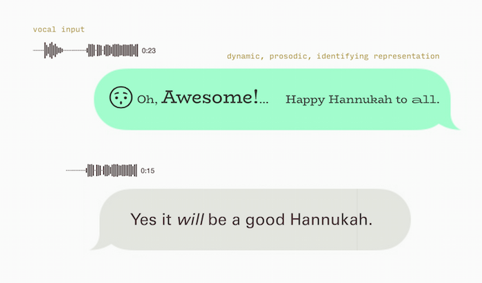
Increasingly, we inhabit digitally mediated environments wherein our personal communications are often textual rather than verbal. Never before have we had the immediacy nor the simultaneous communication streams and fluid workday that we seamlessly adapt to today. The pervasiveness of text in these intimate exchanges raises questions about the impact of typography on our behaviors and relationships. Although we gain a form of textual communication that functions with the fluency and temporal virtues of speech, our approach to the design of typefaces for these environments focuses more on the display of the fonts, than on their expressive qualities.

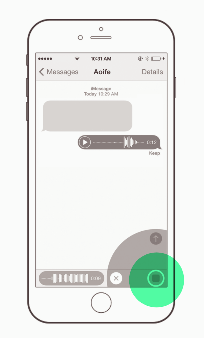
Instant messaging is immersive, and personal, yet the typography of most messaging applications pay little heed to this rapid-fire nature which begins to approximate real-time vocal communication. It does little to facilitate identity, tone or inflection, aiming instead for Beatrice Ward’s ‘crystal goblet’ approach to typography. But is a crystal goblet what we need when we express ourselves in these settings? How often have each of us been confronted by the weight of the period in a text that reads merely “I’m fine.” That punctuation mark, once used to clarify the structure of a communication and separate distinct thoughts, now becomes unnecessary. In the realm of speech bubbles and time stamps, this is often a discretionary addition that becomes a different kind of meaningful.
In 2015, the Oxford English Dictionary’s Word of the Year was this emoticon , and by way of explanation, OED’s president, Casper Grathwohl describes the “visually driven, emotionally expressive, obsessively immediate” audience with whom the “traditional alphabet language has a hard time keeping up.” If so, why? Is it due to the typefaces themselves? The structure of the typeface families? The modes of display? Is the use of emoticons really an indicator that our typography lacks expression or emotional depth?

In recent decades, both the climate of type design and typographic practice have changed. The advent of webfont support, improved screen resolutions, font editors and integration of scripting in the type designer’s workflow have afforded the field new horizons. Johanna Drucker, in Graphesis, notes that digital displays afford more than the printed page, “add[ing] the additional functionality of re-inscribability, computational processing and analysis, real-time refresh, and networked environments.”
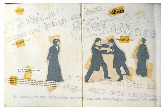
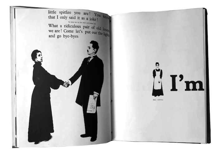
Work like that of Robert Massin, in his pre-digital era interpretation of Ionesco’s
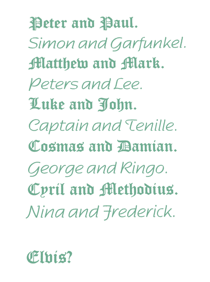
The Bald Soprano anti-play, demonstrates the ability of typography to express and emulate the shape, speed and immediacy of speech. Distilling not only the content of what is said, but the way it is said. These beautiful spreads were created before the digital revolution, and yet this expressive approach to typography has yet to be fully embraced in the new and eminently more conducive digital environment. The resemblance of some of these spreads to the structure of most text messaging applications speaks to possibilities. The desire for and possibility of our communications allowing for expression is evident, but is further supported by recent research in HCI and Linguistics. Specifically, these studies have reflected on how best to represent prosody and emotion in graphic or textual form1, and on improving the automatic detection and annotation of prosody in a corpus of speech2. As far back as 1999, in an address at ATypI in the University of Reading, David Crystal looked at how typefaces might be used to embed non-linguistic information, in his semiotically rich poem about the status of Elvis in the annals of musical history.


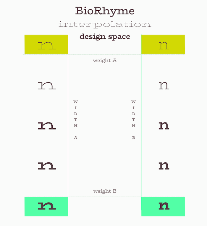
With these concerns and possibilities in mind, it is worth considering how we might more fully realize a typography like that of Massin’s through the design of typefaces. The field of typeface design is currently on the cusp of embracing an approach to type design that allows for on-the-fly interpolation of typefaces from a few master weights. Nick Sherman makes a strong case for typefaces to be as responsive, interactive, real-time, scaling and fluid as the websites they serve and noting that type design for large families is already centered around this practice, based on the definition of poles between which to interpolate intermediate weights and styles, and the creation of a conceptual design space.

Dynamic treatments for typography are also becoming more commonplace in the world of identity design, where tools like Processing have allowed designers to create flexible and adaptive behaviors for type. Collins’ generative identity for the TDC60 awards is a good example of this, as is the recent TypeCon Denver identity system designed by Nicolas Felton, which used the letterforms as a framework around which to wrap linear structures. These approaches showcase the potential for typefaces to act as responsive pieces of software that can be programmed to shapeshift and adapt to their environs and user input while still maintaining an identity. This way of thinking can also be seen to reflect a broader conception of design as a practice of creating processes and systems, rather than products.


Traditionally, in the creation of a family, the type designer defines points within the design space to serve as individual weights or styles with specific typographic purposes in mind. If the potential for dynamic typefaces on the web is realized, there is another purpose to which this technology can be put. Thinking of typefaces like visual voices, whose tone, timbre, and intonation can change fluidly, but whose overall identity remains consistent, would allow for the design of typeface not just to support hierarchical data, or differentiated content, but to articulate emotion, mood, and prosody—reflecting not just what language looks like, but more appropriately, the shape of our speech.
