March 21, 2016
Face Forward: Fluid Identity
A rich and diverse range of topics were covered at the inaugural Face Forward International Typography Conference which took place over two days in December 2015, in Dublin, Ireland. Sara Jamshidi, until recently, Design Observer’s senior designer, attended the peer-reviewed conference at which typographic identity, authenticity, ethnicity, and security through disciplines as disparate as linguistics, philosophy, history, and architecture were explored. Sara, along with four attendees, wrote dispatches from the conference, which we are featuring this week.
**** Architects and typeface designers have been thinking about generative design related concepts such as modularity, parameterization, and automation since at least the late Medieval period. These notions have been refined over the centuries, and are now an integral part of these disciplines. Such concepts entered the communication design consciousness rather late in the second half of the twentieth century and are not yet commonplace.
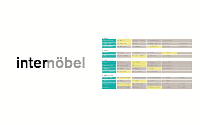
As far as I can tell, Swiss designer Karl Gerstner introduced a coherent theory of generative communication design when, in 1964 he declared, “instead of solutions for problems, programmes for solutions.” In his book Designing Programmes he demonstrated that methods borrowed from scientific disciplines could be adapted to the needs of communication designers.
The “morphological box of the typogram” is a vivid example. Gerstner showed how an idea generation strategy borrowed from Swiss astrophysicist Fritz Zwicky (the “Zwicky Box”) could be used to generate solutions to a simple, typographic logo design problem. Contemporary visual identities are neither as simple nor crystalline as Gerstner’s demo—they consist of a number of component parts (symbol, word mark, typography, color palette, graphic elements), all of which need to work together to form a coherent identity system.

Recently, Gerstner lamented the fact that designers have not moved beyond the modernist approach to static visual identity design and further developed his generative approach to harness the power of new media: “[visual identities] continue to be applied as rigid appendages to all media – no matter whether they appear in print, on the internet, or are representational or atmospheric.”
In the modernist visual identity paradigm, components of visual identity were considered fixed and a tremendous effort was expended to ensure that the elements appeared consistently across all applications. In the emerging visual identity paradigm, some or all of these components will be considered fluid and variable and an equal or greater effort will be needed to determine which elements are allowed to vary and which elements will remain constant.
While this approach is currently somewhat speculative, the theoretical groundwork is being laid and a precedent is being set in professional practice. Hugh Dubberly has described the paradigm shift taking place in design as a transition from a “mechanical-object ethos” to an “organic-systems” ethos. In his theoretical model, Dubberly sees designers moving from a position of authorship to one of facilitation; clients moving from a position of owner to one of stewardship; and the end state of a design project moving from completion to adaption, evolution, and continuous updating.
Ulrike Felsing has compiled the most comprehensive set of case studies to date documenting visual identity systems that take an organic-systems approach. In her book Dynamic Identities in Cultural and Public Context she states, “[f]uture design potential lies in interdisciplinary workgroups benefitting from the possibilities offered by perpetually updateable [sic] databases and generative archives, and in custom-designed computer programs and sub-programs (plug-ins).”
Such programs, which will be able to control and design ongoing processes, have the potential to take the place of “closed visual identities.” Two strategies for achieving this Felsing refers to as “permutation” and “open form”.
Permutation requires a designer or team of designers to generate a large number of visual elements — a sign family — that all adhere to a superordinate design principle. The application of these elements is then governed by an algorithm: the computer “chooses” which elements to use on a given application. Over time, new elements can be added to the database while others are
deprecated. This imbues the overall visual identity system with dynamism and allows it to adapt organically.
deprecated. This imbues the overall visual identity system with dynamism and allows it to adapt organically.
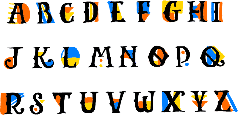
One example of permutation cited by Felsing is the Walker Art Center visual identity system, called Walker Expanded. A custom typeface family is randomly combined with a large number of simple graphic elements and vibrant colors to lend each application a unique identity while also maintaining appearance the overall system.
The strategy of open form involves the incorporation of “real-time processes or data in a dynamic manner”. Thus, while elements of the identity are controlled by a computer program, the instructions are coming from an external process, such as weather conditions or some other natural phenomenon, rather than a person.
This strategy can be seen in the design of the Visit Nordkyn visual identity system by the Norwegian design studio Neue (2010). Nordkyn is a peninsula that sits at the northernmost county in Norway, and as such it is subject to dramatic climactic conditions. The solution for a visual identity system intended to attract adventure-seekers to the area is expressed in the motto, “where nature rules.” Designers at Neue devised a system by which certain parameters of the picture mark would be determined by current weather conditions. The symbol’s shape, which begins as a hexagon, morphs as winds in Nordkyn change direction. The color of the symbol also changes with the current temperature reading, from red at -25°C to cyan at 0°C to magenta at 25°C.
Due to the constant input of weather data, the Visit Nordkyn visual identity system is constantly changing. Any static application, such as stationery or signage, simply captures an instance of the identity. Such a system addresses the shortcomings identified by Gerstner. Rather than a “rigid appendage” applied consistently across all media, the Visit Nordkyn identity embodies the organic-systems ethos.
This fluid approach will ostensibly allow a visual identity system to adapt to changing conditions and evolve organically over time rather than requiring an unnatural often unpopular “rebrand” (think UPS or, more recently, American Airlines) and subsequent loss of equity in the identity. Fluid visual identities will be continuously generating yet never actually crystallize, like a living organism.
Observed
View all
Observed
By Jason Murdock

