December 31, 2009
Face Forward: Tobias Frere-Jones
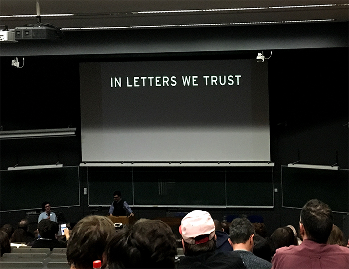
Tobias Frere-Jones during his keynote address
The inaugural of Face Forward conference was held in Dublin last December; this week on Design Observer, we will feature some of the presentations and research shared in Dublin.
++++
In today’s design and typography environment most conferences are focused on featuring recent work and the application of typography across various practices, without any emphasis on academic and peer-reviewed content for educational purposes. But for the organizers of Face Forward—Mary Ann Bolger, Rathna Rmanathan, and Clare Bell—this was something of a concern. They decided to initiate a peer-reviewed conference with contributions from practitioners and scholars working inside and outside of academy, focusing on both practice and research in visual communication, visual language, and design issues.
As with many successful peer-reviewed conferences (in any field), the discussions around each presentation topic were as—if not more—informative than the papers presented, so we decided to continue the discussions online with our readers about some of the most compelling projects from the conference.
Over the course of this and next week we will post some papers presented at Face Forward 2015. Tobias Frere-Jones was the keynote speaker and following is a short conversation I had with him about the conference and the importance of scholarly forums in design and related fields.
What do you think made Face Forward conference different from the other typography or design conferences?
It was heartening to see scholarship and research embraced like this, even if it ran the risk of seeming “obscure.” There was a recurring theme, both on stage and in the programming, that research is both valuable and continuous. Small discoveries today will support larger realizations tomorrow.
Face Forward is the first academic and peer-reviewed conference about design and typography that I have heard of (let alone attended). In your opinion why is it important that such conferences provide a forum for discussion as opposed to mainly presenting projects and inspirations.
Design has an important commercial value, but it’s really useful to have all that put on mute, as it were. It can recalibrate your thoughts about your own work. It can encourage us to keep experimenting and exploring.
As a conference attendee I found it both educational and inspirational to focus more on my personal research projects. Did you find any of the papers or topics covered in the conference specifically notable?
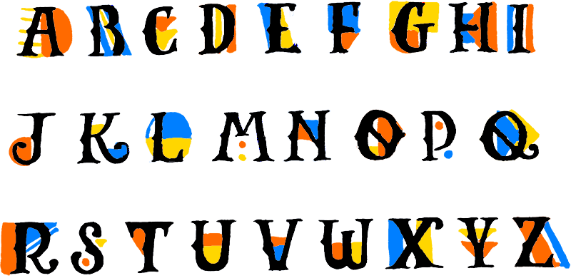
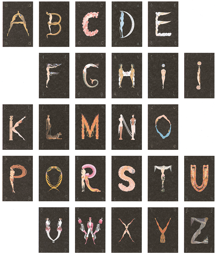
I quite liked Tom Spalding’s presentation. It looked at the public signage of one Irish city in the eighteenth and nineteenth centuries, and presented it as a record of lettering history but political history as well. It’s really thrilling to see something so apparently small being opened up to reveal a larger picture. Also Amy Papaelias’ survey on type specimens in the past, near-past, and present. It was visually rich but also clear in its thinking. (More information about Tom Spalding’s Layers can be found here.)
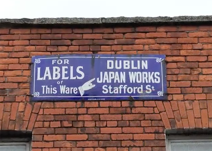
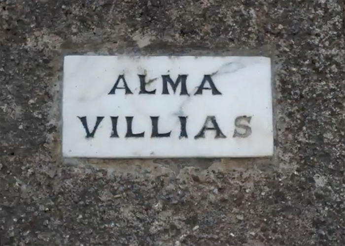
Slides from Tom Spalding’s presentation
Would you please tell our readers a little about your presentation and your collection that you shared?
I presented a research project in progress, which tracks the use of letterforms as security devices. Most of it concerns banknotes, and specifically from the American Colonial period. The talk began with observations made in my own collection, but includes examples I found at the American Numismatic Society, and also material from the Smithsonian.
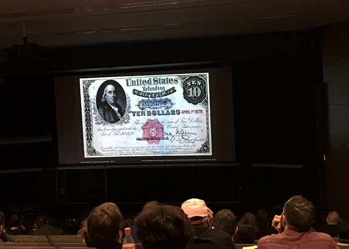
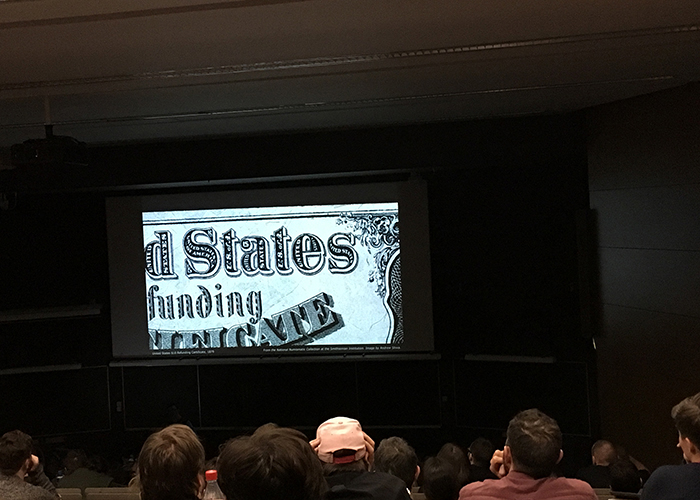
Slides from Frere-Jones’ presentation
What is the importance of such conferences for young typographers and researchers?
More than anything, it’s the demonstration that you can (and should) go deep into your material, whatever that may be. And the more you find, the more passion you’ll have.
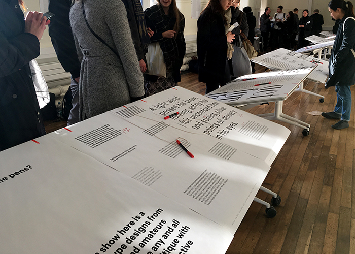
Face Forward attendees presented their type specimens for feedback
As we know you recently released a new type family, Mallory; can you tell us a little more about it and MicroPlus styles?
Mallory began as an experiment in mixing typographic traditions, building a new design with British and American traits. My father was American and my mother is English, so this was a more personal motivation, to make a typeface that had the same heritage as me. Mallory also includes new “MicroPlus” versions, which are simultaneously text sizes for screen and tiny sizes for print. The challenges of these two environments call for nearly identical responses (looser spacing, larger x-height, blunter shapes), so I tried solving them together. The idea is based in the history I learned from my mentors like the late Mike Parker. It felt like a new way to put history to work and bridge the gap between print and digital environments.
Mallory, designed by Tobias Frere-Jones
Observed
View all
Observed
By Sara Jamshidi
Recent Posts
The Risks of Retreating from DEI with Catalyst’s Alix Pollack & Doug Powell Redesigns Design Thinking Why ethical AI is good business Dispirited Away: In the wrong hands, ‘Ghiblified’ genAI images erode ethos, empathy, and our very humanity Walkie talkie: An architect-turned-tour guide on designing presence in Lisbon
