
January 8, 2010
A Makeover for the BART Map
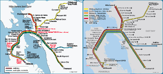
In mid-September, Bay Area Rapid Transit (BART) released a redesigned map of its commuter rail system. Unlike the notorious 1972 Massimo Vignelli redesign of the New York City subway map, the new BART map didn’t make much of a splash in graphic design circles. I learned about it from Facebook, where a friend linked to a blog post maligning the new design for flattening the curve in San Francisco’s Mission Street. The blogger called the change a “slight upon the history of this city.” But the new BART map flattens more than the bend in the Mission District: with the purity of perfect geometry, it forces a comb through the old map’s wild tangle of rail lines.
I moved to San Francisco a few weeks after the new map began appearing in BART stations and might have forgotten all about the blogger’s call to “preserve the curve,” but a slow roll-out — stations have been updated but train cars have not — has meant that a rider is often confronted with a jarring side-by-side comparison of the old and the new. Seen together, the maps look like a cartographic version of a reality TV makeover show (“She’s all cleaned up and ready for her big date, folks!”), and represent a long-standing debate in transit map design: geography versus geometry.
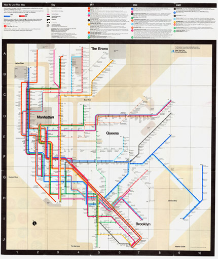
The New York City subway plan is probably the most familiar example of a major transit map drawn in the geographic style. Major parks, waterways, and landmarks appear, and transit lines snake across land and water in a broad approximation of their true paths. The five boroughs are significantly out-of-scale, with Manhattan expanding and Staten Island shrinking to accommodate the relative complexity of mass transit in each, but the subway map is geographically accurate enough for tourists to think they can get by using it as a street map.
The plan for the London Underground map, conversely, is the quintessential geometric map. It’s a schematic diagram showing the relative positions of stations along the lines without regard to their true physical location. Visually similar to electrical circuit diagrams, the map’s lines are drawn at 45 or 90-degree angles. Underground employee Harry Beck devised this diagrammatic approach when he set out to redesign London’s transit map in the early 1930s. The technique revolutionized network mapping, and many major cities subsequently adopted geometric mapping for their transit systems.

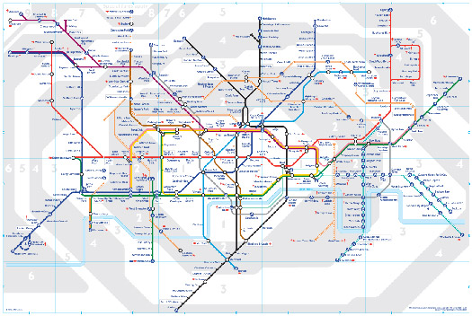
Typically, map users crave geography while map designers prefer geometry. The old BART map, with its bends and curves, is more geographically accurate than the new version, but the new map is hardly a radical departure into flatland. Bearing a strong resemblance to a BART planning map from the 1960s, the new version is something of a return to the past. New York and London have also faced the push-and-pull of these conflicting mapping paradigms (the Vignelli subway map, for example, failed because it was too geometric for public tastes,) and last September, the Thames was quietly removed from the London Underground map. Unfavorable media attention and public disapproval caused the river to be reinstated in the map’s next edition, released two months later.

Transit maps hold a vital position in the visual culture of the places they represent: they often frame a visitor’s introduction to a new city and are the focus of the weary commuter’s stare day after day, year after year. A transit map provides a set of instructions for how to traverse a city. It influences behavior, prescribing our movements by guiding the paths we take and in so doing, has the power to actually shape a city. A transit system’s existence is objective, because it is material: but a transit system’s map — whether it is geographically or geometrically motivated — is subjective. It interprets a transit system according to the perspective of its designer. Harry Beck, an electrical draftsman, drew a map that looked like a circuit diagram. The hand that draws the map is making innumerable choices and solving innumerable problems. Some are aesthetic, such as what colors to use, while others are tactical — how to treat the convergence of multiple lines in a congested area, for example.

The new BART map is certainly easier to read. Some well-trained designer took a weed wacker to the typography, and he or she knew that there’s something essentially appealing about brightly colored lines running in parallel. When I first saw the new map, I breathed a Modernist’s sigh of relief. As a graphic designer, I couldn’t have abided my newly adopted city using the old map. It was embarrassingly messy, almost disgusting, the way yellow slithers up toward Pittsburg/Bay Point after wriggling between and under red and orange. Like a child drawing, the old BART map could take you on a flight of fancy, but wouldn’t get you to and from work.
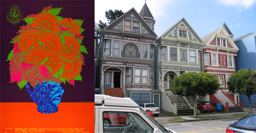
If I consider the old BART map in the context of the visual culture of the San Francisco Bay Area, I am no longer certain of its inferiority. Historically, two of the major touchstones of graphic art in the Bay Area are psychedelic poster art and Emigre magazine and type foundry. The swirling hand lettering of the “Cosmic ’60s” concert posters of Victor Moscoso and Zuzana Licko‘s experimental typefaces like Citizen and Base 12 challenged accepted norms and marked the Bay Area as a safe space for graphic play. Today, widespread mural art, graffiti, and campy Victoriana ensure that San Francisco’s built environment is one of America’s most colorful, and most DIY urban destinations. A sense of visual whimsy extends to the Muni, San Francisco’s light rail and bus system and BART’s transit cousin. Muni’s logo, designed by Walter Landor in the 1970s, is informally known as “the worm” and borrows directly from 1960s poster art. Muni’s sunny color palette and knocked-out lower case typography reads as retro-unhip-hip enough to feature in The New Ugly. The old BART map’s visual language — snaking, hand-drawn lines, typographic naïveté — begins to make sense.

Ultimately, how a transit map looks communicates information about the people who designed it, the people for whom it was designed, and the place it represents. Certain transit maps have come to symbolize the very spirit and character of a place. In Metro Maps of the World, author Mark Ovenden claims it “difficult to imagine an image more ingrained into the very psyche of a population” than the London Underground map. Ovenden also maligns the “slavish topographic accuracy” of the old BART map. Yet loyalty to topography is what gave the old map its unique visual qualities. Besides, the new BART map engages slavish geometric inaccuracy. The BART system, with five lines and forty-three stations, is simple. The new map feels inauthentic. Lines have been straightened for straightness’s sake, not to solve design problems. The BART map gained legibility but lost a rare hectic energy. Now that the old map is nearly gone, I realize how wonderful it has been to be confronted by a poetic, painterly map, by a map that makes me uncomfortable.
Observed
View all
Observed
Share on Social
By Rachel Berger
Related Posts

Arts + Culture
Nila Rezaei|Essays
“Dear mother, I made us a seat”: a Mother’s Day tribute to the women of Iran

The Observatory
Ellen McGirt|Books
Parable of the Redesigner

Arts + Culture
Jessica Helfand|Essays
Véronique Vienne : A Remembrance
Design As
Lee Moreau|Audio
Announcing: Design As Season Two
Recent Posts
“Dear mother, I made us a seat”: a Mother’s Day tribute to the women of Iran A quieter place: Sound designer Eddie Gandelman on composing a future that allows us to hear ourselves think It’s Not Easy Bein’ Green: ‘Wicked’ spells for struggle and solidarity Making Space: Jon M. Chu on Designing Your Own PathRelated Posts
Arts + Culture
Nila Rezaei|Essays
“Dear mother, I made us a seat”: a Mother’s Day tribute to the women of Iran
The Observatory
Ellen McGirt|Books
Parable of the Redesigner
Arts + Culture
Jessica Helfand|Essays
Véronique Vienne : A Remembrance
Design As
Lee Moreau|Audio