
May 10, 2019
Behind the History of Illustration

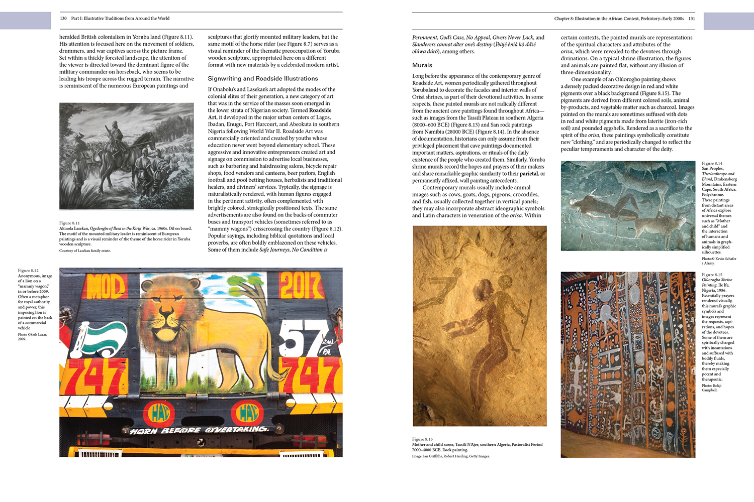
There has never been a proper textbook on the history of illustration, and now there is. History of Illustration (Bloomsbury) by Susan Doyle, Jaleen Grove, and Whitney Sherman is an ambitious, 592 page volume that covers the field on all continents, technology in all its forms, and conceptual and representational methodologies. Such a massive book deserves a long interview with its principals. The three co-authors explain their method and motives behind this landmark book.
Steven Heller: History of Illustration is the first textbook of its kind. And a long time in coming. Having myself tried and failed in my own attempt, tell me how did your book take shape?
Jaleen Grove: Hey! Yours and Seymour Chwast’s book is not a failure—it is part of the discourse, and one that captures a studio-practitioner’s way of engaging with the history of form and style, which no other book has done. Our book’s genesis was very grass-roots. First, the illustration community was clamoring and we each of us had been urged to write a history book singlehandedly.
Whitney Sherman: I had met Susan at ICON6 and discovered her interest in doing a book, later I met Jaleen in the Society of Illustrators Permanent Collection while she was doing research for her PhD and I was conducting a research-based History of Illustration class for undergrads. I told her about Susan and we agreed that a team approach was best in order that the results not be skewed to any one person’s idea of the history.
Because many rumors were circulating about manuscripts in various states, the first thing we had to do was find who else who might already have material, and figure out what potential readers and users would want included. Jaleen and I created and circulated a very long survey in 2012, and with the help of the Society of Illustrators flushed out other writers and had data that helped us develop potential content. In January 2013, following up on the survey effort, illustrator James Gurney emailed about a dozen history-writers he knew with a call to action.
Susan Doyle: There was an online forum through a WordPress in which contributors talked about what they thought should be included. We set up a History of Illustration list-serve so ideas and conversations could be tracked. The Norman Rockwell Museum’s Deputy Director Stephanie Plunkett immediately offered to hold a meeting in April, which was attended by about 26 historians, curators, a dealer, educators, practitioners including Murray Tinkelman, who had always wanted to write the history and who had been instrumental in keeping illustration history alive in illustrators’ education at Parsons in the 60s-70s; and at Syracuse’s and Hartford’s grad programs later.
At that meeting we roughed out a broad table of contents and agreed that the book would act as a sort of stake-in-the-ground in claiming that Illustration has a discrete history. I stepped up to lead the editing and Jaleen and Whitney agreed to assist. Several chapter writers emerged — like Robert Lovejoy and Brian Kane who eventually tackled multiple chapters each. Over the next months, I focused on expanding the TOC and we all recruited more specialists to tackle chapters or sections.
WS: We also sought advice from Richard Kelly (of the Kelly Collection); Louise Schoonover Smith who had, with her brother John, created the Frank E. Schoonover Catalog Raisonné; and Dr. Angela Miller, who edited the textbook American Encounters: Art, History, and Cultural Identity. In addition, we asked David Apatoff, himself a collector and noted amateur illustration historian, to advise us on legal issues.
JG: Little did we know it was going to be a five-year project. We thought three, tops.

SH: What were your criteria for inclusion?
JG: Illustration and Illustration Studies have many subfields, all with their own idea of what illustration is and what its history is—it was important to me that no part of the field be left out. For an author to be included: first—they had to be knowledgeable about a specific area; second—willing to volunteer for only the compensation of a free copy of the book. None of us editors or writers were paid in anything but books, as is normal in academic publishing. Writers also had to be associated with reputable teaching, research or curatorial positions and credentialed as well.
SD: As for topics—the months after the NRM meeting were filled with rewriting the TOC and discussing topics with the various writers—and having collaborators suggest other collaborators. That was an odyssey! We mined online research affiliations to find scholars and emailed them out of the blue. In 2013 and 2014 at CAA (College Art Association), Jaleen got nibbles from Oxford University Press, Bloomsbury, and Thames and Hudson, and we started to negotiate a book deal. It took from February until June 2014 to work out the contract. Publishing with a big corporation for the international textbook market has many constraints, and several authors were surprised about how restrictive the terms were—especially since no one was getting paid.
JG: We decided to go with a large publisher because we felt that it was important to have worldwide reach and eventual translations; to pass the headaches of distribution to pros; and to have a recognized, reputable imprint. Also, Bloomsbury has committed to producing a lot of design titles lately, and it is important for illustration to be among them.
WS: At the point the contract was signed, Bloomsbury wanted to add African approaches and we realized scientific and new media chapters really needed parsing out too. We didn’t add fashion until 6 months later.
SH: How did the three of you as authors decide on who did what?
SD: This was pretty organic. I had been teaching the History of Illustration course since 2007 had asked for a sabbatical to focus on the project which started in 2014. Since agreeing to lead the editing at the NRM meeting, I actively worked with conscripts to chapter with them. I ended up concentrating on ancient through early modern print and non-western topics. This led to formative discussions with scholars willing to parse out what illustration meant in specific historical geographic contexts. Early science ended up in that section because of the print techniques used and the relationship to Islamic illustrated science books.
JG: I have conducted extensive research in 19th and early 20th century illustrated magazines from primary sources, and I have formal training in Western survey art history, so it made sense for me to focus on the middle chapters of the book and to write on the avant-garde. I also have an interest in making sure illustration students get introduced to critical theory just as fine art, film, and design students do, so I worked with Dr. Sheena Calvert and others to distill Plato, John Berger, Walter Benjamin and so on into readable explanations for undergraduate art students.
WS: I was most interested in the mid- to late 20th century illustration including Push Pin, children’s material, the digital revolution, and shifts in standards of beauty (Illustration Brut) within the practice, so it made sense for me to focus on the contemporary chapters. I also designed a curvilinear timeline that accommodated the unequal numbers of world-events, inventions and exemplars that needed to go into each era. My daughter, graphic designer Bryn Freeman, was recruited to create the layouts I’d designed and to meet our pressing deadlines.
During the editing process, we faced the challenge of creating a consistent voice, and we even rethought chapter groupings, so at times material formerly in one chapter ended up in another credited to a contributing author. We each reviewed all of the chapters all the way through the final draft stages, and through multiple proofs as well.

SH: What is your taxonomy? Did you have debates among yourselves about the organization?
JG: Organization was set by the survey, which showed a desire for a full global history from cave painting to present told chronologically, but there was also a call for organization by subdisciplines such as children’s books and medical illustration. So, the ancient world is in Chapter 1, and augmented reality is in Chapter 29, and each chapter also tells its subject more or less chronologically. Within this basic chronological order, however, many individual chapters focus on a region or a subdiscipline, and immense timespans are captured in some cases: the India chapter, for instance, covers 3000-year-old traditions through to the present.
WS: We never had any contentious debates, but it did take a couple years to decide the placement of certain specialty chapters since they overlap with what was going on in broader avenues of publishing. Within chapters, we led with the TOC, but tried to let the writers decide what to cover, stepping in if we felt something needed to be added. Often the expertise of extra contributors was solicited for even just a key sentence or paragraph.
SD: The peer reviews also led to inclusion of new information and refocusing of certain chapters that were sprawling. The timeline ended up being a terrific addition because it makes clear the contemporaneous nature of activities that appear in separate chapters. It’s a visual aid to help students think globally about traditions.
SH: I learned from experience that organizing the history of illustration chronologically though logical also bypasses the nuance of form and content. How did you solve the problem of, say, distinguishing narrative from style?
SD: I am not sure I understand your assertion that a chronology bypasses or makes difficult the discussion of the relationship of form and content. Because no style exists in a vacuum, talking about the evolution of technologies, religion and socio-political events is part of the whole narrative. The “how“ of the making and proliferation among audiences is key to understanding the illustration’s cultural meaning. Narrative traditions are also shared cross-culturally and it’s fascinating to show linkages facilitated by cross-cultural dialogue including the sharing of technology. For me, that was one of the most enlightening aspects. Before this project, I had never thought too much about the ubiquity of humankind pondering the metaphysical, the absolute power of heroic mythologies as a mirror of cultural identity or that the proto-sciences were actually an early form of “crowd-sourcing”. All three spawned such rich visual cultures!
JG: For me, historical context and stylistic expression are linked and need to be considered together. For example, my chapter on the European modernist avant-garde discusses the contexts of bibliophile collecting, unhappiness with commercial culture, interest in “primitive” art, the First World War, social unrest, and the eventual co-opting of the avant-garde by commercial culture. Seeing Futurist works next to Dada ones next to later Moholy-Nagy’s mass-magazine cover allows the reader to understand how form is inherited and applied in new social contexts over time. Brian Kane has also provided a genealogy of the academic tradition in one convenient “family tree” chart in the chapter on nineteenth-century American magazine illustration. We hope students would be able to identify these stylistic forebears in illustrators such as Bernie Fuchs or Barbara Nessim appearing in subsequent chapters.
WS: This process of overlapping forms, aesthetics and influences continues through today in the discovery, inclusion, rejection and reinvention of technologies. We worked hard to keep time, culture, technologies and assertions on beauty in mind with each chapter. Where we felt more was needed to convey understanding, to make the parts connect or go deeper, theme boxes were added. Obviously “everything” can’t be included but we felt the major threads were included.
SH: Also in terms of chronology, there are periods where form is consistent (i.e.19th century) in part because of printing methods, but other times where printing allowed for much diversity. Did you address these concerns?
JG: I’m not sure I agree that the 19th century or any other can be characterized as a period, or that it has consistent form. You can legitimately make that argument if only looking at illustrated newspapers that used facsimile wood engraving, which forced an assembly-line sameness for the purpose of capitalizing media production, and admittedly those newspapers swamped the visual culture 1830-1890. But even within that trade, photography vastly changed the look of the hand-made engravings around 1870. Meanwhile, steel plate engraving dominated the early 19th C fine book production, and from 1840 forward there was a backlash of pictorial wood engravers like Linton and the Pre-Raphaelites whose styles were different than that of the mainstream wood engravers. In the same years there’s the huge range of self-expression allowed to lithographic artists from Daumier to Mucha. And photoengraving, starting in the 1870s, allowed autographic brush illustrations by Manet and others to be printed in mass magazines (yes – illustrations, not “fine art”). We show all these kinds of print in the chapters that cover the 19th century, as well as in other centuries, and discuss them.
SD: The special-topic theme boxes allowed us break out the various technical advances in reproduction that were mentioned in chapters so that the running text could focus more on the meaning and impact of the actual images. We lamented that we couldn’t put in all our “favorite hits”— rather we selected images that serve as exemplars of categories of making and meaning.
WS: The theme boxes also cover critical theory in a very streamlined way that helps students link ideas about philosophies and judgements about artistic practice, impacts of the marketplace on creatives and their networks, and the politics of “Fine Art” versus Graphic Design and Illustration; really, how commerce impacts the making and circulation of illustration.

SH: Like any true textbook yours is aimed at a linear lesson plan or schedule. How have you balanced the overarching history versus the individual “genius” or form-giver?
JG: As educators we felt it was important to go beyond what can be found on Wikipedia. We wanted to give works a context, to question canon, to illuminate typical careers as much as spectacular ones, and to highlight people who were marginalized by the cultural lenses of prior writers’ times. There are already trade publishers doing wonderful monographs on big-name illustrators—we wanted a more material-culture and social-history approach than a canonical recitation of “greats” that duplicates what is already out there. At the first Rockwell Museum meeting, Desdemona McCannon (illustrator/writer/educator at University of Worcester) and Dr. Sheena Calvert (writer/educator at University of the Arts London and Royal College of Art) proposed an approach inspired by the British Museum’s “History of the World in 100 Objects”. This is where items are chosen for the informative and engaging story they can reveal about the culture they are from. Our chosen images include very obscure but illuminating examples.
WS: At the same time, it is still important to have practitioners know a common set of names and imagery to reference when, for example, they are art directing or collaborating. As a result many of the famous names are included too. In sourcing imagery, we relied on museums, practitioners, and networks of collectors to provide reasonably priced images. In a few cases, works by canonical artists were excluded because of extraordinarily high fees for copyright. But we were also extremely lucky to have some living illustrators generously contribute their work to the book!
SD: Generally speaking, however, it was just as much a dearth of space and restrictions on word count that made us streamline chapters. The publishers were very keen that chapters be more or less similar in length for the purposes of teaching. We were pretty convinced that faculty would pick and choose chapters most relevant to their programs and that most would not choose to teach from every chapter or use the whole textbook. Since all the chapters include a historic overview in their introductory paragraphs, chapters (or parts of them) can be taught in any order the instructor wishes. It’s helpful to strategically highlight those cross-cultural influences we mentioned earlier when jumping around, which helps readers reinforce their understanding of world history a little, too.
SH: Issues of gender must have been a concern for you. What was the thought in terms of addressing this?
JG: We encouraged all writers to include women whenever possible. Sometimes this meant, due to space, a difficult decision between a worthy woman and an equally worthy man. That’s why Neysa McMein is there, but not Coles Phillips. There are also theme boxes that discuss theorists such as Judith Butler and Donna Haraway and theories of gender.
SD: We wanted to be conscious of mentioning where women were admitted to and flourished in the practice, but not to overstate the success stories so as to imply equity. It wasn’t just that social mores precluded women from getting certain jobs or as complete an education as men, but art directors and editors made assumptions that women were “more suited” to themes of motherhood, children and family, etc. because society consigned them to those roles. A real chicken-and-egg conundrum, that one of the Theme Boxes addresses specially.
WS: In seeking to underscore the position women were placed in as well as the unsung successes, we felt we were able to successfully serve several much-needed objectives. Jaleen’s latest research, recently presented at the Illustration Across Media symposium at Washington University in St. Louis [all the presentations can be viewed online: https://livestream.com/WUSTL/IllustrationSymposium2019], points out the level to which women have been excluded from the actual writing of illustration history by male writers, compared to female writers. If we ever write a new edition, these findings should be included as well.
SH: Also race and racism (ie. stereotypes and cliche) must have plagued your research. How did you deal with this?
JG: In a way, deplorable imagery is a gift to the educator because it is tangible evidence about the past that shows times CAN change for the better, which inspires the student’s conviction that creative work is worthwhile, serious business.
SD: Right! We have to give full on trigger warnings in class when we teach this stuff – but to ignore it leaves a gap in a young person’s understanding of how insidious racism is in hegemonic visual culture. Since most illustration students will have to depict people throughout their careers, looking at, and analyzing hurtful historic stereotypes sensitizes them to the nuances and implications possible in their own illustrations.
WS: Similar to being aware that many works by women have not been previously included in the discussion of illustration history, we had a number of opportunities, in covering American illustration, to select the work of African-American and Latino illustrators as well as works that dealt with race and racism such as Tom Feelings book The Middle Passage.
SH: Parameters. Where does illustration cross over into design/illustration or illustrative graphic design in your scheme?
JG: The term “illustration” is notoriously slippery, and contingent on the culture and period producing it. We asked each chapter writer to define illustration according to their needs. As a result, a wide range of images and objects are admitted as “illustration”, which I think is really healthy. Illustration is not a thing, it’s a practice, an intent. It’s more helpful to look at illustration’s social functions and how images pair with words, some basic prinicples of which are laid out in the Introduction and an early Theme Box. So we don’t make any claims that this or that is art/illustration/design – we talk about how those categories evolved and affected the field and its status, and we allow things often labeled as “art” or “design” to be “illustration” as well. Things can be all three at once, even. When and why the labels kick in is more informative than trying to pigeonhole objects.
SD: One thing that has driven us through this project is the dearth of critical discourse among illustrators about their own practice. Graphic Designers as a group articulated higher goals for themselves in the early parts of the 20th century, whereas illustration seemed to be stuck in a market-response-mode driven by trends and style. Taking a critical look at illustration as a form of cultural agency is key to the advancement of the field.
WS: With closer looking, and an understanding that illustration is practice-defined, we can really begin to see how illustration is ubiquitous—hidden in plain sight—a topic I covered in my presentation at the Illustration Across Media symposium. The ubiquity of digital platforms and outlets show how well-loved illustrations are among contemporary audiences. People love pictures and the provocative pairing of images and text is at an apogee. Permeable boundaries do exist between Graphic Design and Illustration. Having practiced and taught both, I’ve seen a good number of hybrid students and practitioners, each with their own particular emphasis, navigate both fields, being resilient and creating a broader footprint in their practice.
SH: What did you leave on the cutting room floor?
JG: There is much material for an improved edition. On my wish list are: Eastern Europe; more Spain, Italy and France; all of Africa outside of Nigeria; Oceania; First Nations of North America; global contemporary practice.
SD: It wasn’t just that we didn’t have experts to write about this stuff—we simply had to get the book into a reasonable form within a reasonable timeframe. There was also a mandate from the publisher from the beginning to keep the word count right about where we are (almost 600 pages; approximately 900 images). In certain cases, original drafts by authors had to be chopped almost in half to keep the length in alignment with our contract.
WS: This was particularly difficult in the chapters on 19th century periodicals, comics, and all the late 20th century topics where there is just so much important material to talk about. But we simply couldn’t have certain chapters remain oversized and have the work serve as a textbook. As is, the book is weighing in at about 6.5 lbs!

SH: Obviously all textbooks are destined for revision. Do you believe illustration is continuing to expand? Do you foresee a revised edition in your future? Will it be analogous to Meggs’ six editions of “A History of Graphic Design?”
JG: Illustration is not so much expanding as rediscovering forms it already inhabited in times past—for example, accompanying oral traditions, as in stained glass church windows or the kaavad and story scrolls that have been practiced continuously in India for at least 3000 years. These are basically analog versions of animatics that illustrators routinely produce on Youtube and in the animation industry today, which show sequential pictures with a voiceover or music. So yes—there is much room to grow in including all the emerging forms and new contexts illustration now lives in.
SD: For me this book is in a way a “proof of concept” for a budding field of art history with cultural studies. So far so good—we are seeing topics raised in the book coming up at conferences and an increased interest in discussing Illustration history and theory as part of contextualized studies in American Illustration programs. We are meeting scholars and researchers who are really diving into illustration history in a way that would not have been embraced in decades past.
WS: And as we gain a better appreciation of what it means to be global citizens, being aware of each other’s visual and cultural traditions. Who knows what iconography will survive and morph in the next decades! The synthesis of discrete elements into hybrid forms, in pursuit of shared visual language, makes having an appreciation of the root sources be incredibly important.
SH: Finally, I recently wrote a book (forthcoming) on Teaching The History of Graphic Design which addresses ways to handle the pedagogy. One of the points is that 40 years ago there was only one real textbook, now there are at least a dozen, plus historical offshoots. Do you see yours as a first of “many” more?
JG: One of the primary functions of a “first” is to provoke others into doing their version. This is how a discourse develops. Ours is necessarily breadth more than depth—there is much need and opportunity for rigorous “depth” books to come out.
WS: We discussed the breadth vs depth issue early on and for a short bit talked about whether we’d be called out on what was not included in the book, but quickly realized that this left the door open for others to join in the effort to bring our practice into a stronger light and, in our view, claim much of the imagery included in art history tomes as ours.
SD: Agreed. We optimistically set out to make a skeleton to build off. As it is, we have most of the basic armature, but not all. Fleshing it out will be a rich challenge! Hopefully there are stashes of ephemera to be uncovered and a continued interest in cross-disciplinary study that interrogates the very boundaries that have stymied critical study of illustration in the past.
Observed
View all
Observed
By Steven Heller
Related Posts

Design Juice
Rachel Paese|Interviews
A quieter place: Sound designer Eddie Gandelman on composing a future that allows us to hear ourselves think

Design of Business | Business of Design
Ellen McGirt|Audio
Making Space: Jon M. Chu on Designing Your Own Path
Design Juice
Delaney Rebernik|Interviews
Runway modeler: Airport architect Sameedha Mahajan on sending ever-more people skyward

Sustainability
Delaney Rebernik|Books
Head in the boughs: ‘Designed Forests’ author Dan Handel on the interspecies influences that shape our thickety relationship with nature
Recent Posts
Mine the $3.1T gap: Workplace gender equity is a growth imperative in an era of uncertainty A new alphabet for a shared lived experience Love Letter to a Garden and 20 years of Design Matters with Debbie Millman ‘The conscience of this country’: How filmmakers are documenting resistance in the age of censorshipRelated Posts

Design Juice
Rachel Paese|Interviews
A quieter place: Sound designer Eddie Gandelman on composing a future that allows us to hear ourselves think

Design of Business | Business of Design
Ellen McGirt|Audio
Making Space: Jon M. Chu on Designing Your Own Path

Design Juice
Delaney Rebernik|Interviews
Runway modeler: Airport architect Sameedha Mahajan on sending ever-more people skyward

Sustainability
Delaney Rebernik|Books

 Steven Heller is the co-chair (with Lita Talarico) of the School of Visual Arts MFA Design / Designer as Author + Entrepreneur program and the SVA Masters Workshop in Rome. He writes the Visuals column for the New York Times Book Review,