July 29, 2009
Can Graphic Design Make You Cry?

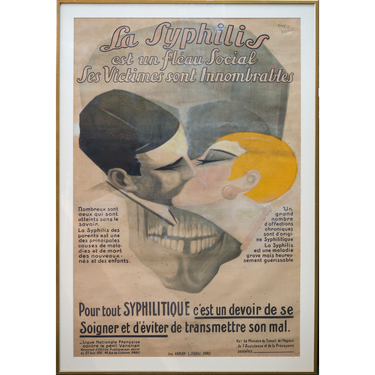
Theodoro, La Syphilis, circa 1926
I grew up surrounded by pictures of drama and terror and death. Our house was filled with oversized, captivating posters like the one above, in which fear and frolic were provocatively conjoined through pictures and words. That they were propaganda was meaningless to me: after all, I was a child, with no money or independence or power of my own, so exercising any suggested behavior prompted by a poster’s message was out of the question. (Though surely the implied cautionary tale — become sexually promiscuous and you will contract syphilis and die — could not have been lost on my well-intentioned parents.) Still, these great big confabs of massive typography and layered image were the visual hallmarks of my immediate orbit, literally flanking my passage from the reliable safety of home to the untold mysteries of the outside world, and providing what I would later come to realize was my introduction to graphic design.
Much later, as a graduate student of graphic design, in the late 1980s, I was exposed to the parameters of what design was and could be, and here, my struggle to reconcile form with emotion was hopelessly stalled. While I begrudgingly acknowledged the value of my formal education, such aesthetic orthodoxy was, frankly, anathema to me. How, after all, could you make design that communicated to human beings and deliberately drain it of all human content?
I have spent a good part of my adult life trying to answer precisely this question.
When I was a student, the prevailing wisdom maintained that the true power of design lay in chiseling it down to its purest form: it was only when it was unencumbered by sentiment that design could truly deliver on its modernist promise. To inject personal voice was to deviate from this no-nonsense objective, and one was best advised to resist such subjective impulses. Better to hone your craft and minimize your imprint, remove yourself from the work and focus on the most salient, most germane form your message could and must take. The designer’s mission was simple: to create the simplest, most harmonious, most neutral form, thereby enabling communication to the widest possible audience.
Oddly, none of us dared challenge this hypothesis because it was widely assumed that our design ancestors had struggled nobly against years of oppression to drag themselves out of the murky propaganda brought about by war and commerce and decoration and, God help us, commercial art. We were the lucky survivors. Now: go fill your three-haired paintbrush with Plaka, and shut up.
It bears saying that most, if not all of my teachers had come of age in Europe, during that post-war period when the profession privileged clarity above all else. As the chosen disciples of this noble tradition (descendants of the Bauhaus, the Künstgewerbeschüle and Black Mountain College, those pioneers who brought graphic design to America) they dutifully adhered to a don’t-rock-the-boat view of design education — indeed, of design itself. And here, the general perspective was one that privileged rigor over voice, seeking the most reductivist solutions to life’s most complex problems.
This never sat well with me. It occurred to me then, as it does now, that life’s most complex problems are the same: war is war, death is death, the world evolves but the basic problems do not essentially change. That styles come and go is a given (Victor Moscosco’s 1960s civil rights protest posters were as visually representative of the generation in which they were published as is the one I’m about to reveal from 1915) but how is it that sometime between the Summer of Love and Hurricane Gilbert, an entire generation of designers virtually abdicated responsibility where the true representation of human experience is concerned? And that we were encouraged to do so in the name of design?
The book I published late last year could most certainly never have been produced twenty years ago, when there was little if any support, let alone tolerance, for the value of human narrative in the context of graphic design. Yet to look at this poster — published in 1915 by the Boston Committee on Public Safety, following the sinking of the Lusitania — is to wonder how it was ever possible to imagine design in the absence of such fundamentally personal stories. The image was based on a widely circulated news account from Ireland about the tragedy, which claimed the lives of more than one hundred Americans. “On the Cunard Wharf lies a mother with a three-month-old child clasped tightly in her arms. Her face wears a half smile. Her baby’s head rests against her breast. No one has tried to separate them.”
Fred Spear, Enlist, 1915
No one has tried to separate them, indeed: nor did the artist, Fred Spear, attempt to separate image from sentiment, news from art, form from content. It remains even now a chilling and unforgettable picture — a mother and her child, swept into sudden death — which, in conjunction with the single word, creates a message of ferociously simple impact.
Some years ago, I asked my students if graphic design ever made them cry. Particularly with regard to graphic design that lived online — where the cacaphony of competing messages makes a single, immersive experience unlikely — was such a thing even remotely possible?
And why, they countered, was this a goal?
The goal, I explained, was to join the manufactured thing — graphic design as an external representation of something else — to the world of the living. The goal was to connect, to enlighten, to more deeply understand, and how can you act if you can’t remember? You remember when you feel something, like I felt terror as a child in a world of public health posters. But as much as I was haunted by them, I was mesmerized by their beauty, their theatricality, their humanity — and that memory has never left me. Who among us does not hope to create work with such indelible, lasting power?
This all bears repeating now, at a time in which so many designers are engaged in addressing design for the public good — design that is sustainable, meaningful, socially relevant — because how can you achieve any of this if you don’t engage at some fundamentally human level, a level where memory and feeling are as valued as form and execution?
I write this now at the risk of exposing myself to personal attack: nostalgia is now as it has always been, a bad thing in design. At its best, it’s redundant. (At its worst, it’s kitsch.) But the opposite is equally vexing, because design that caters to designers, or design that privileges novelty over reality, or design that ignores its basic constituents — design for social change is, after all, design that must be socially relevant, and that means design for and about real people — is just as problematic as design that celebrates modernist ideals in the name of neutrality. Design that strives for neutrality, that seeks to extinguish its relationship to the human condition, risks removing itself from the very nucleus of its purpose, which is, yes, to inform and educate — but also, to enchant. And at the end of the day, we succeed in this effort by being honest: we’re not graphic designers but people who make graphic design. Which means that first, we’re people: people who pay taxes and raise children and read newspapers and vote. People who eat and sleep and argue and question. People who laugh. People who remember. People who even, occasionally, cry.
Observed
View all
Observed
By Jessica Helfand
Related Posts

Equity Observer
Ellen McGirt|Essays
Gratitude? HARD PASS
Equity Observer
L’Oreal Thompson Payton|Essays
‘Misogynoir is a distraction’: Moya Bailey on why Kamala Harris (or any U.S. president) is not going to save us

Equity Observer
Ellen McGirt|Essays
I’m looking for a dad in finance

She the People
Aimee Allison|Audio
She the People with Aimee Allison, a new podcast from Design Observer
Recent Posts
‘The creativity just blooms’: “Sing Sing” production designer Ruta Kiskyte on making art with formerly incarcerated cast in a decommissioned prison ‘The American public needs us now more than ever’: Government designers steel for regime change Gratitude? HARD PASSL’Oreal Thompson Payton|Interviews
Cheryl Durst on design, diversity, and defining her own pathRelated Posts

Equity Observer
Ellen McGirt|Essays
Gratitude? HARD PASS

Equity Observer
L’Oreal Thompson Payton|Essays
‘Misogynoir is a distraction’: Moya Bailey on why Kamala Harris (or any U.S. president) is not going to save us

Equity Observer
Ellen McGirt|Essays
I’m looking for a dad in finance

She the People
Aimee Allison|Audio

 Jessica Helfand, a founding editor of Design Observer, is an award-winning graphic designer and writer and a former contributing editor and columnist for Print, Communications Arts and Eye magazines. A member of the Alliance Graphique Internationale and a recent laureate of the Art Director’s Hall of Fame, Helfand received her B.A. and her M.F.A. from Yale University where she has taught since 1994.