
December 26, 2018
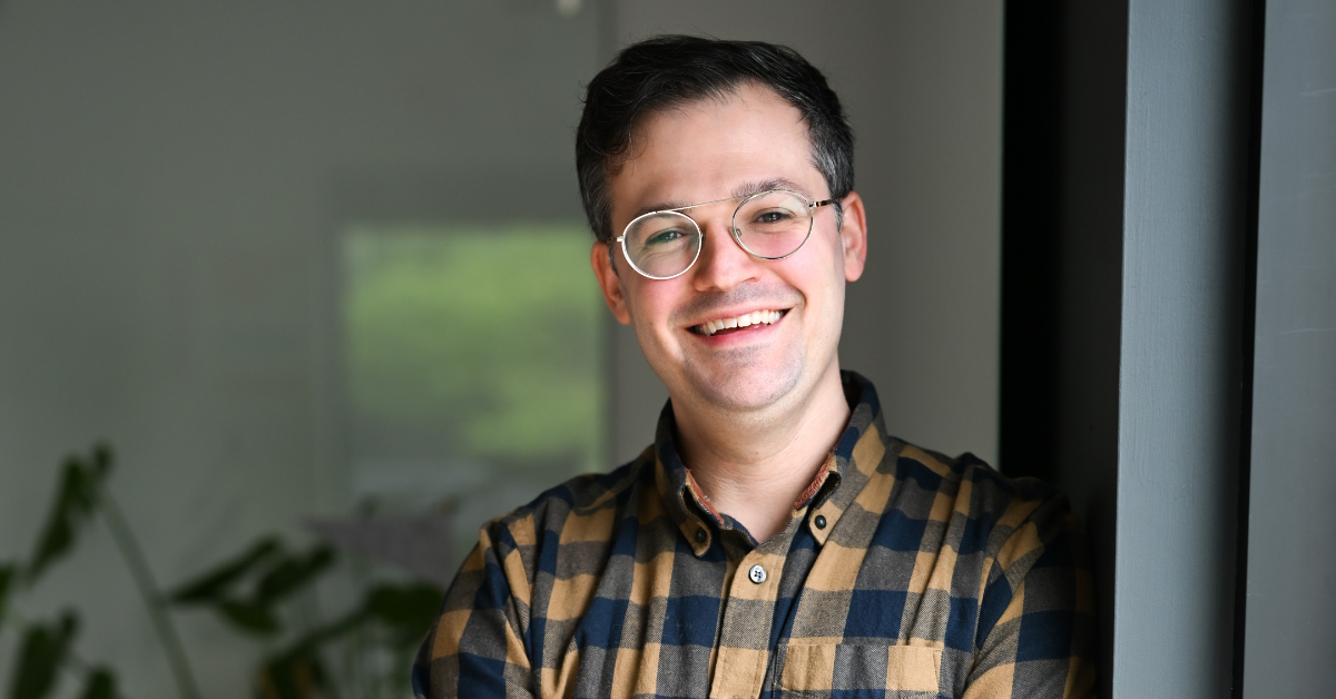
Chain Letters: Celene Aubry
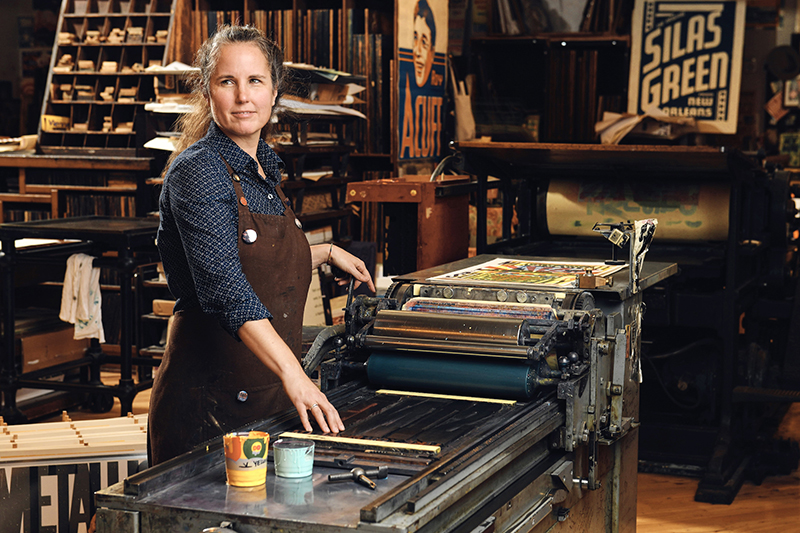
Photo: Jason Kempin/Getty Photography
This interview is part of an ongoing Design Observer series, Chain Letters, in which we ask leading design minds a few burning questions—and so do their peers, for a year-long conversation about the state of the industry.
This December, we’re elevating the act of gift giving by pondering the items inside the box: examining design as craft, poring over process, and picking the brains of designers whose technical skill turn products into objets d’art.
Celene Aubry is the Associate Director and Manager at Hatch Show Print, the iconic letterpress print shop continuously operating since 1879 in Nashville, Tennessee. The shop got its start printing billboards, handbills and posters for a variety of entertainers throughout the South. Today, Hatch Show Print continues to function as a letterpress poster and design shop—printing custom posters for musicians and events all over the world—while also showcasing print-centric art in their gallery and offering hands-on tours and workshops from their education space.
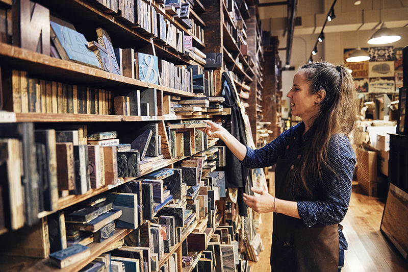
Photo: Jason Kempin/Getty Photography
Walk us through your ideation process. What are a few key steps in taking a product from concept to production? How do you consider the end user?
The majority of the work we design at Hatch Show Print is custom-designed posters which we also letterpress print. They are mostly commemorative or celebratory, which require us to tell our clients’ stories while carrying on the tradition of a 19th century process informed by 21st century sensibilities.
With each job, there are at least two clients: The actual client, who ordered the poster, and the end receiver (or user) of the poster. Some of our projects, like posters we design and print for live entertainment venues, have three clients: the artist or entertainer whose name will appear on the poster, the show attendees who visit the merchandise table, and the venerated venue.
Ideation forms with research and communication—and ours is a quirky design process, so good communication brings the client into our world. Education is such a powerful tool to fully engage clients. For my part, I like to have some ideas jotted down that answer these questions:
- How does the client prefer to present itself?
- How is the client perceived by its end users, and is it different than the client’s self-image?
- If it’s not obvious, what’s the purpose of the poster? Is it meant to communicate news with a grand flourish, or to be a keepsake for the event, or is its intention something else entirely?
- What inspired the idea to call upon the shop for a custom poster? This can help us understand the role the poster will play in a marketing plan or in the execution of an event
Then I start with a few sketches that establish hierarchy and layout. After that, the poster can become physical—typeset and enhanced with graphic elements or imagery which may already exist in the shop’s collection, or may need to be created. Once the design is complete, a proof is made by hand (hand-printing the type and imagery), and a digital image of that proof is sent to the client for discussion and approval. Ink colors and paper are discussed, and once the approval is final, I print!
Education is a powerful tool to fully engage clients.
A lot of products that we use today were the outcomes of happy accidents. Have you ever made mistakes in the making process that helped you come up with a new idea or overcome a creative roadblock?
Hatch Show Print was founded in 1879. So in a way, 140 years of design lives within the walls of our shop. We have type and blocks that were carved during the shop’s first years of business in Nashville shelved alongside blocks that were carved last week. We’re probably ‘rediscovering’ tricks of the trade as we work, because there is no other design and production letterpress print shop in the world that works quite like we do. Sadly, as each year stretches into the next, our best resources for experience and knowledge—our mentors in the craft of letterpress printing—are waning.
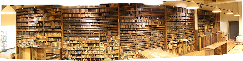
“Our 60′ wall of print blocks contain an array of typography and hand carved imagery (some discontinued from the early 20th century, when it was made) that could please any designer. The wall tells the history of the shop, and contains so much potential energy, because from it, we’ll continue to tell stories in posters and prints.” Photo: Celene Aubry
The natural path to solving any design problem is rarely straight. There are many small discoveries made along the way to one design solution, and sometimes those small discoveries, whether it’s an old photo plate in the collection that merits a new story, or an array of historic blocks that can be brought together and remixed for a set of playing cards, compound the excitement of working among all this old wood and metal.
The natural path to solving any design problem is rarely straight.
We also hand-mix just about all of the ink we use in our work, so color is a constant topic of discussion and experimentation. Fresh combinations present themselves during the process of preparing a poster for print (called “making ready”) or when we run misprints from previous poster jobs through the press to check the quality of the current print, and these unintended layers of ink inspire new combinations for future posters. (The same can happen with designs for products we don’t produce on-site.)
Those same heavily layered misprints are chopped up into postcards, pocket-size journal covers, and other small crafty items for sale in our retail shop—truly happy accidents. It’s a way we can reduce our waste (recycle recycle recycle!), and share a bit of these color explosions with others. Every day brings with it the opportunity to make a mistake (or ten), and we relish them as opportunities to enhance our understanding. Of course, the better you know the ‘rules,’ the better you know how to break them.
What’s a trend that you wish would just die already?
As a designer working within letterpress printing specifically, I’ve found that the ‘ransom note’ approach to typography is rarely, if ever, done well. It works for collaged art or design, but the tools tell the truth: If the word or phrase is too tedious to typeset because each letter varies in size from its neighbor, it’s just downhill from there once you get on press. Plus, choosing that route can convey an unwillingness to communicate clearly, and that is the antithesis of the poster design work that I find most engaging.
What’s your favorite gift to give and why?
I really enjoy sharing art (and the great conversations that inevitably follow!). Fortunately, I know a lot of wonderful people who make beautiful work—whether it’s something handmade, a good book, or album—and I really enjoy being able to share them with others by giving their work as gifts. I’ve always been attuned to how things are made, and working in a place where I control the design and production myself has only enhanced my appreciation of that. So, whenever I come across something that ticks all the boxes—good design, aesthetics, and manufacture—I can’t help but want to share it!
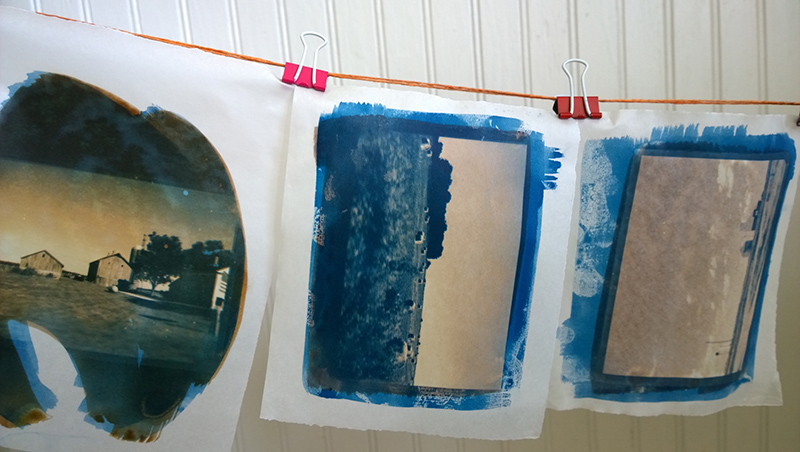
“Photo prints that I made, hanging on the line in my kitchen, to dry. In these particular prints, I brought together the two processes of cyanotype and van dyke, to experiment with their interactivity.” Photo: Celene Aubry
Your question from Nicole Licht + Melissa Deckert, founders of Party of One: Do you have any creative outlets that offset the multi step process you employ at work— we are curious to find if you crave any immediate creative pleasures?
Ha! Great question. Yes. I have owned a camera of one kind or another since I was a kid, and I truly enjoy the series of connected interludes that a good photo-based print requires. I love capturing images during my travels (even out and about in Nashville) where I can get lost and work with the existing light and conditions to really see my surroundings.
And the print process itself is its own experience. I enjoy making cyanotypes and van dyke prints (two very early forms of photo printing). Within a printing session, the experience of making an image can be different, based on minute variations of the chemicals, the exposure in the sun, and the wash-out. It’s a blast, and feels new every time I do it. Of course, for the ultimate in immediate results, I have a couple of old Polaroid cameras that I can pull out and see how they turned out in 60 seconds!
Observed
View all
Observed
Share on Social
By Lilly Smith
Related Posts
Design Juice
Rachel Paese|Interviews
A quieter place: Sound designer Eddie Gandelman on composing a future that allows us to hear ourselves think

Design of Business | Business of Design
Ellen McGirt|Audio
Making Space: Jon M. Chu on Designing Your Own Path
Design Juice
Delaney Rebernik|Interviews
Runway modeler: Airport architect Sameedha Mahajan on sending ever-more people skyward
Sustainability
Delaney Rebernik|Books
Head in the boughs: ‘Designed Forests’ author Dan Handel on the interspecies influences that shape our thickety relationship with nature
Recent Posts
“Dear mother, I made us a seat”: a Mother’s Day tribute to the women of Iran A quieter place: Sound designer Eddie Gandelman on composing a future that allows us to hear ourselves think It’s Not Easy Bein’ Green: ‘Wicked’ spells for struggle and solidarity Making Space: Jon M. Chu on Designing Your Own PathRelated Posts
Design Juice
Rachel Paese|Interviews
A quieter place: Sound designer Eddie Gandelman on composing a future that allows us to hear ourselves think
Design of Business | Business of Design
Ellen McGirt|Audio
Making Space: Jon M. Chu on Designing Your Own Path
Design Juice
Delaney Rebernik|Interviews
Runway modeler: Airport architect Sameedha Mahajan on sending ever-more people skyward
Sustainability
Delaney Rebernik|Books