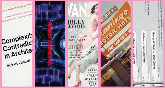
1. Cover, Complexity and Contradiction in Architecture by Robert Venturi, 1966
2. Opening titles for Iron Man, designed by Kyle Cooper, 2008
3. Cover, Vanity Fair, photo by Annie Leibovitz, March 2008
4. Flamingo Motor Hotel, photo by Rick Poynor, 1978
5. Sample Ballot, Design for Democracy by Marcia Lausen, 2007
2. Opening titles for Iron Man, designed by Kyle Cooper, 2008
3. Cover, Vanity Fair, photo by Annie Leibovitz, March 2008
4. Flamingo Motor Hotel, photo by Rick Poynor, 1978
5. Sample Ballot, Design for Democracy by Marcia Lausen, 2007
This article, in an earlier version, first appeared in Dwell (December/January 2009, Vol. 09 Issue 02) in an editorial series of "introductions" to various aspects of design and architecture. The authors thank Dwell for its original publication in their pages.
INTRODUCTION
Broadly defined, graphic designers (sometimes referred to as “communication designers”) are the visual ambassadors of ideas: their role is to translate, communicate — and occasionally even agitate — by rendering thinking as form, process and
experience. *
In addition to their role in the visual engineering of most printed matter, graphic designers today lend their expertise to a host of related disciplines including, but not limited to, strategy and consulting, information and experience design, branding and broadcast design, and signage and wayfinding systems. They are groomed to acquire a certain classic set of skills (which today demand a facility with software) including drawing, photography, composition and typography — the design and structural characteristics of letterforms, arguably graphic design’s lingua franca.
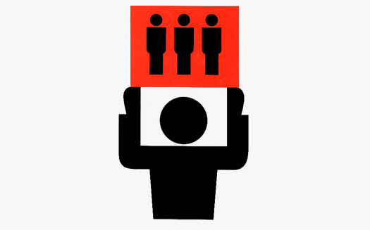
Isotype Pictograms: Isotype — an acronym for the International System of Typographic Picture Education — was developed after World War I by the Austrian educator Otto Neurath. With German illustrator, Gerd Arntz, Neurath created a hieroglyphic vocabulary of easily understood symbols that have been assimilated internationally.
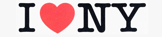
I Love NY Logo: Designed by the grandfather of graphic design, Milton Glaser, in the 1970s, this rebus combines a red heart with the rounded slab-serif typeface American Typewriter.

UPS Pictograph: The UPS logo was designed in 1961 by Paul Rand as a sort of heraldic pictogram. Rand said he gauged his success when he showed the work to his daughter. ("Why, it looks just like a present, Daddy," she said.) The logo was redesigned in 2003 by design firm Futurebrand.
Graphic Design Done Right: A good identity is simple, but never boring; flexible, but never chaotic; playful and iterative — and always supremely recognizable. Good examples of graphic design done right are Saks Fifth Avenue and The New York Times online.
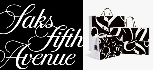
Among the more recent examples of successful identity programs are Pentagram’s redesign of the Saks Fifth Avenue identity, in which the classic script signature is recombined to create a series of stunning black-and-white compositions, and The New York Times website, an editorial extension of the Old Grey Lady which both bows to and amplifies that newspaper’s classic personality to a dynamic online environment.
On Design & Business: Joel Podolny, formerly Dean, Yale School of Management
Merz to Emigre and Beyond: Avant-Garde Magazine Design of the Twentieth Century by Steven Heller
* ["experience" is a widow (also called an orphan), a word or fragment appearing alone at the end of a paragraph. No good graphic designer would have let this go to press in print or online it's an obvious mistake.]
Graphic design is an international language composed of signs and symbols, marks and logos, banners and billboards, pictures and words. As visual communicators, graphic designers maintain a delicate balance between clarity and innovation: if too much of the former is a snooze, too much of the latter yields chaos. In between lies a complex series of negotiations which lead, in turn, to a host of applications — the same logo engraved on an envelope one day, emblazoned on a truck the next — and therein lies the designer’s peculiar, if paradoxical challenge. Succeed, and the world works a little better as a result. Fail, and — well, you’ve got the butterfly ballot.
In addition to their role in the visual engineering of most printed matter, graphic designers today lend their expertise to a host of related disciplines including, but not limited to, strategy and consulting, information and experience design, branding and broadcast design, and signage and wayfinding systems. They are groomed to acquire a certain classic set of skills (which today demand a facility with software) including drawing, photography, composition and typography — the design and structural characteristics of letterforms, arguably graphic design’s lingua franca.
Long ago, to be a graphic designer was to distinguish yourself by defining your territory as fundamentally two-dimensional. Unlike artists, graphic designers had clients. Unlike architects, they delivered printed messages. Today, with the meteroric rise of desktop computing, social networking and mobile technologies, graphic design is the ultimate DIY activity. Or is it? Albert Einstein once said that the secret to creativity is knowing how to hide your sources. So don’t ask us to explain how kerning works: just trust us.
ICONS OF GRAPHIC DESIGN
Isotype Pictograms: Isotype — an acronym for the International System of Typographic Picture Education — was developed after World War I by the Austrian educator Otto Neurath. With German illustrator, Gerd Arntz, Neurath created a hieroglyphic vocabulary of easily understood symbols that have been assimilated internationally.
I Love NY Logo: Designed by the grandfather of graphic design, Milton Glaser, in the 1970s, this rebus combines a red heart with the rounded slab-serif typeface American Typewriter.
UPS Pictograph: The UPS logo was designed in 1961 by Paul Rand as a sort of heraldic pictogram. Rand said he gauged his success when he showed the work to his daughter. ("Why, it looks just like a present, Daddy," she said.) The logo was redesigned in 2003 by design firm Futurebrand.
GRAPHIC RECOGNITION
Graphic Design Done Right: A good identity is simple, but never boring; flexible, but never chaotic; playful and iterative — and always supremely recognizable. Good examples of graphic design done right are Saks Fifth Avenue and The New York Times online.
Saks Fifth Avenue, brand identity and packaging by Michael Bierut at Pentagram
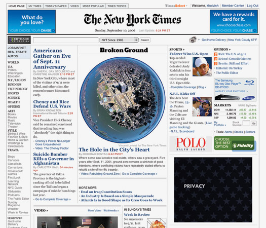
The New York Times online
Best: Saks Fifth Avenue; The New York Times online: Seen on everything from shopping bags to shipping vessels, print collateral to web and motion graphics, an identity program balances variety with specificity. Often accompanied by “bibles” — detailed style guides outlining the proper procedures for implementing a logo or trademark — identity programs shoulder enormous responsibility. While infinitely scalable, a good identity program is grounded in a kind of basic formal system: color palettes, font choices and grids (the underlying armature upon which most printed materials are placed) all help to solidify a brand’s visual recognition.
Among the more recent examples of successful identity programs are Pentagram’s redesign of the Saks Fifth Avenue identity, in which the classic script signature is recombined to create a series of stunning black-and-white compositions, and The New York Times website, an editorial extension of the Old Grey Lady which both bows to and amplifies that newspaper’s classic personality to a dynamic online environment.
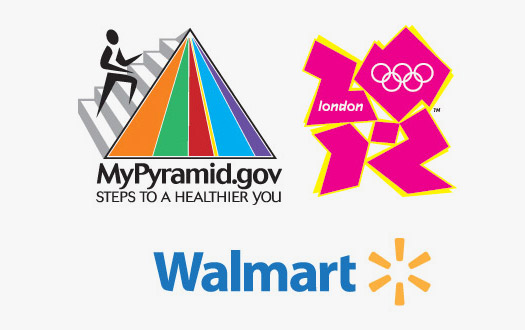
Identity Crisis: Graphic Design Done Wrong: A bad identity lacks formal distinctiveness, making it hard to place and even harder to remember. It’s too complex. Or it’s just ugly. There are so many examples, among the recent worst being the U.S. Food Pyramid, the logo for the 2012 London Olympics, the 2009 version of the Walmart logo, and anything, ever done in Powerpoint.
The Food Pyramid, The 2012 Olympics and the Walmart logo
PowerPoint presentation, design by Teddy Blanks
Worst: The Walmart logo; PowerPoint; the food pyramid; and the 2012 Olympics: Identity programs thrive particularly when there is a lively relationship between that which is constant and that which is variable. The opposite, consequently, reveals itself in programs that favor one (too much constancy) or the other (too much commotion). Regarding the former, Walmart’s recent repositioning features a bland logo that could easily be mistaken for countless other brands, while Powerpoint’s interface, though easy to follow, is little more than a recipe for boredom. (It would not be an exaggeration to suggest that Powerpoint is anathema to most designers.)
In the commotion category, the 2005 redesign of the U.S. Department of Agriculture's "food pyramid” is hard to read, and uses a generic, stick-figure bounding up a staircase of color bars to represent an individual’s ideal nutritional intake. (Considerably easier, if ultimately lethal, to duck into a local McDonalds: golden arches or stick figure with color bars? You make the call!) It is possible that Wolff Olins, the designers of the controversial 2012 London Olympics mark, similarly aspired to such graphic representations of atheleticism: pink, blue, green, orange! And sliced off corners! The jigsaw-puzzle letterforms immediately unleashed a torrent of public vitriol (including pleas from some 45,000 petitioners) and generated at least one study suggesting the mark in video form was likely to induce seizures among epileptics. Oh well.
GRAPHIC DESIGN OF THE FUTURE
On Craft: Marian Bantjes, Graphic Designer
The future of aesthetics lies in random generative software such as Processing, but which will become less random as designers gain control of its abilities. The digital will merge with the hand-made like electric guitar and bagpipes, and together they will break down the rigid tempo imposed by increasingly prescriptive and powerful template software.
On International Design: Richard Grefé, Executive Director, AIGA
In the 21st century global economy, communication designers will make the complex clear. They must also focus on human-centered need, sustainability, simplicity and the special challenges of communicating across cultures. Communication designers will become a strategic resource for the way we approach problems. Creativity can defeat habit.
On Design & Business: Joel Podolny, formerly Dean, Yale School of Management
The future of design in business is promising, from both strategic and tactical perspectives. Design can help frame a business problem, develop and support a clear and compelling message, and align that message with business objectives and customer preferences. Design can drive revenue. And more and more companies are discovering the value-add that design can provide.
On Type: Matthew Carter, Type Designer
New font formats are encouraging type designs with larger and more varied character sets, particularly significant in the non-Latin world. There are more good young type designers now than at any time in history, and there is more teaching of type design at college level — a bright future.
On Education: Meredith Davis, Professor, North Carolina State University
The future of design education depends on how well institutions can adapt curricula to changing conditions in the field: to the increasing complexity of design problems that argue for tools and systems, not objects; to designing with rather than for people; to recognizing the importance of community and context; and to collaborating with peer experts in other fields.
On Sustainability: John Thackara, Director, Doors of Perception
Most designers are in the representation business, so their first response has been to design a poster about sustainability, or launch a media campaign. But the transition to sustainability is not about messages, it’s about activity — helping real people, in real places, change a material aspect of their everyday lives.
On Visual Language: Alice Rawsthorn, Design Critic, International Herald Tribune
One of the most important roles for graphic design in the future will be to help us to make sense of what’s happening in the world around us by interpreting developments in science and technology in a visual language we can understand. Graphic designers have always done this by presenting complex information clearly and legibly, but increasingly they will do the same for theories, as the software designer, Ben Fry, has already done with his visualizations of the human genome.
THE POSTER AS A GRAPHIC MEDIUM
From nineteenth century broadsides to twentieth century propaganda posters, the poster is to graphic design what the building is to the street.
Posters have always existed in that tension-filled space between culture and commerce, situated somewhat precariously between the fine and applied arts. If nineteenth-century posters offered pomp and propaganda, early twentieth-century posters created a canvas in which expressive typography mixed with theatrical juxtaposition to produce new formal languages. Throughout this time, it might be argued that a poster has always been seen as a kind of visual tonic, an antidote to chaos — and something which, by sheer virtue of its scale, can knock you right over. “Some one sole unique advertisement,” as James Joyce once wrote, “to cause passers to stop in wonder, a poster novelty, with all extraneous accretions excluded, reduced to its simplest and most efficient terms not exceeding the span of casual vision and congruous with the velocity of modern life.”
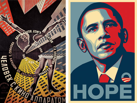
Russian Constructivist film poster designed by Georgi and Vladmiar Stenberg, 1929 and Obama Hope poster, designed by Shepard Fairey, 2008
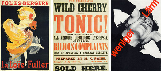
Folies-Bergére theater poster, designed by Jules Chéret, 1893, Broadside advertising wild cherry tonic, 1970's and Weneger Lärm Swiss poster, designed by Josef Müller-Brockman, 1960
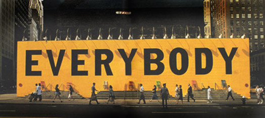
Everybody Installation, designed by Tibor Kalman with Scott Stowell and Andy Jacobson, M&Co., Times Square, 1993
GRAPHIC DESIGN IN DAILY LIFE
Some facts and figures you may not know about what we see in the world around us.
1. The term graphic design was first coined by the American book designer William Addison Dwiggins in 1922.
2. The average yearly income of graphic designers was $45,340 in 2007, according to the U.S. Bureau of Labor Statistics.
3. Before he became famous for his TV comedy work, the late Phil Hartman worked as a graphic designer. He created the logo for Crosby, Stills, Nash & Young.
4. While there are numerous graduate programs in graphic design in the US, only three give PhDs: North Carolina State University, Carnegie Mellon University and Illinois Institute of Technology.
5. The Nike swoosh was designed by Portland State University student Carolyn Davidson in 1971. She was paid $35 dollars.
6. There are 40,000 students in four year and graduate design programs in the US; there are 1,000,000 in China. Source: AIGA and Central Academy of Fine Arts, Beijing.
7. Designers have always been near the center of the civic experience. The US Constitution was written by the Committee on Style.
8. South Carolina beauty Queen Caitlin Upton had planned to attend Appalachian State University to study graphic design, but chose instead to focus on her modeling career.
9. Photoshop 1.0 was released in 1990 for Macintosh exclusively.
10. Until communication designers discovered and changed it recently, a law in Illinois prevented the use of lower case letters in candidates names on ballots.
BOOKSHELF
A History of Graphic Design by Philip Meggs
Now in its fourth edition, and still the best general text on graphic design history, from the cave paintings at Lascaux to more recent developments in digital technology, the late Meggs capably and accurately assesses the broad legacy of graphic design.
Change by Design: How Design Thinking Transforms Organizations and Inspires Innovation by Tim Brown
A leading designer explains and describes "design thinking" as a methodology for design practices and organizations. An interview with Tim Brown was published on Observer Media.
Graphic Design: A New History by Stephen J. Eskilson
A substantial new history of graphic design, now being widely taught. Critically reviewed on Design Observer by Alice Twemlow and Lorraine Wild.
Graphic Design History: A Critical Guide by Johanna Drucker and Emily McVarish
Another new history of graphic design, now being widely taught. Critically reviewed on Design Observer by Denise Gonzales Crisp and Rick Poynor.
Envisioning Information by Edward Tufte
Former Yale statistician Tufte reconsiders the successes and failures of information graphics — those charts and graphs that illustrate quantifiable data — and illuminates the practices as well as the pitfalls inherent in the visualization of information.
This five-volume series brings together the most important critical writing on design from the United States and Europe. An important teaching anthology.
Metahaven: Uncorporate Identity by Daniel Velden & Vinca Kruk, editors
A contemporary take on design identities, branding, social networks, and national identities and borders.
A contemporary take on design identities, branding, social networks, and national identities and borders.
Merz to Emigre and Beyond: Avant-Garde Magazine Design of the Twentieth Century by Steven Heller
The best book on the design and history of magazines. Period.
No More Rules: Graphic Design and Postmodernism by Rick Poynor
A comprehensive overview of the origins of postmodernism, deconstructionism, and graphic design in the digital age.
79 Short Essays on Design by Michael Bierut
With topics ranging from business to art, economics, history, war, politics, film and books, Bierut casts a broad lens on the relationship between graphic design and multiple facets of contemporary culture.
The Design of Business: Why Design Thinking is the Next Competitive Advantage by Roger L. Martin
The head of Rotman School of Management looks at "design thinking" from the perspective of business innovation, as well as sourcing a foundation for this work in American pragmatic philosophy.
The head of Rotman School of Management looks at "design thinking" from the perspective of business innovation, as well as sourcing a foundation for this work in American pragmatic philosophy.
Thinking with Type by Ellen Lupton
Written as a primer for design students, Lupton’s encyclopedic knowledge of typographic form and history endows her writing with a supreme readability. This chooses typefaces to work with all day long, this book should be required reading for anyone with access to a personal computer.
Understanding Comics: The Invisible Art by Scott McCloud
To date, McCloud’s book remains the best for understanding the relationship between time, space and delivering messages to an unseen audience. Highly recommended for those interested in the design of motion graphics and websites.
GLOSSARY
AIGA: The largest professional design association in the U.S., which was founded as the American Institute for Graphic Arts in 1914 and today boasts over 22,000 members. (AIGA.org)
Anti-design: A response to the “slow strangulation of design by ‘branding,’ and to the partial rediscovery of a political instinct among graphic designers.” (Adrian Shaughnessy)
Bleed: When an image or color extends beyond the trimmed edge of a page.
Blobject: An object that is curvaceous and flowing in design, such as the Porsche 911 or the Womb Chair.
CMYK: A color system used for printing — usually referred to as four-color process;
An abbreviation for cyan, magenta, yellow, and black, which, in varying combinations, produce most colors.
Designism: Design as activism, i.e. design that instigates social change.
Design management: A methodology for approaching organizations to make design choices in a market- and customer- oriented manner.
Experience design: A holistic approach to the overall experience of a design environment.
Faux-baroque: An attempt to bring a human touch to computer-produced design, through the use of swishes, whimsical drawings and various botanical elements.
Font: A specific size and style of type within a given typeface. All characters that make up 10 point Helvetica italic comprise a font. (Not to be confused with typeface.)
Grid: An underlying structure of columns, rows, margins, and lines, that dictate the way information is organized on a page.
Hickey: Extraneous matter such as dust, splashes of ink or small pieces of lint that make marks on a printed piece.
Kerning: Adjusting the space between individual characters in a font.
Lorem ipsum: Used as placeholder text because it approximates a typical distribution of characters in English. A bastardization of Neque porro quisquam est qui dolorem ipsum (“Neither is there anyone who loves grief” — the perfect metaphor for graphic design), from Cicero’s De Finibus Bonorum et Malorum.
Point: A unit of measurement for fonts and line-spacing: 1 point equals 0.351 mm. (There are 12 points in a Pica.)
Serif: The small horizontal lines on the ends of each stroke of a typeface, e.g. Times Roman.
Sans Serif: Typefaces without horizontal lines on the ends of each stroke, e.g. Helvetica.
Squeeze-n-Tease: In broadcast design, the process of squeezing of a show’s closing credits into one-third of the screen in order to maximize the remaining space for promotional purposes. (James Gleick)
Typeface: A series of fonts and full range of characters including numbers, letters, and punctuation. e.g. Helvetica, Times Roman. (Not to be confused with font.)
Widow: The final word of a paragraph that stands alone, or the last line of a paragraph from the previous page flowing onto the top of the following page.
WYSIWYG: Acronym for What You See Is What You Get; an estimated screen representation of how a final image will look.
An earlier version of article first appeared in Dwell, December/January 2009, Vol. 09 Issue 02. This new version is © William Drenttel and Jessica Helfand, 2010. All photos are used here with kind permission of their authors.


Comments [61]
Not to be snarky, but since the door was opened by the widow at the top of the page, I thought I'd point out that no good graphic designer would allow duplicate list items, as appear in the "Daily Life" list above.
Just being picky.
10.11.10
12:15
10.11.10
12:27
Good article, though.
10.11.10
12:43
10.11.10
01:37
10.11.10
02:35
3. Opening titles for Iron Man, designed by Kyle Cooper, 2008
Both listings are reversed in the graphic. Regardless, it's a great article.
10.11.10
03:47
Why not explain why the Neurath stick figure is good, while the Food Pyramid stick figure is bad?
10.11.10
04:17
10.11.10
06:01
10.11.10
06:26
I have to agree on the NYT online version. Whenever I open it, a feeling of relaxation and familiarity comes over me.
10.11.10
06:30
10.11.10
06:33
Correction...
Faux-baroque definition: "An attempt" rather than "A attempt."
10.11.10
06:39
10.11.10
08:42
10.11.10
09:08
A reminder of graphic design's limited scope.
Or - maybe Walmart's successful (if controversial) strategy of frugality extends to its employment of graphic designers.
10.11.10
10:30
b) Nike logo in 1964? This from the site that Spanish-inquisitioned Eskilson's book -- recommended in the article, no less -- for getting its facts wrong? What's next, the IBM logo was designed in 1949?
10.11.10
10:31
10.11.10
10:42
Although both Dwayne and Nuncio have questioned our description of the Paul Rand UPS logo as a pictograph or pictogram, I think we will stand by this mixture of terms. It is a logo and named as such. But it is also clearly a [see Wikipedia definition] "pictograph (also called pictogram or pictogramme) ... an ideogram that conveys its meaning through its pictorial resemblance to a physical object." The whole story of this logo is that it looks like a wrapped present with a bow on it, clearly conveying a pictorial resemblance to a physical object.
10.11.10
10:57
10.11.10
11:07
add a shortlist of Design Couples
who have inspired the rest of us.
Shortlist of Design Couples:
Thank you!
10.11.10
11:37
So easy too. option + left bracket type word then option + shift + left bracket. Option + shift + right bracket for apostrophe before the s.
William’s arrow hit the apple.
Larson’s auto supply.
James’ gripped the dog collar.
10.11.10
11:41
and
The old UPS identity is a logotype as it combines word and image as one element. The is a symbol. The IBM logotype is a logotype because the letters are graphically altered into a new kind of abstract image.
I like to call type identities signatures but, maybe there are some other names out there. Sony is a good example of type only. No symbol. No alteration. Microsoft may seem like a signature but wait, it has a little nick in the o and s so, it’s a logotype!
Target has a symbol and a signature (in Helvetica) but is is technically not a logotype as they operate separately even when together.
In the long run, none of these terms matter as brands are more complex then a splotch stuck on a thing. Color, motifs, symbols, typography, the trucks used, uniforms, sound, etc., can all make a brand. (Cue Intel commercial singing employee tune.)
10.12.10
12:06
Sorry for being so self-satisfied, everybody. I just wanted to call some attention to my contribution here.
10.12.10
12:59
The general public doesn't adhere to the standards set by graphic designers. Nobody understands our love of font and graphic design icons such as Paul Rand and Milton Glaser. We are oftentimes overlooked.
This is an interesting beginner’s guide to graphic design, and I do agree that this article would be a great addition to the wikipedia page.
While there is countless numbers of great examples of exceptional design, there seems to be just as many terrible examples. One can search “worst logos” and be overwhelmed with the amount of poor logos. Sexual innuendo, misspellings, clip art and poor font choices galore. Giant companies screw up too. I think of Animal Planet, WGN, and Google specifically.
It takes a strong eye to see what works and what falls short. All of the mistakes that make me cringe could be fixed (in my mind) by Helvetica-happy entry-level designers.
I find the author’s appreciation of the various suggestions to be refreshing. The internet is far too full of passive-agressive bickering. I wonder how many mistakes I've made...
10.12.10
01:38
That comma shouldn't be there.
Also, I agree with the amusing blurb at Tputh.com: "Looks interesting, but the type's too small to read."
10.12.10
04:00
For some reason I like the openness to corrections, maybe because it suggests a degree of perfectionism that contrasts with the sloppiness we often take for granted in online writing. Or maybe I just like being nitpicky.
In that spirit (and a couple of these might be out of order):
[Worst: The Wal-Mart logo; PowerPoint; the food pyramid; and the 2012 Olympics] -- These should be listed in the order in which they appear visually: "The food pyramid; the 2012 Olympics; the Wal-Mart logo; PowerPoint".
[With German illustrator, Gerd Arntz,] -- That first comma shouldn't be there.
[atheleticism] -- Misspelled.
[South Carolina beauty Queen Caitlin Upton] -- "Queen" should be "queen".
[candidates names] -- Should be "candidates’ names".
[describes "design thinking" as]
[looks at "design thinking"] -- Thanks to an earlier commenter, I noticed these don't use the "real" quotes used elsewhere in the article.
[To date, McCloud’s book remains the best] -- Redundant. You don't need the "To date".
[cyan, magenta, yellow, and black] -- You use the serial comma here (the one after "yellow") but not elsewhere. I prefer the serial comma, but either way, you should be consistent.
[Design as activism, i.e. design that instigates social change] -- There should be a comma after "i.e."; also after "e.g.", which is used in a few places.
[including numbers, letters, and punctuation. e.g. Helvetica,] -- Again the serial comma. Looks like the period after "punctuation" should be a comma. And there's "e.g.".
[An earlier version of article first appeared in Dwell,] -- I'm guessing that should be "this article".
By the way, I'm often torn between the British and US conventions regarding quotation marks. (British being "like this", and US being "like this.") I've used the British convention here because I think it improves clarity when talking about text itself.
10.12.10
04:51
Okay, enough obsessive compulsing for now!
10.12.10
04:58
10.12.10
05:07
10.12.10
05:24
In this instance the logo is attempting to do something that will still be relevent and youthful 5 or 6 years after it was created. It is meant to also show the london olympics to be a different and vibrant place, and convey motion. In all those regards I think it succeeds. Whether you personally 'like' it or not is not a measure of its success.
As for the 65000 people who complained - in the UK we complain about everything, people complain about radio shows they haven't even listened to - just to jusp on a bandwagon - just look at whats happening to the BBC. Its still a tiny fraction of the population. And how many people have suffered sezures from seeing the motion graphics. IT really is stupid to base your design opinions of facts taken from the Daily Mail.
10.12.10
05:32
10.12.10
05:41
10.12.10
07:25
10.12.10
08:39
10.12.10
08:43
“As someone with no academic training in graphic design, I'm always astounded by the level of arrogance some graphic designers have in their opinions. In such a subjective topic, I find the elitism slightly off-putting and snobby.”
What you see as arrogance is actually not arrogance. Graphic designers often work in the background, our craft unseen and unfamiliar to many. Typography even more so with type designers being the dark wizards of type. Then along came fonts for the computer. Opening up this world but with no context for how it operates. So when people with no training as designers (on the job or academic) see this intense passion, some call it off-putting and snobby.
Often, designers do work that millions of people use every day and don't realize the thing they are reading is so cool or easy to read because a graphic design took the time to care about the details. Graphic design and typography is often all about the details.
In a way, it is kind of like one of those classic car competitions. A lot of what the car owners are dealing with is old and fussy. Few people are familiar with the older parts, models, and technology. But at the same time, the paint job has to be perfect, the interior superb. Every nut, fuse, and belt must be authentic for the year. If the owner does not go for the best car they can clean up or make better or sometimes, build from scratch, they will loose the competition.
Your local car fanatics are not elitist or off-putting or snobby (except perhaps some at the Concours d’Elegance). Maybe because they work with grease and engines and the cars are macho. The spirit of good design is the same. Great car designers, great car restorations, great car re-builds into new interpretations; Are just like a designer redoing a magazine design (iPad design now?), designing a new product packaging design from scratch, or taking a convention of design and using it in an unexpected and sometimes strange way.
People who teach beginning graphic design courses often talk of seeing students “get it” after a semester or two. I have seen students with stronger views than yours. They hate design, they hated the design professor but completely change and at graduation come up to me and tell me what jerks they were and how they love typography and design now. Some of them are now art directors in New York at world famous firms, lead designers at agencies around the world, graduate students, and design professors.
10.12.10
09:59
"...at the end in of a paragraph."
With German illustrator, Gerd Arntz, Neurath created a hieroglyphic vocabulary of easily understood symbols that have has been assimilated internationally.
"...symbols that have has been..."
10.12.10
10:51
10.12.10
01:02
I have not read it yet, but I did notice that Rick Poynor's last name is misspelled in the credits for the five images at the beginning of the post.
Avoiding widows and orphans in printed work is one thing, but the way things are seen online is not solely dependent on a website's designers or coders... Browser settings can be changed by the user, and that includes typeface and type size.
10.12.10
01:31
"This chooses typefaces to work with all day long, this book should be required reading for anyone with access to a personal computer."
And thank you, Mike, for defending our tendency to come across as arrogant when talking about our work. Many of my beginning students think I am overcritical, but they come around to join the discussion by the time they graduate. It's just that we spend a lot of time studying and obsessing over details that most folks don't notice (hierarchy, etc.) but ultimately benefit from.
10.12.10
04:32
A widow is one thing and an orphan is another. I guess 'The Elements of Typographic Style' by Bringhurst should also be on the book list, it's no good knowing your history (3 books on graphic design history?!) if you think an orphan is the same as a widow.
'No good graphic designer would have let this go to press in print or online it's an obvious mistake.'
In book design it would be allowed to go to press, widows with 5 or more letters, usually, are allowed.
One more thing, why is Milton Glaser the grandfather of graphic design? At least call him the grandfather of American graphic design, I live in London, and over here Alan Fletcher is the grandfather.
Holy shit I need to get a life.
10.13.10
02:21
10.13.10
02:36
The American Institute of Architects (AIA) has more than 80,000 members. http://www.aia.org/press/AIAS077761
AIGA and its members and supporters need to be clear when making claims using "largest" and "professional."
AIA is larger. And "professional" as associated with AIGA is at best questionable, if not a downright lie.
AIGA might have professional interests in play but there has never been a standard measure of "professional" within graphic design. Whereas AIA membership requires proof of license, degree, etc. in order to be considered for membership.
"AIGA is the largest graphic design association in the U.S." is a fair statement. Be specific (graphic) about the design discipline and drop "professional." The only standard for inclusion in AIGA is the ability to pay the annual membership fee.
10.13.10
03:36
http://www.asid.org/about/
10.13.10
03:50
10.13.10
07:24
This is incorrect. There are at least four: NCSU, CMU, IIT, and the University of Minnesota, Twin Cities. All four programs offer a PhD in graphic design. I believe there might be another one or two out there, as well.
10.13.10
03:01
10.13.10
09:39
Almost. CSN. Not Y.
Thank you for a very enjoyable and informative article.
10.14.10
01:34
Thanks, I feel better now. And, by the way, "There are 40,000 students in four year and graduate design programs in the US;" should be rendered "There are 40,000 students in four-year and graduate-design programs in the US;"...
10.14.10
02:17
"... ["experience" is a widow (also called an orphan) ..."
I have never heard these terms used interchangeably either. I teach typography and I use Bringhurst's definitions:
"Isolated lines created when paragraphs begin on the last line of a page are known as orphans. They have no past, but they do have a future, and they need not trouble the typographer."
I differentiate between word widows like "experience" above, and line widows – "the stub-ends left when paragraphs end on the first line of a page ... They have a past but not a future..."
See Bringhurst pp 43-44.
10.14.10
08:41
Bon weekend, Julia
10.15.10
07:48
10.18.10
09:18
Over the past twenty to thirty years, design has come to mean much more than a professional designator: A graphic designer or an architectural designer (although, I bet most architects would rather be called architects!).
Indeed, the call lately of the need for “design” to segment in education and in practice (much like medicine did centuries ago), is one I agree with. With that inevitable future (present?) in mind, AIGA is the largest “design” organization and the AIA is the largest “architectural” organization.
Here’s a link connecting to another perspective on that issue: http://tumblr.com/xtnlfpehb
10.18.10
06:21
The London 2012 logo is bold, memorable, well-executed, and (gasp!) fun. It in no way lacks formal distinctiveness! So what if a bunch of people were shocked by it – that's a natural reaction to something shaking up the status quo a bit. I struggle to remember what any other recent Olympics identity looked like, but this one has become an icon. It's pretty much the antithesis of the Walmart logo. Thank god clients occasionally let designs like this one through, otherwise we'd all be stuck nicely setting Myriad Pro for all of eternity.
The whole debacle reminds me of the premiere performance of Stravinsky's Rites of Spring, which at the time was so extreme it started a riot. Less than thirty years later the piece was part of a Disney film.
Anyway, if you piss a bunch of people off, there's always a chance you're doing something right.
10.18.10
08:01
I like the poster of Russian Constructivist film very much.
At this time, graphic design catch more attention than usual. I have my work designed by a company called BPOVIA. And they are good.
10.20.10
01:58
10.20.10
01:59
10.22.10
02:02
I know this is a deeply unpopular view amongst my peers, but I like the 2012 logo. Actually - I think it's genius! It's not smooth or slick or well balanced or pretty, and I suspect that's the point. It can appear in any colour or pattern that takes your fancy, it's as recognisable as any symbol I can remember and best of all, it's not a 'running' figure festooned with stars.
I'm not always a fan of the work of Wolff Olins but the initial public shock at seeing this odd little thing has long since worn off. People are now at least comfortable with it, even if true love has yet to blossom.
It’s a little depressing to find out that designers are so easily subject to the ‘shock of the new’, but as one earlier post points out, as people and as a profession we aren’t always that special. We should sleep on things a little more, because often the truly new takes a bit longer to get used to - for all of us.
10.22.10
11:29
"2. The average yearly income of graphic designers was $45,340 in 2007, according to the U.S. Bureau of Labor Statistics."
10.24.10
10:22
10.24.10
11:37
11.06.10
10:15
As a design educator, I'd like to propose a revision to the definitions of typeface and font (two of the most often misused terms in design today).
Typeface: a unique visual design for characters, usually including letters, numbers, punctuation and other marks. Stylistic variations of a typeface are grouped as a Type Family.
Font: the physical thing that images or creates the typeface for print or screen. This could be a job case of metal sorts for letterpress printing, a film strip for a phototypesetter or a digital file for computers.
03.18.11
05:34