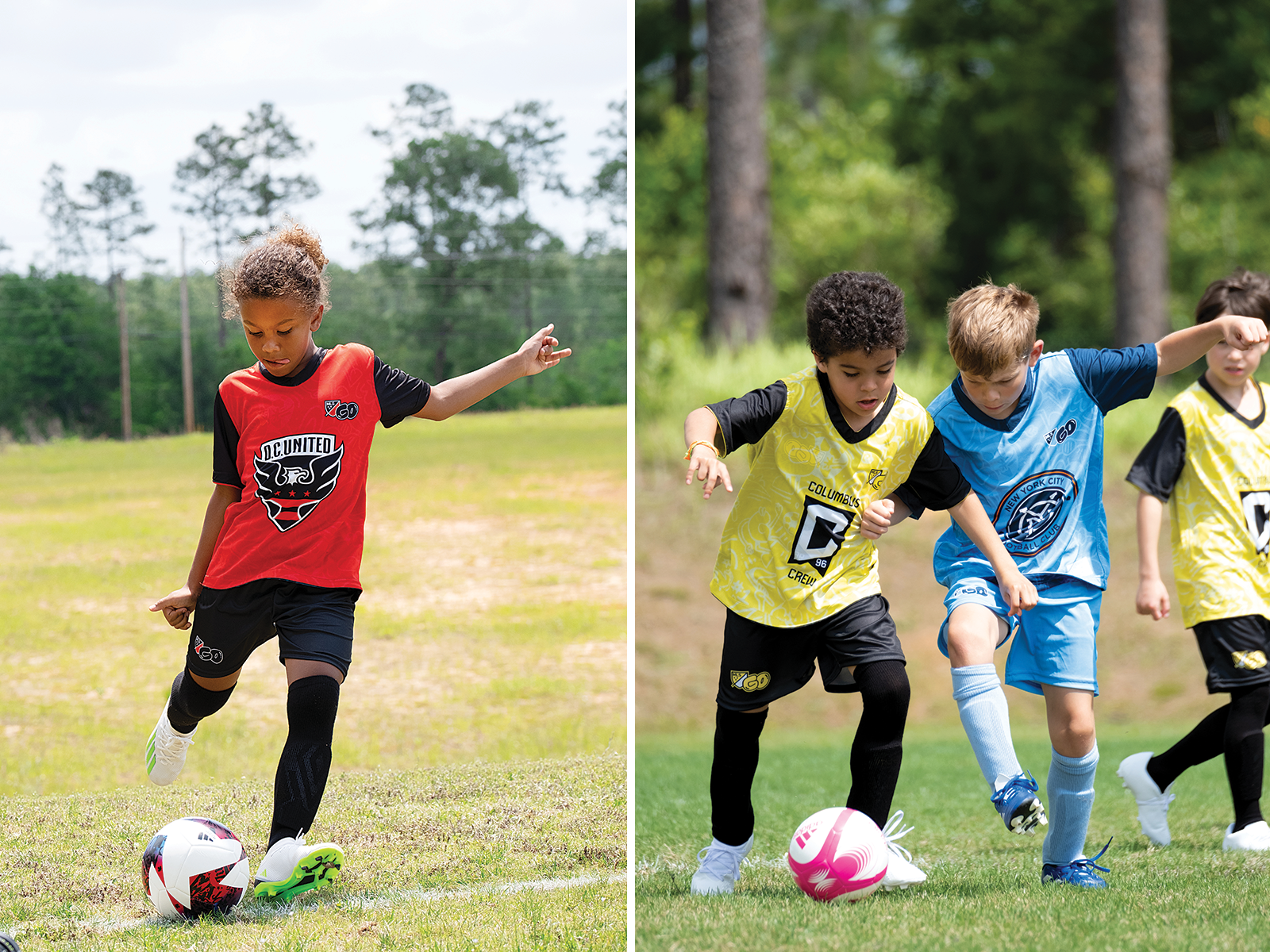
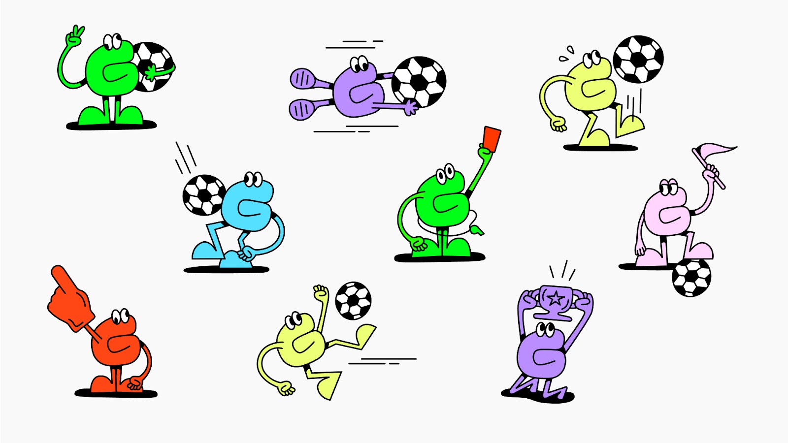
Major League Soccer recently launched MLS GO, a recreational soccer program for kids in 18 cities who may not have access to existing soccer groups and initiatives. To do so, they reached out to NYC brand studio Athletics to create the visual identity, brand positioning, and name. The new branding is aimed at the 4-14 market and is led by a brightly colored mascot created from the word "GO" itself. The animated letterforms split into a player and a football taking on soccer related activities like dribbling to represent and enforce the fun nature of the game. Malcolm Buick, Partner & Executive Creative Director at Athletics talked to Design Observer about the development process and MLS GO's commitment to inclusion on the soccer field.
Athletics rebranded MLS soccer in 2014, and subsequently several other MLS projects and now MLS GO. Obviously this project is aimed at an entirely different audience, but what has carried through all your work with MLS?
Along with the creation of the Major League Soccer brand, and MLS GO, we have also designed several high-profile premium tentpole events for MLS, including MLS All-Star, Campeones Cup, Leagues Cup, and a series of TV spots for MLS Works, their philanthropic arm that focuses on social responsibility within the league's operations. Furthermore, we also designed the identity for Nashville Soccer Club, and led the brand positioning and storytelling for Seattle Sounders FC, one of MLS's oldest and most decorated teams.
The game itself is incredibly thrilling, offering more than 90 minutes of high-level, non-stop excitement. It's hard not to fall in love with. It’s our passion for the sport that comes through in our work, and we deeply appreciate a league that's dedicated to genuine growth of the sport in North America. We also approach our sports-related projects with a strong commitment to craftsmanship, ensuring the same level of thought and attention to detail that our other clients appreciate.
Our genuine enjoyment of working in sports is fueled by our extensive understanding of the field. Personally, I also have two young daughters who are deeply involved in soccer, both competing on competitive travel teams. My work with MLS, even though it's a men's league, keeps me closely connected to the ever-evolving soccer landscape; it’s a way to connect deeper with them through a sport they love. I also play, so I can live out my boyhood dreams of playing pro by designing for professional teams. Close enough I suppose : )
How did you all land together on the name MLS GO? And was that a hard part of the branding or did it come pretty quickly?
Our decision to name it MLS GO came after extensive market research and countless hours spent observing grassroots soccer firsthand. The vision was clear right from the beginning; we aimed to create a welcoming entry point into the world of soccer. The challenge was to adopt a softer and more approachable perspective on soccer and sports branding. We wanted to move away from sharp, angular designs and instead embrace a gentler and more inviting approach.
The MLS crest played a crucial role in adding credibility and authenticity to the entire program. We also introduced a mascot, considering how integral mascots are to the history of soccer. Our goal was to offer a unique, typographic take on this tradition. So, let's GOOOOOOOOOO!!!"
The MLS GO story seems very much aimed at increasing access to soccer for younger kids who might not have access to it in their communities. Fun and affordability are two words we see used most regularly. Are those the two main barriers you discussed with MLS?
The MLS GO story is geared towards enhancing soccer accessibility for young children who may lack opportunities in their communities. 'Fun' and 'affordability' were central themes in our discussions with MLS. It's interesting to note that in Scotland, where I grew up, the game could unfold virtually anywhere with just a ball, a small group of players (sometimes as few as two), and a makeshift goal, often created with two jumpers (sweaters) spaced 8 yards apart. Soccer in North America significantly differs from the European concept of football and is primarily structured as a 'pay-to-play' system, which can create significant barriers to participation for a considerable portion of the population.
Soccer can been seen played in almost every country on almost any type of field, by people of all ages, if fact, soccer is one of the easiest games to pick up and play. What about US youth soccer wasn't feeling to MLS like it was as inclusionary as it needed to be and how did you address that in the branding and positioning?
Soccer transcends borders. It’s played in virtually every corner of the world, on a wide range of surfaces, by individuals of all ages. In fact, it's one of the easiest sports to get into and enjoy. When it comes to US youth soccer, the feeling was that it might not be as inclusive as it could be. There are barriers, such as cost and accessibility, that limit the participation of many young, aspiring players, especially in major metropolitan areas.
In our branding and positioning work with MLS GO, we made it a priority to address these concerns. Our approach aimed to create a more inclusive and welcoming environment for youth soccer in the United States. We emphasized the importance of fun, affordability, and accessibility, making it easier for kids from all backgrounds to engage with the sport and enjoy the beautiful game.
Earlier this month, in the New York Times, James Daunt, the Barnes & Noble chief executive, said “Any design agency would have a heart attack if they could see what we’re doing. The curious trick has been that if you actually let the local book-selling teams do what they think is best, you suddenly get much better bookstores.” This it makes a lot of sense for some organizations, and could be applied to local soccer clubs. How, as a design team, do you feel about the need for local groups to have ownership and how was that built into the new brand? (If it was.)
The intention behind MLS GO is to complement local leagues, not diminish them. Local leagues are critical to the growth of the game. Without them, soccer in North America cannot flourish. But the fact remains that youth soccer in North America can be financially and geographically out of reach for many people.
MLS GO aims to expand the number of youth leagues, especially in major metropolitan areas. This will make the game more available to more kids at an earlier age. With its resources and networks, MLS can help overcome some of these cost and accessibility barriers that make it hard for operators to start leagues and harder for young players (and their parents) to enroll in them. MLS has a vested interest in bringing more kids and diversity into soccer, and they have the brand recognition and infrastructure to do it in a fun, exciting way.
Is there anything we haven’t asked that you would like to tell us about the project?
We conducted a studio-wide survey to (unofficially) name our adorable MLS GO mascot. Top marks went to Gopher, Goat, and Golazo.
Lastly, how many of you play soccer? Have you ever talked about designing a soccer jersey for Athletics?
Enough to field a starting eleven. In fact, Athletics has had its fair share of glory on the pitch in recent seasons. Though we didn't quite make it to the top-tier agency league, we proudly stepped onto the field representing Athletico Pathetico (our namesake). And, funnily enough—you brought up jerseys—we've got something in the works, so keep an eye out for it; it's going to be a banger!