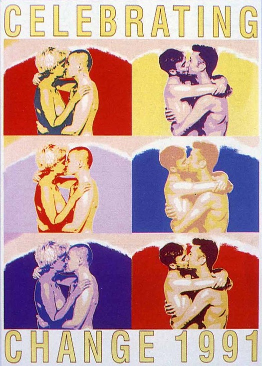
Celebrating Change 1991 by Robyn McDonald of Inkahoots, screenprint, 1991
This case study of the Australian design team Inkahoots was written in 2001 for the School of Communication, Design & Media (since renamed) at the University of Western Sydney as part of a series of specially commissioned close readings. A much shorter version without notes was published in Eye in 2002 (not online) and was reprinted in my book Designing Pornotopia. This is the first publication of the complete text. I present it here because I believe that Inkahoots — still working today — offers a paradigm of socially motivated graphic design practice from which there is much to learn. The essay reflects the spirit and concerns of the time when it was written and I have resisted the temptation to update it. It’s a long text so I am posting it in two parts.
My introduction to Inkahoots, a Brisbane-based design company, came in the form of the book Public x Private, published in 2000 to celebrate their tenth birthday. Until then, based in London, I had not been aware of their existence. However, as I later learned, one could have been based in Sydney or Melbourne and still not have heard of Inkahoots before they decided to go public and talk about their work and motivations. This says much about Inkahoots’ way of working. Graphic design has always had a “star system” of sorts and, for as long as there has been something recognizable as a design profession, a few names have been well known to colleagues, with exhibitions, catalogues and books devoted to the dissemination of their work. In the 1990s, particularly in Europe and the US, but also elsewhere in the world, this process accelerated and, today, young designers still at the start of their careers are routinely publicized and acclaimed in professional publications. More monographs about designers are published now than ever before.[1] By waiting 10 years, during which time they received little publicity either inside or outside Australia, Inkahoots pursued a modest path that runs counter to the mood of the times.
I had several immediate reactions to Public x Private. First, I was intrigued to learn that designers with this kind of ambition were working in Australia. This is not meant to sound dismissive or patronising. It simply reflects the fact that very little journalistic or critical commentary about contemporary Australian graphic design is published, even in Australia, and up-to-date information is hard to come by at such a distance. Second, I was struck by the nature of the design work showcased in the book. Many of its stylistic tropes, gestures and mannerisms were highly familiar from international graphic design in the early to mid-1990s. Inkahoots’ retrospective provided further evidence that these styles had become an international lingua franca, and that, while they might be regarded by some as being exhausted at their points of origin — in Los Angeles or London — they still had currency elsewhere. Third, and most significant in terms of the impulse to undertake this case study, I was impressed by the three texts in the Inkahoots book. This passage, taken from the introduction by Inkahoots’ directors, gives a good indication of the book’s flavor and of the designers’ concerns:
We work mainly in the community and cultural sectors. Not just because that’s where the best work is, but because we figure our environment is already cluttered with sophisticated corporate imagery that often doesn’t represent the community’s best interests. Alternative visual messages struggle to be heard above the rowdy din of dominant media. They need to communicate incisively with compelling power and drama, or even quietly with careful subtlety, just to compete.[2]
This was noteworthy because in the context of contemporary graphic design in Britain or the US — the design cultures with which I am most familiar — it is a highly unusual point of view. In the space of just 72 words, the word “community” is used twice, instantly evoking debates about culture’s purpose historically identified with the 1970s and the years before Reagan and Thatcher, and the “best interests” of the community are contrasted with design produced by the “dominant” corporate sector. By the 1990s, a clear, ideologically-defined conception of community had more or less disappeared from professional debates about graphic design (such as they were) just as surely as it had evaporated from the wider social discourse. Young designers who came to maturity and began their design studies in this period might encounter such ideas from older design teachers, shaped by earlier times, but these ideas would not be perceived as central or receive any reinforcement or legitimation within the professional discourse of design, emanating from design organizations and publications. Working in London as a design journalist, as both writer and editor, from the mid-1980s, I hardly ever encountered designers, particularly at the successful heart of the profession, who talked about their activities using the terms, and with the convictions, expressed in this statement by Inkahoots.
To explain why this interested me so much I need to say a little more about my own position. As the 1990s progressed, my sense of frustration with the limitations of graphic design discourse increased. One comparison will serve to make the point. When, as editor of Eye, I published an essay titled “Cult of the Ugly” criticizing the aesthetic dimension of the new digital typography, it caused an uproar, generating many angry responses from designers, particularly in the US.[3] As an editor, I had never seen anything like it. A year later, when I accepted for publication an essay I hoped would be equally provocative, titled “There is Such a Thing as Society,” an explicitly political reading of design’s social and cultural purposes, it generated only a fraction of the response and nothing at all from American readers.[4] It was hard not to conclude from such experiences that Eye’s readers were rather more concerned about their freedom to create outlandish typeface designs than about what their work might signify as an expression of social values. In 1999, seeking a more effective way of stimulating professional discussion of design’s priorities, I became involved, as an adviser, in an initiative by Adbusters magazine to write and launch a new, updated version of British designer Ken Garland’s First Things First manifesto, originally published in 1964.[4] In the year following its launch, the First Things First 2000 manifesto was published widely in Britain, North America, Europe and Japan and succeeded, at least to some degree, in its intention to encourage renewed thinking about these issues, particularly in design education.[5]
Even so, there are few prominent examples of socially concerned designers who prioritize work for the community sphere as a matter of principle. Without concrete, well-publicized instances of designers willing and able to work in this way, despite the limitations of the cultural and political climate, the critique embodied in First Things First is vulnerable to the charge that it is little more than wishful thinking, an unrealistic throwback to an earlier way of working that has no relevance today. Some designers, responding critically to FTF, have doubted that such a course could be sustainable in the present climate, in business terms, and have used this as a justification for their own disinclination to challenge the status quo. What was interesting about Inkahoots was that they did appear to have established a form of practice wholly consistent with FTF’s call to rethink priorities that was economically viable, while being founded on consciously-held, idealistic principles that many now reject as both unfashionable and untenable. For this reason, Inkahoots’ position and practice merited further study. What was it, in their personal backgrounds or local cultural and political contexts, that encouraged and facilitated this way of thinking and working? Could their approach be regarded in any sense as a paradigm for graphic designers seeking to establish and pursue socially concerned forms of design practice?
Community arts in Queensland
As their book indicates, Inkahoots’ development has passed through two distinct phases, from 1990 to 1995, when the team operated as poster collective, and from 1995 to the present, during which time a reconfigured Inkahoots has functioned as a design company. While this study is primarily concerned with Inkahoots’ second incarnation, the team’s way of working can only be properly understood by considering the cultural forces that gave birth to its first incarnation. Inkahoots may have changed its modus operandi, but its guiding principles have their origin in the political idealism of its early years.
Under Joh Bjelke-Petersen, premier of Queensland from 1968 to 1989, basic rights and civil liberties were constantly attacked. This is not the place for a detailed description of the repressive policies and practices pursued by his National Party-Liberal Party State Government during this period. Suffice it to say that, in 1977, Bjelke-Petersen effectively banned the right to march in protest — enjoyed in Sydney or Melbourne without hindrance — and over a 15-month period more than 1,800 people were arrested for demonstrating in the streets about uranium mining in the state. Senator George Georges, a participant in these struggles, describes Bjelke-Petersen’s government as “oppressive, undemocratic, authoritarian.”[7] In his authoritative history of Queensland, Ross Fitzgerald characterizes the unrelentingly pugnacious premier as a “fundamentalist Christian, passionately anti-socialist and a fervant advocate of unfettered development” — attitudes that gave rise to a reactionary form of governance with a “pronounced tradition of authoritarianism and anti-intellectualism.”[8] Fitzgerald concludes that Queensland during this period was a “cultural wasteland” in which cultural and intellectual life was deeply demoralized.[9]
Elsewhere in Australia, these were years of optimism and growth for the community arts network. Many had been politicized by events in the late 1960s and early 1970s: by protests against the Vietnam war; by the women’s liberation movement; by the anti-nuclear movement; and by a growing interest in alternative lifestyles. “In various ways all levels of Australian society were touched and changed by the energy, activity and experimentation that flourished,” writes Toni Robertson.[10] Increasingly, the role of art was questioned and radical artworkers proceeded from the belief that:
So long as art, in any of its forms, limits itself to the domain and interests of any one section of society, it will assist in the maintenance of the social and economic divisions of that society.[11]
There was a shared resolve among community arts workers to make art and its practice as widely accessible as possible. After the establishment of a national funding body, the Community Arts Board (later renamed the Community Cultural Development Board), community-based arts programmes proliferated. As one commentator, Julie Ewington, noted in that year:
Many young artists are giving up the merely decorative and absorbedly self-referential art in which they were educated for engagement in social and political issues, for dealing through their art with the lives and concerns of real people.[12]
One of the more vigorous forms this commitment took was poster-making, which offered a cheap, simple and — in the form of silkscreening — readily available means of expressing dissenting points of view. A key center for the development of this approach was the Sydney University Art Workshop, known as the Tin Sheds, where people with no previous art training were introduced to screenprinting and photographic techniques as expressive forms of social and political commentary. Here, and elsewhere, Australian political poster-makers worked in groups, allowing them to share costly equipment and pool ideas about their work. Examples include Earthworks Poster Collective (based at the Tin Sheds, Sydney); Permanent Red Poster Collective (Melbourne); Another Planet Posters (Melbourne); CoMedia (Adelaide); Garage Graphix (Mt. Druitt, Western Sydney); Megalo Screenprint (Canberra); and Redletter Community Workshop (Melbourne). For these studios, writes Lee-Anne Hall, a member of CoMedia, collaborative practice was usually pursued in four distinct ways:
Open access — “hands on” involvement, use of facilities, access to tuition.
Projects — co-authored with the community, projects examine the social, political and cultural concerns of the community.
Commissions — client/artist relationship, the work attempts to both positively and accurately represent gender, class and race issues.
In-house posters — the production of posters by workshop members, without sponsoring clients.[13]
Redback Graphix, established in 1980 in Wollongong and later based in Sydney, was distinctive in that, unlike other artist-run workshops, it was not a collective and did not have a policy of open user access. Instead, as with Inkahoots in its second phase, the primary focus was on commissioned work undertaken on a professional basis for appropriate fees.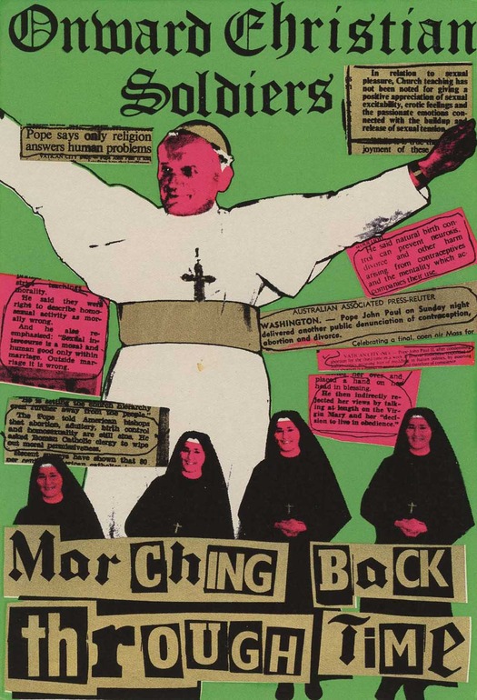
Onward Christian Soldiers by Michael Callaghan and others, Redback Graphix, screenprint, 1979
In Queensland, by contrast, community arts was much less developed. Indeed, one writer went so far as to suggest, in 1982, that the state could be as many as 25 years behind the rest of Australia.[14] Key “radical rallying points” for those in Brisbane who did care about these issues were the local radio station, 4ZZZ, established in 1975 by the University of Queensland Student Union, and the political theater groups Popular Theatre Troupe (active in the 1970s) and Street Arts Community Theatre Company (active in the 1980s).[15] The Community Arts Network of Queensland was formed with the aim of fostering development in community arts, ensuring maximum use of personnel and resources, and disseminating information to artists, groups and anyone interested. In 1979, Michael Callaghan of the Earthworks Poster Collective was invited by Margriet Bonnin, co-ordinator of the Queensland Film and Drama Centre, located at Griffith University, to establish a screenprinting facility at the centre. Bonnin later explained:
My main interest was the excitement of producing large numbers of political posters in a place like Queensland. If things were difficult in Sydney they were a thousand times more difficult here.[16]
Callaghan’s first Brisbane poster, created at the center using photographic collage and cut stencil, and displayed around the campus, posed the question, “If the unemployed are dole bludgers, what the fuck are the idle rich?” and answered it satirically with an image of a chimpanzee relaxing under a parasol with a drink. The poster is frequently reproduced in histories of the period. The graphic quality of this and other images had a “powerful influence on future posters made at the Centre,”[17] according to one writer, though it has also been suggested that community access to the workshop was necessarily limited by its relatively isolated location within the university grounds.[18] In the 1970s and early 1980s, another regular source of political posters in Brisbane was Craft Press, which produced runs of several thousand distributed to special interest groups and friends, displayed in public places and sold in bookshops to generate income for groups involved in the civil liberties movement. Punk rock, too, was overtly political in Queensland, a significant means of expression for young people and the political subculture, and the punk scene was a key source of posters, with both the musicians and others closely involved with the music often designing the images:
. . . the close relationship between the music scene and the postermaking scene was one of the things that made it so vibrant and attractive to people – that they could have a political message and a political conscience and be activists but also work in an area that was their great entertainment and enjoyment.[19]Poster artist Chris Stannard (b. 1961) , one of Inkahoots’ founding members, recalls the crucial role played by street posters in some parts of Brisbane, from the mid-1980s to the mid-1990s, in fostering a sense of “social cohesion” and place. In the suburb of West End, where he arrived in 1983 and where he still lives, a brick wall on the corner of Boundary Street and Vulture Street became a popular site for bill posters because of its accessibility, visibility, the number of passers-by and its appropriateness to its target audience.
Many of the posters that did the rounds were cultural and political, and unlike the political posters that were produced in the southern states for sale and collection, Brisbane’s posters were designed for the street first. This meant that the kind of dialogue that was occurring on our poster walls was more than an events bulletin, it was a public forum — an urban gallery.[20]
Open to all-comers, the ever-changing “urban gallery” survived until 1994, when Brisbane City Council, determined to clean up the city’s image, started to crack down on bill posting with the threat of prosecution and, as Stannard puts it, “the walls went blank.”
Inkahoots as a poster collective
The idea to start Inkahoots arose in 1989 when Stannard, Geoff Heller and Robyn McDonald — the only original member still with Inkahoots when I undertook this research — came together, during a housing crisis in Brisbane, to work on a poster project for the Tenants’ Union of Queensland. McDonald (b. 1958) had qualified as a registered nurse before studying political science, art history and philosophy for a BA at Queensland and Sydney Universities (1980–3), then gaining a Dip.Art in illustration at Queensland College of Art (1984–6). She describes herself as a “perpetual student” during her 20s, supporting herself by nursing at the weekends, and her political awakening began as an undergraduate:
Because I had left school at 15 and gone straight into nursing, I felt I had missed out on an education. So I was going to uni in an old-fashioned sense to get educated or to learn about my society, my world. It feels like such a freedom now, when I look back on it, to have that choice. It was classes like philosophy, which radically questions our worldview, and political science classes. I studied Soviet politics and comparative religions, but really it was the lunchtime forums where the anarchists took on the international socialists.[21]
In 1982, after transferring her BA to Sydney University, McDonald studied radical feminist philosophy, including the writings of Luce Irigaray and Julia Kristeva. She notes that Bob Weatherall, the aboriginal elder and activist, was another significant influence on her political development. One of her early screenprints, Queensland: the Sunshine State (1985), is based on a photograph she took of Weatherall being arrested at a land rights rally in Brisbane.
I did feel I was a social activist more than anything. I just had a strong desire that I should communicate what I felt — from that young energy — were the great ills in society [. . .] Then I went to art college. That was where I had the drive to want to express myself visually, but the real drive was to express, or I suppose to share, my political beliefs.[22]
In her final year at Queensland College of Art, McDonald suggested a visit to the studio of Redback Graphix in Sydney, with her year-group, and was impressed by the collective’s high standard of professionalism. In January 1987, inspired by Redback’s example, she formed the Black Banana collective in Brisbane with two friends, Phyllis Paterson and Stephen Nothling, also graduates of the college. She enjoyed the hands-on, artisanal aspect of the work, the physical processes involved in rendering an idea in an appropriate visual form:
It was fun. We never got paid. We never had wages. We didn’t even have a car between us. We’d have to get cabs to and from art college so we could expose our screens for printing. It was really very unprofessional, but at least I was able to continue my art practice and talk with political groups about producing work.[23]
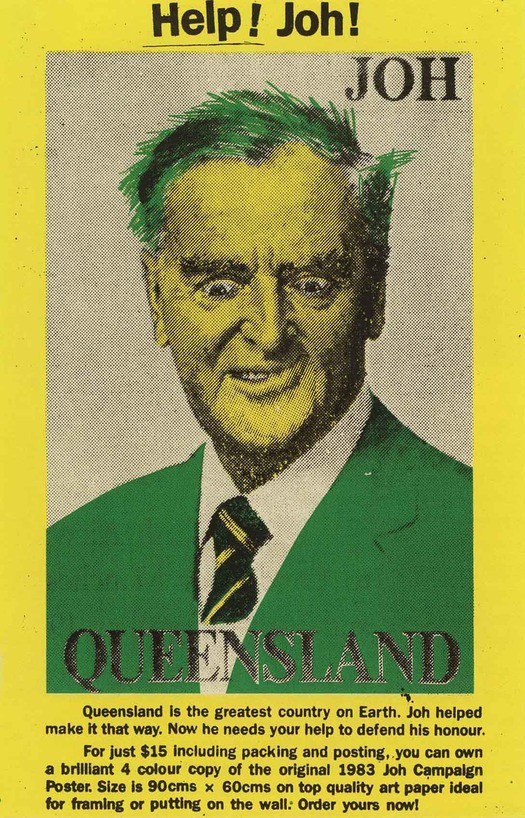
Help! Joh! by Inkahoots, screenprint, 1991
In December 1989, the Bjelke-Petersen era came to a long-awaited end. Inkahoots, with funding from the Australia Council, began life in early 1990 in the concrete basement of the Transport Workers’ Union building in Brisbane, for a rent of just $50 a week. McDonald, Stannard and Heller were joined by another young artist, Suzi Blackwell. To receive government funding, they were required to form a constitution and become an incorporated company with a committee; Dee Martin, then an arts officer at the Trade & Labour Council of Queensland, became a committee member. The collective’s name, Inkahoots, was chosen for its “Australianness” and because they saw themselves as being “in cahoots” with community activists and also because they worked with inks. As the “first left wing, artist run organisation”[24] of the new political era, Inkahoots rapidly became a focus for radical groups and causes. Preparations for the Labour Day Parade, Lesbian and Gay Pride Week, and Reclaim the Night protests were undertaken in their studio, along with Access Arts workshops for people with disabilities. Government funding covered start-up costs, the purchase of screenprinting equipment and one wage for a community access worker, although in the early days of Inkahoots, every member of the collective would deal at different times with members of the public using the studio. Other wages had to be covered by other means.
A few months before I began my research into Inkahoots, the group made an unexpected discovery. They vacated the basement studio in 1995 and they assumed that the dozens of posters covering a long rear wall had been destroyed long ago. In 2001, the space was empty, but the posters had survived and I was able to visit the site during my research. Collaged from floor to ceiling with overlapping images, the wall conveys a powerful impression of the vibrancy, energy and commitment of working life in the studio, and of the broad range of social, cultural and political causes served by Inkahoots’ dedicated band of community artworkers: Child Care, Land Rights for Aboriginals, Australian Gay Games, International Women’s Day, Men Against Sexual Assault, Reclaim the Night, Queensland Disability Housing Coalition, Tenants’ Union of Queensland, the Communist Party, Rock ’n’ Roll Circus, and the West End Street Festival. Some of the posters were created by community users of the studio’s facilities; others by Inkahoots. One of the most effective in purely graphic terms, positioned in the center of the wall, is a black-and-white street poster by Stannard protesting about the Gulf War, which shows an American soldier in a helmet, against a black background, and some way below, in white sans serif type, the heartfelt, eloquently simple plea — “don’t do it!”
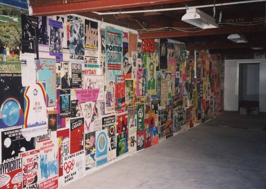
Inkahoots’ former studio in the Transport Workers’ Union building in Brisbane, 2001. Photograph: Rick Poynor
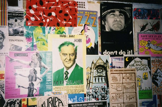
Posters printed by Inkahoots’ at their former studio, Brisbane, 2001. Photograph: Rick Poynor
One of McDonald’s posters, high up on the basement wall, had been carefully defaced with white paint by some unknown visitor, suggesting its continuing power as an image to provoke (all of the other posters had been left untouched). In 1991, the Labour Government decriminalized homosexuality, and the poster, titled Celebrating Change 1991 (shown at the top), features two gay couples, both naked from the waist up, embracing and kissing. Each photograph is repeated three times to form a Warholian grid of six images and the bright Pop Art colors add to the open, lighthearted, postive mood. McDonald produced the poster as a limited edition screenprint of 40 or 50 copies as part of a group of four (the other posters dealt with abortion, marijuana and domestic violence) funded by a grant from the Australia Council to cover time and materials. Sensitive to the reaction of gay viewers to a representation, by a straight woman, that could be seen as “voyeuristic,” she describes the project as a gesture of support towards her lesbian and gay friends. Criticism was possibly allayed by the fact that Inkahoots member Suzi Blackwell, a lesbian, was one of the models. The poster was also a chance for McDonald to focus on her own political and artistic expression, away from the demands of clients and community groups. Two posters were put up in the street “for fun,” she recalls, but most were distributed to friends for private display. Celebrating Change did, however, have a public impact:
When an Inkahoots poster exhibition traveled the state and went to Western Queensland and Mt. Isa [in 1992], it got very strong reactions in some of the regional galleries, with comments in the visitors’ books about how disgusting it was. Some of the library staff, where it might be going up, had to deal with a strong critical response to the poster. I don’t think it ever didn’t get hung, but maybe it quietly didn’t get hung in some places. But it actually, truly got censored here in Brisbane. I think I was on maternity leave then, and there was going to be an exhibition space opening up, a long, glass panel in the city, along a walkway, and they asked Inkahoots for some posters to put up. So this was one of them. There were probably only about eight posters and we were asked to remove this poster so we removed the whole exhibition.[25]
This was not the only time that issues of sexual politics addressed by an Inkahoots poster led to censorship. In 1994, the by now well-established collective organized “Special Edition,” an exhibition at Brisbane City Hall of 11 posters designed and screenprinted at Inkahoots by politically motivated Brisbane artists.[26] The aim was to explore the “changing political landscape of the 90s” and the exhibition reflected Inkahoots’ discovery that
. . . there was a growing demand for posters that made a more sophisticated contribution to the debate of complex issues. Issues that were appearing more frequently on the agenda of organisations within the community sector and, later on, within Government departments. [. . .]
While these posters have been produced for exhibition and for sale, their cousins, community produced street posters have gone into decline mainly due to laws prohibiting bill posting. This situation is proving to have a disasterous [sic] effect on community events as most community organisations cannot access commercial advertising. Streets busy with posters are evidence of a community busy with activity.[27]
However, one of the posters, Dam Dykes by Suzi Blackwell and Angela Bailey, proved unacceptable to the gallery. Its subject was HIV/AIDS awareness and the need for information about health risks to lesbians, and in a spirit of unapologetic frankness it featured a photograph of two women engaged in oral sex. “This poster has come from and belongs to lesbians,” the artists explained.[28] Its content, they pointed out, was based on consultation and research. In the face of the gallery’s blatant censorship, the gay community exerted pressure on Inkahoots to withdraw the entire exhibition in protest. They responded to this dilemma by choosing to proceed with the display of the remaining ten posters, rather than forfeit the whole show. On the opening night there was a protest inside the gallery, which Inkahoots tacitly supported, with speeches by angry lesbians.
For Inkahoots, the exhibition proved to be a turning point. “We thought it was terrific to invite practising artists from Brisbane to be part of the big project, but, in fact, it turned quite sour and drained us of our energy,” says McDonald.[29] In its idealistic attempt to serve the community, the studio was facing economic pressures familiar to other Australian poster collectives. Members of the public using the studio often had no idea about the screenprinting process and educating them was laborious and time-consuming. The pressure eventually took its toll on Inkahoots’ community access worker, Harry Buckingham, who complained to other members of the group. McDonald recalls:
There was pressure for us to have the community pay a fee for hiring the studio, but it was never enough. The time it took to produce their posters was so much more than what they could ever pay for, or what the funding covered. So we were all subsidizing the community with our low wages and it got to the point where it was like, “Well, we really can’t keep doing this. This isn’t sustainable.” [30]
Inkahoots was a relatively late arrival among Australian screenprinting collectives. By the late 1980s, the political role and impact of posters designed and printed for the “urban gallery” was much diminished compared to their role in the 1970s, when political life, in the form of demonstrations and strikes, was much more evident in the streets. Increasingly, high-impact professional advertising was colonizing this public space.
In the past, partly because of their historical role posters were always the obvious choice when people wished to explore cultural issues. As people gain a better understanding of modern communication systems and the need to match the dominant mass media in its monopoly on distribution, it becomes clear that more sophisticated strategies must be developed to present other viewpoints.
While the poster still retains undeniable appeal and a particular, unique application, we are finding that computer, video, film, radio and television are by far the more effective and relevant art forms of our day.[31]
As an examination of six socially concerned Australian print organisations noted in 1988, radical collectives such as CoMedia and Redback Graphix were now in the process of broadening their scope and diversifying their activities. The escalating costs and the health risks of screenprinting meant it was no longer central in the way that it had been. Community clients required a wider range of communication services and demand for commissioned work had increased. “No longer dealing simply with posters, [these organizations] engage in all manner of graphic design . . .”[32] There was a need, too, for a new, more developed visual vocabulary to accompany political debate:
. . . when we talk about uranium and peace issues, it’s no longer suitable to keep shoving up doves all the time. People are sick to death of those kinds of images. So it is really important to develop the language. Along with a development of the language is a sophistication of style.[33]
Inkahoots’ challenge, in its second phase, would be to broaden its scope, to develop a visual vocabulary that adequately reflected fast-moving changes in contemporary visual culture, and to find a more viable basis on which to finance its activities:
That was the last time Inkahoots sought government assistance for any of its projects. Stacked up against digital technology and offset printing, manual screenprinting seemed out-moded both as an artform and as an effective form of mass production. Within months, we had packed up the community access screenprinting equipment and sent it off to Cairns City Council where it was given its own purpose built studio . . .[34]See also:
Inkahoots and Socially Concerned Design: Part 2
Why the Activist Poster is Here to Stay
Utopian Image: Politics and Posters
1. See Rick Poynor, “Battle of the Big Books” in Michael Bierut, William Drenttel and Steven Heller (eds.), Looking Closer Four: Critical Writings on Graphic Design, New York: Allworth Press, 2002, pp. 245–8.
2. Robyn McDonald and Jason Grant, “Introduction” in Public x Private: Inkahoots 1990–2000, Brisbane: Inkahoots (self-published), 2000, unpaginated. See also http://www.inkahoots.com.au.
3. Steven Heller, “Cult of the Ugly,” Eye, vol. 3 no. 9, pp. 52–9.
4. Andrew Howard, “There is Such a Thing as Society,” Eye, vol. 4 no. 13, pp. 72–7.
5. See “First Things First 2000: A Design Manifesto”, Adbusters, no. 27, autumn 1999, unpaginated. See also Rick Poynor: “First Things First: A Brief History,” Adbusters, no. 27, pp. 54–6. Reprinted in Poynor, Obey the Giant: Life in the Image World, London: August/Birkhäuser, 2001, pp. 136–40. For the text of Ken Garland’s original manifesto, see Howard, Eye, vol. 4 no. 13, p. 73.
6. For an account of the reception of First Things First 2000, see Rick Poynor, “First Things Next,” Adbusters, no. 36, July/August 2001, unpaginated. Reprinted in expanded form in Poynor, Obey the Giant: Life in the Image World, pp. 141–50.
7. George Georges, “Foreword” in Pete Thomas, No! No! To Joh, Brisbane: Building Workers Industrial Union, 1979, p. 2.
8. Ross Fitzgerald, A History of Queensland: From 1915 to the 1980s, St Lucia: University of Queensland Press, 1984, p. 244, p. 632.
9. Ibid., p. 634.
10. Toni Robertson, “Community Arts: A History,” Art Network, no. 5, summer/autumn 1982, p. 18. For a critical survey of community arts in Australia, see also Vivienne Binns (ed.), Community and the Arts: History, Theory, Practice, Leichhardt: Pluto Press, 1991.
11. Robertson, 1982, p. 5.
12. Julie Ewington, “Political Postering in Australia,” Imprint, no. 1, 1978, p. 1. Reprinted in Paul Taylor (ed.), Anything Goes: Art in Australia 1970–1980, South Yarra: Art & Text, 1984.
13. Lee-Anne Hall, Who is Bill Posters? An Examination of Six Australian Socially Concerned Alternative Print Media Organisations, Caper, no. 27 (special issue), Australia Council, 1988, p. 4. The poster movement has been extensively documented. For more detailed information, see, in addition to those works directly cited: Therese Kenyon, Under a Hot Tin Roof: Art, Passion and Politics at the Tin Sheds Art Workshop, Sydney: State Library of New South Wales Press, 1995; Roger Butler, Poster Art in Australia, Canberra: National Gallery of Australia, 1993. In the course of this research, I found the collections at the library of the Art Gallery of New South Wales and the Schaeffer Fine Arts Library at the University of Sydney particularly helpful.
14. Bruce Dickson, “The Development of Community Arts in Brisbane,” Art Network, no. 5, summer/autumn 1982, p. 44.
15. For a vivid picture of community arts in Queensland during these years, see Steve Caplin (ed.), Challenging the Centre: Two Decades of Political Theatre, Brisbane: Playlab Press, 1995.
16. Quoted in Clare Williamson, Signs of the Times: Political Posters in Queensland, Brisbane: Queensland Art Gallery, 1991, p. 5.
17. Ibid.
18. Louise Dauth, “Posters: A Partial Picture,” Art Network, no. 5, summer/autumn 1982, pp. 26–7.
19. Margriet Bonnin quoted in Williamson, 1991, p. 9.
20. Chris Stannard, “Flour & Water: Social Cohesion & the Ready-made Place,” Queensland Community Arts Network News, no. 3, 1999, p. 17.
21. Interview with Robyn McDonald, Brisbane, 1 September 2001.
22. Ibid.
23. Ibid.
24. Chris Stannard in Public x Private: Inkahoots 1990–2000, unpaginated.
25. Interview with McDonald, 1 September 2001.
26. Exhibition at Brisbane City Hall Art Gallery & Museum, 14 April to 30 June, 1994.
27. Statement by the Inkahoots Collective, “Special Edition” exhibition leaflet, 1994.
28. Artists’ statement, “Special Edition” exhibition leaflet.
29. Interview with McDonald, 1 September 2001.
30. Ibid. 31. Julia Church, “Fighting Fire with Fire — Cultural Movements,” Imprint, vol. 22 no. 3/4, December 1987, p. 15.
32. Hall, 1988, p. 3.
33. Julie Shiels of Another Planet Posters quoted in Hall, 1988, p. 9.
34. Chris Stannard in Public x Private: Inkahoots 1990–2000, unpaginated.


Comments [1]
I agree they are a model and inspiration for those of us looking for ways out of the industry's corporate embrace.
06.27.13
06:14