Jack was a very special person: easy to meet, hard to fathom, fun to be with, stimulating to listen to, effortless to learn from, and difficult to forget.
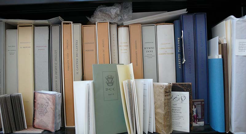
I first met him when he visited Yale where I was a graduate student in the mid 60’s, and re-connected when I went out to San Francisco to take a summer job between school years. Down the hall, on the third floor of 300 Broadway, across the street from the go-go palace, was the Greenwood Press where Jack held court.
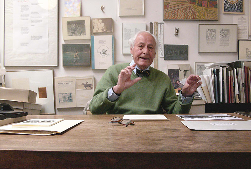
Jack holding forth at his desk at 300 Broadway.
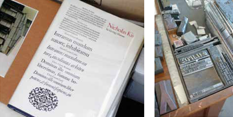
The place looked great and smelled great. On the walls were handbills for lectures on architecture and philosophy, invitations to art openings, keepsakes from Jan Tschichold, Herman Zapf, Wolfgang Weingart and Sam Francis, proofs from this or that project, specimen sheets from Nicholas Kis, snapshots of Jack with Tschichold, Zapf, Giovanni Marderstag and Alberto Tallone; Japanese letterforms and Persian pottery.
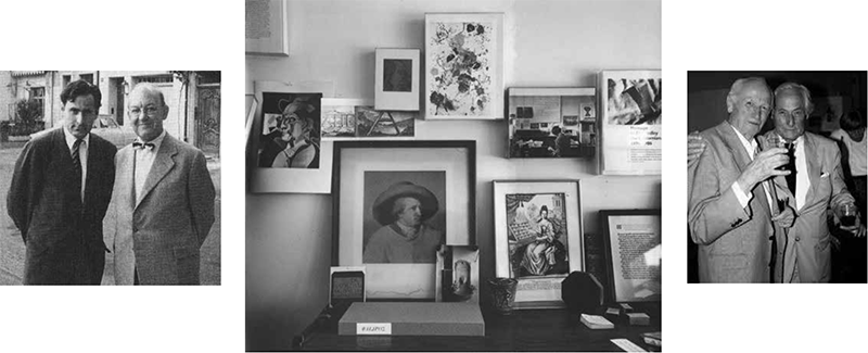
Left: Jack with Jan Tschichold in Basel, 1958. Right: with Herman Zapf in San Francisco, 2001.
But this wasn't the first Greenwood Press. The first one was founded in 1936, when Jack was 14, in the garage behind his father's house on Greenwood Street in San Mateo, a few miles south of San Francisco. He described himself “as an apprentice, learning to become the journeyman printer….[P]ast masters continue to allow us to see their tools within the epoch of their making. We marvel and try to learn their masterful skills.” Throughout this “apprenticeship” he sought out, befriended and learned from the great typographers of Europe. And, over the years, he became a master himself.
Refining his own skills as a book typographer, printer, and teacher, Jack consistently resurrected his Press as a place to balance paying work with the rewards of personal study and publishing. Indicative of Jack’s off-kilter energy, one of his first books was on the History and Rules of Bicycle Polo, invented in India by enthusiasts too humble to own a pony, and later imported to New England. In the book, Jack serves as the photographer's model for correct strokes and strategy and he remained an avid and accomplished player into his 70’s.
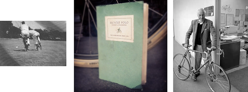
LEFT: Jack and his brother Bob playing bicycle polo, in a frame from a documentary on the sport by his other brother, Frank, 1940. RIGHT: Jack with his preferred means of transportation.
In the late 40s he purchased a complete showing of Stempel Janson and proceeded to publish in 1954 the definitive exploration of the origins of this typeface which he so much admired.
Near the end of the essay he writes:
“The reader's pleasure in this type, as in all great types, is that one is not aware of its existence as something special—it is free from the obvious accessories which are fashionable today and dull tomorrow. Jansen is a universal norm in type. Its attraction evolves slowly without the bizarre noise of the pretentious, standing rooted to the spirit of the great European humanities of the 17th and 18th centuries.”
Hand-set Janson was the default type choice at Greenwood Press.
He might just as well have been describing himself, or at least his work, which I see as having the same qualities of unpretentious clarity and utilitarian elegance, rooted in the spirit of the great European Humanities.
“I’ve always thought of myself as a craftsman,” Jack wrote, “working on books. But with that component there is also this other component of what really excites me--and that is the words and thoughts and ideas in readers and writers.”
Jack was introduced to the world of art and ideas by his brother Frank, a documentary filmmaker. In 1955 he was awarded a Fullbright Grant and spent three years in Italy with his wife, Josie, and their two children, studying Florentine books and the origins of Western printing. Throughout his career he was drawn to certain texts that have spoken to him: Goethe, Camus, Hesse, and more recently, Plato and Horace.
His beautiful PHAEDRUS, published in 1977 after years of study, explored the typographic potential for expressing the dialog between two speakers. In 1991 came the elegant translation of the Horace Odes; and then in 1999 he published A Typographic Journey, his remarkable personal history of the Greenwood Press, 1934 – 2000.
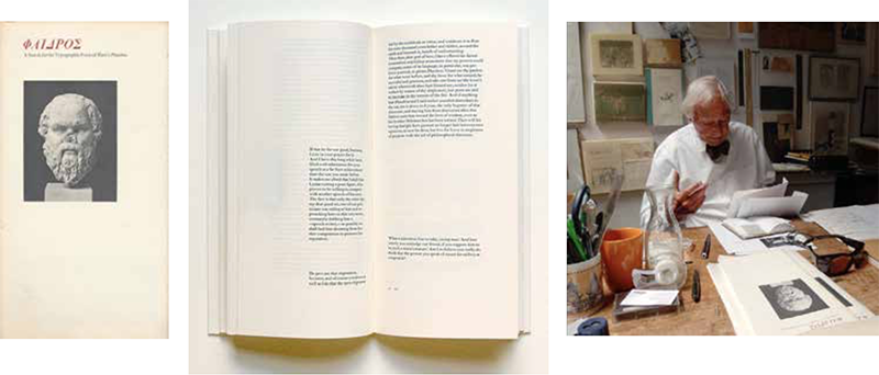
Exhaustive experiments to represent the conversation between Socrates and his interlocutor led to the publication of Phaedrus in 1977.
In all these personal projects, Jack was not just craftsman and typographer, he is also publisher, and the distinction is important. Michael Taylor, who provided the new translation for Horace’s Odes, noted that:
“Jack‘s career has been shaped by the urge to go back, not only to what gave birth to the conventions of fine printing in the 20th century, but even more fundamentally, to what led to printing—the need to publish...to secure words on parchment, or papyrus...to preserve them from the failure of memory and the winds of change.”
Jack was a truly literate person and wanted to share the enthusiasm he found in reading. “One sentence,” he has said, “can change your whole life, if you really understand it.”
Architect Felix Drury, a longtime friend from when they both taught at Carnegie Institute of Technology in the late 50’s, reflected that Jack is “a guardian of those aspects of culture which he regards as enduring, essential to the soul of man...the things people have to protect from debasement by the crassness of modern life.” As a publisher Jack took these ideas, these values and advocated: read this; remember this; keep this handy.
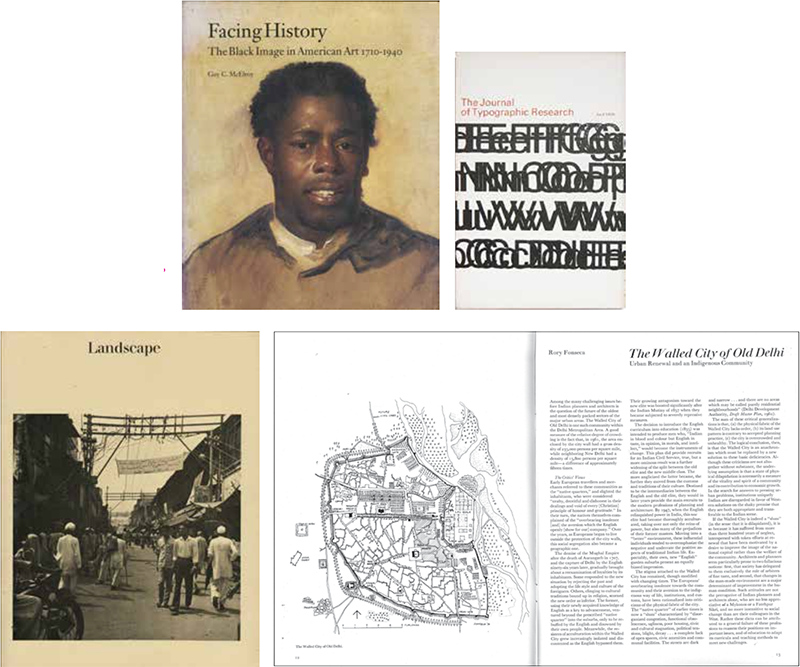
Brought up in the rich arts and crafts tradition of bookmaking in the bay area, Jack’s openness to the ideas and influences of European modernism and his conviction that typography was in the service of the message has separated him from the normal preciousness and fuddy-duddyness of the fine book crowd. His commercial projects like the catalog for a show on black images in America have the same simple clarity as his personal projects. His typography for Visible Language Journal and his long collaboration with soul-mate J.B. Jackson on Landscape magazine were models for their genre.
Parallel to his calm and elegant book design was another more playful outlet. Over many years he experimented with compositions made from some old wood type he acquired when he moved into 300 Broadway.
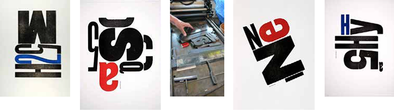
Watch Jack Stauffacher showing his large wood-type prints.
Then in 1988 type designer Sumner Stone arrived at the Greenwood Press and plunked down a Mac SE on Jack’s desk, saying he ought to check it out. Despite his philosophical snarling about “computers” he took to it quickly, generating elegant sample pages alongside his Vandercook proof press. Sumner speculates that so many metal pressmen like the Mac because of their urge to directly manipulate and control the typesetting process. Jack soon became an advisor to Adobe where he brought his refined sensibility and healthy skepticism to digital typography.
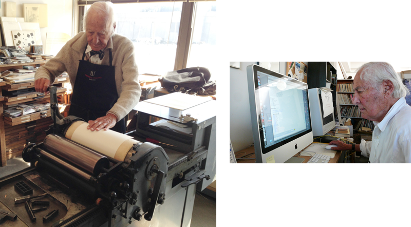
Jack on the trusty Vandercook. The Macintosh presented its own unique opportunities for the typographer.
Over the years, his personal enthusiasm and the modesty of his methods made him an influential teacher and mentor. Many have found careers in the book arts largely due to his inspiration. Type designer Charles Bigelow, reflecting on a course he took under Jack Stauffacher in 1967, wondered “how he managed to teach in such a short time enough typography to last a lifetime. He didn't do it with a textbook, though he showed us a lot of books, and he didn't do it with an ideology or a methodology, though he had those in reserve somewhere. He did it by example ... Jack seemed so sturdy in his commitment, so honest in his vision, that I made my choice, maybe not all at once, or even consciously, but irrevocably, to become a typographer.”
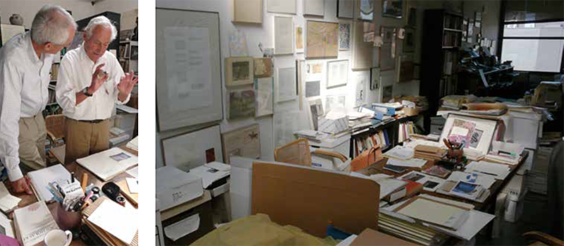
The author absorbing the finer points from Jack in the Greenwoood Press, 2009.
Jack’s close friend, designer Chuck Byrne, observed:
“A man of clear, firm values and beliefs, Stauffacher can be an imposing and forceful figure when discussing something he is passionate about, which is most things.” This I can attest to. Whenever I could get to the Bay Area I invariably planned a visit to see Jack. He was always welcoming, engaged and animated, the place a jumble of treasures. Friend and colleague Adrian Wilson recalled the Greenwood Press as “that oasis of migrant painters, misunderstood poets, starving calligraphers and beautiful girls.” Often he would insist that we go have lunch with his buddies who regularly dined in a nearby Italian restaurant where there was always a table for Jack.
His cheerful and gentlemanly demeanor masked a determination to think and work at the highest level. His modern old-fashionedness found its way into everything he did and provided me with yet another model of how to live a fulfilling life in design. His absence seems odd already.