Richard Rockford is sixty-seven, lives outside of Buffalo, New York, and has been dealing for forty-four years in folk art, industrial antiques, graphic design artifacts, and any and all manner of “raw materials” from which his art is made.
According to Richard, “he is well-read on art, but entirely self taught with no traditional painting, sculpting, or drawing skills.” To that point, he keeps all his work very low-tech—using just a drill, a saw table, and a nail gun. Because so much of his work involves the reappropriation of graphic signage as raw material, I contacted Richard for more information.
John Foster: Tell us about your influences Richard, and more about what you do.
Richard Rockford: I am in love with old surfaces, faded colors, rust, and most changes that age, use, and environment do to things. My artwork is influenced by Cornell, Nevelson, Pop Art, Rosalie Gascoigne, and many others but what I most like doing is presenting the viewer with the sights and feelings I get when hunting my materials. It’s almost a form of transferring emotions in my brain and what literally resides in my eyes and presenting it in art-like forms to other people.
My studio and work area are actually a total mess. I drag out materials—usually after thinking about what I might try the next day while trying to fall asleep—and I start placing things in position until they look good. I never look down on trial and error as a good work method. When satisfied, I start cutting wood, gluing things, working as fast as I can. Most (not all) works are done in this rapid burst of energy. Low tech and high energy allows me to see a good result and move on, while going home with a real feeling of accomplishment.
JF: So, you start with an existing vintage sign (or object) and completely transform it. You give it a new life as an art object rather than the more utilitarian thing it was. Is this a fair observation?
RR: Oh yes … I kick the utility right out of things! My work is very design conscious, very history of design, but fragmented. This creates some interesting problems. A lot of old things are too good to cut up, a lot of them are too common or commercial—they remind me too much of cheesy restaurant decor. Some people in the “assemblage” business use perfect items to create ensembles that look too un-natural to my eye. Others use any kind of decay to show some sort of “nostalgia” panorama.
I put together a show last June where a metal worker friend and I put found metal rusty hunks on top quality metal bases. It was very successful but it was hard to lure folks as they expected welded wrenches and engine parts. It’s the same with cutting up signage … it is not what people expect. Like an autopsy or a microscope study, I make the material into smaller units to explore the real building blocks of letter forms, color positions, contrasts, and abstractions that exist below (or actually just on) the surface in all our objects and signage. Sometimes just a repeating grid (tennis balls, Christ figures, wood type) will make us force ourselves to explore the colors, differences, and shapes of a familiar and plain item.
JF: Authenticity and surface wear seem to be starting points for you. Is your home full of antiques and signage?
RR: Actually, not at all. We like modern paintings and just a few of my works. I have always had an aversion to keeping good things. It suggests that your clients are getting second best and I have always needed to offer everything I could to bring buyers to this area and pay the bills. I do enjoy dragging a lot of new work home so I can see it away from the studio—where there are too many things in every background and bad lighting. Luckily, almost every work gets better in a home.
When you ask about authenticity, it hits the mark for me. I guess I have a comfort level in life and in my work. I always want to be somewhat sophisticated, well thought out, and in a position where those who don’t “get it” can see something new and enjoyable. But, I also want to be where the more sophisticated viewers will see something of real value and worthy exploration. I never want to be “corny” and I never want to be “hot” on the art market. This allows me to see what I like, make it quickly, and offer it to all levels of folks.
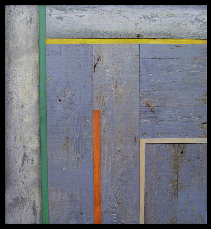
Elevation | 36 x 30"
Simple, thickly painted wood with strips of ink stained poster block fragments.
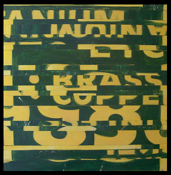
Copper | 34 x 34"
This was an aluminum hand-painted sign from a local scrap yard.
Todd | 43 x 43"
Warped sign with all the 3-D letters gone, leaving ghosts on the black paint mixed with sand. It is chalky and flat and sealed with matte varnish, framed with brown quilt rack parts.
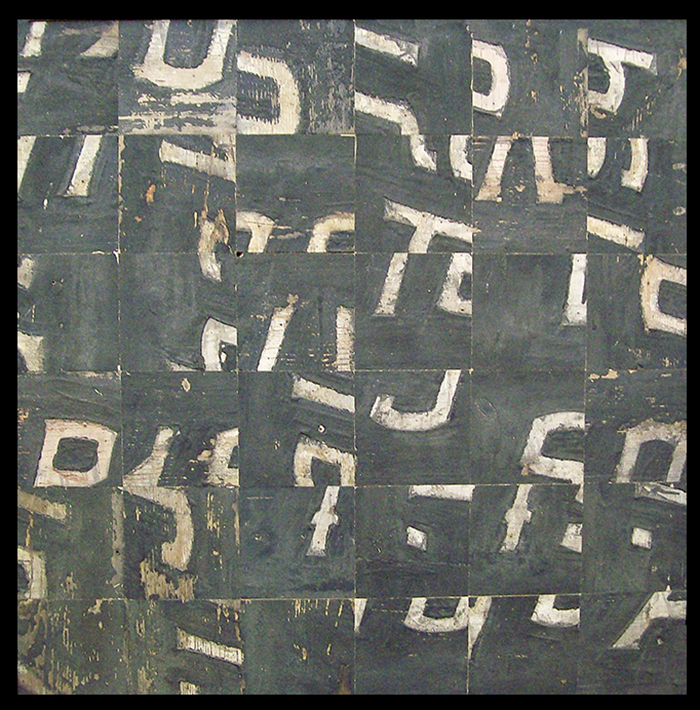
Miller Tire | 34 x 34”
This was a circa 1925, sheet metal sign, cut it into 5.5” squares. Painted background is mixed with very fine sand. 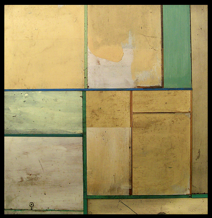
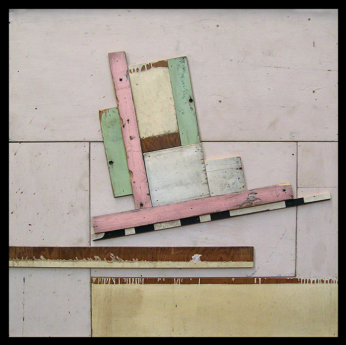
It’s About Nothing | 32 x 32"
Many different but similar wooden blocks with thin dividers.
Dirty Design | 40 x 40"
Continues dirty wood theme with some more colors.
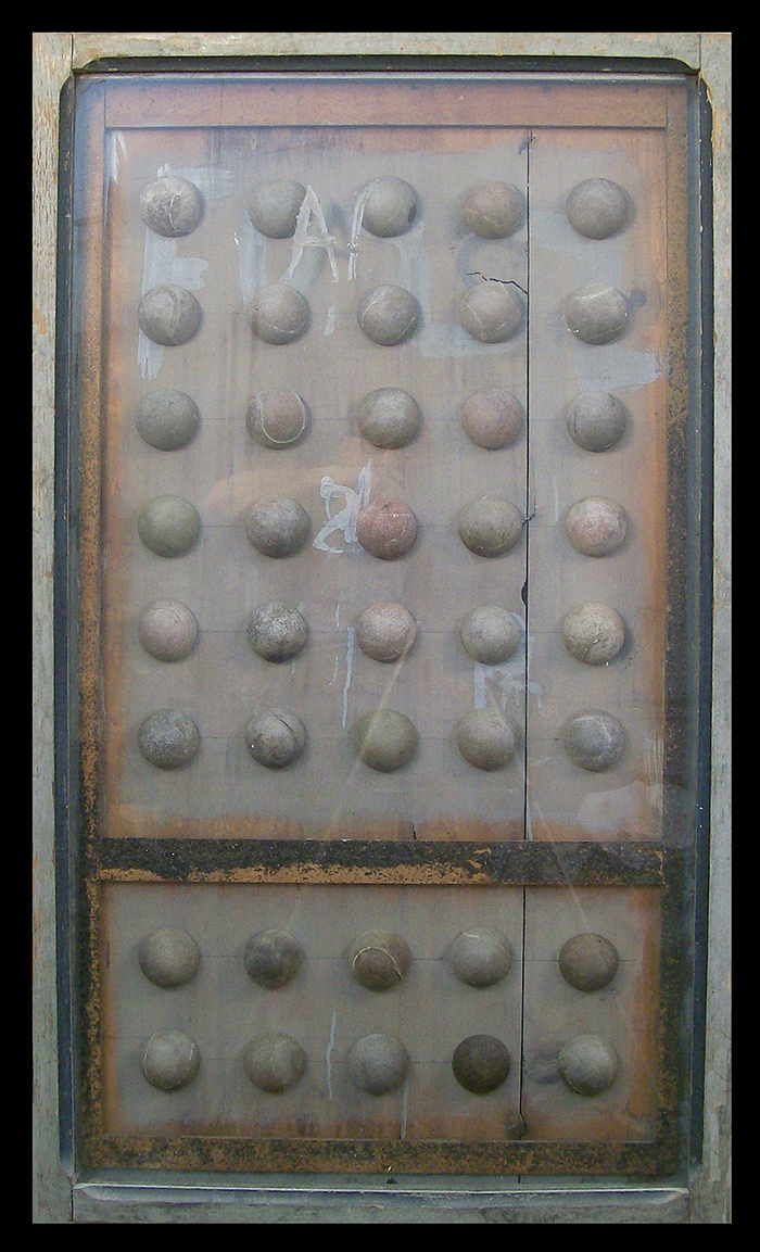
Thirty Over Ten
Thirty old tennis balls arranged in a found glass case.
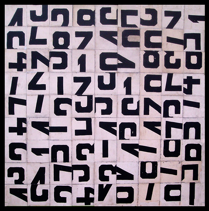
Half Again | 48 x 48”
This is a large field made up of half letters from a circa 1930 homemade race track timing device. The vintage letters were hand painted on aluminum sheets.
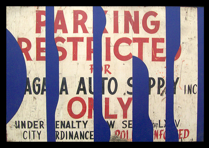
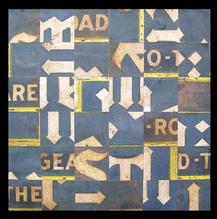
Parking Restricted | 30 x 46"
Cut up sign and a blue board—two works at once. In the style of artist Ciao Fonseca.
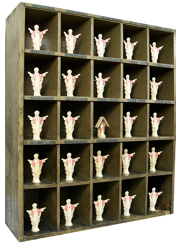
Unholy Arrangement | 48 x 48”
This is an old order sorter from a Buffalo factory, with twenty-four cast metal “Bleeding Heart of Christ” figurines (and one plastic version), never sold. They came out of a country store, circa 1920.
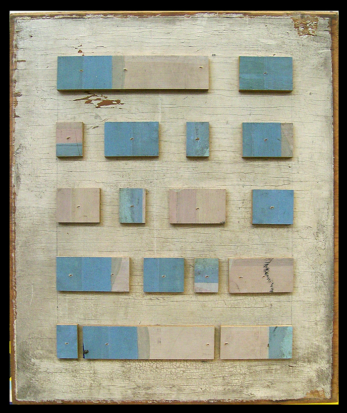
Format | 20 x 24”
This is a circa 1850s door panel with crackled white paint. I added blocks from a huge hand-painted sign from a clothing store in pastel colors. Nicely dull and dirty, matte varnished.
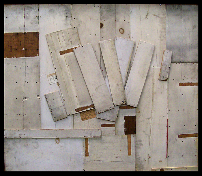
Lucky Days | 42 x 48"
Made entirely of old dirty white boards from a circa 1935 homemade cabinet.